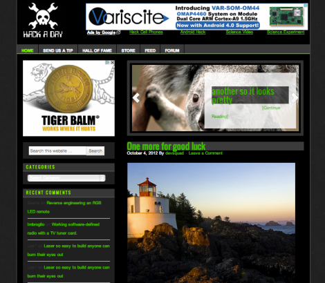
 <edit — Dark default layout (now shown above) with white option>
We’re going to be implementing a new template soon. We’ve been wanting to do this for years and it is finally happening. There are many reasons why this is necessary from site load speed to better commenting. This will give use more control over what is in our sidebar (right now I have to hand code everything into the friggin’ template!).
This is going to happen. Help us make it awesome.
Here is a preview of the new template. Yes, there is a white background. Lets take that as issue number 1. Anybody want to chime in on how to use javascript/jquery to load a different CSS file so people can choose a dark background? I’ve started reasearching, but I’m no star programmer.
<edit –> we’ll default to dark with an option for light.>
What does everyone think about the commenting system? How deep should we be able to nest? Right now I think we’re at 3 levels deep.
Would you prefer for us to do the stories as we are now (picture + a breakpoint wherever we want), or would you prefer for us to use excerpts to put more stories on the front page, but you only see a predefined amount of characters before you have to click to read? (ex: venturebeat)
<edit –> keeping our current system of BIG picture and controlled break>
We won’t be coding any completely new systems. We use WordPress and we don’t even have the ability to use all wordpress plugins that are available because of the hosting system we’re on. However, if you have any more ideas on how we can make browsing hackaday easier/better, lets us know.
We obviously can’t make everyone happy. Change is always met with resistance ([Newton’s] 17th law).









coming to this site once in a couple of days i’d like to be able to scroll through all the new posts.
may i suggest an infinite scroll page or at least “load more posts” button rather then “next page” link.
Wow, 177 comments so far. I’m sure every conceivable thing has been considered at this point, so I’ll just say thanks, and I’m looking forward to it.
If you allocate real estate for ads, would it be possible to get ads that are targeted for this crowd? E.g. farnell/mouser/digikey, dev board teasers from TI, scopes and analysers, … I read in the AMA that you get a lot of mail from marketing from such companies, why not squeeze some money out of it?
Forgot: I’m referring to that nexus7 crap from Google on top of the screenshot.
+1. These are probably the only kind of ads I will ever click on. Ever.
Same… I only sometimes click on adds because I want to be nice but I’m rarely interested
This has obviously been commented about a million times, but it needs to be said a million more: Make the black background default, or so help me God, I will remove you from my bookmarks.
I like it basically how it is except for a few things.
It would be nice to have the site dynamically adjust to the horizontal resolution of the monitor in use. That way I won’t be reading a thin column of text with light years of black space either side.
Also, a way to expand each story without having to open a new tab/window to read it.
Apart from layout changes (which are highly subjective) that’s all I can think of right now.
The suggested look is really, really, really cheap. Reminds me of those spam pharma sites.
If you MUST change it, at least try to replicate what you have today (as others say: if it works don’t fix it) – with an option to change the looks via stylesheets.
THIS
+1
The new white theme is boring. One of the major reasons why Hackaday is my favorite electronics site is the current dark theme.
Remember that photos always look better on black backgrounds.
I much prefer the article on the left and navigation on the right. Maybe it could be optional?
Add a Donate button, I would donate in a heartbeat and I frequently do on sites that ask for it and are what I consider to be one of my favourite sites.
I doubt I’m the only one who would. *shrugs*
As for how the site looks, its mostly OK – I never look at the content to the right of the page though it is actually invisible to me. Which is funny because I have only just realised now.
I second this.
P.S: Accidentally clicked report
hackaday.com uses an invalid security certificate.
The certificate is only valid for the following names:
*.wordpress.com , wordpress.com
Please make the entire site work properly with https
Couple of notes:
– Highlight the current selected page in the top menu, WordPress makes it easy by setting a special class for the selected page.
– There’s a black line between “home” and “send us a tip” buttons in the menu, consistency please!
– There’s a double-wide space between the left and right panel, is it really necessary? Should be the same as the padding on the sides (more content space).
– Is the top ad centered vertically? I can’t really make it out.
– HAD logo seems a little blurry, again, might be just me.
– Integrate search to HAD, currently you use Google directly, but did you know you can show the Google results inside your website. It’s bad practice to send visitors away. Maybe even use WordPress search, which isn’t actually that bad.
I have to see more to make further comments.
I asked Oliver Richtenstein on twitter about the font colour issue. This is what he had to say:
https://twitter.com/ia/status/255959300508364802
great. I don’t like dark websites.
Light is better ! Like Google, Facebook … just clean and light.
Sigh!! I hoped it was some April Fools…
I *LOVE* the current “Hackaday template” (meaning “the Hackaday-unique template”).
Are you actually in need to change it?
Please, don’t change anything.
I understand you need to update the site but pretty please don’t use another ugly generic “web2.0” look that is so common these day’s and really does NOT stand out.
this site has a distinct feel about it, keep it that way …
Looks like every other site on the internets, wahoo.
How’s about working on stuff like spelling, grammar, and not posting stuff which is just plain nasty/bad/lazy.
I realise making crap shiny is far more important than making it not crap these days…
I undestand that it needs more time to maintain hardcoded things, etc…, but i don’t understand why you should change the design to get a better maintainable system (?)
The new design looks like any other website…wheres the recognition value ? And where are the people that want the black on white version ?
krater
Oh please keep the black background please please :]
Oh please keep the black background. It’s both relaxing and nice (as well as giving you a visual special identity).
Remove the carousel, it adds no benefit to the site.
Keep the content on the left side.
Keep the green/dark colors, they make your site unique and stand out from the rest.
Place the search to the upper right corner, this is the place where most people expect the search to be.
Here’s a quick mockup: http://oi50.tinypic.com/34pnvcp.jpg
In order of importance:
1. I want to see the latest hacks in reverse time order as now. Most important feature. Allows me to quickly see new content.
2. I want the ‘next page’ to go back in time.
3. I want to be able to search for previous stories by tag, or categories.
4. I want to see the list of links showing grouping such as xbox hacks, etc…
5. I want to see comments only under each storypage.
6. I want you to use a theme that shows up well on mobile as well as regular browsers (I still use FF).
7. I want to easily be able to send you links
8. I want to buy stuff from your store !! I’d rather support you that way than be inundated with new ads.
Note:
Your identity is white green on black with logo. Simple and compact. Please keep that.
Comments only need two levels of indent. we want to see useful notes not some epic conversation thread. Remember – compact, succinct. Up and down votes might mean less moderation by you.
You know what really bugs me? The
at the bottom of the page should have a bar or something between them
Please please keep article content on left side to avoid scrolling on mobile devices.
Please, leave the background black or dark grey. It’s not about being a 31337 h4xx0r but having sensitive eyes. White background just overloads my eyes and makes pages much less readable.
If you want to go the Gizmodo/Engadget route (both long removed from my bookmarks) at least give us the ability to get back to a readable content with cookies.
One quick thing, not sure if its already been mentioned, but Microsoft got slammed for using all uppercase letters for menus in vs.net 2012. It supposedly makes it harder to read. It is something simple, but it might make the titles easier to read subconsciously.
One other thing, it seems the mobile version of HAD has gone again. Please bring it back!
I prefer to have content on the left, so that I can zoom to read the text without having to scroll over to find it.
>Have a proven design
>change it to look nicer
>shitstorm ensues
Sounds ’bout right.
Well, it’s time for me to put my 2 cents in.
Personally, I prefer the current theme. As someone with light sensitivity issues, I can vouch for the fact that the black background is easier on my eyes. It also does have that underground feel that others have mentioned.
I also must say it is probably one of the faster sites that I frequent. I used to also look at hacked gadgets.com but it was so slow and cluttered with ads that it was annoying. So I don’t go there anymore. Hackaday though remains open in a tab constantly. It’s fast, and sleek. I’ve noticed that with a lot of blog sites, when they start adding fancy things, it tends to slow things down. By all-means, make it more usable for yourself so you don’t have to code stuff in by hand. But don’t; add stuff that will slow the site down, clutter the site up, or make the site look like every other reposting blog site that is a sorry excuse for a tech news site.
PLEASE keep the green/white on black.
I am on your site most of the day at work, and it is the exact color scheme I use in gVim, so it looks like I am working.
I CAN’T GO BACK TO ALT-TABBING all day.
heh heh. BACK TO WORK!
now have to unlearn the site :(
and learn to hack the new site…*sigh*
Personally i don’t see a need for change of colour theme. leave the colours as is.
You said way up in the comments that you ran a poll in 2010. i’ve been reading since pretty close to the beginning, and i do not remember any poll done regarding the theme. but that is beside the point – poll numbers from 2010 are absolutely not usable now – we’re two months away from 2013 – that is a 2-3 year difference. Poll numbers are generally only good for a month or so around when the poll was done.
the only way to truly know how your readers think about the theme change now, is to run another poll now, not to rely on one from 2010. I am fine with an updated theme for the layout of your page elements, and i am even fine with moving around the sidebar (although i wouldn’t), but please leave the black bg and green/white text.
I’m sure you’d notice a heck of a difference.
I’d also investigate why your host is crippling your WP installation. Maybe it is time for that to go to a host who will allow you the freedom you require…
I will definitely miss the current HaD format, but whatever changes you make I’ll still be a loyal reader. Thanks for all your hard work, Caleb (and the entire team).
I vote for the current system of picture and breakpoint. Your writers do a superb job of giving the right amount of introduction and bait to promote each post on the homepage.
Thanks for the plans to keep the ability for dark background and light text. Looking at the template, I think I could get used to the new layout better if I had the comfort blanket of the familiar background and text colors. I find the black background perfect for my third-shift light-sensitive eyes.
I’m not a coder, so I’m not sure what all it would entail, but it would be great to be able to browse posts by date. Just a suggestion, but maybe a simple calendar…click on the date to view posts from that day, left/right arrows next to month to change the month.
Regardless, thanks again for the hard work and dedication.
Hackaday…
wat r y doing…
Hackaday…
sthap!
Current web interface is cute and oldschool, new one looks like april joke.
Don’t do it!
The current layout could maybe use some tweaking. Black is not the greatest choice for a background, however a subtle grey pattern is fine.
The screenshot here looks like a gawker site, and I’m sure plenty of readers will immediately begin worrying about the quality of HaD posts if the layout changes.
The advertisements shouldn’t be overtaking content. That’s the worst change about this layout by far. I would love to see nice advertisements on the side or something, somewhere out of the way.
I believe that HaD would do a good job of keeping ads relevant and possibly interesting which is good for everyone – the only problem is if the ads are intrusive, annoying, or in anyway off-putting – people WILL ignore them (and eventually ignore the site too).
they’re identical to what we have now. No difference except the left/right column change
I love the green/white on black colour theme. It is recognizable, comforting and easy to read.
Also might I suggest a random button. There are days when I have read everything up to date and I just want some random hacky goodness. Apologies if it’s already been addressed, didn’t read all comments…
I like the button idea.
Leave the site as is.
As the majority of the flood has commented on, this look is a representation of your site as what you stand for and your identification as an individual from the other sites.
I love the instructable’s website and many others for the content they provide and as well the look of the site. It stands out with the name of the site and is identifiable in an instance.
Changing your site you can do, but for those that would like to keep the site as is, leave an option to keep the default. And as for those votes of wanting a change, when all is said and done, you can tally the amount of viewers to the site and get a real number for your tally.
Part of the theme of this site reads to me as “This is a place of doing things no one else is doing.” A rebelious stance if you will, but to change the site to look like everyone else only makes you fade into the crowd and become forgotten.
Don’t let yourselves be forgotten. Stand out of the crowd. Create! Be unique! Make the next best project and stand out! For god sake man! This is what your site represents to me, and the great articles that are posted do not deserve to dissolve into the white void of the data filled net.
Keep to your guns, fix the code where need be and keep on trucking in the fashion you have held for so long to and keep on growing into the personality your site has now. To change without the option of keeping the classic site so many seem to enjoy and come back to, would feel like a disservice to those that view your site every day.
Thank you for your site and what it has brought to me with the knowledge I absorb every day, if not more.
Don’t put white-out on something that is not a mistake. Break out the eraser and fix the spelling errors.
Thank you.
One of your many HaD site supporters,
now and hopefully far into the future.
Azurus Nova
It ain’t broke, don’t fix it.
green on black is part of your brand.
white on black makes it indistinguishable from other sites.
WoW! I’ve never seen any Hackaday story draw this many comments!
I’m for keeping it AS IS.
I especially like the writer’s own defined breakpoints than a fixed number of words.
There’s nothing as irritating as stopping in mid sentence and havi… Read More.
Caleb, if it’s any consolation I still use copy-paste for new entries to my own website.
At any rate, here are some things I’d like to see:
1) high speed at low bandwidth (so be miserly)
2) only a minimum of stuff that scrolls with me
3) don’t make it work like gizmodo
4) keep the ‘previous page’ ‘next page’ links on screen always — maybe using a title frame at bottom?
5) minimize the use of flashy flash.
don’t fix what isn’t broken
I do agree that I like the unique colour scheme on the site but the new site looks good and once I change the colour scheme from the default I’ll be in love.
The thing I would change is the sidebar I would move the ad and the rest of the left side under the carousel so that the content is right up top on the left. As it is right now to me the content is almost the last thing my eye hits. I do understand you want your ads to be very visible though. I really like that the forum, RSS, and store are right up top. That’s way easier to find.
The site could use some change and it’s nice that you’re trying to incorporate what we want.
the only thing I pay any attention on this site is the stories you list down the left. pretty pretty please with sugar on top keep the black background (it goes with your logo better, agrrrrr). Now what you have been doing works for me, if you need to direct people to ads and a store then do that on the right. Upgrade to the new coding method to make it easier for you, sure, but don’t screw with the black background and the left side of the page. You’ll lose your branding..
I agree a CSS/tenmplate contest voted by the HaD community is a great idea!
What better way to engage your audience and best critics :) this way no whining just a consensus and everyone goes on their way. Hacking HaD the way we feel is best.
Or you can just leave it as is :P
White/Green text on black bg is far easier to read. The monitor flicker is much more noticeable in a white bg/black text than the actual HaD style (Yes, I still use CRT, have 2 screens, problem?).
or, in a more direct way,
I SEE NO PROBLEM ON GREEN+BLACK, I USE GREEN PHOSPHOR TERMINALS ALL THE TIME!
-leave the color scheme as is
-add some sore of up and down vote to comments
-comments have some sort of page view so you dont have to scroll so much
-better use of horizontal space
-side bar on the right
I have been following Hackaday since the beginning. I was just looking to start a blog to add to my commercial website and wished I could use the Hackaday style. I’m looking for a similar WordPress template that displays well on all browsers.
Caleb, Why not fix or pay someone to fix the current style so that it loads faster, no hard coding, etc…?
Also Caleb, if you need new hosting, I may be able to help as I have a dedicated server. Let me know your diskspace and bandwidth requirements, etc… and I’ll see if I can help. In fact, if anyone else needs help, with hosting, let me know. I’ll take a look at your website? All I’d want in exchange is a link to my site.
Appropriately labeling the advertisements as such will improve the separation between content and advertisements. In addition, your mockup could use a picture that doesn’t look like a stock photography vacation picture (which looks like an ad) – put in a photo of an arduino, circuit board with a combination chainsaw/flamethrower for a soldering iron and I’m sure we’ll just start drooling.
For further feedback, I’d also like to see the placement of text for article promos (i.e. what’s below the fold here) and within articles themselves.
Finally, the top content promo (I think it’s a content promo – the one with the Koala Bear) could probably have better textual design. White text in a black box, in a white box – It’s not very clean looking. I’m actually torn about this box. It doesn’t need to be so prominent nor take up so much real estate. I want to get to the latest hacks first. Featured items can be pushed to the side where they will remain prominent, but out of the way of the main content.
Will be interesting to see how the new site works out.
BTW everyone should have tiger balm as its very good. I use it with inflammation of joints!