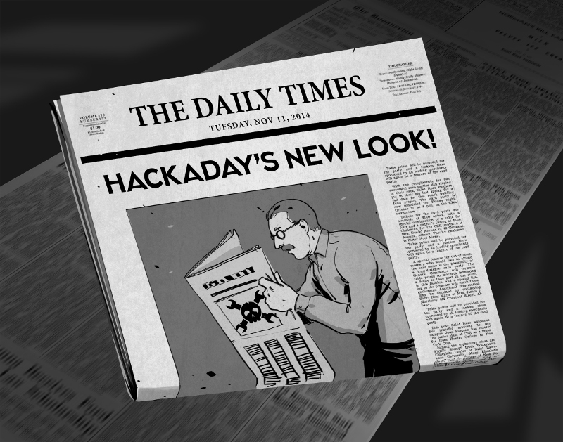
There comes a time when your movable type becomes so over-used that you no longer get a legible print off of the printing press. For months now we’ve been at work on a new site design that maintains the essence of Hackaday while ejecting the 10-year-old dregs of the site. With each small success we’ve actually ruined ourselves on viewing the old design. It is with great relief that we unveil a site design built specifically for Hackaday’s needs.
The most notable change is in the content of our landing page. For ten years, loading Hackaday.com resulted in the most recent blog posts. The blog concept is proven, but provides little opportunity to highlight quality original content and information about upcoming events. We have tried the use of “sticky” posts but honestly I find them somewhat annoying. The solution to this is not immediately apparent, but I feel we have found the most efficient solution to our complex set of needs..
We have a lot of community members who participate in Hackaday in numerous ways. Changes found in this design are driven by that fact. The landing page will, from this point forward, be a somewhat more persistent collection of notable content from the blog, our community site (hackaday.io), as well as news regarding live events, store features, contest highlights, and more. Those hard-core fans — a label I also assign to myself — will find the same reading experience as always on the new blog URL: hackaday.com/blog.
Aesthetically, we hope that all will agree the new design far supersedes the old. There was a lot to fix, and the work of the Hackaday crew who designed and implemented this new interface is truly amazing. I hope you will take the time to leave a positive comment about their work. As with any major transition, there will be some bumps in the road. Right now most of our sidebar widgets have not been migrated but that and any other problems will be fixed soon.
In this design we strived to highlight the title and image of each post to immediately convey the core concepts of the projects shown here. The author by-line and comment count remain core to the presentation of the articles, and our link style continues to be immediately apparent in the body of each article. I think we have far surpassed the readability of the comments section, in addition to the content itself. We knew we could rebuilt it… we have the technology… long live articles worth reading.
UPDATE: We are working very hard to fix all the parts that don’t look quite right. Thanks for your patience!
UPDATE 2: Infinite scrolling isn’t a feature, it’s a regression. On our test server all the blog listings were paginated just like always. When our host, WordPress VIP, pushed live the infinite scrolling manifested itself. We’ve filed a ticket with them and are hoping for a solution shortly.
UPDATE 3: Infinite scrolling has now been fixed and the blog layout now paginates. The mouse-over zoom effect has been removed. Slideshow speed has been adjusted and if you hover you mouse over a feature it will pause the scrolling.


Well, I gave it a try for several days and had to make a stylish patch. The letter-boxing of images not composed for letterbox format makes them difficult, and as others have said, crowded, to view. It’s uncomfortable. I had to reduce the h1 size as well. Most of the time, article titles span lines, reducing readability. I have found myself doing more brief skimming of HaD since the change than quality reading time because it was so uncomfortable to look at and just felt closed and visually inaccessible.
All I did to make my eyes relax is this:
.entry-featured-image a{height: 500px}
h1, h1>a {font-size:32px}
body, button, input, select, textarea { color: #54DA56; }
I forgot to mention that I also used the !important tag on all of those to make sure they applied. It’s not perfect, I only took care of the things that annoyed me… which, given it’s a short list, should be seen as some credit to the web designer who did the layout.
This looks horrid on mobile devices just saying…
I miss the green text already, bring it back.
You just lost a 5x daily reader due to the redesign.
No, actually the views are consistent and statistically insignificant.
Thinking we need a plugin (like the old greasemonkey scripts) to revert to the old layout! Can’t stand this cluttered huge text anymore. Not all of us are retired with failing eyesight…
to be quite honest I have read none of the 640+ comments. It is too difficult at work on my iPhone 5s.
Can you optimise (and redirect) for small screen mobile devices? Either that or an easier way to see what we missed when we get to our home (hacker) computer?
I’m sorry but I hate the new theme. The writing really hurts my eyes, The titles and images are to large and I have to zoom out. Please fix this!
seven (7) articles in the RSS feed is killing me. I don’t get to my reader every day and I’m missing articles like crazy.
Notice anything different, dear?
Um.. Have you lost weight?