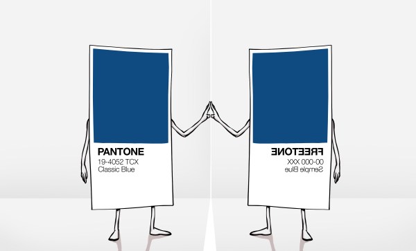
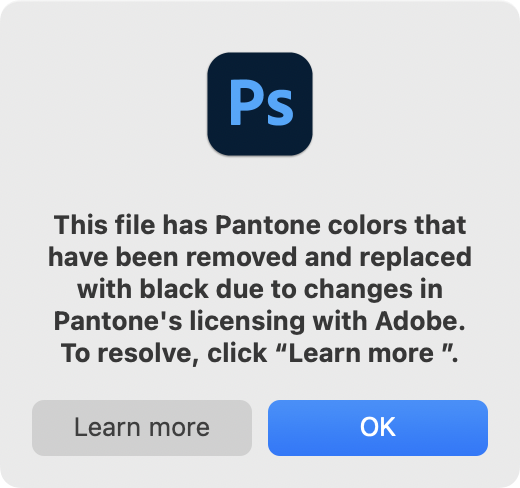
We recently covered the removal of Pantone colour support from the Adobe cloud products, with the two companies now expecting artists and designers to pay an extra subscription for a Pantone plugin or face losing their Pantone-coloured work to a sea of black blocks. Our coverage focused on our community, and on how the absurdity of a commercial entity attempting to assert ownership over colours would have no effect on us with our triple-byte RGB values.
Interview With An Artist And Pigment Activist
It’s fair to say though that in our focus on hardware hackers and open source enthusiasts, we missed its effect on artists and designers. To rectify this omission we needed to step outside our field and talk to an artist, and in that context there’s an obvious person to interview.
Stuart Semple is probably one of the more famous contemporary British artists, but in relation to this story it’s his activism over the issue of colours and intellectual property that makes him an authority. He’s drawn attention to the issue by releasing his own art materials in colours that directly challenge those which companies have tried to claim for themselves, and is perhaps best known in our community for challenging Anish Kapoor’s exclusive licence for VantaBlack, the so-called “world’s blackest pigment”.
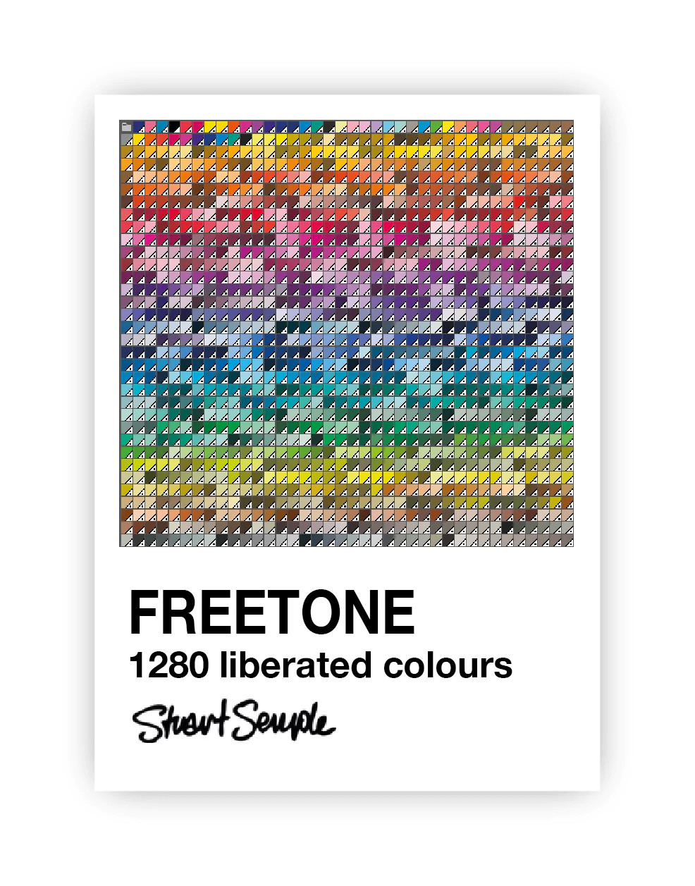
Most recently in response to the Adobe/Pantone controversy he’s released Freetone, a free plugin for the Adobe suite that in the words from its web page contains “1280 Liberated colours are extremely Pantoneish and reminiscent of those found in the most iconic colour book of all time. In fact it’s been argued that they are indistinguishable from those behind the Adobe paywall”. I had a phone conversation with him, in which he explained why Freetone had come into being.
Hackaday I understand Pantone is something used by designers, so I’ve worked for companies in the past where the designer would specify a Pantone index and it would appear on the screen, on the printed box, and on everything else identically. But why why do you as an artist use Pantone?
Stuart Well, I use it in lots of ways. So I make a lot of screen prints as part of my art. So you know, if I’m working with a screen printer, I want to know that the print that they make of my work is the colour that I want it to be, so Pantone’s really useful for me for that.
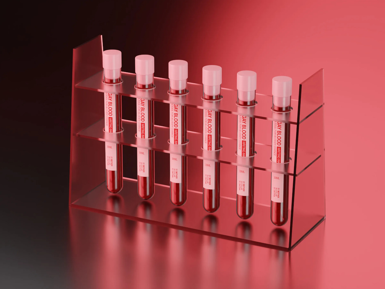
But also, even with within the paints, so I just did a thing where I made some paints, which actually uses the blood of gay men. It was really important to me that the colour of the paint matched the colour of actual blood. So I was working with a lot of people, we’ve been collaborating, and I was working with some friends in New York on it, and we needed a common language.
The red I was talking about was the red they were talking about, and Pantone is super useful for that. In fact, it’s the go-to for that. I just did a record cover for Placebo, the band, that was produced for me by someone that prints, so I had to tell them what spot colours I wanted. So I had to tell them Pantone references, it’s the language they understand.
Hackaday So my next question relates to Freetone. Obviously, as as you’ve distributed it, it’s a Adobe plugin. How does it solve the problem? Because obviously, I can specify a Freetone colour, and anybody else with Freetone can tell yes, that’s that colour. But how do I then go to a printer who buys his inks with Pantone specifications and map one to the other?
Stuart How it works is, if you download Freetone, you’ll find colours in there, and one of them will be called Sempletone 648C. Well, it’s exactly the same as Pantone 648C. If you do your work on the screen, use the Freetones, and then when you send it to the printer, it’s actually blatantly obvious to anyone that 648C is clearly apparent. If you’ve got the Pantone fan book and you look at the colours, it’s the same. 846C in mine is the same as 846C in the fan, in the Pantone book. I’d like to see them try and argue that they own it, but I don’t think they do in the name or the Pantone trademark, but these are Sempletones with a number. So I think it’s gonna be hard.
Hackaday My next question is probably getting more into the technology of it all. Do you think it will be possible to replace Pantone’s service completely? So if you took every Sempletone colour and threw it at a spectrometer and published the spectrum, would you then be able to say to an ink manufacturer or similar, here are the full technical details rather than just a colour, and does your paint correspond to this spectrum? I’m curious how far you could push open source in this line.
Stuart That’s really cool. I love it. Like, if you could just give them that spectral data, and if they’ve got a spectrometer they could measure it a their end. But there’s nothing that advanced at the moment, a lot of action is done by eye still. My answer is, I don’t see why not if there was a cool enough device. I don’t know if the spectrometer would be good enough to match it. I don’t see why not, I don’t see why you couldn’t publish the data. But it would have to be the whole spectral information and not just like an RGB value.
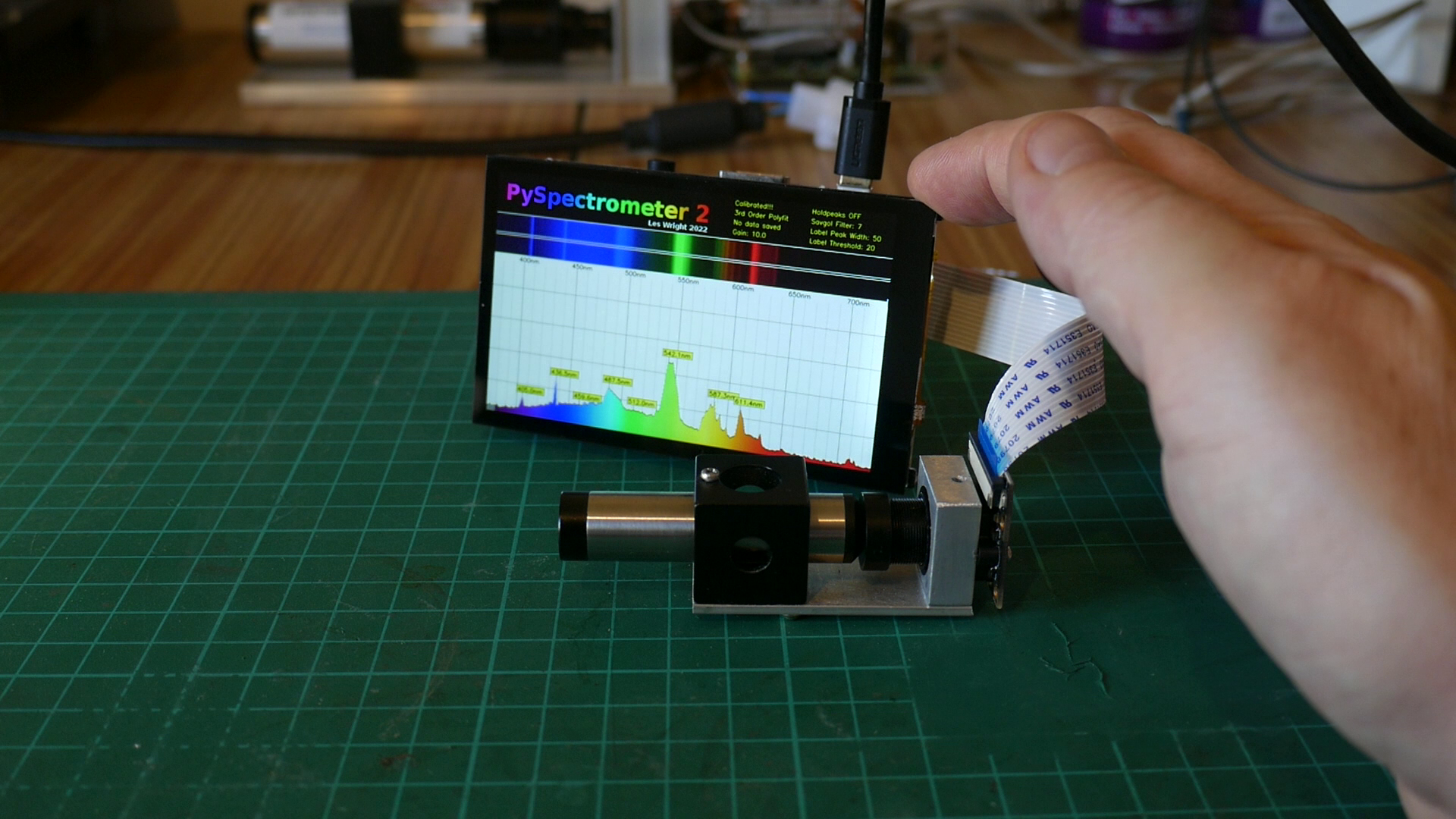
(At this point the interview digressed for a moment into a discussion of open-source spectrometers such as the Raspberry Pi project we featured recently, as Stuart’s lament was that a spectrometer can be an extremely expensive instrument. It isn’t the job of an interviewer to lead their interviewee so we’re skipping this part of the transcript, however I think we can all look forward to whatever uses Stuart makes of an affordable spectrometer. We’ll pick up the interview at the next question.)
Hackaday One of the real problems with the whole Adobe suite, and this has happened in world as well with for instance the Autodesk CAD packages, is that they have gone into the cloud and become software as a subscription. So I understand completely, the frustration of artists at suddenly being told they have to pay an extra subscription to keep their Pantone support, and I’m particularly shocked to find that Photoshop isn’t just displaying black pixels over Pantone colours, I’m told it’s wiping out the Pantone information on saving. Do you think that anything in the open source software ecosystem comes close to replacing proprietary products like the Adobe suite for you as an artist?
Stuart Yes, 100%, there’s loads of stuff. I think open source is just the answer, I believe in freedom. And freedom means freedom to express yourself and freedom to own the thing and tweet the thing and change the thing and all the rest of it. So yeah, 100%. I think there’s actually better things than Photoshop, the problem we’ve got is that Adobe have the industry stranglehold. And if you want to work with someone, you have to be talking that language. And that’s still the problem. It’s like an operating system, but it’s got the monopoly.
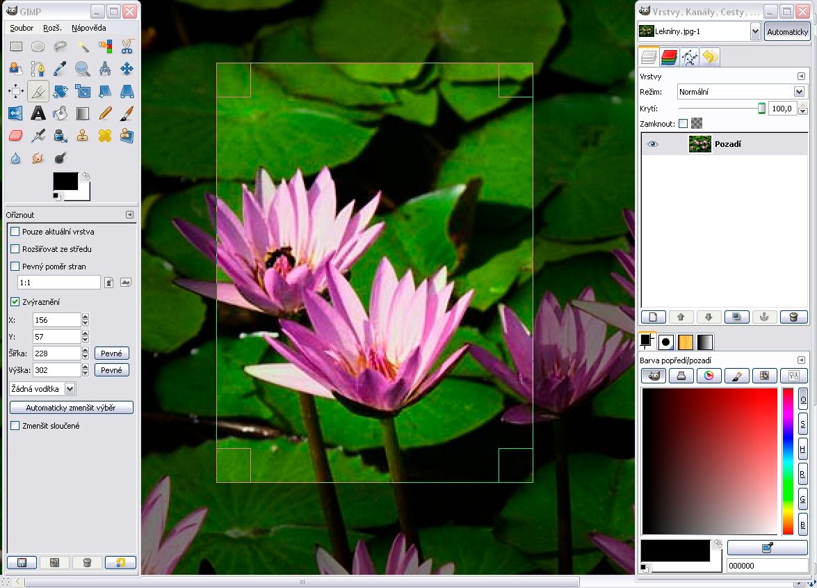
So there are other things, for instance, on a Mac, there’s something called Pixelmator, which is as good as Photoshop in my opinion, I use it every day. It’s not free, but you buy it once, and that’s it, free updates. Like software used to be. And there are other things, like GIMP is amazing. It’s awesome, but it doesn’t really replace Photoshop.
Hackaday Here at Hackaday we can make noises about how wouldn’t it be great if the developers of GIMP or other software could stick Freetone into their products, because they don’t have Pantone as it’s licensed?
Stuart Yeah, that’d be a dream, wouldn’t it? I mean, why not? I made it for everybody. As far as I’m concerned, it’s out there, use it, change it. incorporate it, the more people the better, I think.
A lot of people use GIMP, and it’s good. Really good open source stuff that always has been. We know the future is in the open source stuff, proprietary stuff just won’t last, it’s just not adaptable. It’s putting greed and profits above the user, it can’t work. There’s no freedom in it.
Hackaday To me the most egregious thing is that as I understand it they will delete the Pantone information from your PSD. This really shocked me.
Stuart They’re literally holding it hostage. It’s like 20 quid, or delete from your work, which is, wow. They’re not giving me anything, anyway. I’m renting the software, paying to use the software every month, it’s not free. And the licence fee is a lot. We’re already spending hundreds and hundreds a year on this software, probably about 800 quid a year. Another 20 quid, just to pen the work we make before. I mean, it’s our work! It’s pure corporate greed, isn’t it.
Hackaday Thank you very much for the interview.
As we wrapped up, I asked him about his Black 3.0 pigment, produced as a reaction to VantaBlack and Anish Kapoor. I was curious whether it might have a specially good infra-red response for headsinks or solar collectors, but sadly he informed me that it’s primarily a visual colour for artists. It’s very cool stuff, incredibly black, and I really want to get some to play with, but probably no better than a rattle can for heat purposes. Never mind, an engineer’s curiosity satisfied.
What’s Next, For Both Artists And Engineers?
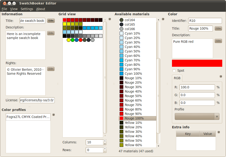
Following the interview, it’s worth looking at the Freetone project from our side of the table as well as his. If we as a community would like to ensure that colours do not become ever more proprietary, then it is probably on us to ensure that where appropriate it is supported within our sphere. GIMP support for instance would at a stroke make open source software an easier choice for millions of artists and designers, and could I think be done relatively easily through its existing palette support. There’s SwatchBooker which appears to perform the necessary interchange, and I found the ASE2GIMP project which imports Adobe palettes into GIMP, but sadly I couldn’t make it work here. If GIMP shipped with a Freetone palette built-in, would that be too much of a development task to contemplate?
From Stuart’s side, having sat down and played with Freetone, if there’s one thing I could ask him it would be to release it as more than just an Adobe plugin, and to give it an open source licence. As it stands it’s a binary available for no charge through his web shop, I think that releasing it as a straightforward list, perhaps even as simple as a CSV file, would make it so much more accessible to developers. And coupled with an open source licence that allowed them to include it within their software, I think it would be unstopable. We’re not open source licence nerds here at Hackaday, but I’m guessing something that does the same for a palette as a library licence such as the LGPL does for libraries would be appropriate.
In our world we’re wrapped up in electronics and code, and it’s sometimes easy to forget that the work we do reaches way beyond our workbenches. If you’ve spent enough time in a hackerspace you’ll know that art and engineering are almost the two sides of the same coin, so it’s pleasing to find such a moment of crossover. Let’s hope Freetone support can find its way into the open source movement, and together we can keep the tentacles of yet another IP land grab at bay.