If you’ve ever looked at the bottom of a bank check, you probably glanced over some strangely formed numbers? If you’re a fan of science fiction or retro computers, you’ve probably spotted the same figures on any number of books from the 1980s. They’re mostly readable, but they’re chunky and thin in places you don’t expect.
Those oddball numerals didn’t come from just anywhere—they were a very carefully crafted invention to speed processing in the banking system. These special fonts were created to be readable both by humans and machines—us with our eyes, and the computers with magnetic sensors. Let’s explore the enigmatic characters built for Magnetic Ink Character Recognition (MICR).
Machines Will Do The Work
These days, much of the money in the world is sent and received via digital transfers. Once upon a time, though, paper was king when it came to moving money. The almighty check was how you got money out of one account and into another one.
Sadly, as populations grew and economic activity skyrocketed, the status quo couldn’t hold. By the mid-1940s, the problem was already apparent, with the Federal Reserve dealing with 2 billion checks a year in 1946. While mechanical adding machines and various other techniques helped, fundamentally, bankers and clerks were processing millions of checks daily, all by hand.
The financial world needed a way to speed handling of checks as much as possible. The solution was to enable machines to read as much of the information on a check as possible, so they could handle the basic sorting and processing steps at speed. This would eliminate much of the manual reading and handling by humans, and greatly improve throughput.
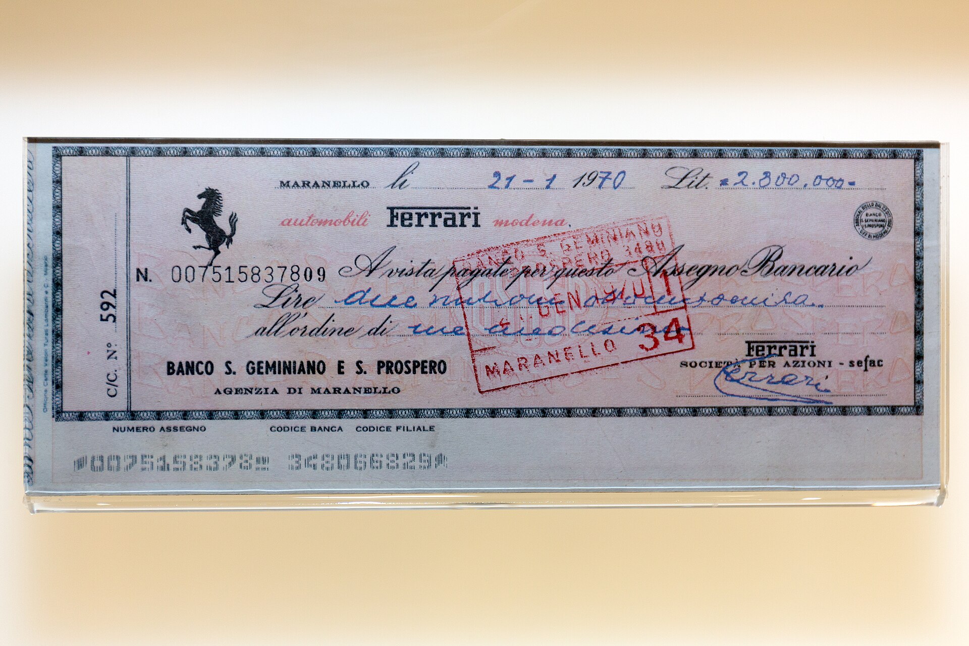
The problem was that in the middle of the 20th century, technologies like optical character recognition, or even digital cameras, were decades away. Instead, the key innovation that saved banking was MICR—short for Magnetic Ink Character Recognition. It involved printing certain characters on checks with an iron oxide-based ink. The combination of the ink’s magnetic content and the unique shape of each number meant machines could read the checks easily and unambiguously—even in the case they were physically damaged. Meanwhile, the MICR characters were also designed to remain human readable, so they could be readily understood by the humans using them, too. This was an important backup in the event a check failed machine reading for whatever reason.
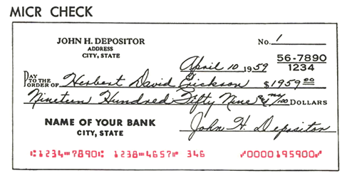
With MICR, checks could be pre-printed with a bank’s routing number and the customer account to draw from, leaving just the payment amount to be read from the check user’s handwriting. Alternatively, even the amount could be printed in MICR characters if the check was fully machine-issued, speeding processing further. With the aid of magnetic ink, processing speeds went up prodigiously. In 1950, mechanical aids had allowed one clerk to process 1,300 checks in an hour. Fast forward to the magnetic ink era just a few years later, and clerks were able to handle 33,000 checks or more in the same amount of time.
As is so often the way, the world did not agree on one standard for MICR purposes. Developments across the banking world occurred during the 1950s, with two major magnetic fonts being developed in parallel.
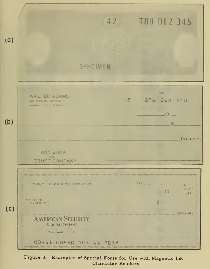
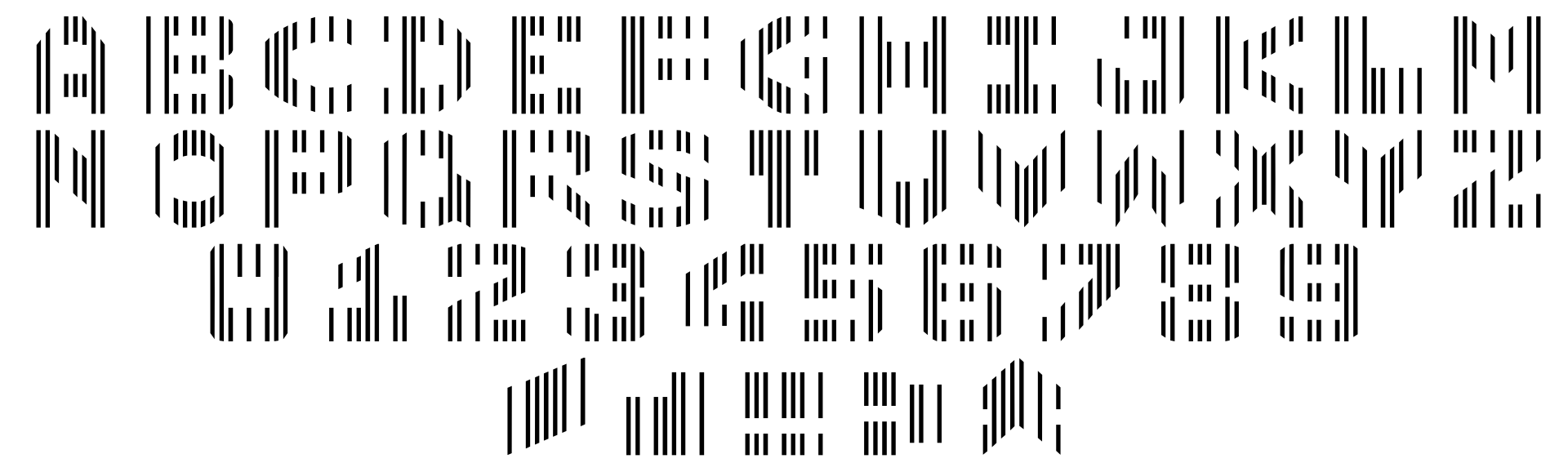
If you’re based in the United States, Canada, the UK, Australia, or much of the rest of the English-speaking world, you’re probably most familiar with a font called E-13B. This is the one with the gloopy letters and the worst ‘1’ numeral ever committed to print. It was developed by General Electric and the Stanford Research Institute. Its designation was entirely pragmatic—E denoted that it was the fifth font considered, and B denoted the second revision. 13 referred to the fact it was designed for use on an 0013-inch grid.
The font was designed to create a unique magnetic signal pattern when each numeral or symbol was scanned by a magnetic reader. The shapes were specifically engineered to avoid any possible confusion – that’s why the 0 has those straight sides, and the 8 is so hefty at the bottom, for example. Each number generates a waveform that’s distinct from the others, making it easy to process the signal and read the check accurately. E-13B wasn’t perfect, with 2s and 5s putting out rather similar signals in some cases that could cause confusion, but it proved itself more than reliable enough to do the job.
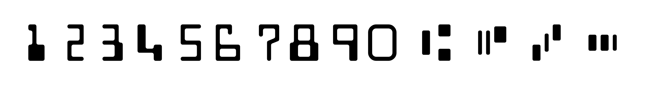

The standard was trialled in 1956 and was adopted by the American Bankers Association by 1958. By 1963, the American National Standards Institute (ANSI) designated that E-13B would be the standard, and by 1967, the Federal Reserve mandated the use of magnetic ink on checks. E-13B went on to become a graphical motif commonly associated with computers and modernity, with artists commonly creating lookalike characters for the whole Latin alphabet. However, the official E-13B standard only ever had 14 characters—numerals 0 to 9, plus four additional control characters for check processing—”transit,” “on-us,” “amount,” and “dash.”
At roughly the same time, French computer company Groupe Bull was working on its own standard. In 1957, it developed the CMC-7 font, which used an entirely different approach to E-13B. Rather than relying on the varying the intensity of magnetism by the amount of ink in a character, CMC-7 instead relied on characters made up of vertical bars. The spacing between the bars could be read by machine to determine the numerals. The design gave CMC-7 characters more of a barcode-like appearance. Notably, CMC-7 also featured a full alphanumerical character set—41 glyphs, including A-Z, 0-9, and five control characters.
Thanks to the geopolitics of the mid-20th century, each MICR standard ended up with its own stomping ground. While E-13B dominated in the Anglophone world, CMC-7 ended up being used in France, Spain, and much of Europe and South America. At heart, both standards did the same thing—they enabled machines to read most of the data on a check with a minimum of fuss.
Banks might feel mostly digital these days, but MICR fonts are still an important standard in the financial world. If you’re issuing checks, you might end up running into some problems if you’re not printing them with the appropriate MICR font and magnetic ink. For most of us, checks are a simple tool of the past, but it turns out a great deal of engineering went into perfecting them before the computer came along.


When I was a teen, my Dad did software support for a line of desktop check scanners. Initially, they just had one model, maybe the size of a toaster, but eventually they added a much larger and faster scanner to their catalog. I managed to snag a couple of the small ones when all that wound down and everything was cleaned out. I figure they’d be good for some motors and sensors if I ever get around to tearing them down.
As for MICR, I remember he had a special toner cartridge for printing checks. I always found the font fascinating. I hadn’t realized there were that many control symbols.
Not just the toner usually (though that did exist) Banks are fussy about this and usually you would be using a printer “designed” to accommodate. They tended to be robust models though. I did a stint handling audits of payroll data, printed checks and “advice” forms.
And …
https://en.wikipedia.org/wiki/Magnetic_ink_character_recognition#MICR_reader
Finally the mystery of the old Hackaday logo font is solved!
nopes, its more like this https://hackaday.com/tag/logo/
https://hackaday.com/tag/logo/
; )
I must be newer here than I thought, I had to look that one up: https://web.archive.org/web/20041008205518/http://www.hackaday.com/ or just https://web.archive.org/web/20041008205643im_/http://www.hackaday.com/common/videos/pt/hackaday-logo.gif for the logo.
Editing this one set me off on a search for the font that must have been, but most of the results for “MICR font” just give you ten digits.
Anyone know what the old Hackaday font was?
MICR Regular font
I only generally remember what it looked like. Maybe it’s one of these “9 Free MICR Fonts”:
https://www.1001fonts.com/micr-fonts.html
Whatthefont found it as Computer Std Regular
I was hoping for an explanation of how MICR was read, at least historically.
Are there multiple elements in the “read head”? By eyeball, it looks like there would be at least 3 segments in the printed characters/symbols.
Maybe that crosses over into Retrotacular turf.
I searched for “micr head” and it seems that it has only one segment.
Me too.
https://www.bogen-magnetics.com/eng/products/magnetic-heads/
the MICR reader is mostly analog. It’s wild. theoretically one could just put together some iron oxide ink at home and start drawing them by hand. Magnetizing them could be as simple as using a permanent magnet before it slides over your read head.
how the read head is designed, it’s like a tape head but really wide. someone that is good at machining ferrous metal could maybe make one by hand. would be easier to just buy a MICR head and wire it up. you theoretically should see some waveforms if you bias it correctly.
I would love to see a write up of someone actually experimenting with this. I only know the theoretical from taking apart some discarded (and very non-functioning) banking equipment many years ago.
Yeah, apparently it is detecting a waveform. I was guessing from the segmented trailing symbols on checks that the head may be segmented. Nope.
I guess the symbols look like that for the benefit of human readability.
It pretty much looks like the head out of a tape player.
https://www.brushindustries.com/data/StreamFile.aspx?loc=pdf&file=07182021170308_Brush-Industries-Long-Life-Magnetic-heads.pdf
A quick skim leads me to believe that the answers are here, including an amplifier circuit schematic and chart of nominal signal level per character.
https://nvlpubs.nist.gov/nistpubs/Legacy/FIPS/fipspub32-1.pdf
…and waveforms.
For other ways to annoy your neighbors and make your significant other ponder their life choices, you can salvage the play head from an old tape deck and make turntable-ish noises with the strips from credit cards. Nothing like making a little noise out of weird and/or obsolete shit.
Hm. Looks like the heads are a single track. That makes the decode algorithm even more interesting.
Various ways of reading (section 5.5).
https://download.support.xerox.com/pub/docs/DocuPrint_100_100MX/userdocs/any-os/en/GenericMICRFundamentalsGd.pdf
Me too.
My first thought was two magnetic read heads, one at 1/4 from the top, and a second at 3/4, but that does not work with the control characters, which suggest 3 magnetic heads. Adding a third head just for the control characters also feels “off”. Especially in a time from before (wide spread) computer / electronics use. So my best guess it’s a single vertical read head, and it reads back a variable amplitude when the text moves along it.
Half this article (and some of the pictures) appears to be a copy from https://en.wikipedia.org/wiki/Magnetic_ink_character_recognition#E-13B
A little bit later…
Single vertical read head confirmed by (Pages 5 & 6):
https://patentimages.storage.googleapis.com/6f/d8/be/845d434eec2667/CA2754666A1.pdf
Not really a copy, but a digest make in an automated way. That guy can´t write good text, but apparently he learned his way with some language model.
And for those that are curious, here are the magnetic waveforms when read by a single sensor head.
https://www.smartcheque.com.au/general-info/about-micr/micr-character-tolerances-and-waveforms/
Interesting stuff. I was expecting unipolar signals from the head. The waveforms in this document are bipolar. I guess the amount of ink weighted to the top of the head yields one polarity and ink weighted toward the bottom yields the opposite polarity.
Cool.
I was stupidly expecting the presence of x amount of ink to yield a signal of a certain level. Duh, only the change in the amount of ink passing by will produce a non-zero output.
I kinda have a little bit of an idea now how the decoding could even possibly work.
I’ve learned my something new for today.
No, that’s not how it works. The vertical distribution of the ink is completely irrelevant, and only matters to a human reading it optically.
The positive peaks are where there is a vertical edge going from no-ink to ink, and the negative peaks where there is a vertical edge going from ink to no-ink. The longer the edge, the stronger the peak is.
Obligatory pop reference: https://www.youtube.com/watch?v=oH2Ywyb127k
Thanks for the article. I never gave much thought to ‘how’ those codes work on a check (other than knew they were scanned), nor knew they were magnetic. Learn something every day. And yes we still write checks today. Sent one of off to our rocket club, and gun club… And the wife pays some bills with checks.
I pay most regular bills with checks. I will not do online banking.
I am 41 years old and have never used a cheque. They were abolished in my country (the Netherlands) when I was 17.
silly. checks are far riskier….
Neat. Why didn’t people ever try using the MICR to program computers, or did they?
In the CMC7 system, there doesn’t seem to be an obvious connection between the machine readable and human readable parts, it seems like a bar code that is cut into the shape of the character. That means it would be easy to make the machine read something different, and you would have to be very familiar with it, and pay attention to seen that something is off.
As in the amount reads out to the human a higher amount then the machine reads. Scammer throws a fit about machine is wrong look it says x amount right there pay me more. Right?
I use to work for Burroughs on the reader/sorter machines that read the MICR from the checks. Look at page 88 through 101 in the PDF at this link.
https://bitsavers.org/pdf/burroughs/MediumSystems/B2500_B3500/1025475_B2500_B3500_RefMan_Oct69.pdf
Note that just before the read head there was a magnet. There was a piece of Mumetal that forced the check against the read head.
” In 1950, mechanical aids had allowed one clerk to process 1,300 checks in an hour. Fast forward to the magnetic ink era just a few years later, and clerks were able to handle 33,000 checks or more in the same amount of time.”
Am I missing something? These printed numbers only encode the account information, so the clerk still needed to read the amount on the check – how is one clerk processing nearly ten checks per second?
With the systems I worked with, the amount of the check was read by OCR. The clerk was presented with a cropped image of the amount as it appears on the check and the OCR output value. In the vast majority of cases the OCR output was correct and the clerk just had to press enter. Only if the OCR output was wrong did the clerk have to key anything, so they could process checks very quickly indeed.
Not to say it’s the most rewarding work…
but if you have OCR that actually works, you don’t need the magnetic part that this article is about….
Those numbers don’t add up
That was post…let’s say 1980s. I remember when the blue background boxes started appearing on checks. Prior to that,mit was just a line prefixed with a $________
I agree. The 1300/hr manual input figure also blows my mind. That’s entering routing number, account number, check number and the check amount all in approximately 3 SECONDS, consistently over extended periods. That’s the equivalent of typing 300+ words per minute. Truly amazing.
MICR (Magnetic Ink Character Recognition) Encoding Font. Free download, free for commercial use. Now all you need is an ink cartridge and some magnetic ink. See you in prison ;-)
https://www.1001fonts.com/micr-encoding-font.html
Only “if you can” “catch me”.
Seems like adding MICR to the article keywords would be a helpful thing.
“If you’ve ever looked at the bottom of a bank check”
What is a bank check? Are you a time traveller from the twentieth century?
E6B, E13B. I am confused.