A few weeks ago we asked our dear readers if they were interested in coming up with some card art for the Mooltipass project. We received more than a dozen of them and a few days ago the HaD project Mooltipass followers/Mooltipas Google group recipients voted for their favorite ones.
Today we’ll present you the three popular ones and ask you to pick your favorite, so please follow us after the break…
![[Bjorn]'s design](http://hackaday.com/wp-content/uploads/2014/04/z_bjorn-wielens_suggested_design_v32.png)
[Bjorn] is a very active and pragmatic Google group participant, so this is the design he sent us. Given that exactly 1.2cm of the card is sticking out of the Mooltipass case, you’d only be seeing the “Mooltipass key card” text once the smart card is inserted.
 [Luke] is someone that does things. The design shown above was quite popular in our previous poll.
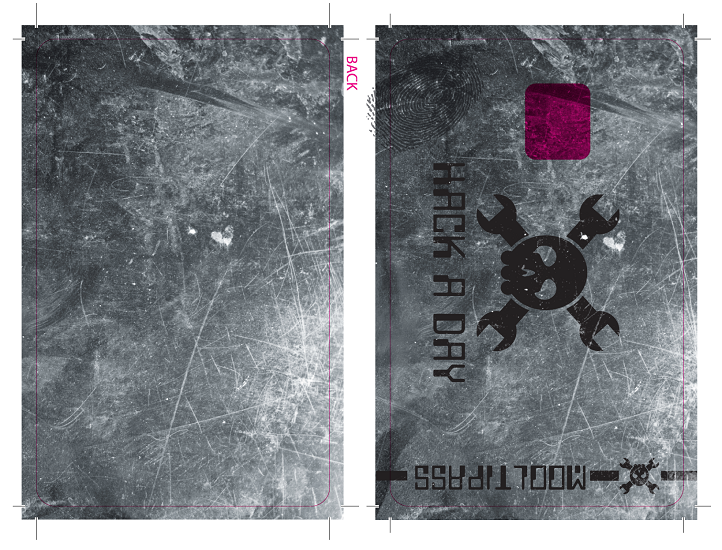
![[Robert]'s design](http://hackaday.com/wp-content/uploads/2014/04/z_robert-tomsons_suggested_design_v11.png) Our German contributor [Robert] sent us a more sober black and white design which does look quite nice in our opinion.
Our German contributor [Robert] sent us a more sober black and white design which does look quite nice in our opinion.
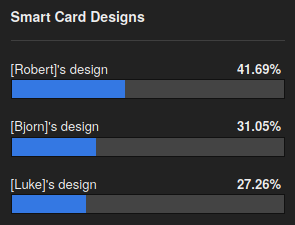 So what do you guys think? You may vote for your favorite design and/or submit your comments below.
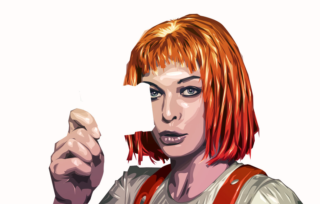
[Article picture attribute: angelitomercenario]


I vote for roberts design, based on my experience with card printers, i think it’ll turn out the nicest when printed in small quantities, since it can be done completely with black resin.
Can we vote for the Leeloo holding one of the cards as the new card? or is that way to many colours?
I 2nd that! Leeloo holding the card.. card… just need to change the angle a bit.
If you don’t make it happen I will.. Then again I think I just will…
Is it on purpose the order is different between the post and the votebox? I almost clicked the last one (because i wanted to vote for the last one in the post) and realised the name was wrong…
(as i write this i realise the votebox is probably in alfabetical order, which the post is not)
or it seems to be some random order in the box, and i just happened to get it alphabetial on my first visit, after i posted they got re-ordered.
i wll stfu now, made enough of a fool of myself :)
I set it up in random order every time the page loads to prevent any bias… But you’re correct, I’ll change that
You’re actually introducing a different form of bias, by violating consistency…
not sure it’s really a bias, if it is real randomness :).
Anyway it is fixed
pix above reminds me of run lola run
It’s Leeloo (Milla Jovovich) from Fifth Element :)
Voting it goes Luke, Born, and Robert. In the article it goes Born, Luke, and Robert. In the results poll it goes Bjorn, Luke, and Robert.
Is Bjorn (Born?)’s name spelled wrong? Also, please fix the inconsistencies. Please.
It seems the voting box re-randomises the order on each pageload… i got biten and confused by this too (see comment(s) above)
Ahh… but the name is still spelled wrong.
Bjorn, or Björn with the correct letter in place, is a name used in the nordic countries (Sweden in my case) meaning “bear”.
I’m aware that Bjorn is a name. Earlier the article spelled it Born and the voting was Bjorn. Seems to be fixed now though.
hmm 1,2cm? mixmasterangels mila could really fit there (somehow)
http://abload.de/img/mixmasterangel_hads6qv2.jpg
I would love Bjorn’s original design (See http://goo.gl/RlNx56) but out of the above 3, I vote Robert’s design. It seems easier to print and looks understated so a thief might not think its anything important, although it would be nice to have something like the Mooltipass logo on the top edge instead of the words in tiny lettering under the Hack a Day logo. (Honorable mention to Taylor Shields for his ultra-minimalist design)
Robert’s design, simple and elegant.
[Robert]’s with [Born] “Mooltipass key card” text
yes good idear… combining the good things of both designes seems like the best way to go..
that’s a neat idea
Back to security basics, I don’t think it should advertise what it does on the outside…
As such, Luke’s design is best against crimes of opportunity.
Luke’s and Robert’s are essentially identical in this regard. What are you seeing unique about Luke’s that sets it apart in your opinion?
It gives the least information about what it is. I’d rather whichever wins not say Mooltipass at all…
I like the “passwords cannot be recovered” on Bjorn’s one, and the little bit where the logo sticks out at the top. Those are it’s main features IMO, you could lose the background and just keep the black and white and it’d still be as good.
The password-loss reminder is particularly good, because people are used to a world where they can mess up as badly as they want, then just call tech support. This is both a warning against that, and also lets you know you’re dealing with proper security stuff designed by people who know what they’re doing.
Which I hope it is!
Is it born or bjorn?
sorry, bjorn… corrected.
I think the card should look like some random loyalty card from a shop or something. It should not tell what it really is.
Or like a hackerspace member card.
One nice feature to have would be to have a ruler printed on the side of the card.
Something functional eh?
I assume the card is mostly empty so how about a removable cut out of a lock pick. I think that would be perfect for a “universal key” card.
Can’t we chose the picture of Leeloo you have up there?
+1 LeeLoo Pic.. ; )