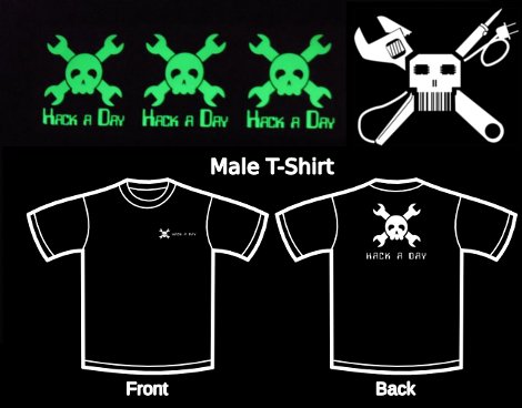
The Hack a Day store is still going strong. We’re really enjoying the fact that when you buy a Hack a Day item, it was made by one of us. We hope we can keep this up. It makes our merchandise mean so much more, we think.
We’ve been getting tons of requests for other colors of stickers as well as other products. Other colors of stickers is easy enough, we now have black, white, both gloss and matte, light grey, and just starting today, glow in the dark. We’ll be updating the store as we run out, or buy new colors. We only have a little bit of the glow in the dark right now, so if you don’t want to have to wait for more to come in, you better place your order quick.
We have also received a steady flow of requests for T-shirts. Unfortunately, we just don’t have all of the equipment yet. So, we’ll begin taking pre-orders for t-shirts today. As soon as we have roughly 30 pre-orders, we should be able to start making the shirts. To begin with, we’ll be doing white logo on black shirts. There’s also a Custom shirt option that gets your name placed on the front of the shirt as well, though that does come at some additional cost. Maybe after he gets all the kinks worked out, [Jakob] will grace us with shirts to sell as well.
There is also a product that has been the source of a lot of discussion between the staff. A new logo, designed by [Caleb]. You can see it above. Some feel that we should adopt it as our new logo, since the old one is kind of a generic biker symbol. The new one reflects a little more what we do. [Phillip Torrone], the founder of Hack a Day and designer of the old one likes it and says ” love it … i say go for it – evolve or die :)”. What do you guys think? Even if it never becomes the site logo, it will be for sale in the store.
[update: Judging by the feedback, we’ll be sticking with our original logo. Custom designs will be available in the store though. Email me directly(caleb@hackaday.com) to discuss getting your design on there. ]






Awesome new logo, love the “barcode” mouth…
I prefer the old logo.
In related news, what happens to those who have laser etched the old one onto their hand? They’ll look a right fool if the logo isn’t even current :P
(The new one also looks more difficult to do as a HelloWorld pattern!)
-Andy
I like the idea of the new logo, but I think it could be a bit more polished. I have always loved the old logo though…
While I like the new logo, I think it’s kind of busy. Possibly making the skull simpler would help. I do like the soldering iron, though. Good work!
The new one looks like it was whipped up in about 10 minutes. I can see the idea behind it and I like the thought processs, but the old one is so much cleaner and easier to look at.
Keep in mind that a logo can have a redesign without completely losing it’s origins. Take the Pepsi logo for example.
As Andy said, the suggested logo would be difficult for readers to use as a ‘hello world’ in image related hacks.
Maybe you guys should have a logo design competition and then let the readers decide the winner?
qfp skull eyes
cute but as a small image it makes them look fuzzy and meh
Although I like the soldering iron It doesnt seem to fit, maybe a screwdriver would be better
I do like the logo. But as stated earlier I think it needs to be refined a bit more and brought down on the “busyness scale”
I suggest replacing the “barcode skull” with the old skull.
lol, let me guess, t-shirts made by the DIYDTG?
Oooo, barcode for teeth and some 16-SOICs for eyes. And a soldering iron! And an adjustable wrench; gets much more use than a fixed wrench. Me likey.
The skull should be replaced with an Arduino, considering it makes up for 50% of the hacks on the site ;)
I like the old logo better. Like compukidmike, it seems too busy. Are the eyes supposed to be chips (either that or the eyes are just blurry)?
only if it blinks william
I don’t get it. I offer to donate some already made shirts for you guys to sell and I get shot down. You say maybe I could join a contest for a logo design. And then you just up and change the logo? As a professional tattoo artist I have done artwork for bic lighter comp, dickies clothing, Ed hardy clothing, etc. You say it’s stuff made by hackaday fans but it sure doesn’t look like it. Oh well. If you guys would rather pay for them.
@all about the logo,
It HASN’T changed. It was a thought, and judging by the feedback, we’ll be sticking with the old one.
@6adget,
All of our stuff is made by us. That could change though under the right circumstances. wanna email me directly? caleb@hackaday.com
Barcode skull with the wrenches, the asymmetry is killing me.
It’d look great if you replace the new skull with the old one and remove the lead from the top right of the soldering iron. Cuts out some of the busyness and makes it a more international logo at the same time.
I’m afraid it has too many details. It could be not very recognizable when scaled down. So maybe further simplification is the key to the success?
Perhaps you should clarify that the soldering iron is a STICKER. The description makes it seem as though it’s a 2USD soldering iron.
new logo sucks, please don’t change it
love the new logo design, but it would be sad to ditch the old one completely
I like the idea behind the new logo, but I agree its too busy (and asymmetrical) to be a replacement. Barcode mouth is cool. I’m still considering grabbing a sticker of it…
What I would like to know, is what type/brand of shirt will you be using for the tshirt preorder? Just to help aid in size selection, because they vary of course. And these are going to be vinyl heat transfers, right?
It is cool but it isnt a step foreword: It isnt going to handle shrinking, 150px is way to large for a logo’s smallest size
Id buy a sticker though
I like the NEW logo better, FWIW.
+1 to “I love the idea behind the new logo, but this implementation looks wrong.”
I have More color for stickers in vinyl Gold Blue White Red Black Green orange yellow dark blue etc.(more) and thermal yellow for ironing to a t shirt and also can help in the web store..
Caleb Kraft dou you think i can help?
After reading the comments I have to give some love for the new logo design. Well done, Caleb. But I’ve always loathed the current logo as it looks old without the slightest hint of retro!
The asymmetry in the new one is eye-catching. You can clearly see the evolution from original to Caleb’s design. And any concerns over clarity at small sizes (i.e. favicon) can be assuaged by a clever pixel artist. It is common practice to remove detail and simplify shapes to increase clarity at lower resolutions.
“evolve or die” – Phillip Torrone
the new logo sucks!
I’m not opposed to a logo change but I hate the proposed logo. The skull / tools proportion is awful. The skull is lost in the cross-section of tools rendered with needless realism. More importantly, the cartoony, almost smiling nature of your current (great) logo’s skull is lost in favor of a busy and angular design. Even if you fixed the proportions and simplified the tools, angry/evil skull-and-crossthings are MUCH more generic than the identifiable logo you’re using now.
Rule of thumb: if you can’t imagine people doodling a logo on their notebooks between classes, ditch it. Send the design back to Caleb and have him evolve it for a bit longer.
I like the new logo, but I also like the old skull – so a mix of both would be ‘nice’
Keep the adorable old skull :) The wrenchs could be replaced with the new set of crossbones, but honestly- he’s just too cute to be a scary biker ;)
Love the new barcode mouth and the sharp edges of the new skull, but the cross just doesn’t feel right. Perhaps it’s too busy.
My vote is: New skull with old crossbones.
new logo sucks compared to the old one.
Old one looks refined. New one looks like a Myspace page graphic.
Keep the old logo!
New one is too busy, I don’t like it.
I’ll be grabbing a shirt :)
possibly in time for the Detroit maker fair I will be attending with Jack the blackjack playing robot V2.0 ;)
I’m not against evolution or change. I like clean and simple symmetry, and the new logo is too “busy”. With due respect this is not like that the original created a brand recognition in the general public for a product to sell. In that this will be on an on demand manufacturing several styles could be offered. In my opinion any product offered by Hack a Day should include the text Hack a Day A local oilfield services company has a logo of a muscular man dressed in a T shirt, jeans. Holding a lighting bolt in one hand and a pipe wrench in the other in out stretched arms. The asymmetry works for their logo because their customers know they do power line work and pipe line work.
@AndyT As if having a blog logo etched on a hand didn’t make them look foolish in the first place. My impression has been those who are into body art, where unconcerned what others thought, and might be proud to be around when something was “old school”, wearing permanent evidence of it.
I didn’t see a bar code, just a way to represent teeth, like how the nose was reworked.
I’ll probably get shot for asking this but… is there a reason why the logo must have a skull in it?
Never really understood the skull thingy too, but the current one is cute anyway. Leave it alone plzkthx.
the new logo isn’t as clean as the old one, but i think it is infinitely badass.
new logo needs more arduino
re logo: http://jollyjack.deviantart.com/gallery/#/d2qy647
Understood the old logo, but I’ve never used a wrench in any of my hacks; screwdrivers, socket drivers, soldering irons, chips, even a drill and a saw, but an adjustable wrench, haven’t had to use one yet.
The old logo scaled well, you could place it on a business card or t-shirt and it was recognizable, it’s going to be tough finding something to replace them.
I like the old logo better too.
“Judging by the feedback.. we will be caving in to the haters instead of doing what we want to do.”
I like the new logo enough to order one… and more importantly it sounds like you guys at HAD like it. None of these people are going to stop coming here because of a logo.
You could use them both, the old one for smaller stuff since it’s obviously better for that, and the new one for bigger displays.
i like the original logo but i like the idea of evolving it maybe adding the bar-code but the adjustable wrench needs to go, maybe a screwdriver and binary(or some random coding)in the eyes… just a thought
Nobody has mentioned it yet, but one of the problems with the new logo is that it’s not a human skull in it, or it’s some imbecile mutant. I can’t imagine a sensible hacker with a cranium this tiny. What kind of tiny brain would it accomodate? There’s barely enough room for an Arduino.
Check drawing books. Eyes are at 50% of the head height. If you have bottom jaw removed, they’re even lower.
I like the new logo. The old one is cool, but i agree with the article, its kinda generic. I had a sketch that is almost identical to the new design, except with out the bar code mouth, that I was gonna get it tattooed on my left shoulder.