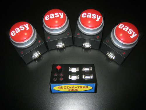
Who would have known that being given the task of planning a holiday party at a wine bar would turn into a hacking project? Well, here’s how that happened. A committee was in charge of the festivities and had decided on doing a mock game show. It wouldn’t really feel like a game show unless you had a contestant lockout system where the first one to hit the button gets a light and a sound while the runners-up get nothing. This is where [RoysterBot] comes in. He built the Quiz-o-Tron from 4 “easy buttons” from staples and an Arduino. After having finished it, he found the system to be somewhat lacking in the excitement area. When a button was pressed it only lit an indicator on the main Quiz-o-Tron box. He decided to add a small circuit inside each of the Easy Buttons using a 555 timer and some LEDs to give them some better feedback. Apparently he was going to patch into the speaker as well, but didn’t have time to get that added.
[via Adafruit]


Aaaagh! Another fun project posted in Intructables… When will people learn to stop posting good projects there? Instructables SUCK big time! I know it os free and just need to sign up, but it is lame!
I would have done this with all relays minus the 555 timer. Kind of overkill for a microcontroller.
Approved by Master Billy QuizBoy and Conjectural Technologies.
How can they make your tomorrow better?
(Go Team Venture)
My Staples has been sold out of Easy Buttons for-ever!
Now I know where they went.
yeah, you can do a light up/lock out system with 4 flip flops, just wire them into each others resets so once one is high the rest cant go high.
The quickest alternative is Buzz Buzzers, which are extremely cheep and USB HID so very easy to hook up to a PC to do the lockout, provide user selectable sounds, drive a display, and log the results.
@SS
I agree Instructables sucks. If anyone is looking for an alternative check out hackhut.com
Its geared towards hackers and readers don’t have to signup to get full content.
@RoysterBot
I have never seen an easy button in person, is there a speaker in it?
Still don’t know why people hate Instructables so much. It is free to sign up for christ sake. You can have all the steps in a fairly decent PDF format, so who says you have to go through any pages or click on anything? Let it go, or help out the guy making HackTuT / other instructable clones.
@instructable haters.
Have you forgotten this gem already?
http://daid.mine.nu/instructabliss/?url=http://www.instructables.com/id/Quiz-O-Tron-3000-Arduino-quiz-contestant-lockout-/
Tis is a project that just won’t die. I built mine in 1986! For those of you that can’t find easy buttons, this was my solution. Momentary push button in the end of a piece of PVC plumbing pipe. If you want to look very professional, use a rubber hand grip from a bicycle for the grip.
@DarkSim
Its true Instructables is free but so is hackhut.com. And at hackhut your work isn’t lost among crafts, etc., plus we’re trying to give you the features hackers need and we’ll listen to your ideas to add new ones.
@Paul
Really pushing your site huh? I applaud your attempt and agree someone should try to make a more friendly clone, but..
Are you open to criticism? A standard blog is not the way to do it. Instructables had a good system before the requiring registration, ads and ‘noise’. I’d be trying to recreate the early years. It was friendly to navigate as an instruction manual. The pictures with hover over boxes for further detail work well. I don’t want to have to click a picture twice to increase it’s size.
Also, the colors are hard on the eyes. Too dark, you need to break up with some light/white.
@bill porter
I don’t mean to be pushy, I really am just trying to create a place for hackers that is better and more focused. We may not be some large fancy company, but we are sincere.
I am more than open to criticism, I need it.
I disagree, I think the blog format works perfect for hacking. If you have a lot of info or steps you can create posts in chronological order easily, if you only have one small hack or need a seperate place for contact info, files, faq, etc. you can create a page. And yes we have tried keep the “noise” to a minimum.
As for the clicking a picture twice for a larger version the author can choose to not have that happen when they embed a pic but I’ll look at ways to force all pics to be that way thanks for pointing it out.
I thought the colors were good, very “hackerish” (is that a word?) But I could be wrong, maybe white text? what do the rest of you think?
@Bill Porter
On HackHut.com:
Ok I changed the the color of the text to white. is it easier to read?
And I changed it so all new images posted from this point on should enlarge with just one click. thanks again for the tip
@paul
re. the colors… I think the basic colors are fine, but that diagonal pattern/texture is what makes my eyes hurt.
@Paul,
I submitted an email through your “contact us” page on your site to take this up offline and not junk up the comments of a good project. I suggest others with critiques do the same.
Looks pretty neat. Only thing I noticed was the layout of the LEDs – 2×2 instead of 1×4 requires knowledge of how things are laid out ahead of time.
Nice work.
@Paul Bill is right, the blog format isn’t going to attract people. Another thing you don’t want to do is promote your site by running down your competition. Better stands on its own. There are only two things that are important in business, innovation and marketing. If you are competing against Instructables, find 100 people who don’t like it and build something based on their input. And never, ever, assume just because you like it others will.
This project always reminds me of metastability.
Here’s something from an old MIT course:
http://www.fpga-faq.com/FAQ_Pages/synchronization_answers.pdf