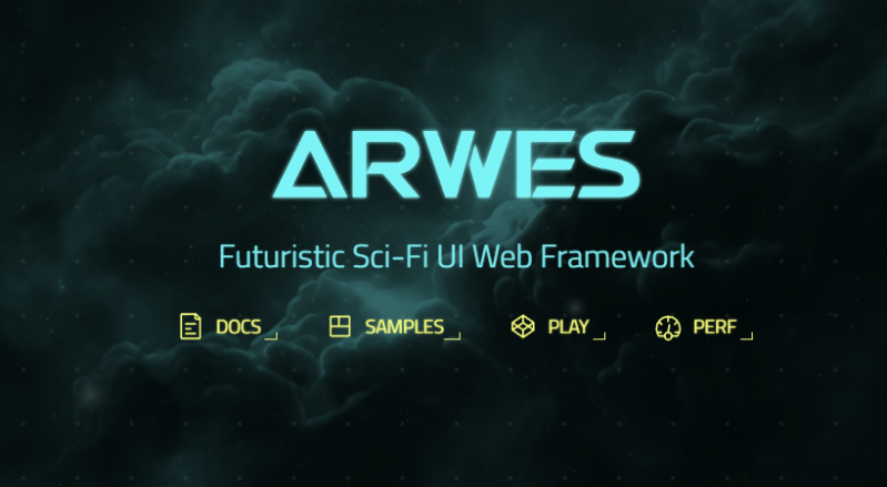
Many of us grew up watching Star Trek, marvelling at the beautiful colorful interfaces on the computers that ran the Starship Enterprise. Today’s computer interfaces have certainly grown fancier since the Windows 3.1 and Mac System 7 days, but they’re still nowhere near that gorgeous. The Arwes framework aims to change that, at least where web apps are concerned.
The framework is inspired by the cyberprep and synthwave aesthetics, while drawing from media like TRON: Legacy and Halo. You can get a peek at what it can do on the Arwes website, or look at how it runs on sites like SoulExtract or the Cyber Movie Database. It’s very much about glowing lines, 1980s computer sounds, and screens with animated text fills.
It’s still in an alpha release, and likely isn’t yet ready for business-critical production use. It currently consists of a set of basic components that can be assembled into a functional futuristic website design, but you’ll need some experience to use the tools at hand. There’s a sandbox for experimenting that should help in that regard.
You might just find that it’s the perfect tool to create an interface for your very own cyberdeck, or you might put it to work on your next website design. Either way, if you create something fantastic, don’t hesitate to drop us a line.






“Today’s computer interfaces have certainly grown fancier since the Windows 3.1 and Mac System 7 days, but they’re still nowhere near that gorgeous. ”
Windows 2.0 (incl. Windows/386) and LCARS (as seen in ST:TNG) are from same year, actually.
http://www.sabrizain.org/startrek/lcars.html
To get rid of the aggressive soullessness you’re eventually going to get into some uncomfortable questions about why refinement culture exists, plus some awkward headbutting with accessibility obsession. The explanation for why everything has such shockingly ugly, minimal, rounded-corners “Playmobil” design now (and it has been this way consistently for several decades with basically zero changes, which is unique compared to say the 60s/70s/80s/90s) is going to end up skewering some golden calves.
I worked on set for Star Trek: First Contact… remember that scene where Worf and Picard battle the Borg out on the deflector dish? That was shot second unit, and Peter Lauritson was directing. I watched him set up the LCARS shots that you see Picard poking on to detach and eject the deflector dish to prevent the Borg from calling for backup. Peter, a super-nice guy, was using a Macintosh IIci to “play” the LCARS screens that the camera films. The screen used was an early LCD screen which at the time (1996) was uncommon and expensive, but a good choice because it did not have to be synced to the camera shutter like you used to have to do with a CRT. But it was not a touch screen, just a monitor. The LCARS screen animation, as I recall, was then played back in something like Aldus Persuasion or PowerPoint, and someone offscreen was triggering the changes when Picard’s gloved hand touches the screen buttons.
And the laptop Paxton used in Twister, had a huge umbilical connection to a nearby SGI Onyx
Cool! Thank you very much for your reply and sharing this little insight about behind the scenes with us. 😃👍
I think that would be a horrible interface in practice. Imagine you’re trying to increase power to forward deflector shields, but the ship is rocked by incoming fire just as you hit the screen, and you end up turning the shields off instead.
Clippy: I see you’re trying to turn the forward deflector shields off, would you like help with that?
That comment alone shows why we need a “+1” button on here!
Now waiting for the Barbie UI Web Framework. And the MAGAUI Web Framework. And … the skullwrench ui web framework. Oh not, not this one, because no edit button.
Looks neat & achieves its main goal, totally reminds me of “sci fi ui” in old games and stuff, i like it.
But, like the comments above, i also struggle a bit with the “does this need to be a framework?” question, no offense etc.
So is there a version of this one can apply as a WM to XFCE or similar DEs?
Reminds me of the early days of enlightenment.
http://www.enlightenment.org/
The go-to for oh shiny windows managers.
Ah I was thinking along the lines of the dr460nized KDE theme as used in Garuda Linux (obviously a bit heavier than XFCE but I’d still love to see an Arwes theme for both!)
Would it be fair to say that what I’m looking for is the reverse of what Canonical’s just done with their preview release of LXD UI?
I guess not; I was confusing LXD with LXDE… 🤦🏼♂️
Reminds me of my Win98se setup with less gradients lol.
Which part? The DOS based part (runs scandisk etc), the Windows 3.1 based part or the Windows 98 part?
– Windows 98 had used mini.cab, which was a stripped-down Windows 3.1x.
I always liked the UI in the CSI series