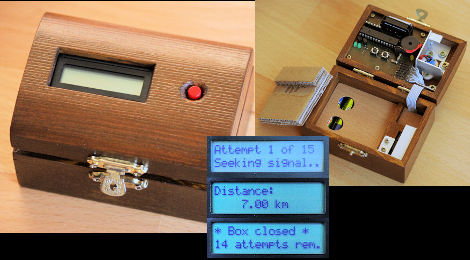
[Markus] built his own reverse geocache puzzle box but on a smaller scale than the original. His is based around a PIC 18F2520 and powered by two AAA batteries. The user interface includes one button, a 16×2 character LCD, and a piezo speaker. The box unlocks itself when the GPS module inside detects the proper location on the globe. There is also a secret code that can be tapped on the button to unlock the box prematurely, and another to show the locations in which the user attempted to open the box. This build doesn’t leave much room for a payload, but [Markus] did a great job designing the board and making the components fit as efficiently as possible.







Geocaching always seemed like the uni-bomber’s wet dream. Wait for the target to get in range and then… Well you get it.
What mechanism is used to lock the box shut?
It’s easy to solve by drawing 3 – 5 circles though.
Room enough for a couple of J’s, sounds like the perfect box to me.
I loved this project the first time ’round, this smaller version is much more pleasing to look at.
As for the payload, you could have a hint as to where the real payload is, or have some sort of card (be it a gift card or RFID card, or anything like that.)
A gift like jewelry, or a key to a new house, vacation villa, or car would fit nicely.
Very nice finishing.
Not only a nice proj. but nice finish, too! Well done! I like.
The lock is a small servo. Its horn rotates into place to hold a aluminium bracket mounted to the lid. You can see the horn in closed state here: http://www.jave.de/blog2/wp-content/uploads/2010/06/box_bottom.jpg
Anybody try to solve the captcha on that page? Holy crap that is rough.
Love the whole finsh and Like Spork said you could fit a rfid card in lead to another cache……idk just a thought
First time I saw one of these, probably on this site, I was just blown away at what a great concept this is. I’d only give the user four guesses though — an extra one just in case.
15 attempts is WAY too much, 3 attempts + triangulation is enough.
Yah. Fifteen tries is a HUGE number, since the display implies that it tells you the distance to two decimal places. Two trials should narrow it down to two possible locations, then either take another one for the distance measurement, to know which one of the two it is, or just go to one of the locations and try it. If it isn’t right, try the other.
This is very well done. Digging for criticism here, I’d probably use “## attempts left” instead of “## attempts rem.”
I don’t have the patience for this. I’d just pry it open.
@ Khordas
Yeah, that’s great. So let’s say you’re tring to get your SO to a scenic location for a special gift, and they, for some reason, don’t break out the map and compass *before* the first try, but instead press the button a few times to see what it does.
There goes your splendid idea, and you’ll be drinking that bottle of wine by your lonesome.
When a person, ANY person smart or otherwise, becomes the user of a product, they immediately gain stupidity points that you should account for in your user interface.
For those who want to triangulate, maybe it should be programmed to give you only “warmer” or “colder”?