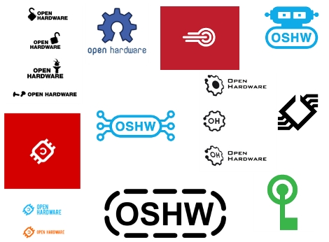
The Open Source Hardware (OSHW) initiative is rolling right along. But now it’s time for you to share your input. The movement is choosing a logo and you get to decide which one it will be. The ten finalists shown above were narrowed down from the 129 submissions received during the public call for logos. The thought is that any time you have a new project which fits the OSHW definition you can slap this on the project page, or silk screen it right on the PCB (although OSHW applies to more than just electronic projects). A picture says a thousand words you know.
Voting ends April 5.
[via Evil Mad Scientist]


i like the red one on top
You have to be honest, none of those logos are very good at all.
There are many really nice designs. It’s gonna be a tough choice. I wonder which one will win.
Put the one with the deep red background on a flag, and we can re-enact the cold war
The big OSHW on the bottom sure isn’t as flashy as the rest but keep in mind it should be something that is simple enough to silkscreen/etch/laser engrave onto your hardware.
What a great set of logos, it was a hard to decide.
I like the black IC on the upper right
I went for the copy-left chip
I vote the blue OSHW towards the middle.
Very hard to choose. I think I will recognize them all if I ever see them.
The “copyleft” chip is a nice idea, but I don’t know how it would work in practice unless you also put a “this way up” logo somewhere near it. I’d assume I was looking at the board upside down and think it was a stylised copyright logo, myself.
I picked the gears. I like the first of the three. Copyleft was next, but it just seems silly to me.
@Ben Ryves
If the copy left had any text nearby it would work. (see the other two examples below the red one)
My reading of OSHW doesn’t see anything that forces copyleft, given that many people like permissive licenses I do not see how any of the “copyleft” logos are appropriate, I am rather surprised a committee would select them without any objections.
None of them stood out to me all that much. I went with the OH gears as they were least bad so to speak.
Also, the voting page is horribly broken.
52 – OSHW Bot was my choice.
Copyleft chip is my vote, OH gears look somewhat defunct…
Why does it need a logo?
None of these are acceptable. The one I like best it the gear with the opening toward the top, though. While gears may not actually be a part of computers, they do signify hardware very well and of course, there’s more to hardware than computers. Copyleft is a good concept for incorporation into the logo but I don’t like the implementations here.
I like the one that says “open hardware” with the two screws next to it, because it kind of suggests that “open hardware” could also be read as a command.
I don’t really think the final ten are that good honestly. A good logo will reproduce at a very small scale and still be legible. Most of these are way too detailed to do that. Also, none of them really convey open hardware without words next to them.
I guess if I had to pick one, it would be the “OSHW” one bottom center.
#3 looks too much like the SCSI logo. #16 is an obvious copy of the Open Source Initiative Logo rather than something completely original. #4, #52, #53, and possibly #95 fail to achieve language neutrality (“OSHW” is an English initialism). I agree with both Ben Ryves and Brian on #28. To me, the others look even worse.
Copyleft chip, definitely.
The OSI-parody one (also popular), seems way too generic to me. I’d rather open hardware be thought of as independent from free/open source software (even though they’re both awesome), not just a spin-off of the FOSS ‘movement’.
Uhh these logos are terrible. These are the kind of logos you get from indians on digitalpoint forums for $3 a piece.
There are far better logos on the full list than these 10 finalists. Sigh.
I’d have to place my vote in for gears because
A) looks pretty decent
B) lets people know what the OH/OSHW stands for at a glance.
C) I don’t really like any of the circuit-based ones, since hardware is a lot more than just that (and I AM studying to be a computer engineer)
I like the bottom gear, without the text
I voted for the opened gear, OpenHardware should loose the electronics associations as soon as possible.
Since, I assume, the logo itself will be opensource, I can omit the Open Hardware text at the bottom of the logo, which I do not like.
My favorite was the open gear. I think it is the only one that has a logo that actually shows what it is: Open hardware. All the other ones are kind of lost on me little robot with eyes? No. Upside down flag and circle? No.
I’d go with the FSM logo in the middle
I sorta liked the gear wit the missing segment, until I realized it looked like a broken part. Broken is not something we would want associated with “open” anything. I now lean to copy left chip. I don’t seeing a reversed orientation being a problem if placement is paid attention to. Practically every pat has an obvious “up” direction. Fot example insure it’s near or matches other text on a circuit board, and so one.