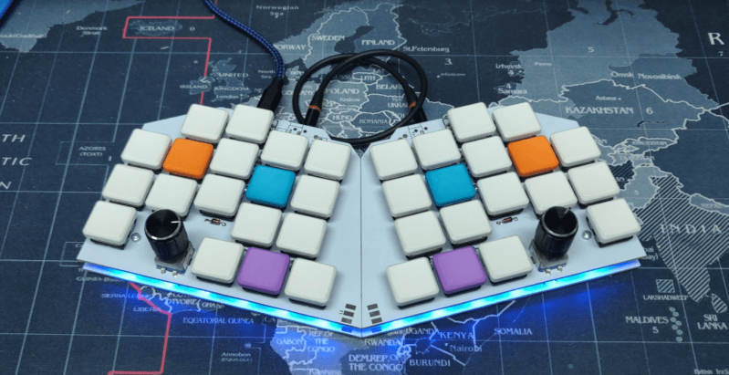
It happens to pretty much everyone who gets into keyboards. No commercial keyboard can meet all your needs, so you start building them. Use them a while, find problems, build a new keyboard to address them. Pretty soon you think you have enough user experience to design the perfect keeb — the be-all, end-all magnum opus clacker you can take to the grave. This time, it happened to [aydenvis]. We must say, the result is quite nice. But will it still be perfect in six months?
As you might expect, this board uses an Arduino Pro Micro. We can’t say for sure, but it looks like [aydenvis] created a socket with a second Pro Micro board populated only with female header. That’s definitely a cool idea in case the board fails. It also has two rotary encoders and a pair of toggle switches to switch controller and secondary designations between the PCBs.
We like the philosophy at play in this 36-key ‘board that states that prime ergonomics come when each finger must only travel one key distance from the home row. This of course requires programming layers of functionality into the firmware, which is easy enough to set up, but can be tricky to memorize. One thing that will help is the color-coded RGB underglow, which we’re going to call sandwich glow because it is emanating from the middle of a stacked pair of PCBs floating on 7 mm standoffs. We only wish we could hear how loudly those jade Kailh choc switches can clack. The board files are up on GitHub, so we may just have to make our own.
Indeed, many keebs we see use a Pro Micro or two, but here’s a tasty split that runs on a Raspberry Pi Zero W.
Via reddit


Impressive keyboard!
The knob is too tall and can blocking your fingers. Rather have them in the *middle* of the keyboard, may be they make more sense to be at the upper corners.
Unless you type with your fingers laid perfectly flat against your keyboard (nobody does, it’s not how hands work) there isn’t any chance of hitting that encoder. It’s really easy to under-estimate how much clearance you have in that area, but it’s really quite a lot!
I agree, that is a terrible arrangement and topology. However, if it works for the user, then who are we to argue?
Agreed, did make me look at it hard a few times trying to figure out if the image was upside down or something..
But if it works for them that is great, I think they might actually be short enough to not interfere with larger hands.. But it certainly looks awkward.
They mention it the conclusion that the encoder is tall enough they touch it, but it doesn’t bother them.
I’m sure it wouldn’t work for a lot of people, but I guess that’s why some of us design our own.
It seems that way, just looking at it. But look at your hands while on the keyboard: Most people will have their hands pretty arched, rather than flat. I think there would actually be plenty of space in there for the knob.
I meant this comment to be replying to @tekkieneet.
Wow! I didn’t see this till now! Thanks to Kristina and Hackaday for the feature.
For posterity:
Yes, the encoders got in the way at first. After 3 days, I barely even brushed them. I like their position because it means I can scroll side to side with my hands on the home row, just rolling my thumb across them.
No, this was not my final board. I built another split with hotswap sockets and then a giant 18×6 slab of ortholinear goodness.
“We can’t say for sure, but it looks like [aydenvis] created a socket with a second Pro Micro board populated only with female header” This is correct. The PCB houses hotswap sockets, and the Pro Micro gets ‘legs’ made of cut-off resistor wire. If the Pro Micro ever fails (or has the USB socket snap off), the entire unit can be replaced without having to de-solder it. They’re available here, for example: https://keeb.io/products/peel-a-way-sockets-for-pro-micros?srsltid=AfmBOooMV9Bug73bfpoFAyZSWgM-weSOpO8GK4jSn0W61S7DtJ4rVQX3.
If you have questions, my contact info is linked in the GitHub repo!