
We’re blessed to have such a great community at Hackaday. Our tipline often overfloweth with all manner of projects and builds of all stripes. We see it all here, from beginners just starting out with their first Arduino to diehard hackers executing daringly complex builds in their downtime, and everything in between.
If you’re sitting there in the grandstands, watching in awe, you might wonder what it takes to grace these hallowed black pages. In life, nothing is guaranteed, but I’ve been specially authorised to share with you a few tips that can maximise your chances of seeing your project on Hackaday.
First Thing’s First: Tell People About Your Work
To write about your project at all, first we have to be able to find it! Don’t be bashful, tell us about it by sending a tip directly to the Hackaday writers!
We like to share projects with readers, and that means they need to be able to access them, too. Thus, having the details of your escapades in a publicly accessible format is key. A great place to write about your project is, of course, Hackaday.io! For the low, low price of free, you can post pictures and details about what you’ve done. There’s plenty of fun contests to enter your project into, as well.
But look, anywhere you are able to publish full details in a publicly-accessible way will work. Basically, if it comes with a link we can share with everyone, you’re good to go!
A Simple Thing Can Be as Interesting as a Tour de Force
You could be forgiven for thinking the only way to glory is by having the most amazing, expensive, wonderful, and unique project ever, but you’d be quite mistaken. Are you excited about? We will be too!
We love an original or impressive build as much as anyone else, but that’s not all that matters. There’s also great value in the bread and butter projects that solve real problems people face every day. Your project might be reinventing the garage door opener, for example, but you also might have found a nifty way to do it, or a hack that makes it way more usable than it was before. It also spurs the creative juices in everyone else that reads it, allowing them to become more powerful from the benefit of your experiences. So, just because your project isn’t the world’s first robot lander on Pluto, we still want to take a look!
We Want the Gory Details!
The fact is, Hackaday writers are people, just like you and me. They’re tasked with the job of finding cool projects out in the wild that our readers would like to know about. To do this, we need as much info about your build as possible. We need a great image to capture the gist of the project, and we appreciate a demo video whenever possible. Ask yourself if you’ve adequately answered the what, the why, and the how.
The What is simple – what is it? Is it a radio controlled car? A fire-fighting drone? A new Python library that automatically hacks the Library of Congress to create an eclectic 1870s playlist for your anachronistic keg party? Your project post, or video, or whatever it is, should clearly explain what the project is as quickly and clearly as possible.
Why is just as important. The substance of the Why, of course, is absolutely up to your discretion. We heartily accept “because it’s fun” or “to see if we could” as much as we accept “I was sick of my spouse reversing into letterboxes”.
The How is something that’s often forgotten, and yet is so vital to showing the most interesting parts of your work. You could have a great video of your amazing mag-lev LED sphere, but if you don’t explain how it’s done, it’s likely to get passed over. Hackaday articles aren’t just about saying “hey look, this is cool” – we’re about learning new things and educating each other through our work.
Pictures Are Worth A Lot Of Words
Finally, pictures really are important. Hackaday writers are adept at using every tool available to cajole even the dimmest, darkest, most poorly cropped images into usable headers for articles, but even their elite talents can only stretch so far. Without a header photo, there’s no article, so it’s of primary importance to get this right.
The best thing you can do is to have a series of photos showing off the project. Just don’t forget to capture an overview image that shows off the build with the project centered in the frame. Leave plenty of space around the project in all directions so that it can be cropped in various ways as needed.
Often we use images taken from videos. If you’re filming your project, we love it if there’s a few solid seconds of the item of interest, nicely framed and well lit with slow or minimal camera movement. Get those glamour shots into your video – your audience will love them and so will we!
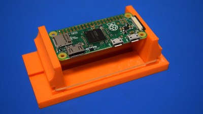
Of course, if your project is code, or something not visually representable, often there are measures that can be taken. For example, a new library for working with GPIO on the Raspberry Pi in Python might get an image made up of the relevant logos to quickly indicate the topic to the reader. If your project falls into this category, you needn’t worry. But for everything else, please, take some nice clear photos and frame them well!
Final Thoughts
Overall, nothing can guarantee that the world will fall in love with your project or that it will make the pages of Hackaday. We can’t cover absolutely everything, and sometimes there’s just too much out there (a great problem to have). If your project doesn’t get picked up you can always send a link to us again in case we missed it.
I hope you found this helpful in prompting you to explain your project thoroughly, and to post excellent images of it. I wrote it to help eager hackers and makers to understand what we look for in a great project, as well as to share some general tips on how to best present your project for any technical audience. In summary, tell us what, why, and how, and show us what we’re going to get excited about, and you’ll go far. Happy hacking!


It’s funny, I’ve had simple projects I spent a few hours on (and even projects that didn’t work out) posted here.
But a major 3D printing survey I spent years on wasn’t published.
Check it out anyway: https://saccade.com/blog/2019/12/fit-testing-block/
hey this is a great project! (but i don’t mean to knock hackaday’s editorial choice)
i think about this a lot. i haven’t put too much effort into tuning my printer, mostly i work around it in my designs. I have a design variable called “ee” (edge extra), I make holes +ee and pegs -ee, so a value of ee=0.3 would be represented by 0.6 in your table (a 10mm peg fits in a 10.6mm hole) if I’m understanding correctly. when i want things to effortlessly fit together on the first try without trimming, i use ee=0.3. if i want them to be snug or don’t mind some trimming, i use ee=0.2. sometimes i care a lot about the fit and i tune it to the mating in question, it can be as small as ee=0.1. it’s not really that simple but that’s the rule of thumb i’ve learned for the kinds of parts i make.
i’ve always wondered if this is typical or if everyone else has better printers than i do and don’t have to be as severe about it. from your experiment, it sounds like my printer is about middle of the road. thanks!
It’s always called “wiggle” in mine, and it sounds like we’re in roughly the same ballpark. Sliding 0.3 mm, snug 0.2 mm, and tight 0.1 mm. Still, I end up printing specific test features when it matters.
(Although mine are one-sided, so maybe that’s a little tighter than yours, but maybe you’re not doing facet correction for circles? D=D/cos(180/n) for inside fits in a polygon-circle.)
J.Peterson’s fit tests are cool! I like the 0 – 0.6 mm series.
Thank you for this!
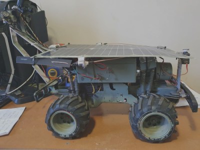
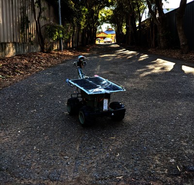
The picture examples may not be the best. The first picture shows lots of detail and the contrast ensures nothing is lost. Conversely, the other picture shows very little of the actual project and a lot of random outside, the details of the rover are barely visible and what’s there is crunched into a large area of black. Contrast is useless if it means losing essential detail.
Detail is great for your project photos! But when we’re looking for a header image, we want something that shows the whole project in context at a glance.
Maybe it’s just the color settings on my Mac and display but for me the second photo of the wheeled gadget is dark, muddy, and indistinct. The lighting and contrast of the first photo shows me much more of the undercarriage, but sadly the angle doesn’t let you see much of what’s on top.
I have to agree with these comments. The photo recommendations in the article leave me scratching my head, and the examples even more so. The first photo is the one I would choose if it is the cart we are supposed to be interested in. The second photo has it lost in a bunch of irrelevant surroundings. Puzzling.
i agree the lighting is a disaster in the second photo but the irrelevant surroundings are on purpose. by making the photo bigger than it needs to be, you allow cropping to a variety of aspect ratios. the graphic designer can decide whether to use a tight shot or a wide shot, portrait or landscape, 16:9 or 4:3. in the first photo, it’s essentially already been cropped so the editor doesn’t have any choice about it…if they crop it at all they’re gonna lose part of the object.
on top of that, the background clutter in the first photo makes it hard to tell where the object ends and the mess begins. and the landscape in the second photo makes it easy to tell scale.
you know, all things that were said in the article.
Yeah, my thoughts same. I can see the object in the first photo clearly, admittedly they could take the clutter away at the left edge but it does show the subject at hand.
The dark low-contrast outdoor photo with the dappled light (which does NOT help) just doesn’t show anything of use. Good for a situational photo perhaps.
It’s about options. The second photo allows us to crop in on the subject as there’s plenty of free space around it. The top photo gives us no options to produce the different aspect ratio pictures we need, and just looks like a pile of random electronics.
Header photos are to draw the audience in. They need to be croppable to different formats, and show what the project is clearly.
The second photo clearly shows a robot exploring an urban landscape, and can easily be cut up into different sizes.
The top photo looks terrible as a header and can’t be cropped at all without chopping off part of the subject. It just looks like a pile of electronics on a messy bench.
My secret – cats, squirrels, or other fuzzy critters.
They can’t resist a hack related to cats.
:-b
That is also how YT works :)
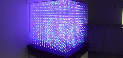
“We’re yet to find a specific purpose for LED cubes, but they’re undeniably cool. Often, that’s the best reason why!”
I was lucky enough to attend a Supercomputing conference and many of the supercomputer vendors had large LED cubes for visualizing the supercomputer’s workload. LED cubes were the easiest way for a quick visualization of whether the supercomputer nodes were actually working through a big dataset (dynamic display), or had gotten hung up on something (static display).
That’s awesome and I love that it’s useful too.
As a veteran hack-a-day project author, I think you should not discount your project failures. What doesn’t work can be at least as interesting and entertaining as things that do. I haven’t been counting, but I’ve probably had as many of my failures featured as successes.
Fail on!
True indeed. My only featured project was a “Fail of the Week” that I submitted myself. I was actually pretty proud that I got it so wrong that it made it to the HAD front page! (or maybe just embarrassed, but it was kinda cool anyway)
Yup, my first entry on HAD was a failed project. There’s tons to learn from failures!
i was planning to send in my first submission for a project that never got finished due to covid…
…designed to be shared or used in public in close-proximity…
finished enough for a “bench-test”. now i know digital cell networks (edit: this-one) can actually intermingle with a P.O.T.S. “hybrid”, yay.
its a project that interfaces a cell to a portable P.O.T.S. line using wires and a whole lot of button-matrix-encoding. its essentially a pocket land-line (wired-home-phone-line) connected to a celltower using cellphone guts, providing actual DIAL-TONE. accepts pulse-dialing for now but will include roman-black’s DTMF on a PIC16F in future.
yes i could have done it with bluetooth ect… but i like electronics.
now if i could just include full dial-up internet and fax… lol
PS: if cell has simcard under battery and you trick, wire, or capacitor it to be powered while swapping simcard youll break it (and sim?), include minimum-load (discharge) resistor, 40$ lesson.
to trick a cell to boot with USB-charger but no batt-inserted; jumper a resistor to the battery terminals, this may cause a HUGE overload on the charger as some phones need HUGE surges for Tx and CPU. i used a 56k but maybe that represented the wrong temp.
I think that a video is becoming very close to table stakes on these projects. I’m not really a visually oriented person, and I haven’t really made any effort in this area. When I retire, I hope to spend some time on doing quality videos. A shaky camera and no editing really won’t cut it these days.
Yep. Moved over to video first and the article with detailed pictures gets backfilled when there’s time.
It’s not HAD in my case making the decision. It’s the amount of people viewing the content. The videos get the traffic, and hence the conversation I publish to encourage, these days.
It’s not us! Video has killed the radio star — it’s just the platform that people are using to push their work out there.
For in-depth hacks, especially software, security, and electronics design hacks, I’m a big fan of written word. I’d much rather a PDF schematic than a video, 90% of the time. There’s an ability to pause, reflect, skim, and get an overview on a static page that’s just missing in videos, IMO.
Not saying that videos don’t have their place, and that we don’t also cover great videos — we do — but that making a video is yet another hurdle, and if that stops people from documenting their projects, that’s a loss.
Here’s something that might tickle one’s fancy. Started 5 years ago at https://www.pcenginefans.com/forum/index.php?topic=19524.0 before the forum was shut down a couple years ago. This project was on the back burner now and then because getting info on HuC6201 chip was hard, all I can get is pinout but not its function. Recently I’ve been working on this again and shared the progress on Facebook group (hidden to non member) and I think I am close to final solution.
}Users who had PC Engine (the little white console) or the CoreGrafx had a few options for saving game progress from HuCard games rather than the password saves. Also saves were built in the CD system. Users with TurboGrafx-16 had either Turbobooster Plus or TurboCD. All Duo has save option built in. Unfortunately the handheld system PC Engine GT and TurboExpress never had any option at all. I’ve been burned trying to read password from tiny 2.5″ LCD screen and not getting the right letters so I wanted to have a built in save option.
Major changes: using flash RAM instead of original SRAM to eliminate the need of battery or super cap, option for switch to select multiple 2k sections to save to since flash RAM did not come in 2k size, and small enough to fit inside the cramped handheld system. If I get the prototype working I’d start a page here somewhere
I’ve always wondered why HaD doesn’t have a “firehose” section where we can see all of those projects, big and small, unfiltered and WAY off the links from the main page, plain text, and in the robots.txt file to not index because spam is a thing. Would love to find the gems in there that may not be don’t page material but still interesting enough to be useful.
That sounds like their goal with the Hackaday.io stuff.
The photo aspect ratio seems to be the only thing that needs to be looked at as to why. I remember when HaD’s header photo was the same in the blog strip as when you viewed the full page of that photo’s article. The text just expanded down. I looked at the strip view of this article and sure enough the jolly wrencher is cropped of the wrenches ends but not on the full article you see above. On my phone I see the full wrenches on the blog strip. So keep these differences in mind for a header photo.
Hi Hackaday,
Can I suggest an improvement? Lately (couple of years) I have submitted quite a couple of tips, but none were featured on the website and I got no email response. Earlier all of my tips were featured and I used to get an email response, sometimes mailing back and forth about the cool thing we stumbled across. So I started wondering if the tip system worked at all and have stopped submitting tips, which is a shame because there are so many great projects out there.
It would help me a lot to get some feedback from you. Even an automated email would confirm that the submitted tip successfully made its way to you. And if you decide not to feature it, which is not a problem for me, some hints on why the project failed to meet the mark would be helpful. Thanks for posting this guide, by the way, that already answers part ls my last question.
Cheers,
geekabit
Yeah, I was pondering the same thing. I recently submitted a tip (for a project I just finished), and got no reply. So maybe it was received (and rejected), or maybe it was skipped. No way to know.
Hiya!
We don’t have an automatic reply setup, but we probably got your tip. E-mail is pretty reliable? I guess we could look into it — you two are not the first to suggest this.
Tips are hit-or-miss, depending often on which writers are reading the tipline when they’re still up on the front page. When tons of hot tips come in at once, something that would otherwise get picked sometimes falls under as well. There’s a bit of a crapshoot aspect to that.
I’ve been trying to read all the tips myself over the last few weeks, and I’ll keep on trying. :) We get a lot, and a surprising percentage are truly great. Doing all of the tipsline justice is a full-time job!
So yeah — if you don’t get it picked up the first time around, feel free to send it in again. We just had a case where a really stunning project got “forgotten” six months ago, maybe because no radio-interested writers were looking at the time, but I caught it this time around and flagged it.
Thanks for your response Elliot. I understand selecting tips is up to the writers and dependent on the moment, but a little communication goes a long way. To me a short “We received your tip but won’t be showing it” email is preferable over a black hole.
I’ll see if I can remember some of the tips I sent earlier and re-submit at some point.
Keep up the good work!
Editorial rant: I love that this piece gives great tips for making your projects look better and read better, which _does_ make our job of presenting them easier.
But what I’d also like to underline is that we are actively looking out for the little cool bits of novelty/inspiration/masterwork/transcendence in your projects. And it doesn’t have to be 150% ultra-awesome either — sometimes just a clever solution or even a well-done simple project will be the inspiration for someone else, and that’s the reason that we’re here at the end of the day.
So if you’re saying to yourself that you don’t want to write something up b/c it doesn’t have the “production value” of a robot arm with a chainsaw on it, then we’ve failed you! We want you to document what you’re doing. If you’re proud of it, if you think it will inspire someone else, solve someone else’s problem, or even get someone started down their path of hackery, then we want to see it!
Thanks again to everyone who sends us tips and who documents their projects, big or small. You are Hackaday.
Could you post a project that is not an open source project ? For example if there is some fee to get the file of 3d-model.
Thanks