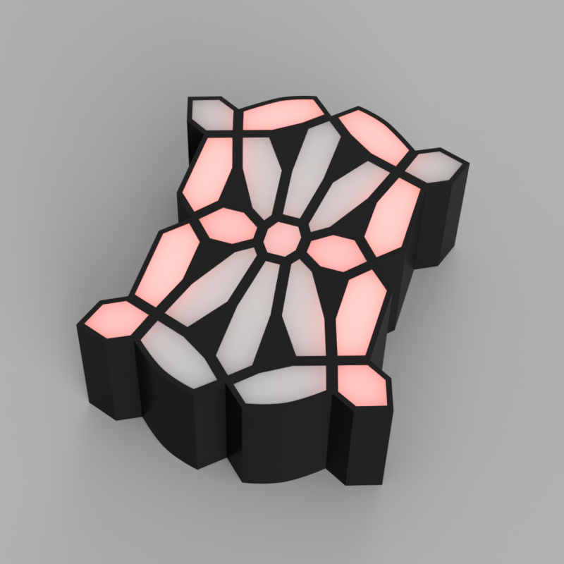
IO user [monte] was pointed towards an 1898 display patent issued to a [George Mason] and liked the look of the ‘creepy’ font it defined. The layout used no less than 21 discrete segments to display the complete roman alphabet and numerals, which is definitely not possible with the mere seven segments we are all familiar with. [monte] then did the decent thing and created a demonstration digit using modern parts.
For the implementation, [monte] created a simple PCB by hand (with an obvious mistake) and 3D-printed an enclosure and diffuser to match. After a little debugging, a better PCB was ordered from one of the usual overseas factories. There isn’t a schematic yet, but they mention using a CH32V003 Risc-V micro, which can be seen sitting on the rear of the PCB.
Maximum flexibility is ensured by storing every glyph as a 32-bit integer, with each LED corresponding to a single bit. It’s interesting to note the display incorporates serifs, which are definitely optional, although you could display sans-serif style glyphs if you wanted to. There is now a bit of a job to work out how to map character codes to glyph codes, but you can have a go at that yourself here. It’s still early doors on this project, but it has some real potential for a unique-looking display.
We love displays—every kind. Here’s a layout reminiscent of a VFD digit but done purely mechanically. And if you must limit yourself to seven digits, what about this unique thing?


Yep! I’d say that is kind of creepy!
I think it’s also a little kooky.
Mysterious and spooky
It’s altogether ooky!
This really is scree-am
A little CUCKOO, a little WACKY! Start gettin’ me a little KOOKY, a little–you know–LOOPY!!
It looks like the display on the Predator.
“If it bleeds, we can kill it”
i’m’a just leave this here. https://en.wikipedia.org/wiki/HP-41C#/media/File:LCD_Display_of_HP41CX_(cropped).jpg
I thought of this instantly as well. My dad loved his HP41C.
However the crazy serifs on this one are kinda neat. Not sure about using 32 bits but hey 🤷🏼♂️, if you’ve got them.
I’m sure there are some bitwise operations that could compact the storage as this is essentially has 4 identical quadrants. So maybe store every permutation of one quad, and then call each quad separately? I’m not great at that.
I dont see it. That one looks like a standard 16seg display
14* segment
I really like it.
A shame of the damaged LED.
7 segments 8 bit chips
It looks like the letters are made out of moustaches put together. Very fitting for an 1898 font. ;)
Very stained-glassy about this font. I would like to see it on an LCD.
Is it just me or is one segment not working in the video?
Thank you, I have a very short attention sp… SQUIRREL!
Yes. I was gonna post after I checked to see if anyone else already noticed the upper right diagonal cell was dead. And there you were.
That was intentional to get more comments on youtube :)
Cool !
It looks like a Rorschach test…
To you, maybe.
I’ve seen a vintage photo of such a display. It was in “Electricity In Every-Day Life”, published 1903 if I recall. It was a 3-volume set, of which I had 2 volumes. The application in the photo was a large advertising display on top of a multistory building, taken at dusk, displaying a message that I recall as “THE AMPICO PLAYS YOUR PIANOS”.
I have lost track of the books over the decades, so I can’t supply additional details.
You mean we could have had art deco instead of hard blocky displays this whole time, and nobody noticed till now? This is the best thing I’ve seen on HaD in years!! I love it!
When you start having 21 segments (so 3×7 pins), it’ll be better to use a bitmap font (with a lot less segments in the end, like this one: https://i.redd.it/89yb8c3nzun71.png It’s quite legible at 3×3 (9 segments) and clearly legible in 3×5 (15 segments).
and the bitmap font is rectangular, which is important for packaging. personally i think 21 segments is inefficent in terms of pin addressing. the most efficient would be a square number of parallel pins. in this instance the closest square is 25, so you end up with 4 unused spaces for led. that is to say add the pins 3+7=10 so then divide 10/2=5 5×5=25.
I like that 3×3, needs a tiny bit of refinement though. The A is wrong, should be an upside-down V (maybe add the middle pixel). G needs the middle pixel removed. R needs a pixel at middle-right.
Gets you twice as many rows on your LCD, why spend the cash on a 16×2 when a 16×1 will work!
The 5×3 reminds me of the 8-bit days trying to cram as much as possible into a tiny display.
Similar display used for Franlab: World’s First Forgotten Electric Wonder – Chariot Race Of 1910
And a 1980s DL-3422 search YouTube Rare 22-segment LED display
I like this design, it’d be from a Britisch cyberpunk history which never was. I frequently encounter alternative segment displays on YT. Either with more, or fewer digits. Not too long ago Pekero released a video demonstrating his 38 segment display, as it enables some other alphabets as well. The simulation of his full display with date and time in Japanese wouldn’t be too out of place in a universe like Dues Ex.
Ah, this would be a neat truetype font for use in a steampunk or similar game.
I made fonts of some of these old electro-mechanical devices, and they are up on GitHub!
https://github.com/pedasmith/AdvancedCalculator/tree/main/Fonts
I’ve got several of these old electromechanical devices converted to fonts!
https://github.com/pedasmith/AdvancedCalculator/tree/main/Fonts
I’m surprised I haven’t seen Post’s video about segmented displays mentioned.
https://youtu.be/RTB5XhjbgZA
He even had one of his designs used in a Chilean watch recently.
Did you mean “Segmented Displays by Posy” not Post?
https://www.youtube.com/watch?v=Th-u84OkpeQ
It would be cool to see a steampunk typewriter that composes these characters, impact printer style, using 21 type bars, each with one dot/square.