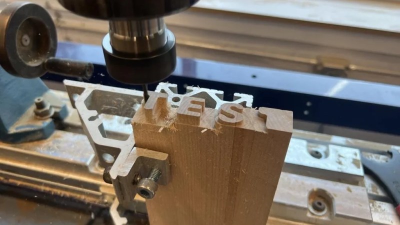
If you have a CNC router, you know you can engrave just about any text with the right tool, but Jointly is a typeface that isn’t meant to be engraved. That would be too easy for [CobyUnger]. His typeface “Jointly” is the first we’ve seen that’s meant to be used as joinery.
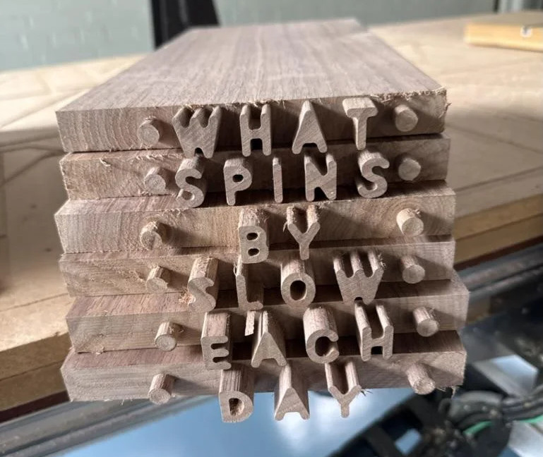 The idea is simple: carve mortises that take the shape of letters in one piece, and carve matching letter-tenons into the end of another. Push them together, and voila: a joint! To get this concept to work reliably, the font did have to be specially designed — both the inner and outer contours need to be accessible to a rotary cutting tool. Cutting tools get harder to use the smaller they go (or more fragile, at any rate) so with Jointly, the design spec was that any letters over 3/4″ (19.05 mm) tall needed to be handled with a 1/8″ (3.175 mm) rotary cutter.
This gives the font a friendly curved appearance we find quite fetching. Of course if you’re going to be cutting tenons into the end of a board, you’re going to need either some serious z-depth or an interesting jig to get the end of the board under the cutting head. It looks like [CobyUnger] has both, but he mentions the possibility of using a handheld CNC router as the cheaper option.
Speaking of routing out type, do you know the story of Gorton? You can’t make joinery with that typeface, but you’ve almost certainly seen it.


Is it just me or is this is vaguely giving “comic sans in wood” vibes?
Apropos given how much of a joke “real” woodworkers would view this.
I’m a “real” woodworker (at least, I have a signed certificate that says so) and I think this is really cool! It won’t be the strongest of joints but with so much glue surface it will probably hold up as good as a modern tenon and mortise joint.
no real value when it’s internal and not visible but when they go all through the other piece, that’s an awesome way to write something and join at the same time
Use contrasting woods. Make the joint. Cut through the finished joint parallel to the face of the text. Voila, two-tone text. Admittedly, this would be a long, ahem, route to achieving said effect.
Otherwise, yeah, it’s conceptual. Well, maybe you could hide a series of short text messages in a piece of furniture. That’d set the spy game back a century or two.
There are various decorative joints which are more or less practical. With modern glues, joints are often far stronger than they need to be and you can sacrifice a little bit of strength for decoration.
Examples are the OG dovetail joint (https://en.wikipedia.org/wiki/Dovetail_joint), a pin joint or the nicer pin-and-crescent joint (https://www.woodmagazine.com/woodworking-how-to/joinery/pin-and-crescent-joint) or this beautiful decorative joint (https://dornob.com/decorative-puzzle-piece-table-joints-put-the-joy-in-joinery/) which falls in the same league as this text joint.
An important aspect from joinery is it’s manufacturability, and CNC has enormously increased the options there.
There are some really awesome CNC joints out there.
https://hackaday.com/2020/10/23/complex-wood-joints-thanks-to-new-softwares-interactive-features/
https://hackaday.com/2012/04/16/joinery-sure-to-be-useful-on-your-next-sheet-goods-enclosure/
and the great-granddaddy of them all:
http://winterdienst.info/50-digital-wood-joints-by-jochen-gros/
Doing it with letters is just hilarious, though.
It’s the radiusing. Not a lot of fonts you see these days have radii everywhere the way this one and, yes, Comic Sans do.
Wow … what a rabbit hole to dive into. The history of the Gorton typeface was a nice start to the morning.
Now, do I build that vertical table onto my CNC Router????
Or a “rabbet” hole. ;-/
Boooooo! Also, well done. But still, boooo!
I envision a store bought house that arrives in a shipping container. All parts “labelled” so that assembly is obvious.
I envision ‘bespoke cabinetry’ with pass-through tenons so that when you open a drawer or view the sides of a box the name of the artist, manufacturer or brand is ‘written’ into the wood itself (in contrasting species of wood that make the words stand out.)
Would also be cool to incorporate into a puzzle box, or alternative to labeling or engraving the contents of drawers, etc.
top-tier Ikea furniture
I’m already drawing thumbnails of stories book like boxes for the grandkids and loved ones . One could certainly craft books of fairy tales , poems ext. Out of thin sheets of paper made of veneers of contrasting woods one laminates ! Oh my what to do first? I wish I would have been this excited about Letting 101 freshman year.
This is amazing. The next logical step I see is making a small footprint CNC machine with the cutting tool horizontal, and feeding the end of the board into it. Instead of expanding the Z axis, rotate the tool and workpiece. Fonts aside, you could make some gorgeous things.
i’m not crazy about the joinery on display here but i wish i had this font in openscad for my 3d printing! the default font seems kind of inappropriate for the limitations of the medium
sorry for the double post but i decided to follow through on this wish
i downloaded the font from https://www.cobyungerdesign.com/wp-content/uploads/JOINTLY-Font.zip
i unzipped it and took just the Jointly3.otf file and copied it to /usr/share/fonts/opentype/
i used text(text=str, font=”Jointly3″, size=…); in openscad. and voila!
only complaint is it seems to be just the alphanumeric…my percent sign is showing up as a boxed-X. but i’ll probably use this as my default font in openscad, going forward. thanks!
When you think about it a percentage sign would actually not be bad as a joint, it even has Y-axis symmetry. And a # could be made completely symmetrical (I assume that’s missing too), but might get bulky.
The problem with # (and the holes in the % sign, or with the A’s in this font) is that holes can not be used in this type of end joinery … well that’s not true, they can but have no function.
They have an aesthetic function, as you can see on the pictures on the linked page, where the b and p and such seem to be filled afterwards with a contrasting color material to make it look OK.
But also as many people here seem to like the font for 3D printing you can use the holes there fine, even as joining elements.
Plus it depends on the grain of the wood I expect, very fine grain wood, or bamboo perhaps, might be OK with little pegs being routed. Just guessing though.
And of course when talking CNC.. there’s steel and aluminium andsoforth too :)
yeah this font actually looks really nice for 3d printing. I’m using Orbitron (open source font) which works for printing but has a particular aesthetic. Jointly looks like plain comic sans which is great
“Jointly looks like plain comic sans which is great”
I’m submitting that to /r/brandnewsentence, the subreddit for combinations of words that have never been seen before (and, implicitly, were believed impossible). Actually I could probably just submit “comic sans which is great” all by itself.