Trick question! Of course you do, everyone loves Comic Sans! It’s only like the best font in the history of the internet! Why would you ever use anything else?
Oh! Is it because you feel like writing your novella on a computer is cheating? You wish you could use Comic Sans on your classic Sears-branded Brother Charger 11 typewriter from the 70’s? Don’t worry, we’ve got you covered.
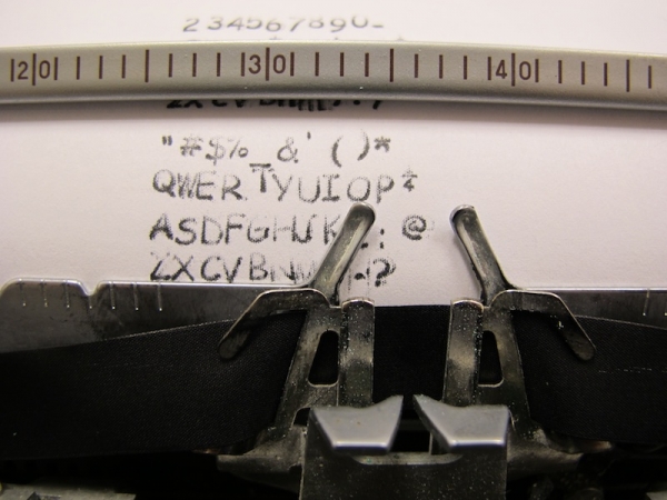
Jokes aside, this is actually a pretty clever hack. He’s modified a typewriter to use custom letters which he has laser cut out of acrylic and super glued to the strikers of the typewriter.
He calls it the Sincerity Machine.
It’s my wish that a classic, functioning typewriter altered to write in the most popular
ly despisedfont of modern times will provoke thoughts about such media concerns.
In addition to modifying the strikers, he’s also made new key covers with a vinyl cutter with their respective, and delightful fonts for all to see.
[Thanks Anonymous!]






What?! people actually hate Comic Sans?! but why?
Because they’re dumb enough to think that Comic Sans is always the wrong typeface, even when it is used for comic books, stuff for children, or even for dyslexics.
Comic Sans, as approved by the Hackaday editing team.
Hmm.
(Although like everything else the ‘hate’ for Comic Sans comes down to “I read on the Internet that I’m supposed to hate it. See also Microsoft, Office, the ribbon, XP, Win7, Metro, and Belgium.)
I want to destroy that typewriter so bad right now.
It’s not that Comic Sans is a bad font, it’s more so the fact that people use it for professional signs.
https://farm2.staticflickr.com/1108/5126379172_385fc27da5.jpg
http://4.bp.blogspot.com/-CqC_0tkoZe8/Uc6XmvhgkZI/AAAAAAAAAUw/bZ1stBSrLIM/s1280/Comic+Sans+warning+sign.JPG
Are you afraid somebody will use this typewriter for a professional sign ?
The underline is worse than the font.
I hate Comic Sans… 0_o
*
{
font-family: “Comic Sans MS”
}
Just saying.
Nothing wrong with Comic Sans, but the typewriter isn’t very accurate, and the spacing is off.
So… comic sans?
Comic sans is known for its poor kerning, so it is a fair representation.
Also I agree there is nothing wrong with Comic sans, particularly ALL CAPS COMIC SANS.
The creator seems to have a bad habit of holding down the keys instead of tapping them, this causes a double-bouce and blurry strikes.
What would be even better would be to laser sinter (metal 3d print) new strikers or those rotating ball things with this terrible font on it and install it back into the typewriter.
Yeah, seems like an ideal opportunity for lost wax casting! (well, not wax here, but lost PLA)
Yes, that was my thought: 3D print a new golf-ball for an IBM Selectric! I have a photo of one, here:
https://www.flickr.com/photos/anachrocomputer/2056888833
The grid in the photo is 5mm, which should give a sense of the size of it. I think it’s either a very lightweight metal, or a very hard plastic with nickel plating. You’d need to work out the placement of characters around the ball, of course.
I always run this when I load a hack-a-day article.
var a=document.createElement(“style”);a.type=”text/css”;a.innerHTML=”div, h1, h2, h3, h4, a, p, li, td, input { font: 20px MS Comic Sans, cursive, sans-serif; }”;document.getElementsByTagName(“head”)[0].appendChild(a);
(Running JS someone posted on the internet without understanding what it does is a bad idea…)
It misses a few bits of text, but IANAWD…
javascript:document.body.contentEditable=’true’; document.designMode=’on’; void 0
You can “hack” the hackaday with this. It allows you to change any elements on the page, until you reload.
Yes… but it doesn’t give you an “Edit” button.
Every time you use Comic Sans, a typesetter cries.
How? They’re all dead.
The “in” thing to hate these days is papyrus I think.
Cuneiform FTW!
Unlike some folk here, I don’t have a religious aversion to comic sans, though I’m happy to admit that I rarely find a use for it. But when I lost my reading glasses on hoiday, and I was quoted £95 for a replacement pair, comic sans was one of very few fonts that I could actually read.
I love comic sans, except for the “t” which looks like a cross. I prefer the the one with the hook on bottom.
I must confess, I derive perverse glee from finding obnoxious uses of comic sans. It is my sincere wish that it will be the typeface on my grave.
as a designer, i kind of think a comic cans typewriter font is actually ironically sexy. someone should scan the type from this typewriter & create a TTF!
Cool! So do the have a Cyrillic comic sans font so the Kremlin can update all their typewriters? Eg, http://hackaday.com/2014/10/18/this-message-will-self-destruct-in-5-seconds/
The worst kind of use I witnessed was a protocol of a fellow student of physics – in yellow. Even though he studied for being a teacher, this was not a good way.
At least it’s not Papyrus!