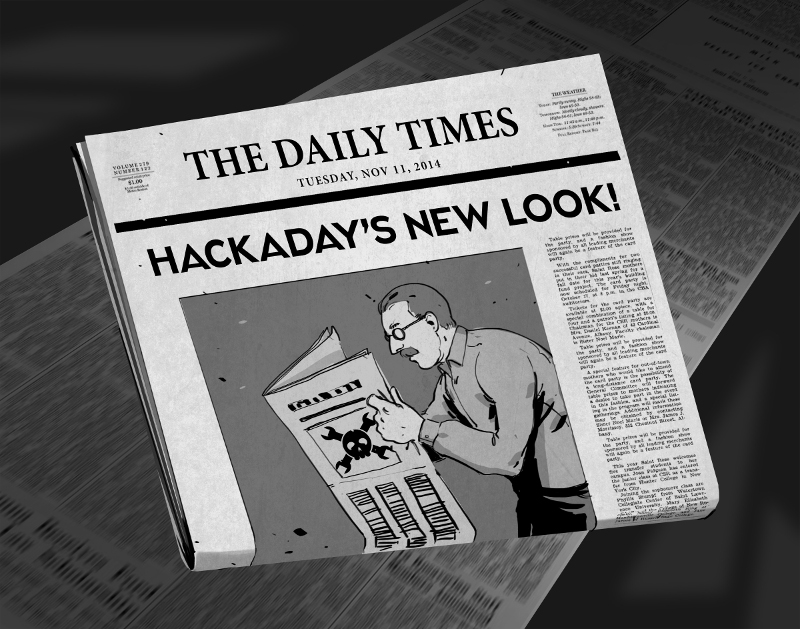
There comes a time when your movable type becomes so over-used that you no longer get a legible print off of the printing press. For months now we’ve been at work on a new site design that maintains the essence of Hackaday while ejecting the 10-year-old dregs of the site. With each small success we’ve actually ruined ourselves on viewing the old design. It is with great relief that we unveil a site design built specifically for Hackaday’s needs.
The most notable change is in the content of our landing page. For ten years, loading Hackaday.com resulted in the most recent blog posts. The blog concept is proven, but provides little opportunity to highlight quality original content and information about upcoming events. We have tried the use of “sticky” posts but honestly I find them somewhat annoying. The solution to this is not immediately apparent, but I feel we have found the most efficient solution to our complex set of needs..
We have a lot of community members who participate in Hackaday in numerous ways. Changes found in this design are driven by that fact. The landing page will, from this point forward, be a somewhat more persistent collection of notable content from the blog, our community site (hackaday.io), as well as news regarding live events, store features, contest highlights, and more. Those hard-core fans — a label I also assign to myself — will find the same reading experience as always on the new blog URL: hackaday.com/blog.
Aesthetically, we hope that all will agree the new design far supersedes the old. There was a lot to fix, and the work of the Hackaday crew who designed and implemented this new interface is truly amazing. I hope you will take the time to leave a positive comment about their work. As with any major transition, there will be some bumps in the road. Right now most of our sidebar widgets have not been migrated but that and any other problems will be fixed soon.
In this design we strived to highlight the title and image of each post to immediately convey the core concepts of the projects shown here. The author by-line and comment count remain core to the presentation of the articles, and our link style continues to be immediately apparent in the body of each article. I think we have far surpassed the readability of the comments section, in addition to the content itself. We knew we could rebuilt it… we have the technology… long live articles worth reading.
UPDATE: We are working very hard to fix all the parts that don’t look quite right. Thanks for your patience!
UPDATE 2: Infinite scrolling isn’t a feature, it’s a regression. On our test server all the blog listings were paginated just like always. When our host, WordPress VIP, pushed live the infinite scrolling manifested itself. We’ve filed a ticket with them and are hoping for a solution shortly.
UPDATE 3: Infinite scrolling has now been fixed and the blog layout now paginates. The mouse-over zoom effect has been removed. Slideshow speed has been adjusted and if you hover you mouse over a feature it will pause the scrolling.


I get the vibe that whomever did this redesign was the same person that designed the HORRIBLE hackaday.io website. The concept and people behind it was great, the design and usefulness of the site is challenging to say the least. This very well be Hackaday’s Digg 2.0 move that forces me to move to new avenues for my hack news. Most of the stuff I see on Reddit a day or two before it hits Hackaday anyway.
I understand you guys are passionate and want to move into the future and not stay in the past, but this latest design is NOT what your readers want. If you fail to listen to them, you will lose them, along with that sweet, sweet ad revenue.
The first response is a knee jerk “it’s ugly” (and it is, don’t get me wrong) and the first response from that is a defensive “we’re doing it for your own good, you’ll like it, you’ll realize how DATED the site was!”.
Both points are true. I hate the new look. It completely changes the focus of the site. Before, you came to hackaday, which started as a tech hacking blog. And saw a tech hacking blog. Now, you come and you see sponsored posts, a few blog posts, and a shopping section. It shows just how far this blog has moved from it’s origin. I’m SURE it’s a necessary move, I’m sure the new model is working a lot better in supporting the website, and the people who make it.
It doesn’t change the fact that the old look, the simple tech blog, is what BROUGHT all of your readers here. I come here to read about interesting tech projects and get inspiration. The old stye is “dated”. And the issue I and (I suspect) most people have is not the fact that you updated the LOOK. But that you completely changed the layout.
Frankly, I was fine with the old and dated. It did the job.
Well guys, what would be the best alternative?? I do not know many, it´s the first time after years I have to take a look…
http://hackedgadgets.com/ (mmh, not that bad…)
http://zedomax.com/blog/ (ahh, zedomax was the inspiration of the new design?)
http://www.ghacks.net/ (or is it ghacks what was the inspiration??)
http://makezine.com/ (yierks..)
http://www.bunniestudios.com/ (endless scrolling)
http://hacknmod.com/ (ahh, looks the same)
http://www.evilmadscientist.com/ (endless scrolling)
http://www.nycresistor.com/ (not that bad)
Reddit, if you can subscribe to related subreddits. Half the content on here comes from there anyway.
I, for one, would love some recommendations> Whether for new sites or just subreddits and the like. I’ve clicked on my hackaday link at least 10x today out of habit and have come away annoyed every time. Time to replace it with something new!
Or a reddit ‘multi’ (you could even name it Hack-a-day) with subscribed subreddits. Then maybe a css hack/script to change the colors and fonts to something….more..familiar….
Hmm, actually that is a pretty good idea….and is sort of a hack-ish, in the spirite of what we seem to have lost here.
Definitely not liking the changes as others have said the fonts are way too large, I would also like to second that losing the archives is a really bad thing, and the main page is definitely very cluttered. IMO less is more when it comes to a good page payout. The readability of the new site is also terrible on mobile devices did anyone even bother testing this on mobile?
As far as I’m concerned this is just change for the sake of change, I’m not really seeing much if anything in the way of actual improvement for someone reading the site and definitely a lot of things that are noticeably worse.
If your goal is to discourage more traffic to the site then maybe you might be able call this better.
The font is too large…
It only shows three or four posts at a time.
And how do we browse through the older posts from the default homepage?
Is [http://hackaday.com/blog] supposed to be the homepage now?
Sorry … Bletcherous
Ugh, you guys are allowing capital letters now?
In all seriousness, my only input is that when you reach the bottom of the blog articles on the front page, you have to scroll around and hunt for the link if you want to continue reading blog articles. It would be a little more streamlined to have another link right there.
Also, my browser no longer lets me resize the comment box, nor does it show a comment box scroll bar. Weird.
Absolutely retarded redesign. I do not care if it LOOKS better or worse, but a lot of the functionality is gone. BRING BACK THE WAY TO SEE OLDER STORIES. NO… NOT ON THE BLOG LINK. ON THE MAIN PAGE. The design is so cumbersome that I may stop coming here altogether if it is not fixed. Got tired of dealing with idiotic webpage designs.
i find that pushing my laptop to the far edge of the table and sitting back in my chair. takes the edge off the pain.
your results may vary though..
And one more thing showing HOW POOR THE DESIGN IS: when the number of comments is large you get “Newer Comments” and “Older Comments”. No idea how many pages there is. No way to go to the first or last page. Nothing. This is just plain BAD DESIGN.
Agreed. Why do the comments need to be paginated? Does the underlying site CMS/logging system have some limit on how many comments to a page? I wouldn’t think so, it’s obviously the same logic re-skinned (because there is still no ‘Edit Reply’ button).
I don’t think anyone is reading these anymore but just to add in my two cents. I’m very dyslexic and i can’t read your new sight at all. It looks like a blurry grey and overwhelmingly white mess. The grey in the background is completely washing out the text. And Sense there is no separation between posts besides bigger text I’m having a hard time finding the start of new posts. I haven’t read your sight sense you changed it because i can’t. I’ve tried several times to see it I would get used to it but no such luck. I’ve bean a avid hackaday reader for 8 years now. But every change you have made in the last couple of years have taken it further from what made me bookmark it when I was 15 and now I can’t even read it. I think I’m done coming here.
As stated above, the wavelength of the color green is most easily seen by the human eye. It also represents the color of the most-used phosphor in old CRT monitors….
I miss the old site….
I guess I’m not the only one who’s bad at visual design. :/
The style sheet makes it very ambiguous what is your blog post, your side bar, an ad, a link (via picture) to more content. I mean, I like dark designs, I like the way you were going with this, seems to mimick alot of the hackerspaces I’ve seen in pictures. For me this style just kinda flows together and presents you with a wall of text yelling from the screen. If I wasn’t an old user of the site, I’m not really sure I’d know where to start. It’s your job to lead me deeper into the site, not hit me over the head with a wall of text and articles. Your old design had enough black space to be more inviting.
The bottom subscribe button should be the same colour as the hyperlinks in my opinion.
I actually like the banner HACKADAY, and the navigation there seems functional to me. Makes it feel all newspaper like. On the flip side of that, newsprint is a dying industry and my monitor isn’t e-ink. Branding is branding I guess.
I agree that the amber is better than the green that was all over the site before. Nice choice.
Can I also ask for the option to display only most recent blog posts on the cover? Every other site I loved who moved to a “community driven” collated home page just seems to turn to “Our Sponsors” page after 3 months. I know that’s not SupplyFrame or Hackaday’s plan, but most plans tend to change.
I beg of someone write a stylish style for this site to make it tolerable. it literally gives me a headache even looking at it
@namespace url(http://www.w3.org/1999/xhtml);
@-moz-document domain(“hackaday.com”) {
*{font-family: Trebuchet MS !important;}
*{font-size: .98em !important}
body{color: #0A0 !important}
.comment-content{padding: 0px !important; margin: 0px !important}
}
Adding in my thoughts after a day or two…
I find the white text on blackish background somewhat straining to read – especially depending on the angle of my laptop screen. When I override the background colour to #000000 (black) I find it much easier to read.
Green vs Amber I don’t mind – the amber makes a nice change to the more stereotypical green.
Regarding the fonts – I do find the headings a little too strong and wide. Especially when the blog article HACKADAY words overpower the Skull and Cross Wrenches logo.
If i had to pick one thing to change though, it would be the background to plain black (not blackish).
Something I do like about the new scheme is the widescreen layout format – I usually ready on a laptop (which tend to have 16:9 or 16:10 aspect ratio these days) – and it means that the articles don’t get too wide because the sidebar seems proportionally wider than it used to.
OK found a fix, if you are using firefox install stylish, then go to userstyles.org and search for hackaday there are several there to choose from, and you can even read the site in it’s horrible new format and colors.
Mobile support worsened by many magnitudes, i wish you would add a proper mobile layout
this is the most boring look ever, white on gray, really?
while you´re at it change the name of the site, the hacker spirit is long gone here.
I have to say I much preferred the old look, though perhaps not quite as passionately as some of the other commenters here :-). Some of the criticisms made here have already been addressed (like the twitching images), and by now I would say, by using the blog page as landing page, it is almost as good as before, except for one thing:
Please, please, *please*, reduce the current “declaration of war” headline font size by at least half. I’m personally fine with the font size of the articles themselves, but the screaming headlines are just as bad as all caps shouting, and make me immediately want to move on to something else.
—
Best regards,
Kári
Most images don’t load from mainland China.
Something is blocked by the Great Firewall, works with VPN.
Reading this site on a phone is now terrible. I liked the old layout better.
Why my comment was removed?
It wasn’t.
Ok, it would seem the overwhelming number of posts here hate the new design, sorry. It sucks working on something and then having people rag on it. And people tend to have terrible bedside manner and can be pretty mean, but come on! Most of the posts that are negative say that the site is causing actual discomfort! like hurting peoples eyes and making peoples heads hurt. Those aren’t just “gripes and moans”. Those are actual physiological symptoms of eye strain! There is a dude who posted up there who has dyslexia and he’s having trouble with your site! I know there are books and guidelines on web design that speak about this very thing and others like “don’t have flashy things that can cause seizures”… People not liking the artistic aspect is one thing, but causing people physical symptoms is another thing altogether.
So the newbie hacker friendly forums has been ____________ ?
Why can’t you provide a Preferences button where I can choose things like background color, font color, size and style? I think that in this age of disability and accessibility concerns, the “One Style to Bind Them All” approach is what is really outdated. My 50+ year old eyes are still easily correctable to better then 20/15 yet I have to put up with a font size more suited to folks with 20/200 vision. And the white text is far harsher to look at for me then the green text was. The preferences should be on a per device approach so I can find what works best on both my PC with a 24” 1900×1200 screen and a rooted Nook tablet with its 7” 900×1400 screen.
The new look is a change for hackaday. Impressive to the unattentive eye. but we all would like the simple layout. can we have a sub webpage of the old layout for the seasoned verterns.
Simplying moving forwared into the future is always a positive step for hackaday and its manys days ahead.
keep up the good work.
maybe with my two CONs to the layout is
Cut the Clutter down
and bring back the sidebar on the right that allows me to go to Andriod hacks. Pc hacks. Etc as to me it was Effective when norrowing down a post from Months in the past.
Sorry but this just looks like utter shit.
i guess the last bit of “real hackaday” (as in, what it was before the acquirement) is gone now aswell.
not a fan of the new interface..
older page layout presented much more info, with less page flips
i gave it a couple days, but i still hate it. have fun being blogaday or contestaday or storeaday or whatever, RIP Hackaday
Could we please please please stop white text on black background?
Where’s the style changer?
The website actually looks pretty good (minus the gigantic fonts – I can make these large myself if I need to..) if you invert your display. My eyes don’t feel like they are on fire then. Maybe this should be a CSS swap button for inverted scheme?
The new layout has ridiculous font sizes, lots of wasted space, and the font color hurts my eyes, I dont care if its gray, green, blue or amber but white is too damn bright. The new layout didn’t bring be anything useful but did look like what buzzword consultants do to sites. But I’ll just read the blog with rss in the future so I can avoid visiting the site.
PS. I didn’t really like the last face-lift y’all did but at least the site was okay to look at.
I still detest the new layout.
[b]EVERYTHING’S STILL TOO BIG[/b].
Bigger != better.
Navigating this new abomination of a layout is more hassle than the previous layout.
Soo muich bloody scrolling involved it’s ridiculous.
Bring back the green & white on black, this amber & white on grey is hideous.
I won’t be visiting here near as often as I used to which is a shame because there’s some great content hidden in amongst the awful presentation.
please fix the font size for mobile viewports.. the articles font size is just absurdly small when viewing on an iphone 5x in portrait orientation..
hell I’ll even write you the media queries if you want!
Getting there. Layout is now good. Choice of colours works for me. Just need a few settings (font size, maybe some localisation, sort order, scroll to bottom button – I notice you have a scroll to top in the top status bar)) and AN EDIT BUTTON! Please.
All you guys constantly asking for an edit button do realize that a properly implemented edit button would require every person posting to create a user account and log in every time they post, right????
It could be done by identifying what you posted through a cookie, along with a 10 minute time limit to modify your post help prevent abuse.
Hmmm… That would be awesome!
You realize if you sign up for WordPress with the same email that you use to post you have to constantly log in anyway? Such an annoyance that I changed the email I post with.
Thanks for shrinking the font! Much appreciated.
The comments where too many to go through but…….. where the hell is the Forums link ??????????????
It’s totally M.I.A.
P.S.
I had to search the site for forums and found the link in a post from 2012 i think it was to get to it :(
your new blog design honestly pisses me off.. fonts far too big, contrast makes my eyes hurt, green > amber. and most of all, every article now starts with a picture, with just a small grey bar between it and the pictures of the previous article. have you ever thought about properly seperating the articles (or their pictures) from another? why not start an article with a headline, because that is where the HEADline normaly sits!!
Really not enjoying the new format. Hard to read.
HAD, it’s been days now. And still so much hate. It’s still horrible for so many of the reasons mentioned. For me personally the ‘orange’ is simply gastly. I’m colour blind ( along with statistcally 5% of your other readers) and didn’t even recognise it as orange until someone mentioned it. For colour blind people green is a far easier colour to see without red tints. Why the white on black? The contrast is simply painful to look at
I’ve been trying to get use to the new site for a few days, but it really is painful and gastly to look at (and not just coz I’m colour blind). It’s really pushing me away and I’ve loved HAD for so many years.
There has to come a point where your devs and management have to conceed that the new design is a monumental fail. Change is inevitable, but failure is optional.
hackaday.com = hackaday.com/blog/
favourites updated, and no, not browser favs. fav-program favs. eg: select-a-browser
PS: will miss the “hint of green” :(
if only websites updated the back ends and added small new buttons we could all use sites that look the same as when they came out, sigh :(
new looks should only be for new things.
pre-PPS: the new “start page” is not a bad idea. -> blog, community ect.
other then that read on;
PPS: the new design is not “bad” per se.
… BUT IT IS DIFFERENT!
AND DIFFERENT IS THUSLY ALWAYS BAD.
its not just this website, ive NEVER, ever, seen a website appearence change that actually made it look “better”. yet billions of dollars get spent every year on website changes worldwide.
with the exception of lightgray-on-white text,
or pink on magenta text ect. change that sh-uff, but JUST THE COLOR.
Agree, massive step backwards and I certainly get a headache when reading so will find an alternative until its fixed.
I wasn’t going to comment. I figured I”d give it a few days to get used to it, skip the whole “Oh GOD, it changed! It’s Horrible!” phase. I figured you’d get a thousand similar comments, then things would move one, but…it’s just So Bad…Really.
I don’t mind the highlight banner, it’s a good idea. The color scheme change doesn’t matter to me, the zoom pic thing is going away. Great.
But after a few days, I have to honestly say the huge fonts and the way all the text and other elements on the whole page just kinda blend together visually is mentally tiring to read. I used to come to hackaday for a few minutes at a time, probably 5-6, sometimes 10 times a day between projects at work just to relax a bit and read some cool, informative content and get the occasional idea from it. Now I find that it’s a chore to visually look past all the noise and pull out the desirable content, and I find myself coming to this site less and less now.
Frankly, I’m quite saddened, as this was one of the two sites I made a point to check EVERY DAY, because it was so engaging and the content was thought provoking, as long as you look past the trolls.
For the overlords and bean counters, you do the math. I know you’re making money off the ads. If a user who previously was visiting the site up to 10x a day drops to 1x every few days….is it really worth it?
Please make it enjoyable to read here again. Please. #SaveHackaday #StopThePain
Tony and I may have been separated at birth. He says it better than I, though our reactions are identical. The reasons he came to the site and stayed with it, the way he uses the site, the way the new site is changing his usage and impression of what HAD is. Bingo. Spot on.
I’ve given the new site a week to see if any other improvements were coming, to see if I’d adjust to it, etc… I really, really, really *want* to like the new HAD. But. I. Can’t. It hurts my eyes, it hurts my brain. It hurts my heart.
Honestly, the last time I felt as sad as I do right now (as I come to grips with the reality that the HAD I knew and loved is gone for good) was when a close relative died.
It gives me no pleasure to say it, but (barring a miracle) this is the last post I’ll ever make on HAD and the last time I’ll likely visit the site. It’s been a good run. A near decade of anything is pretty good these days, so I’m thankful. I’m thankful to the admins, past and present, for their tireless work in curating and maintaining this site through its various ups and downs. I’m thankful to my fellow readers for their insightful comments and inspiring remarks. Heck, I’m even thankful to [pfc11] and [fartface] and the other elder trolls… more often than not their remarks were at least witty, if not funny, and usually what they had to say was even useful in some fashion (come to think of it though, I don’t recalling seeing any of the elder trolls commenting around here of late…). I’ll miss articles/projects from such inspired and gifted minds as Gregory Charvat and Ben Heck and Bunny Huang and all the rest. I’ll miss my several-times-daily short visits which helped me clear my mind as I worked. I’ll miss it all (ok, maybe not the 5.342×10^8 Arduino references). It’s been good.
Peace to you all. May happiness be yours. Live long and prosper.
-Rob (HAD reader/enthusiast, 2005-2014)
I gave it a week, site still sucks. I don’t see a story when I come to the homepage, I see a useless carousel of crap. I don’t care what is in it, it’s just an annoying “feature”, highlighting a story that would have been in it’s place.
F-OFF
I’m going to reddit. R.I.P. hack-a-day
I agree with this one and actually with most of the style related comments too.
Okay, the all caps text is annoying. In short, STOP SHOUTING HACKADAY!
Anyway, here’s the work-around for those using Stylish: https://gist.github.com/STrRedWolf/91782e098d79b6f3128b
Please give us old design!! This hurts my eyes!
Jesus Christ. The changes are terrible! I don’t mind changes, and don’t mind taking time to get used to them, but after reading even just the comments, I’ve got a headache. And it’s not even from the content of the comments!
1) Quit the caps, I thought the internet was past CAPPING EVERYTHING.
2) Like most people, change the color of the font, or the spacing of the characters in the font, or the font itself. The current scheme makes it significantly less easy to scan/do a quick read.
3) The top side scrolling thing = totally unnecessary if it’s just going to show articles that are currently below it. Even if it’s a couple of duplications, it’s still useless duplication.
4) Give the right column less space so the main articles actually have a chance to say something.
5) I don’t give two craps about the hackaday store. Put a link somewhere in the top to it, they’re not new hacks, they’re not new projects, and they are largely available elsewhere.
6) It absolutely doesn’t make sense that you wouldn’t have a “previous” blog posts on the front page link. That someone would have to go to all blog posts and then scroll past ones you’ve looked at to get to ones before. The content is also only half of the page?!
I don’t know whether to side with the logical, long-winded, complaints of my colleagues or to side those leaving angry comments regarding the new theme, but I do agree with both. So I guess I’ll land somewhere between.
Here are the mistakes I see:
Content:
This has been in process for a long time, but take a look at older posts. The authors then actually understood something about the tech they were describing and how it functions. Look also at the comments made on those same posts. They were smart, I mean really smart. I often learned from posts and comments, now it is rare to learn from either. Not because I am brilliant now, but because the quality has degraded immensely over the past 10 years.
You will note that the content went downhill as HaD went from literally 1 hack per day to 4-8 hacks a day that we see now. I get it, quantity over quality, but I’m not a Walmart shopper here.
Layout:
Unless you were trying to get away from this being a blog, this change is a failure.
When I load the page I no longer get posts, but a news reel. I would go to AOL or Yahoo if I wanted that. I come to HackaDay to read the posts and comments, not to see the same ‘news’ stories every time I load the page. What’s more, you only show ~6 posts on the main page, then at the bottom there is no way to see older posts. Guess where I am on the page when I want to see older posts?
Guess what I don’t want to find down there? An advertisement for your store. Correct.
Aesthetics:
All things at the top of the page too big, side margins are too wide wasting a lot of space on my laptop screen. The posts aren’t wide enough meaning I have to scroll a lot to read an article.
Orange on black is fine, but as others have said a ‘whiter’ text and ‘blacker’ background would be easier on the eyes.
All caps in a sans serif fonts? Is that a joke? Cut it out.
Non-Complaint Items:
Newer/older comments is nice. Keeps me from endless scrolling, but it does make it more difficult to follow the comments.
tl;dr
I complained about the new layout. As a hacker, I could fix it client-side, but I would prefer that HaD listens to their visitors instead.
Where the hell is the “previous” or “next” Buttons?
Its not in any obvious location (if it exists) so i have missed a couple of articles… which sucks.
Absolutly hate the new layout… I do understand the need to update but, to paraprhase the Matrix:
“Not like this, Not like this”