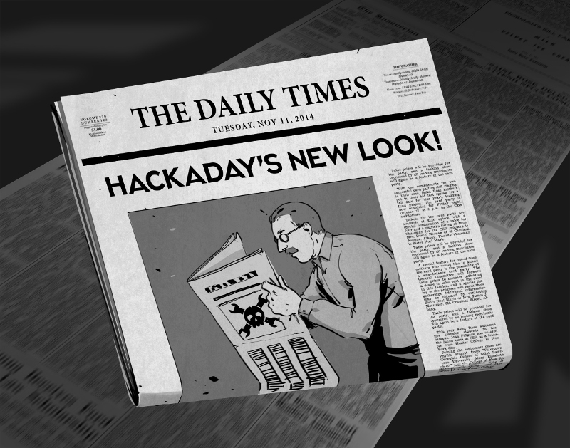
There comes a time when your movable type becomes so over-used that you no longer get a legible print off of the printing press. For months now we’ve been at work on a new site design that maintains the essence of Hackaday while ejecting the 10-year-old dregs of the site. With each small success we’ve actually ruined ourselves on viewing the old design. It is with great relief that we unveil a site design built specifically for Hackaday’s needs.
The most notable change is in the content of our landing page. For ten years, loading Hackaday.com resulted in the most recent blog posts. The blog concept is proven, but provides little opportunity to highlight quality original content and information about upcoming events. We have tried the use of “sticky” posts but honestly I find them somewhat annoying. The solution to this is not immediately apparent, but I feel we have found the most efficient solution to our complex set of needs..
We have a lot of community members who participate in Hackaday in numerous ways. Changes found in this design are driven by that fact. The landing page will, from this point forward, be a somewhat more persistent collection of notable content from the blog, our community site (hackaday.io), as well as news regarding live events, store features, contest highlights, and more. Those hard-core fans — a label I also assign to myself — will find the same reading experience as always on the new blog URL: hackaday.com/blog.
Aesthetically, we hope that all will agree the new design far supersedes the old. There was a lot to fix, and the work of the Hackaday crew who designed and implemented this new interface is truly amazing. I hope you will take the time to leave a positive comment about their work. As with any major transition, there will be some bumps in the road. Right now most of our sidebar widgets have not been migrated but that and any other problems will be fixed soon.
In this design we strived to highlight the title and image of each post to immediately convey the core concepts of the projects shown here. The author by-line and comment count remain core to the presentation of the articles, and our link style continues to be immediately apparent in the body of each article. I think we have far surpassed the readability of the comments section, in addition to the content itself. We knew we could rebuilt it… we have the technology… long live articles worth reading.
UPDATE: We are working very hard to fix all the parts that don’t look quite right. Thanks for your patience!
UPDATE 2: Infinite scrolling isn’t a feature, it’s a regression. On our test server all the blog listings were paginated just like always. When our host, WordPress VIP, pushed live the infinite scrolling manifested itself. We’ve filed a ticket with them and are hoping for a solution shortly.
UPDATE 3: Infinite scrolling has now been fixed and the blog layout now paginates. The mouse-over zoom effect has been removed. Slideshow speed has been adjusted and if you hover you mouse over a feature it will pause the scrolling.


I actually like it, but I’m on a retina Macbook Pro.
:P
Roo
Holy Hell!!!
Everything is so horrible looking now!
It is so cramped and obnoxiously busy!
If you wanted to make your “store wares” more noticable, just put them in the bottom right often the pages. Or bottom of the page. Or a special “featured” box in the top somewhere that scrolls through your merch.
Love the website and its new owners as much as the old ones! We are all family here!
As long as the background color is black and the font is bright, I usually do not have any complaints on aesthetics, but this is a WEE bit much! Please try something more subdued. If you would be so kind.
I take back what I said! I changed my bookmark to “www.hackaday.com/blog.” I’m happy again now! Feel free to moderate my comment down the deletion tubes! Thanks and Good luck!
It still uses whit-on-black that causes eyestrain an leaves a huge afterimage if you read it for more than a few seconds (try looking at a white wall after reading the site for a minute).
I actually use the “disable css” plugin when I view this site. Really. It’s that bad.
I prefer the old layout and design. It was clear, loaded fast and personally I loved having big pictures of projects on the front page so I didn’t need to tap on pictures to enlarge them.
Don’t get me wrong, I appreciate your efforts here but I’ve never understood the concept of re-inventing the wheel. I never had any problems navigating on the old page, this new one is confusing. For example, I still don’t like Slashdot’s “new” design, just like I don’t like Google’s constant “improvement” like “hey, let’s force autosearch on everyone.”
Biggest problems here are ALL CAPS and all the white. I’d maybe use 85% gray with the fonts. And move the project images back like they were, between the heading and the text.
Is the “next page” on [1] missing or is there only one page?
[1] http://hackaday.com/blog/
I do agree on the “fonts too big” comments, the coloring is ok but the green is somehow associated with HaD, a bit of a trademark.
How about feeding all the material to the retro edition? That would give something to fall back to. The ancient design on that one works on pretty much anything, the only problem with the retro site is that it only has select articles on it. It is also very fast on slow connections or seriously limited hardware which still exist.
Yes, I am a dinosaur and I am known to use some seriously old hardware on a daily basis. I do it by choice but I know there are quite a lot of people who are forced to use ancient hardware on slow connections.
whinge, whinge, whine,
blah, blah, blah, blah, blah, blah,
I don’t like change
whinge, whinge, whine,
fonts too big
Blah, blah, blah, blah
:-)
Here’s some quick honest feedback, bugs have been already mentioned so I won’t touch on those but rather these are user design issues.
The layout isn’t bad on a computer. I actually like it, especially the landing page. The main problem appears to be the default size. I’m not afraid to use the zoom button but coming here the first time felt like a punch in the eyes which is probably not what you want a first timer to feel. I understand you’re working on the mobile layout so I won’t mention that :-)
I’m not sure what the purpose is on the ticker on the top. It’s not latest stories. Is it top trending, most posted, or something else? A title there may be useful. At the moment it seems to be a random mash of what I would get if I scrolled down.
Of note is the ticker has a sensible relative font size. The title relative to paragraph is a good size mix. It is also inconsistent with the layout of the rest of the site below where the paragraphs are smaller and the titles are larger. This has both the effect of making the ticker seem less important (was that the goal?) at the same time making the articles harder to read.
Finally on the reading issue. It’s been mentioned but this is worth repeating. The style is incredibly fatiguing. It is hard to stare at my screen with the stark white on black contrast. I have a sudden need to put my computer screen in the sun to preserve my eyesight while using this site. Then the comment box is the polar opposite. Likewise it is fatiguing. The solution is a small change in colour-scheme, maybe a grey on grey? or a reduction in the amount of dark space around the content.
I would suggest looking at trends in the mobile world for cues on how visual styles are being properly done. Take a look at the latest Android release http://www.android.com/versions/lollipop-5-0/. Themes either consistently use white space with black text / limited use of colour for emphasis, OR, where the theme is dark the amount of white text is incredibly limited and the contrast is artificially lowered through the lack of bold fonts.
All of this would make the site far less fatiguing to read, which admittedly is not a problem for a 2 second browse, but some of your articles are quite large and I now find it difficult to get to the end of them.
I second that, my eyes are actually burning just reading to the end of your reply. Modded the CSS and grey on grey seems to be enough for my eyes. That has the side effect of startlingly bright links that look out of place though.
Hmm. Weird. A redesign, and I actually kindof like it right away.
Only the background could be a bit darker. Doesn’t need to be as black as it was, but it looks a bit washed out. But nice style, bigger focus on content… good job!
My eyes are bleeding trying to read bright white text on a black background. At first it looks sharp but after a few minutes it gets annoying as hell. I once had Hack A Week like this and changed it for these reasons. Otherwise, good to see an overhaul.
I just like it.
Not sure why my comment and some others have been removed. I always considered HaD as a community where feedback is generally welcomed and wanted.
You guys look like asses with this whole ‘You are all wrong, you just can’t handle change’ bullshit.
It wasn’t removed. The comment page has overflowed and is now 6 pages long.
I dislike the carousel but I understand why it’s there. What I hope and pray you never ever EVER do though is use those damn lightboxes to show images. Just link straight to the blasted images and stop making it “look neat”. When I click the image, I shouldn’t need to wait for javascript to load a new DOM object to display an image.
As others have said, a link to the “older posts” on the blog portion would be nice. Other than that, I have no comment on layout. I’ll just update my usercontent.css file to fix any issues that really annoy me.
[quote]Also the site now takes more than 10 seconds to completely load. And I think that’s the worst change.[/quote]
I’d just like to reiterate this comment. If you can minify the scripts, css, etc. to improve load times, please do so.
Also, you may consider using Filament Group’s loadCSS and loadJS functions to conditionally load stylesheets/JS depending on screen size, etc. That way you send mobile users their CSS without having to download desktop related CSS. Just a thought.
And while I’m finding things related to conditional asset loading: Conditional loading of resources with mediaqueries
BTW: for the “Post a comment” section you don’t have your hints available any more. This is kind of annoying as you allow actual HTML and a lot of the sites I visit require something like Markdown or VBB/forum style markup. Is there a way to put in a reminder that you’re using HTML?
Thanks!
I really dig the new Hackaday 3.0 layout!
Also, the integration with the Hackaday.io portal was necessary, nice job guys!
Cheers,
Mick
When I come to Hackaday, I come to read articles. At least 95% of the time, I’m clicking through from an RSS feed because an article summary was interesting and I want to know more. If your interest is reading the articles, there is too much fluff in the article display.
Consider this. Right now if you go to http://hackaday.com you see article summaries. The top article right now is the printing press upgrade. On my laptop screen without scrolling, I can see the article title, the article photo, and the first paragraph. But if I click through to the article, I can actually see less information than in the summary.
Instead of an article, I see a ginormous Hackaday banner, a huge nav bar, and the usual fat right-side bar with ads and old articles and the like. The article title font is larger, and I can see just the top sliver of the lead photo. I came for the article, and I can’t see any of it. It’s like you forgot what your product is. Imagine if I went to Amazon.com and the top 1/3 of my screen was the Amazon.com logo and there were so many large headers that I couldn’t see any products.
Currently, your “wasted” top space is about twice as large as Amazon.com.
It’s also just really jarring. It has a very newsprint feel to it. That in and of itself is actually okay. But what’s the headline when I click through to an article? It’s “HACKADAY” in huge font. That’s weird. I go to Hackaday over and over and over. Hackaday is not the news.
If you need another comparison example, check out the New York Times. Their header space is smaller, their content is larger. And if I click through to an article at the New York Times, the headers get out of the way so I can read. It’s all about content. The largest header in an article isn’t the New York Times any more, it’s the article header. That’s intuitive. Learn from that.
They should take a look at http://torrentfreak.com to see a nice way of presenting articles to the public, looks good on a big screen and a mobile phone because the article summaries are stacked 1 wide instead of 2. I don’t like that they use Disqus for the comments and deep nested replies can get really squashed, much like this site with the HUGE borders round comments that really aren’t needed at all.
I had a tab open with a Hackaday page from the “before time” on my 1920×1280 screen. So I snapped it and pasted it up with the same page as it is now. Notice how there isn’t even any article text! Oh for the good old days of 48 hours ago…
http://www.surfacezero.com/g503/data/500/medium/Hackaday_before_and_after.jpg
I think they just increased the size of everything to make the TEENSY in their advert look smaller…
This is it, hackaday is going out of my bookmarks, away from facebook and will be prevented forever from damaging my eyes. I kind of knew hackaday was going to kill itself and it did, just like instructibles and every other ‘diy’ piece of crap site. Byebye and R.I.P.!
Personally I find it harder to read because of the large fonts. Even with zoom-out it’s still hard to read. (This is on a 13.3″ screen with 1366×768 resolution). On a 24″ 1920×1200 monitor it looks sort of OK.
Maybe I’ll get used to it, maybe not, but as it is it reminds me of Slashdot Beta.
It is hard on my eyes. If I don’t tell you, who will?
The new site sucks. Looks like a 12-year old created it. Font is terrible, type-wise and size-wise. Work on content vs. “prettiness”.
People come and go, Intergrated circuits come and go, websites come and go,
dont worry about, lifes to short to get upset over it.
Is there a reason all article titles are in all caps? This is 2014, and the proper form for titles as I learned in elementary school is that you capitalize only the first letter of words in titles.
The HaD site devs probably took a look at the ALL CAPS menus of Visual Studio 2013 and the massive disgust that developers showed towards this, and thought it would similarly be a great way to annoy their constituency?
Great, now everyone can read exactly what I’m reading from across the room! And what is this hideous gray/brown color? Sorry, but this new layout SUCKS.
Yeah, yeah “deal with it” – Nice attitude…
Web designers and the editors should learn to take criticism like big girls and boys and learn that the end user, i.e. the readership’s or the CUSTOMER’s opinions matter, unless unemployment is more appealing…
This was the perfect opportunity to drop the black background. Other than that, I like the look, fonts a tad big, but I can get used to that
Hopefully this will work, I don’t know where it got my account infos…
I’m not against the change and I think showing stuff from the multiple sections of the site on the main page is a good idea(although I’m most likely just going to read the blog), but I do have a few suggestions:
1. It would be a good idea to also make the slideshow pause when we’re over the selection dots under it. That way we wouldn’t have to move the cursor over the article if we want to navigate it manually.
2. It’s nice that the new layout of the blog use a bit more screen witdh real estate, but it’s pretty much useless if you’re going to zoom the content so that it displays in the exact same way as before.
I still had an opened page with the old layout and the text of its newer equivalent is formatted in the exact same way(except for the HUGE SHOUTING TITLES), the paragraphs have the exact same number of lines and the line breaks at the exact same words which makes it pretty much pointless since we could simply achieve that by using the zoom option on our browsers.
Using the previous font size and showing more words per line would be a nice improvement over the old style.
3. As many mentionned before me, the titles shouldn’t be in all CAPS since most people don’t like to be shouted at even in text form unless it’s caps lock day, but it’s not october 22nd. Making it bigger than the previous style is fine, but that is way too big and waste a lot more space than it needs to.
4. I don’t think it’s a good idea to crop the pictures in the blog main page. The first thing that attracts a person attention if the picture, but with the cropping, it often makes it harder to see what it actually is or it hides important information making it not as useful as it was before.
I also have something that bugging me, you said in the article “I think we have far surpassed the readability of the comments section” and I’m wondering how?
I was expecting a way to make it easier to see new comments since our last page visit or something along those lines, but other than the amber color(which is easier to read, but not as cool as the terminal green for a hacking blog) and the zoomed text, I don’t see any change so I’d be grateful if you could point it out.
5. What would be a nice is if it would use more of the screen width once it gets below the stuff on the right, that would make for a lot less scrolling(same thing would be nice for the blog).
6. Since the plan is to improve the site, one thing I’ve always find annoying to do is try to look at every new articles since the last time I visited(I do it at work and don’t always have the time to follow every day) and with the blog format, that meant going back until I find the article I last read and move forward by refreshing the page just before going to the next to make sure a new article doesn’t push one I haven’t had time to read on the page I just read. If the new website would find a way to improve that it would be really nice.
Maybe we could have accounts that keep track of the last article we read and list the newer ones in the reverse order. We’d have the oldest unread on the first page and going to the next one would show the newer ones until we catch up.
I’d be fine with any option that allow me to not miss an article.
Hopefully there’s still a will to improve the site because for now, I find it actually harder to read and follow than before.
http://i57.tinypic.com/ddhrwy.jpg There is an overlay problem with the slideshow indicator.
Thanks for picking that up, the slider has some issues we’re still trying to iron out.
well i don’t mind the change. i just want the color scheme back
This comes from a completely non-professional, “Joe on the Street” point of view. Overall, in my own humble opinion, the new layout looks good. Similar enough to the old one that a regular visitor can still find everything, but freshened up enough that it doesn’t look dated. Yes, to my eye, the header seems quite large, especially with the chosen font for the site name. The contrast issue of the font for the articles and comments could be tweaked by adding a little bit of grey into the font color which would ease the effect on the eye when scrolling. I’ve just gone to the snapshot captured for this date on Archive.org from 2010 and done a side by side comparison of the home page, and find that with the new layout, it doesn’t feel so cluttered, and things are easier to read. Seems to me that the only thing that feels out-of-place is the font used for the site name header and the article headers. It just feels too blocky. But overall, the improvements are good. I DO miss the “console green” already though.
This site was addictive because I would open it up a few times a day and probably have a new post.
A better improvement would be to see when everyone is on and post a new post every 20 minutes or so. That would increase engagement. Posting should follow a bell curve so click addicts like myself still get their fix refreshing at 11pm.
I see my browser auto fillking in hackaday.com/blog. That’s about the only real change for me.
Oh, and “old” has never meant bad here…. In fact, I think when most users here “new” they think “crap”. If hackaday wants to keep up with the joneses you need more buzzfeed titles.
And what about the voting about new or old appearance?
I like the new look but I think it’s abit too grey.
I don’t like how “big” the layout is, I have to move my eyes around a lot because it uses a lot of real estate and has large fonts outside of the body of articles on the main page.
I also don’t like the “Read more” links, it forces you to load another page to read every article, even if it’s just a word that overflowed. Your old publishing system had a “below the fold” for that purpose, figure out how to intentionally add a “fold” for longer articles but let the majority display entirely on the homepage.
I skip a day of hackaday to do an exam and within that time I See CHANGE (not happy). At least scrap mobile version, go responsive and work hard on that. I wouldn’t call what it’s doing now responsive at all. OOOOOGLY
The redesign is ok except for one thing. The main section is too narrow. Once you scroll past the sidebar there’s a lot of empty space on the screen.and those of us that use vertical monitors the main column is very thin. Escpessially since you hav ethe article pictures tot he size. The article text, the main content that uses use, takes up the least amount of screen space. Does that make sense? Wouldn’t you want what the users use most to be more prevalent? Basically either the main column after the sidebar has to stretch to fit the width of the page or the sidebar needs to be thinner.
Notice how the text, what I want to read, takes up so little of the screen space.
http://i62.tinypic.com/sbms92.jpg
Yep, same issue that I have… vertical monitor and nearly half of it is blank
Who says the new hackaday.com does not have a link to the forums.
You just have to know where to look:
http://forums.hackaday.com/
Surely the point of good website design is that you shouldn’t have to know
And where is the LINK to that? Assuming the forum is intended to gain users and not to be left to die of course (I don’t think many people look at the page, and go “I wonder if they have a forum somewhere hidden, lets google that”)
Eye-searing. A giant step backwards.
Worse than the holocaust. Bring old hackaday back!
Slither back to your Berlin bunker.
JIDF Plz go
Say Hi to adolf and eva!
Can we just vote? Its just that this is so bad.
Perfect with this new mobile only theme I can finally browse this in my nongmo organic 3d printed arduino open source clone powered by corn oil and e85.
I love the age we live in ;^)
I really enjoy Hackaday, and I’m generally not against changes, but only if they are for the better. And THIS, is a huge step back. That black background combined with the green/white font color was soothening for my eyes. Now it’s like getting a spiked bullet to the eye when You visit the page.
OK I am giving it a go – but I don’t see that the new format is adding anything – For what is primarily a text based site, too much of the real-estate is given up to guff – on my screen at least 40% of the width is lost. It looks like every other wordpress site including mine and has the same problem: too much space wasted because of oversized side bars.
I feel the same mistakes have been made as in the recent “upgrade” of the microchip website which went from useful to useless because of the move to a fashionable look. From being an essential part of my life, I now only wander by now and then to see if there are any updates. It would be a shame for HaD to go the same way when I think the changes required to make it at least usable are so minimal
It adds plenty. Especially that little section at the bottom that encourages you to spend money here.
Bit late to the party here, but… Is there still a way to browse a list of categories rather than clicking tags?
The “New Hackaday” reminds me why I hate change.
It’s like Windows ME, Vista, New Coke, Obamas Nehru jacket.
Did anyone when designing this new site actually sit down with a piece of paper and sketch out what the final product should look like?
Two words: Leading Lines.
Get familiar with it. It is your friend. Even with this horrid gray, with black still visible (I’m looking at you, blog section), the leading lines would aid in lessening the eye strain of this new format.
Also, please send me an un-magnifying glass so I can put it over my screen when reading your site. People that are cheering the huge and ugly font (ugly font type especially for this tech website) need to admit that they are blind, and buy a pair of reading glasses.
The new website qualifies as the
Hackaday Fail of the Week.
Second day…still I don´t like it!
Please turn it back…at least the color scheme !
Yeah…
I’ve gone from looking at HaD 3-4 times a day to check on new hacks/projects, to viewing it maybe 3 times in a given week.
Since the buyout, the content has been drifting into more and more “social” marketing territory, and less and less hardware hacking/software hacking.
HaD has become increasingly less relevant to me as a source of inspiration/information, and this new “design” is, apparently, the final nail in the coffin.
Consider the camel’s back to be non-functional at the moment, I won’t be visiting HaD anymore.
It’s been fun!
On my system (win7+Firefox) all Toplevel text sticks completely to the left without any space between the text and the end of the screen. On some titles in the blog view the first character is even cut off.
Now that my mouse is not frightened to fly over the pictures anymore (thank’s for the quick fix), I find the new layout really good!
More modern, but with no sidebar or top bar scrolling with you trying to shoot “I’m still there!” (like ars technica), some “scroll wheel horror” stuff (as the soylent website and more and more others…) or “organic -you won’t find what you’re looking for- layout” (as IEEE spectrum) or some other “look, i’m modern” shit we see so often.
I like the sites not needing javascript to work properly, thank’s for keeping that.
It’s even looking OK in tty (not as much as the “retro” version, still)!
I like the new contrast (not yet done on the “blog” part, apparently) and the new font. The site is way easier and faster to use than it were before. Much more easy to read with my dyspraxia!
Waiting for the “small screen” update. I just wish it won’t be another website (something like m.hackaday.com), but more the main site adapting to the width of the screen (like dudkduckgo or thehackernews are doing): there aren’t just “desktop” or “mobile”, there’s also all the other “medium” screens you may put on a raspberry or that kind of devices, or just people zooming with a desktop.
To me, the only thing really missing is a “next page” button on the “from the blog” part. Also, I don’t get what is shop doing at the bottom of the main site…
Good work!
Excellent, Smithers!
You didn’t cave to the current fad of having a hovering toolbar up top that cuts into my reading area, and it plays nice with my iphone too, allowing scrolling and zooming.
Nice! Thanks…and I usually am quite crabby about new web designs.
Hmm. when I log in to leave a reply, I get a toolbar. Damn.