Color palettes are key to any sort of visual or graphic design. A designer has to identify a handful of key colours to make a design work, making calls on what’s eye catching or what sets the mood appropriately. One of the problems is that it relies heavily on subjective judgement, rather than any known mathematical formula. There are rules one can apply, but rules can also be artistically broken, so it’s never a simple task. To this end, [Jack Qiao] created colormind.io, a tool that uses neural nets to generate color palettes.
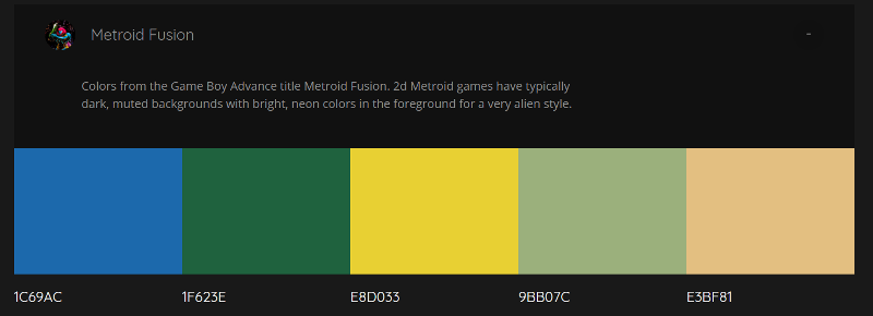
It’s a fun tool – there’s a selection of palettes generated from popular media and sunset photos, as well as the option to generate custom palettes yourself. Colours can be locked so you can iterate around those you like, finding others that match well. The results are impressive – the tool is able to generate palettes that seem to blend rather well. We were unable to force it to generate anything truly garish despite a few attempts!
The blog explains the software behind the curtain. After first experimenting with a type of neural net known as an LSTM, [Jack] found the results too bland. The network was afraid to be wrong, so would choose values very much “in the middle”, leading to muted palettes of browns and greys. After switching to a less accuracy-focused network known as a GAN, the results were better – [Jack] says the network now generates what it believes to be “plausible” palettes. The code has been uploaded to GitHub if you’d like to play around with it yourself.
Check out this primer on neural nets if you’d like to learn more. We’d like to know – how do you pick a palette when starting a project? Let us know in the comments.


Wow, This is such a subjective thing to be tested with neural nets and it seems to do so well. LOL and that is coming from some one that is color blind.
From working with front end web developers (when I was a server side developer) I learnt some things about the colors people choose or like. They fall into two categories. One is pastels (more equal R, G and B at higher levels) with strong color differences (relative disparity of R, G, or B). The second was more saturated primary additive like combinations (R, G, B) or primary subtractive (Y, C, M) with a disparity of contrast within R, G, B, Y, C or M.
Before someone asks – “Well if you’re color blind then what color does RED appear as, to you?” – let me tell you that colors do *NOT* exist in the real world. They are a perception inside the brain only. They are literally just in your imagination.
Having a color system like #FF0000 or 0xFF0000 gives me the ability to make colors exactly as people ask without even knowing what they see.
‘…let me tell you that colors do *NOT* exist in the real world. They are a perception inside the brain only. They are literally just in your imagination.’
Oh god, for some reason…this made me really uncomfortable…and gave me a slight case of the nervous giggles.
Then you will love the concept of binaural beating
https://en.m.wikipedia.org/wiki/Binaural_beats
In a nutshell:
When you play eg a 50 and a 55 Hz tone on two separate speakers, you will hear the sound pulse at the beating frequency of 5Hz. The waves interfere in air.
When you play one sound only to the left ear, the other only to the right, you *still* hear the beating. Remember that the inner ear works in frequency-space, ie there is no physical representation of the original waves entering the brain. The interference occurs only in software running on your meatware DSP…
When I tried that out: mind=blown.
I wrote a paper on that… For a high school english class! All my classes got sciencey stuff!
Mostly about brains and robots… Or robots with neural networks :P
If you’re using ordinary earphones, check the channel crosstalk, it’s quite possible that the beating you heard was due to the impedance of the common return path
>let me tell you that colors do *NOT* exist in the real world. They are a perception inside the brain only. They are literally just in your imagination.
That’s a bold statement there. I’d like to see a source if you don’t mind.
LOL, then you are obviously *not* colorblind.
I exaggerated a very small amount by using the word ‘imagination’ instead of ‘perception’.
Color blind people learn a great deal about color. People with normal color vision never study color as they can just take it for granted – literally.
There is an unlimited amount of information out there about human color perception so google can take you in any direction you choose.
In a nutshell, color is actually just a perception and the colors we perceive because of how our eyes work don’t actually exist outside of the head.
It’s a shared stimulus that we can communicate because most peoples eyes work basically the same way. We use the names for colors like Red, Purple, Orange to communicate this and we are taught the associations between colors and names as children.
But unlike things that do exist, colors don’t have measurement metrics (at least until recently). A real 1kg can be measured as a real 1kg, a real mile can be measured as a real mile, a real orange color – well that depends on who your talking to because it was never real to start with.
Colors do exist. Color is the wavelength of light.
How eyes/brains or displays works, is a different story, and after all, everything we perceive is just in our minds, but this does not mean reality doesn’t exists.
But the orange you see on your screen is not the orange of a flower or the orange of a laser. Each one is a different combination of RGB, only the laser would be a true “orange” color.
Eyes do NOT sense light wavelength. Nor are they wavelength spectrometers.
So while you have an idea of what color means to you, your idea is not supported by the actual design of an eye.
Nice. I wonder what those Android apps use?
[ I’m the guy that made this thing ]
I think most apps/websites just use a database of color palettes or user submissions.
Thank you, I love this! BTC address? I’m buying you a coffee!
I guess he doesn’t like money :/
I absolutely *despise* money
how about donating a few bucks to the EFF instead
For color palettes? The Goog has guideline for UI designs & colors.
https://developer.android.com/design/index.html
Drop the output onto a colour wheel and if the geometries formed don’t match those taught to all design students I’d be very surprised.
Formal rule ⇢ Designer ⇢ artwork or media ⇢ AI ⇢ close match to original rule.
color theory is a pretty leaky abstraction. Try this experiment:
– go to https://color.adobe.com and generate a random color scheme via a formal rule (say, complementary)
– go to https://color.adobe.com/explore and compare with human-designed color schemes
colors are subjective obviously but imo there’s a huge difference
Is there really, or are there mostly just shifts on the edges of the harmony type polygons? “Good Taste” is quantifiable.
That would be an awesome comparison. Do it and we might have to write it up ;D
It is already a thing.
http://hyperphysics.phy-astr.gsu.edu/hbase/vision/colwheel.html
http://hyperphysics.phy-astr.gsu.edu/hbase/vision/vispic/pigwh.jpg
Even more, https://thumbs.dreamstime.com/z/color-wheel-theory-23575508.jpg
I just recently decided to do a nice responsive resume with bootstrap and quickly found that I’m terrible at choosing colors. This just made my day! Love it!
You may appreciate the following:
https://tallys.github.io/color-theory/
Appreciated XD
INTERESTING !!!
spam