In bringing suitable illustrations to our articles, we Hackaday scribes use a variety of sources that offer images featuring permissive licences. Among the usual free image libraries there is one particularly rich source, the line drawings contained within the huge archives of patents granted by the various countries around the world. These are the illustrations used as part of the patent itself to describe the working of the patent being claimed. We use them because though the items they depict are legally protected from copying by the patents they are part of, they as part of the patents themselves are in the public domain. Thus we can easily find detailed hand drawn pictures of all kinds of technical innovations from the last couple of hundred years or so, and from time to time you as our readers reap the benefit.
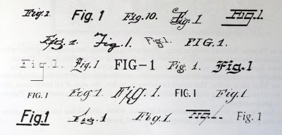
If you spend a while browsing old patents through a search engine such as Google Patents, you can quickly become engrossed in these beautiful images of inventions past. Though their purpose is a functional one to convey the workings of an invention, the anonymous artists have often poured all of their skill into rendering them as considerably more than mere draughtsmanship. In those dusty Government archives lurk masterpieces, just waiting to be found.
It seems we here at Hackaday are not alone in sharing a fascination with these images, for a US patent agent, [Kevin Prince], wrote a fascinating exploration of the medium in his book, The Art of the Patent.
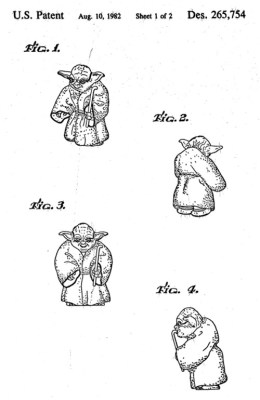
Finally we are then introduced to the design patent, protecting the appearance of something rather than its theory of operation. Yet again some famous and instantly recognisable examples are used as illustration. These represent the most heavily protected commercial design properties on the market, and no effort has been spared to present their tiniest detail in their patents.
The next chapter explores the tools of the patent draughtsman’s art form to represent textures, movement, transparency, and colour through stippling and shading. We are shown the standard textures for representing materials and surfaces, and the different techniques such as exploded and sectional views for conveying the operation of complex mechanisms. We begin to see the level to which the rigidly applied rules for patent drawings can be subverted by the talented artists to convey real artistic expression instead of lifeless diagrams.
![Musical instrument support, [Edward L. Van Halen], US patent US4656917A.](https://hackaday.com/wp-content/uploads/2017/06/eddie-van-halen-patent.jpg?w=321)
Within the patent archive lies a historical record of the defining inventions that have created our modern world. From [Eli Whitney]’s cotton gin of 1794 to an Apple iPod Mini from 2007, the next chapter takes us through a timeline of American history as portrayed through the medium of invention. We are shown [Samuel Morse]’s telegraph, [Elisha Otis]’s elevator, and [Richard Gatling]’s hand-cranked machine gun, the [Edison] phonograph, and in intricate detail, the [Burroughs] mechanical calculating machine. These 19th century inventions form part of the technological bedrock upon which our modern-day society has been built, and the book continues with some iconic images from the 20th century. The Monopoly board is shown complete with money, property cards, and game counters, then the Lego brick, and [Walt Disney]’s animation table. The defining technology of mid-to-late 20th century world events then makes an appearance, with [Enrico Fermi]’s 1955 patent for a nuclear reactor.
![Buoyant bulletproof combat uniform, [Nelson J. Waterbury], US Patent US3398406A.](https://hackaday.com/wp-content/uploads/2017/06/combat-suit.jpg?w=244)
The final chapter of the book is simply a gallery of what must be the author’s favourite patent images, a glorious cross-section of centuries of invention in rich detail. We see industrial machinery, clothing, engines, clocks, and domestic equipment. Not all the inventions shown are familiar, but among them we have the Etch-a-Sketch toy, and [László Bíró]’s ballpoint pen. While the other chapters provide a wealth of fascinating information and background about the patent, it is this chapter for us that encapsulates the engrossing nature of the patent archive more than any other. Images with the same level of detail and interest can be found at every turn in almost all fields, so it must have been a nearly impossible process for the author to whittle down a huge pile of images to those that fit in the space available.
The Art Of The Patent, by [Kevin Prince], started life as a Kickstarter-funded project in 2011, and is now available through your well-known online bookseller. If you have an interest in patents, inventions, or technology history, then we suggest you find a copy for yourself as you are unlikely to be disappointed by it.







I thought that draughtsmanship was about how well the bartender poured your beer?
I have to go look up some more patent art from musicians. :D
Don’t miss Wintergatan’s Marble Machine X faux patent art T-shirts
The only reason not to link to such drawings is the load it puts on the patent server. Not to mention as part of the hidden internet (hidden behind an API) things can change.
I’m just gonna leave this here…
https://www.google.com/patents/US3216423
“You spin me right round, baby, right round…”
And where is the catcher?
The kid is caught in “the cotton bed 97 in the net 83”.
My gosh the male medical community is utterly daft!
Heinlein wrote about using a pedal-operated grav field for that.
http://www.technovelgy.com/ct/content.asp?Bnum=1929
This is an amazing hack.
While not a hack it’s still an interesting read that people who are interested in hacking might be interested in.
I just used three forms of the word interesting in one sentence, is that weird? I feel weird.
We have two main types of articles here at Hackaday, dailies, about 200ish words, usually news of new hacks, and original content, longform articles, >500 words. These latter articles are often not hacks, instead they are informational articles exploring an aspect of technology or our community’s culture or history. Introducing readers to the world of patent art fits that pretty well, I hope you’ll agree.
Prescript: This turned into a rant and the comment section might not be the place for it, I understand, but if you’re going to delete this at the very least CC this to your regular writers, so the quality of the blog can benefit from it.
Can someone on HAD PLEASE do an article on correctly formatting opening paragraphs / teasers? I mean FFS we don’t need to see the whole fucking article when scrolling through the blog (might need to bleep that). What am I talking about? Here’s an example
GOOD: https://imgur.com/a/O79to
– Note it’s ONLY ONE PARAGRAPH, that is designed as a HOOK. The rest of the article is after the jump
– It gives you what the article is about, draws your interest, and makes you want to read more
– At the same time it’s SHORT (How do I underline that?). Not the whole flipping thing but just a summary
– This last point is important because it lets you BROWSE. You don’t need to scroll for pages upon pages to skip a post you don’t like
– It also keeps the look of the page uniform and neat. As you scroll through each article is around the same “height”. See something you’re not interested in? Muscle memory knows it’s 4 clicks of the wheel to get to the next thing, like hitting “next track” on your headset while listening to music. It’s a small thing but it can make a blog enjoyable to browse or a pain in the ass.
Now here’s the issue on HAD (The article itself is interesting and well written, but it’s also a good example of misuse / lack of opening paragraph formatting): https://i.imgur.com/m2oIMYV.jpg
– Scrolling through main blog page, NO articles using opening paragraphs correctly
– All but the rare few have the ENTIRE post in the blog list page
– Any time I DO see “Continue reading…” used, 99% of it is just to include a youtube video – the entire written article was already in the blog main listing
– Post vary in length between rare single (correct) opening paragraphs, average entire 3-4 paragraph posts, and well written but long mega-articles that take forever to scroll past. This makes simple muscle-memory skipping to the next post.
– Think about listening to music without a next track button, needing to hold down FFWD and actively listen for the current song to end and the next one to start. It’s THAT annoying
It’s not even that hard to fix this issue. A simple PSA / Style guide will do. Maybe make posting the article throw an error if no “continue reading…” point has been set and it’s over x chars long. I love reading HAD articles but this issue is so annoying I often give up and read something else when I hit several endless articles and get tired of scrolling.
Edit (We need an edit button, and as a technology news site you must have SOMEONE there who can add it):
The good link was supposed to be this https://i.imgur.com/8FUZFxD.png a screenshot of consumerist.com, another similar blog / news site but more on business than tech, but has an excellent and consistent format.
As a note on the note on the blog, HAD has been all about open source, Why not open source HAD itself? Put it up on github. Then we could all work together to add an edit button / fix or add features as needed.
Think big, we as a community could fix, edit, add articles aswell. That would make hackaday perfect everyday!
If there was an edit button, it should only be 5 minutes. Simple errors like misspellings and when WordPress screws up the links.
Any longer and trolls misuse the feature.
That was very well thought out constructive criticism of HaDs weirdness. May I suggest you send an edited cooy to https://hackaday.com/submit-a-tip/
“This makes simple muscle-memory skipping to the next post.”
to
“This makes simple muscle-memory skipping to the next post impossible”
The most important “art” – have a large amount of money to defend it when its inevitably stolen (if it’s worth anything in the first place).
Awesome review, Jenny… glad you liked it, and thanks!