I am something of an Inkscape fan. If you’re not familiar with the application, it’s like an Open Source version of Adobe Illustrator. Back when I was a production artist I’d been an Illustrator master ninja but it’s been four years and my skills are rusty. Plus, Inkscape is just enough different in terms of menus and capabilities that I had a hard time adapting.
So I created some wooden lettering with the help of Inkscape and a laser cutter, and I’m going to show you how I did it. If you’re interested in following along with this project, you can find it on Hackaday.io.
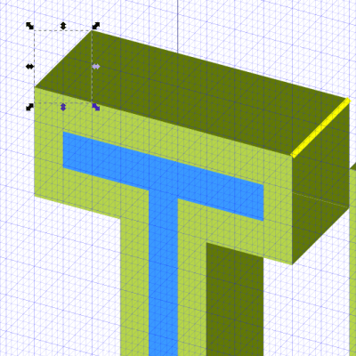
While playing around with Inkscape, I noticed you can create a variety of grids, including axonometric grids. This term refers to the horizon lines in an orthographic projection. In other words, it helps make things look 3D by providing perspective lines.
Font Play
While a production artist I’d been really into fonts. Especially making my own. I’ve been making typefaces for years, including some unforgivably ’90s grudge fonts that thankfully never made it into the world. Fonts are mostly just vector sets dropped into a database with tracking and kerning data embedded alongside.
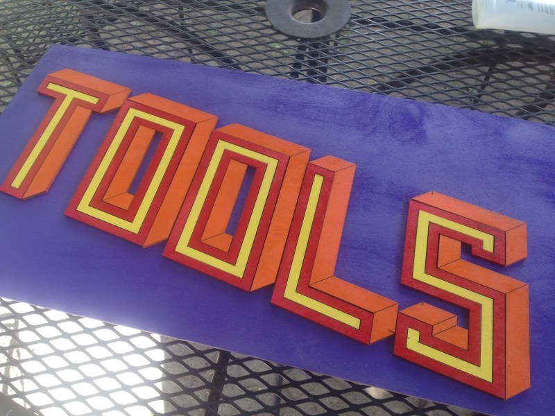
I’ve been watching videos of Jimmy Di Resta cutting channel lettering on a bandsaw — he does a million sign projects — so, when I saw that axonometric grid, I got the idea of making a 3D-looking set of letters that could be cut out on a laser cutter and made into a sign. Maybe try 1/8″ plywood, with the different facets being painted different colors to reinforce the perspective.
To begin with, however, I had to create the letters. I wanted to start with an easy project and just use blocky shapes to form the various parts of each letter, rather than create sexy bezier curves. I started drawing different kinds of letters before settling on a tall, slender, blockish shape. I didn’t do the entire alphabet, just enough letters to get a feel for it.
The Third Dimension Illusion
The next step was to create the perspective effect with the help of the axonometric grid. Each point on the grid consists of two diagonals meeting a vertical. Remember the vanishing point in art class? Same thing. You can play with the angles but they all end up working pretty much the same way.
 The sides of each shape are easy to create. All you have to do is create a duplicate of the letter in question, drop it to the bottom, and then select “Path > Difference” to cut out the parts that are covered up by the main letter. You will still need to draw in triangular shapes that connect the front and back — you can see them in the image above.
Once you get a sense of your design you can free-hand the side panels pretty easily if you have “snap to grid” turned on.
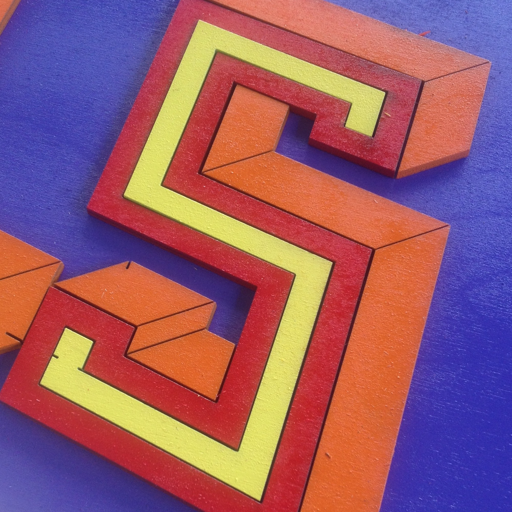
While I was at it I drew smaller inset letters (marked in blue) that will help give my sign a little more visual interest. Remember, each of those smaller side pieces is going to be its own laser-cut part. I have them color-coded to keep them straight in my head, but ultimately they’ll be spray-painted another color.
Cosmetic Cornering
I also want to draw lines for the corners, purely for cosmetic purposes — they help create the 3D effect. You can see them in the design, marked with fat yellow lines. The real lines won’t be that bold, I just kept them that way during the design process so I wouldn’t lose track of them.
So, having created my sign, it was time to laser it out. I sized it for a 24″x12″ sheet of 1/8″ pine, and I bought a second sheet upon which to glue the letters as they come out of the cutter and are painted. The lasering went off without a hitch, with 100% speed and 100% power ensuring the design was complete in less than 8 minutes. The only thing that went wrong is that I failed to ensure the lettering was centered, so I had a harder time aligning it on the board. The diagonal lines marking the corners went through at 1% power and 100% speed.
I’m really happy how the effect turned out — Now I want to make signs for my house, my friends’ houses, random people on the street! It’s pretty easy and you can do it yourself. Having all of these signs around the house might not be for everyone, but what hackerspace, makerspace, or office space isn’t begging for some colorful signage to spice up the decor? Grab some friends and start designing!


It is possible to automate much of this with a script?
You’d think so–when the math stays the same every time, right? I’ve never played around with scripting with Inkscape.
Just build and compose your graphics in Blender 3D and export to SVG using the freestyle plugin.
Inkscape was handy when working with SVG.
Now that’s what I call STEAM™!
Designing fonts is quite hard, you did a good job! I like those 50ies signage styles :) Thanks for sharing!
Not to knock inkscape, but calling it similar to illustrator is a bit off IMHO.
Yeah… Illustrator is far inferior :P
I have both at work and never use illustrator, I like the work flow of Inkscape better, plus there is a portable version.
Two bits. Both are youtube channels.
https://www.youtube.com/channel/UCEQXp_fcqwPcqrzNtWJ1w9w
This guy does some pretty impressive work with Inkscape and Gimp
https://www.youtube.com/channel/UCqCyShJXqnElPTUnxX0mD5A
This guy has boatloads of info for laser cutting/engraving. One thing he mentioned was that at least with his laser cutter after about 60% he was just basically over driving his tube. He proved this in his eyes by starting at 10% and increasing by 10% to 80% and burning in to a fairly thick piece of plastic for a specific amount of time. Up to 60% the melted cone got deeper. After 60% it stayed the same.
That’s good info, thanks!
I wish Inkscape didn’t have weird community problems. They insist on having no paid developers and have taken years to release new versions.
As a maker tool, it is a wonderful tool overall. It just has some sort of rough edges and things that are more attention to detail items that if solved or smoothed over would make it a much more professional tool. At least in my opinion, your mileage may vary.
Don’t know. It’s looks fake.
Actually Inkscape looks more like open source version of Corel Draw! rather than Adobe Illustrator