For all the technology we have, it can still be frustratingly difficult to get any concrete information from the media. Sometimes all you want to do is to cut through the noise and see some real numbers. Watching talking heads argue for a half hour probably isn’t going to tell you much about how the COVID-19 virus is spreading through your local community, but seeing real-time data pulled from multiple vetted sources might.
Having access to the raw data about COVID-19 cases, fatalities, and recoveries is, to put it mildly, eye-opening. Even if day to day life seems pretty much unchanged in your corner of the world, seeing the rate at which these numbers are climbing really puts the fight into perspective. You might be less inclined to go out for a leisurely stroll if you knew how many new cases had popped up in your neck of the woods during the last 24 hours.
But this article isn’t about telling you how to feel about the data, it’s about how you can get your hands on it. What you do with it after that is entirely up to you. Depending on where you live, the numbers you see might even make you feel a bit better. It’s information on your own terms, and in these uncertain times, that might be the best we can hope for.
Scraping the CDC Website
If you’re in the United States, then the Centers for Disease Control and Prevention is perhaps the single most reliable source of COVID-19 data right now. Unfortunately, while the agency offers a wealth of data through their Open Data APIs, it seems that things are moving a bit too fast for them to catch up at the moment. At the time of this writing there doesn’t appear to be an official API to pull from, only a human-readable website.
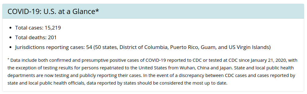
Of course if we can read it, than so can the computer. The website is simple enough that we can split out the number of total cases with nothing more than a few lines of Python, we don’t even need to use a formal web scraping library. It should be noted that this isn’t a good idea under normal circumstances as changes to the site layout could break it, but this (hopefully) isn’t something we need to be maintaining for very long.
import requests

# Download webpage
response = requests.get('https://www.cdc.gov/coronavirus/2019-ncov/cases-updates/cases-in-us.html')

# Step through each line of HTML
for line in response.text.splitlines():
    # Search for cases line
    if "Total cases:" in line:
        # Split out just the number
        print(line.split()[2][:-5])
Everything should be pretty easy to understand in that example except perhaps the last line. Basically it’s taking the string from the web page, splitting it up using spaces as delimiters, and then cutting the last five characters off the back to remove the closing HTML tag. Definitely a hack, but that’s sort of what this site is all about.
There are a couple important things you need to remember when pulling data from the CDC like this. First of all, since the website is an important source of information right now, don’t hammer it. There’s really no reason to hit the page more than once or twice a day. Second, even in a pandemic the CDC is apparently keeping normal business hours; the website says the stats will only be updated Monday through Friday.
Johns Hopkins Unofficial API
A better option, especially if you’re looking for global data, is using the database maintained by the Johns Hopkins University Center for Systems Science and Engineering (JHU CSSE). This data is collected from multiple sources all over the globe and is being updated constantly. Whether or not you realized it at the time, there’s an excellent chance you’ve already seen their online dashboard as it’s become an invaluable reference to anyone tracking the progress of COVID-19.
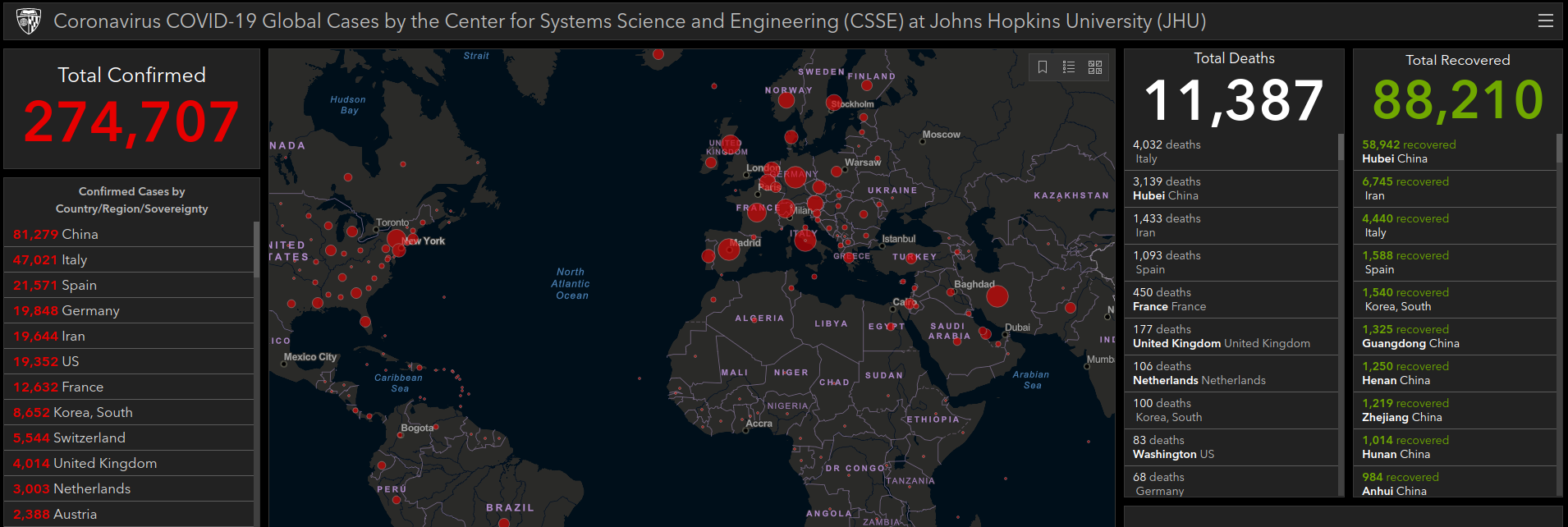
This data is published to an official GitHub repository on a daily basis for anyone who wants to clone it locally, but that’s not terribly convenient for our purposes. Luckily, French data scientist Omar Laraqui has put together a web API that we can use to easily poll the database without having to download the entire thing.
His API offers a lot of granularity, and allows you to do things like see how many cases or recoveries there are in specific provinces or states. You need to experiment around with the location codes a bit since there doesn’t appear to be a listing available, but once you’ve found the ID for where you want to look it’s easy to pull the latest stats.
import requests

# Get data on only confirmed cases
api_response = requests.get('https://covid19api.herokuapp.com/confirmed')

# Print latest data for location ID 100: California, USA
print(api_response.json()['locations'][100]['latest'])
The API also has a convenient endpoint at /latest which will simply show you the global totals for active cases and deaths.
Virus Tracker API
Another option is the free API available from thevirustracker.com. I’m somewhat hesitant to recommend this service as it has all the hallmarks of somebody looking to capitalize on a disaster and the site seems to go down regularly. That said, it’s easy to use and gives you a number of very convenient data points that don’t seem to be available from other sources.
![]()
For example it allows you to see how many of the cases are considered serious, as well as how many new cases have been added today. The API also includes a listing of recent news items related to the country you have selected, which could be useful if you’re looking to make your own dashboard.
import requests

# Request fails unless we provide a user-agent
api_response = requests.get('https://thevirustracker.com/free-api?countryTotal=US', headers={"User-Agent": "Chrome"})
covid_stats = api_response.json()['countrydata']

# Break out individual stats
print("Total Cases:", covid_stats[0]["total_cases"])
print("New Today:", covid_stats[0]["total_new_cases_today"])
The COVID Tracking Project
While it lacks the global data of the Johns Hopkins database, the COVID Tracking Project provides the most feature rich and well documented API currently available. The project was started by a team of journalists in early March, and is committed to collecting accurate information not only from state and district health agencies, but from a network of trusted local reporters. Interestingly, they say the project would likely be suspended should the CDC roll out their own API with complete state-level data.
There’s an incredible wealth of information available through this API, including historical daily data for individual states where available. The API is also unique in that it will not only show how many people have tested positive for COVID-19, but also those who were cleared of it. This allows you to see how much testing each state is actually doing, and is one of the key points of data the project wants to see reported officially by the CDC.
import requests

# Get current data for New York, USA
api_response = requests.get('https://covidtracking.com/api/states?state=NY')

# Show positive and negative test results
print("COVID-19 Testing Results in", api_response.json()['state'])
print("Positive:", api_response.json()['positive'])
print("Negative:", api_response.json()['negative'])
Because their team carefully reviews the data before pushing it out, the COVID Tracking Project might not get updated as quickly as some other sources. But if you’re looking for the most accurate information about what’s happening on “on the ground” in the United States, this is definitely the API you want.
Knowledge is Power
After playing around with these data sources for a bit, you’re likely to notice that they don’t always agree. Things are moving so quickly that even when going straight to the source like this, there’s a certain margin of error. A reasonable approach may be to take multiple data sources and average them together, though that assumes you’re able to drill down to the same level on each service.
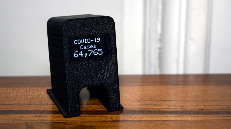
As stated in the intro of this article, what you do with this information is entirely up to you. For my own purposes I put together a little network attached display so I can monitor the total number of cases in the United States, and honestly it’s been a sobering experience. Seeing the number increase by thousands each day has really put the situation into focus for me; and I know that by the time this article is published, the number shown in the picture will be considerably lower than the latest figures.
I can’t say I’m particularly glad to have the latest numbers on my desk every morning, but I’d rather know what we’re up against than remain oblivious. Something tells me many of you will feel the same way. If you’re looking for less of a downer, you could always roll in some happier data, perhaps even showing an animation whenever the number of recoveries goes up. Stay safe out there.


Data is easy. Understanding is what people go through higher-education for. Seeing how much “Lies, damn lies, and statistics” are part of our lexicon, we need all the education we can get.
– No kidding. The statistics (as well as many interpretations of them) splashed around by the media, and even big organizations on this thing, are insane. Particular pet peeve is death rate of confirmed(many times hospitalized due to severity) cases is != death rate of general population if it continues to spread. Many people may not get the virus, get it so weakly they don’t even notice, or get it and just stay at home and not be reported in the ‘surviving’ stat.
– It doesn’t sound fun to get, and I wouldn’t wish it on anyone, but this shutdown stuff is bananas. How many indirect deaths (or general damage) are we causing by it? arguably just as much or more, with no way to account for the stats… Job losses, retirement account damage (wild market speculations, or due to shutdowns), loss of access to health care/insurance from either, avoiding standard medical care, etc. Heck, I know of at least one person forced into a second round of chemo due to cancer coming back, and even though they wanted a mastectomy to make sure they were just done with it, the option was denied as an ‘elective procedure’. Flattening the curve doesn’t work if the curve hasn’t started; they’re sending doctors and nurses home due to nothing to do – there is no crowding, and (citation needed) only <30 hospitalized across my entire state, but yet we need a shelter in place lockdown(?)… Come on, sometimes we need to take on a bit of risk and liability to live reasonably – you could choke to death on your next meal, or be in a fatal accident next time you go out for a drive, but yet we still do these things every day as the risks are reasonable. And yes, protect the high-risk, but the rest of the world doesn't need to shutdown or jump off of a cliff to do this. /rant
Home Assistant has an integration that pulls from the John Hopkins API btw.
Kinda disheartening to see it next to the NWS and security camera entities on my dashboard tho.
This site provides a raw data API that aggregates multiple sources: https://covidtracking.com/
Thanks, this looks like a fantastic project and I can’t believe it didn’t come up when I was looking for APIs. I’ve added this resource to the article now.
you not need to pull anything, just use this: x=2*x
then, x=0
or did you perhaps mean x(t+1)=2*x(t)?
8-)
Stay in fear. Can we get some articles on here that are not COVID related? This is getting old quick.
Saved me a ton(ne) of time gargling or faceborking and left me feeling less soiled about getting this data. Thanks
I second that notion wholeheartedly.
… and some of those “hacks” are just ridiculous like the “hand washing timer LED bargraph thingy”[1]: Yay lets waste some 3d printing resource, time and more to build something almost completely useless with not future purpose that no on will build en’ mass for anyone else anyway.
Granted I’m not contributing anything better, but still…
[1] https://hackaday.com/2020/03/19/handwashing-timer-makes-sure-the-suds-stay-on-long-enough/
btw. this one is missing its “Covid-19” tag.
Folks, for an epochal pandemic, I think one or two articles on the front page is probably about right.
Handwashing, however, isn’t just about covid-19. It’s good to do anyway.
And really, that soap dispenser was just a funny hack. Try not to lose your sense of humor while stuck inside.
❤️
How about social-distancing having other knock-on effects?
https://qz.com/1824020/social-distancing-slowing-not-only-covid-19-but-other-diseases-too/
Makes more sense to count down from 9billion
I did a similar DIY project using an ESP32 + OLED screen. Sri Lankan government provides an API with the statistics. More details can be found at https://techtalks.lk/blog/2020/3/corona-meter
[youtube https://www.youtube.com/watch?v=ztibeK-gi4Y&w=560&h=315%5D
The absolute number (displayed here) is big, is going to get bigger, and it’s hard to figure out what the units mean, at least in terms of the progress of the disease if not in terms of the effect on human lives. It’s probably the wrong thing to watch.
The real statistic that’s interesting here is how many new cases appear per day, or better still, the change in new cases per day.
New cases per day gives you a good handle on how fast it’s spreading.
Day-to-day change in new cases lets you know whether you’re slowing down the spread or not. When this goes negative, you’re slowing down the rate of infection, and if you’re lucky, you’re at or just past the halfway point. It has the disadvantage that if the data is noisy, it’s even noisier.
And even so, you have to bear in mind that with a long incubation, the “true” infected numbers will be a week off of the observed ones. And that poor testing will mess this all up.
All of which is to say: tracking these numbers probably doesn’t do much for you unless you’re an epidemiologist, and even then, they’re to be taken with a grain of salt, or at least a smoothing filter.
But if you insist on looking at some numbers, look at the number of new cases per day. And don’t draw any conclusions about trends in that number until at least four or five days have elapsed.
(Ask me about how everyone in Germany said “we’re over the hump!” b/c many states weren’t reporting statistics over the weekend b/c their statistics offices were closed. When Monday came around, what looked like a significant dip in the new cases evaporated.)
There are certainly other interesting numbers, such as:
How likely, based on your age and physical condition, is it that you will need hospitalization, if you are infected? What about your other family members? How far away is the hospital and how will you get there? If you are taking a cab or an uber remember that you will probably infect the driver. What is the probability of getting care at the hospital, if they are busy?
If you get infected. how many other people on average will you infect? St. Peter will be asking you how many people you infected and you should have an answer.
How many people in your local area are infected? If this is a big number or you don’t know, then you should probably not go out at all.
Remember that if you get infected you will probably infect your family and at least one of them will probably die.
Thinking about these questions will motivate you to protect your family.
Please STOP. You don’t know what you’re talking about and are simply spreading misinformation.
Well, now… there is a very strong correlation to age. Data on that is available through my state website, and basically 95% of the cases are 50 years and older here. What about Italy, which has been one of the most severe? I’d like to know.
Also, the death rates and recovery rates. Can we look over at China and total up the recovered cases? Again, my state is publishing that information, and it’s only sensible to also look at survivability.
What about related causes? About half the cases are in the 55+ age, let’s be honest about how many of these people already have compromised health, a detrimental habit they refuse to kick, or are on life support. Those people should absolutely be wary, and their family members as well. However, it’s too much to assert that every last healthy being hole up and stop living for two, three months in fear of a rather small chance of death or even suffering.
I have a question about new cases per day. Is it simply the number of positive test results each day, or does it not exclude a positive test result for a patient who tested positive previously and then gets tested again later to see if they still have the virus? If not, they would be double counted. Does this happen? Just curious.
The “curve” in Canada since March 10th has been looking like a straight line, the slope of which is I assume the defacto test processing rate.
data are no trouble. trouble are power for this device. Meybe add solar panel?
I added a widget to my magic mirror.
https://github.com/bibaldo/MMM-COVID19
Thanks for that just going to check it out now
Oh, message from a buddy at the St Xaviers Laboratory for Gifted Avians, he says that Corvid-19 is getting unsettled by the psychic background noise from people saying his name, and can no longer pick lottery numbers, so if you could just double check your spelling. ;-)
“What’s the latest number?” and project’s done. That actually doesn’t tell you anything.
On that Johns Hopkins dashboard
(https://www.arcgis.com/apps/opsdashboard/index.html#/bda7594740fd40299423467b48e9ecf6)
people will look at the top-left number and say “Wow!” where wow should be reserved for the bottom-right curve.
Instead of the latest number, fetch cases for last X days, fit them to the curve and output a single message. If data still fits on exponential curve, e-paper reads “OMG, we’re fucked!!!”, once you push it down to linear goes to “We’re winning !!!”, etc
We need to track this with historical content. To get a real picture. Say the Spanish flue, and at least a few of the past attempts to create a pandemic. Start about 1985 and track the avian, several Ebola attempts, and the last swine flue. This gives a context to the numbers.
it will also let you see the bell curve created by almost all pandemics. Or rather the course of any diseases.
currently the odds of getting this virus is small. Dieing well as elon said less than getting killed in a car crash.
The obsessive urge to “be informed” is a bit of a modern mental illness most of the time. How does it help either you or society to know this number in real-time? All it does is increase anxiety. People have been broken by the 24-hour news cycle, and further ground into the dirt with infinite scroll internet news. You don’t need this. This number is abstract and doesn’t mean anything to the vast majority of people. Don’t put it in your face all day. Check it maybe once a day or even once or twice a week, then focus on other things.
The number of new cases reported each day is a nonsense number.
1) Not by a LONG shot does this number come close to the actual number of people showing symptoms. You have both false positives (because everybody is freaking out at every cough), and unreported cases because the symptoms weren’t severe enough.
2) With an increasing rate of testing, this will inevitably show a higher rate of infection (i.e., the number of new infections/day) than in reality.
The only reliable number is the number of deaths, since we can be sure that almost all deaths from COVID-19 are being reported, and practically every case that has serious symptoms gets tested. This is the only number that is useful. From the number of deaths, you can work back to get the number of people who were infected FOUR WEEKS AGO, by using the 0.5% fatality figure that seems to be reliable.
Only then can you work forward from when those people who died today were infected, to calculate the actual doubling rate. I did this a week ago, based on a reported doubling rate of 6 days, and was getting numbers that were shocking at the time, but it runs out this was too conservative, and the actual death rate has exceeded my estimate by about a factor of four. I’m kind of afraid to calculate the doubling rate now.
This is true for the countries that have no useful data (USA, etc https://shorturl.at/dwJ05) For others, it’s relatively easy to fit the curves, project, take measures and in a week evaluate if measures taken had any effect on projections.
For USA, it’s farly random. Currently at 85K cases reported but because of no testing one can only guess what the number is. 150K, 500K, 1M, 10M? Your guess is as good as mine.
None of these numbers are correct. People in the USA were infected with covid starting in January and were treated as if they had the normal flu. It had spread wide and far before politicians kneejerked and media begain spreading mass, brainless hysteria. Everyone needs to stop talking about all of this nonsense and get back to work. Millions of people die from the flu every year worldwide. In the USA it regularly approaches 100k of known deaths and is likely higher than 100k many flu years. People are going to die. Life has a 100% chance of killing you. Stop wringing your pathetic hands and get back to living what life you have left. Anyone’s life can end at any time from the millions of different things that kill us humands and the reaction to this so-called pandemic is absolutely pathetic even if it kills 10x of what the flu normally does. You don’t shut down the world to save a tiny fraction of the population.
I’m not convinced that looking at infection rates is the right metric at all, since testing varies hugely across states and nations across the globe. Sadly, deaths are the most reliable metric we can use, even though that’s much harder for people to face and it represents an even greater latency for projecting future trends.
By that metric many Western countries follow a similar-ish trend. The UK is dutifully copying Italy, despite having seen what was happening so nearby; the USA rate of increase is currently outstripping both.
Interesting many of the comments here, reinforces my conclusions. That a builder who makes the extra effort to insure the methods they plan to employ are tried & trued, and doesn’t used known hazardous materials and practices, are less a hazard to themselves and other than the so called hackers* and other DIY types who a are that proverbial bull in the China shop. No one is planning to shut down the world, that’s hyperbolic FUD of the more dangerous sort. Not that some of the comments employ comparing apple to oranges. Labor is the sector, by being the largest consumer drive every economy in existence. That body that is covered with six feet of dirt. or a generally ill labor force is no longer a consumer, or producer, making others wealthy, whhy get upset of the 6′ of social distancing?
* like many I have created hacks, to get home, or get a critical job done, but they where repaired properly ASAP.
Great job Tom; this is a big help for finding data to check on all the opinions about covid which are not based on data. Can you help me to find historical data on covid testing? International. For example, as of 19 May Cambodia has conducted just over 1M tests. How many of these test were conducted prior to Feb 10 and how many after? To understand the meaning of a huge spike in cases, it helps to know whether or not there was a huge spike in tests. Thanks, mate.