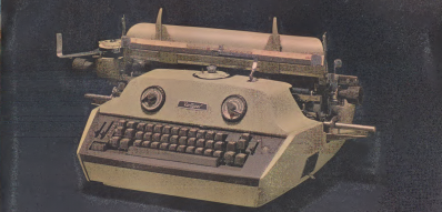
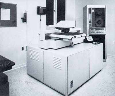
Over the past few years, I kept bumping into something called Hershey fonts. After digging around, I found a 1967 government report by a fellow named Dr. Allen Vincent Hershey. Back in the 1960s, he worked as a physicist for the Naval Weapons Laboratory in Dahlgren, Virginia, studying the interaction between ship hulls and water. His research was aided by the Naval Ordnance Research Calculator (NORC), which was built by IBM and was one of the fastest computers in the world when it was first installed in 1954.
The NORC’s I/O facilities, such as punched cards, magnetic tape, and line printers, were typical of the era. But the NORC also had an ultra-high-speed optical printer. This device had originally been developed by the telecommunications firm Stromberg-Carlson for the Social Security Administration in order to quickly print massive amounts of data directly upon microfilm.
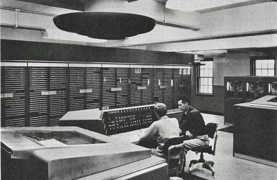
Perhaps you’ve heard stories of programmers waiting impatiently for printouts from mainframe operators? Well you would have waited even longer for your optical plots. Since they used film, they required chemical processing to become photos, slides, or microfilm. But despite this wait time, the printing speed was much faster than line printers of the day: 7000 lines per minute vs 150. While this printing speed was certainly impressive, the ability to plot entire graphs and figures in just fractions of a second was no doubt well appreciated by the scientists at Dahlgren.
What made this device so fast? It was the Charactron Tube which we covered back in 2017. This special CRT has an internal metal screen into which a font is etched. The electron beam projects an entire letter on the phosphor face of the tube in one “flash”, which in turn exposes photographic film. No raster scanning or vector drawing was involved, so the process was fast. But soon the system would be utilized in ways not imagined by the original designers.
Inspiration
Back in those days, before roff, LaTex, and WYSIWYG word processors, preparing technical reports full of complicated mathematical equations and data plots was quite time consuming. The text itself would be prepared using an ordinary typewriter. But special-purpose typewriters like the Varityper were needed to typeset math equations. Plots and figures would generally be hand-drawn or by pen plotter. Hershey came to the realization that the NORC’s optical printer could take on a new role and be used as a typesetter. Dr Hershey not only saw this possibility, but possessed a keen interest in calligraphy and didn’t mind spending his evenings developing this new capability.
The key to make this happen was to define a new mode of output which bypassed the internal stencil fonts. Rather, the film would be exposed by using the period (full stop) stencil as a “dot”, and moving the dot under program control. When applied to text, this is of course slower than using the stencil, but it allows an arbitrary selection of fonts, or repertories as Dr Hershey called them. Furthermore, it opens up the ability to plot data directly onto film, bypassing the slower pen-plotter and even slower hand-drawing techniques of the day.
Dr Hershey learned that engineers at the Bell Laboratories in Murray Hill, New Jersey had developed a font for their optical printer using a similar technique, approaching it from a rasterization point of view. Dr Hershey realized he could expand this to embrace more exotic and artistic glyphs. He focused on using vectors to design his fonts, and embarked on the lengthy journey of researching and building his collection of vector-based fonts.
Works for All Languages (Except Dragons in Motion)
In hindsight, he not only built a set of tools to solve the needs of the Dahlgren community, but pushed the limits of the optical plotter to the extreme. In his reports he demonstrated fonts not only in English, but in other languages such as Greek, Russian, and Japanese. In addition to mathematical symbols, he showed how the plotter could draw electronic circuit diagrams, stellar maps of the galaxy, maps in general, chemical bonds, etc. An example of his thoroughness is found in his 1967 report “Calligraphy for Computers”. Although Hershey only implemented a subset of Japanese characters as a demonstration, he searched through over 5000 of them looking for glyphs which might exceed the limitations of his method. He could only find one such case, which he reasonably decided to ignore:
With some omission of detail in tight spaces and some overflow in complicated cases, this size [a height of 21 raster units] is believed to be adequate for all characters in Nelson’s dictionary except No. 5444. Inasmuch as this character represents dragons in motion, it is of doubtful utility.
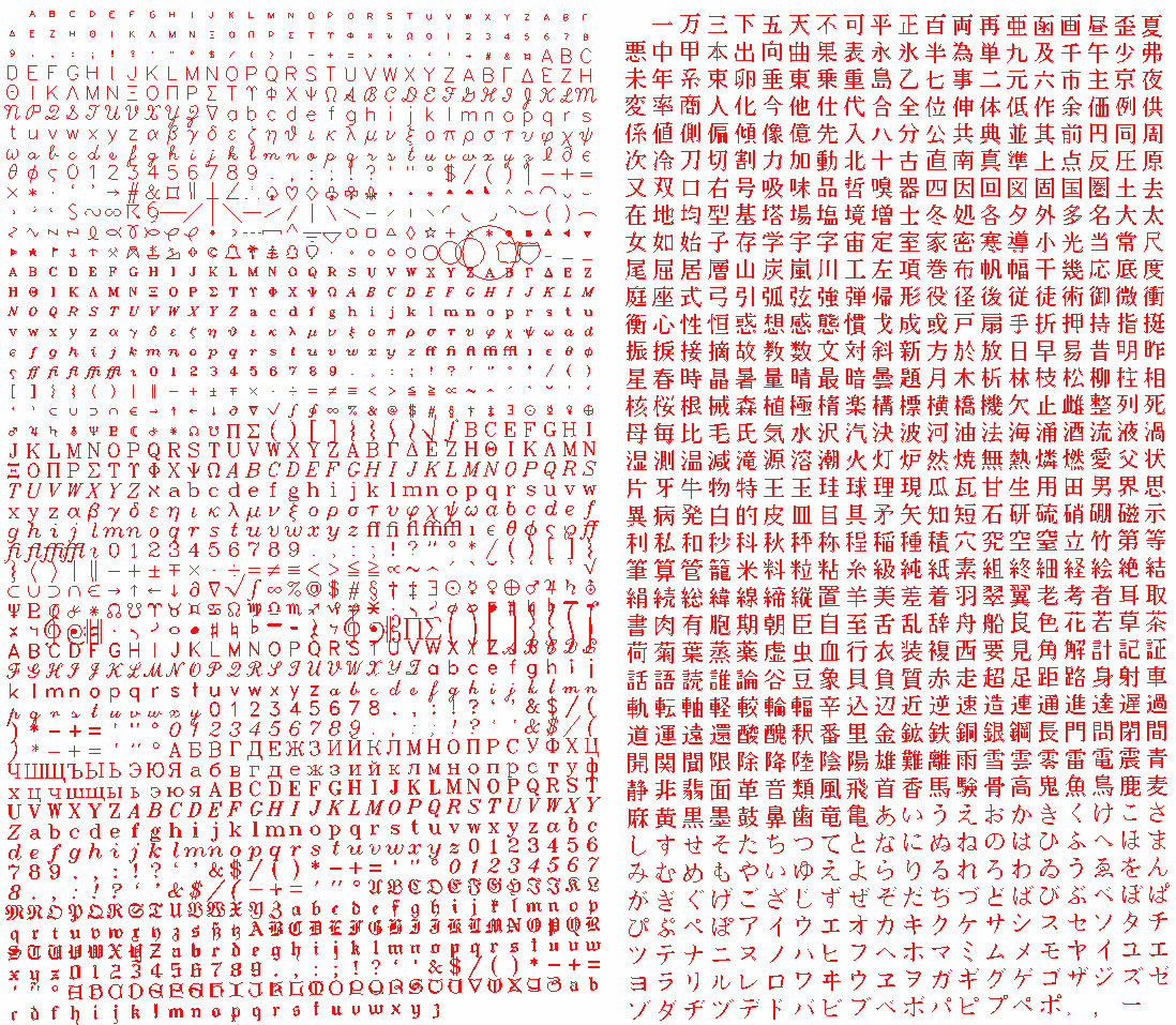
All in all, Dr. Hershey generated about 1400 western and 800 Japanese glyphs, all drawn painstakingly by hand on graph paper. There were five different optical font sizes and three different stroke types, not to mention all sorts of symbols used in mapping, science, mathematics, etc.
The Importance of Hershey Font Today
Hershey was trying to generate pleasing fonts for printed reports using the leading technology of the day. By far the greatest number of glyphs were complex — that is, they were constructed with multiple lines, or strokes, to give increased and variable stroke width. These strokes are often depicted today as thin lines when you search for his fonts online, but when properly drawn, taking into account the size of the SC4020 beam, solid letters will result. Today we have a plethora of fonts at our disposal, so why are Hershey fonts still being used? You might be tempted to say because they are public domain. But probably the biggest reason is the single-stroke family of fonts, which are still quite useful in so many different applications. Here are some examples I’ve encountered over the years.
OpenSCAD (not needed since 2015)
Today if you want to draw text in OpenSCAD, there is built-in support. But when I was first learning OpenSCAD in early 2015, this wasn’t available. A project I was working on needed text, so I decided to make my own. As I went down the rabbit hole of simple lettering that I could implement using the graphics primitives of OpenSCAD, I discovered this is a technique with a long history.
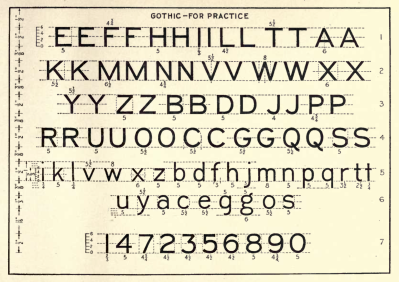
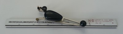
It was during this research when I first stumbled upon Hershey fonts. I have since learned that these classical lettering styles were a source of inspiration for Dr. Hershey, including the Leroy lettering sets used by draftsmen and some comic book letterers.
At the time, I passed on Hershey fonts because they only used lines, and it seemed that real curves would look better. I made my own vector font based on these simple drafting lettering styles which used only lines and circular arcs — things I knew how to make with OpenSCAD. Looking back at this now, I see that text was integrated into OpenSCAD in March of that year. If I had just waited three months, I would’ve saved myself the time and hassle.
Front panel lettering
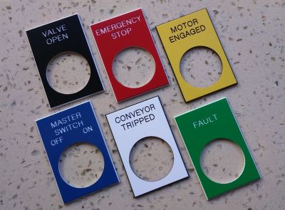
As a young engineer, some of my company’s projects required durable front panel markings. We made these by having the lettering and symbols engraved into the panel using a CNC machine. One well-proven way was to engrave a panel then fill in the grooves with epoxy paint. Today we can even skip the hassle of machine engraving all together. Low-cost direct laser etching provides a cleaner and often more affordable technique. Both these methods work by moving the head, a milling tool or laser beam, along paths which are defined by X-Y pairs. This is a perfect fit for vector fonts. They can be made more or less bold by changing the diameter of the milling tool or laser beam size, and can be easily scaled or rotated as needed using basic trigonometry. Trying to do this with a bit-mapped font would be awkward at best.
PCB Artwork Lettering
We’ve all put text on our PCB’s silkscreen and copper layers, but perhaps didn’t stop and think about the details. When you generate files for manufacturing, the traces and features of your board, themselves naturally vectors, are expressed in the familiar Gerber format (RS-274X). Letters are expressed in the same way.
The first photoplotters used for making PCB film artwork were made by the Gerber Scentific company in the 1960s. This device grew out of a family of large computer-controlled X-Y tables. These were originally used for tasks like cutting patterns from fabric and making prescription eyeglass lenses. The Gerber Photoplotter’s basic operation was not unlike a pen-plotter or CNC engraving machine, except that a beam of light would shine through a selectable aperture to expose photographic film. A wheel containing different aperture sizes allowed you to change the line width and also used to “flash” pads. It was only natural that vector commands were used to control the photoplotter. Rather than reinvent the wheel, Gerber defined a subset of the CNC digital interface standard RS-274D that had been around since the 1950s. With a few extensions and revisions, this is still the format we use today to convey our PCB artwork to the fabrication shop.
As in many fields, technology marches on. PCB fabrication shops don’t actually use Gerber-style photoplotters anymore. These days, more often than not, the manufacturer will convert your Gerber files so that the artwork is transferred to film using a high-resolution, high-speed raster printer. In some cases, the artwork is projected directly onto the PCB itself, entirely bypassing the film and intermediate transfer step.
That said, I don’t think we will ever send rasterized PCB artwork to the manufacturers. The features of the PCB that we send to the shop, traces and pads, are inherently vector-like in nature. And for proper results, the manufacturer needs to identify these features in order to tweak them according to their own unique manufacturing process. That’s the meaning of fabrication notes like “Line, pad, and via dimensions are specified as finished size” and “Controlled impedance traces xxxx should be 75 ohm”. Even silk-screen lettering widths may need to be adjusted depending on the process being used. Adjusting these parameters on a raster-based image, while not impossible, would be much more complicated.
CAD Tools
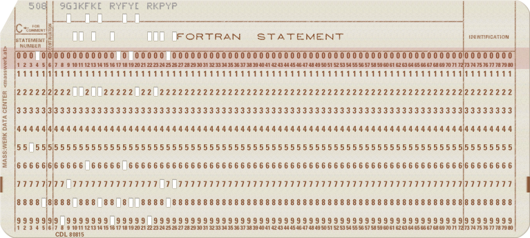
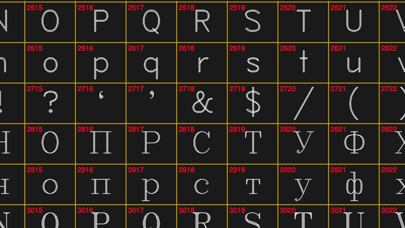
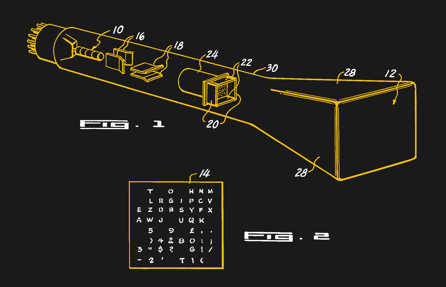
I needed to put some Korean text on a PCB for a client awhile back. After discussing this on the KiCad forum I learned that within KiCad, the PCB lettering is stored internally as vectors — using the original Hershey font format. I won’t go into the gory details, but the original Hershey format is peculiar, to say the least. Hershey used only printable letters, what we could call printable ASCII today, to describe the coordinates in very compact style. There is a letter-based Cartesian grid system with the letter R as zero. The letter S is 1, P is -2, etc. The letter H would appear as 508 9G]KFK[ RYFY[ RKPYP in this notation.
TTGO
I was recently playing around with Micropython on the ESP32-based TTGO module, in order to experiment with text on the tiny TFT screen. I discovered that Hacakday.io user [Russ] used Hershey fonts in his Turtle Plot Bot. This gave me a great jump start for some of my experiments, and is yet another example of finding Hershey fonts under the hood of modern projects.
CRT Vector Drawing Machines
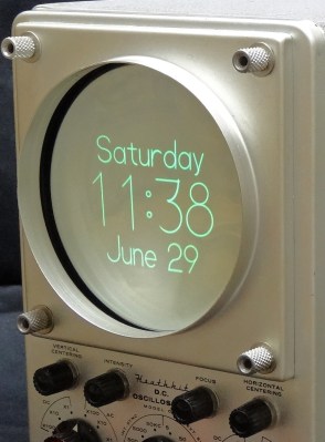
CRT-based projects using vector graphics have become popular in recent years. There are clock projects and general purpose vector displays. This is yet another application where describing fonts with vectors matches nicely with the underlying operation of the display. And you won’t be surprised to learn that Hershey fonts are commonly found on these projects. For example, this tutorial by [Trammel Hudson] on vector display basics shows how to draw Hershey font letters on the screen.
The Hershey Legacy
What would Dr Hershey think about his simplistic single-stroke fonts still being used over 60 years later? Considering all the multi-stroke letters and Japanese symbols that he so meticulously designed by hand, he might be a little surprised if not disappointed. Let us know if you have encountered or used Hershey’s fonts in your projects. If you want to learn more, here is an interesting presentation by Frank Grießhammer about Dr Hershey himself and the development of his fonts .


As I guess someone will have the same need to know which one is the kanji 5444…
Is 龘 (tau): dragons in motion
https://en.wiktionary.org/wiki/%E9%BE%98
thank you; this was the first thing I was going to look up after I finished the article
nekoplanetd, I did some digging, and you are close. The one you found is a “variant” of the one Dr Hershey was referring to. This Nelson index comes from an old dictionary, which apparently is still in popular use today. I was able to find character 5444 without buying the 1000+ page book here at this site:
https://www.kakimashou.com/dictionary/character/龖
Not just dragons in motion, but flying dragons, too! Life must have been exciting back in China in the old days.
This Nelson 5444 character corresponds to Unicode point 0x9F96 (notice that the Chinese character is part of the url in both of our links).
Thanks! I had trouble locating the old book so I referenced my school books. The main difference between fliying dragons and dragons in movement is that yours is “two dragons” and the one I posted is “three dragons”.
A bit like you have tree, then “light forest” is “two trees” and “dense forest” is “three trees”
“Inasmuch as this character represents dragons in motion, it is of doubtful utility.”
This shows just how far back systemic racism in computing actually goes. You can see the effects of it today with Unicode and it’s broken CJK pages.
Computer scientists who were dismissive of East Asian languages and didn’t bother to really understand them or consult experts, who then designed the systems that users of those languages were expected to use.
That’s one of the reasons why Unicode has had such a hard time gaining traction in those countries, and why they developed their own character encoding standards and operating systems like JIS and DOS/V.
Racism shows itself in many forms, but that’s not even *close* to being one of them.
Western engineers created solutions for *their* problems, not for every theoretical problem for every theoretical user who might potentially exist, because that’s ludicrous. Asian engineers did the same. And since when did a new standard that claims to solve all the problems of all the previous standards actually work out that way?
https://xkcd.com/927/ bears repeating.
Additionally, you might want to reread the context of the quote you’re basing your argument around – Hershey spending the time to search through 5000 kanji to find out which ones his technique might have difficulty rendering, and only finding this one, which is *literally* of little practical use. That’s literally the opposite of “being dismissive of East Asian languages”.
The whole point of Unicode was for it to be universal. It’s right there in the name, that’s what the “uni” part is referencing.
So they set out with goal to create a universal character coding, but their system didn’t generate enough input for experts in CJK languages and so they failed. And we are stuck with their failure because Unicode has become entrenched.
The result is that some people can’t type their name on some computers. Sometimes when their name gets display it is wrong. Software that claims to support their language really just ticked the Unicode box and doesn’t actually work, and people are so sold on the idea that Unicode is universal that they can hardly believe there is a problem.
It’s textbook systemic racism. Unintentional, everyone set out with the best of intentions, but still ended up creating something that makes billions of people’s lives more difficult than they need be.
Unicode is terrible, but given the goals and constraints, I’m not sure it is possible to do better. If you think so, please try. https://en.wikipedia.org/wiki/Han_unification will give you at least a start at some of the constraints. (For example, if people who can read the language consider two characters the same, they should be encoded the same — unless there was already an existing computer character code that treated them separately, and unifying them might prevent lossless round-trip conversions.)
Not being able to type your name must be annoying, but if that is a font problem, then Unicode (alone) can’t fix it, and could only make it worse. (Plenty of fonts do leave out the Asian characters to save space — but telling them to represent even more characters won’t change that tradeoff for the better.) If the problem is that the character itself isn’t represented (except via Private Use Area), you can submit a change request to add it to the repertoire. http://www.unicode.org/versions/Unicode13.0.0/ currently talks about the nearly 6000 characters added in that version alone, and there are plenty of additional characters already on the roadmap — but getting them added in a way that developers have even a chance to do the right thing isn’t trivial.
JIS X 208 was first standardised in 1978. How exactly is it a response to racism in a standard initally proposed TEN YEARS LATER?
Engineers focus on using ther brains to solve relevant problems in elegant ways, politicians focus on using their mouths to coerce people. Which, sir, are you?
Racism involves prejudice or advocacy based on bodily manifestations of certain groups of genetic differences. Languages and lettering are primarily associated with culture and nationality, not race.
Calling something racist when it is not, is an attempt to generate trouble and hatred.
I think that would require a height of 28 raster units.
Back in the day, I typed in the coordinates for several Hersey fonts, including Old English, from a very poor Xerox copy of Hersey’s book obtained from the Government Printing Office.
…as did I (in college – 1973/4) for a project which has escaped me. But I do remember typing in one or two of the Hershey fonts.
I used the Hershey fonts in the Mavbot that I used for the Mead High School Robotics class which I mentored. I could draw on paper on the floor.
https://johnkabat.wordpress.com/2016/03/25/i-am-back/
I did engraved panel lettering in shop class about six years after doing vectors in Logo on Apple II’s. The Print Shop (software) may or may not have had Hershey fonts; my dot matrix banners were powerful nevertheless.
And I did both. I used New Hermes machines for those signs, and Print Shop software on my Apple IIE and it got sent to an Epson MX100 printer. I still wonder what did happen to that company.
The letter M is a registered trademark of the Mars Corporation.
I won’t recognise any claim from them unless it is properly served from the appropriate jurisdiction… which is of course Mars.
What? What are you talking about?
M & M candies, I presume.
They only use the lower case m.
The color scheme, red, white, blue, is a trademark of the US Postal Service.
I used these some years back when I needed a small vector graphics renderer for a mostly unknown and now defunct OpenKODE implementation called Antix Game Player. Worked beautifully. I do forget what rasteriser I used, though; possibly Antigrain? (Which I still use. It’s awesome.) The whole thing, including data, was double-digits kilobytes. I did eventually switch to the nothings.org TrueType renderer, which is also awesome.
I have, if anyone’s interested, a simple and crude Hershey font editor here: http://cowlark.com/hershtrans It works by converting to and from annotated SVG files which can be modified in Inkscape.
That’s an interesting tool, David. I am going to bookmark it for future use.
I wondered about licensing when I read that Hershtrans used the NIST format of the fonts.
While the original format and the font design itself appears to be open source / public domain, the exact NIST format published in their 1976 document is considered copyrighted by NIST, thus not open source. See this 1986 usenet post on the topic: http://osr507doc.xinuos.com/en/GhostscriptDoc/Hershey.htm
But glancing at the source code of Hershtrans, it appears they are using the original Hershey format, not NIST, despite the description on the project’s home page.
I wonder how they think they can get around the fact that works by the US Gov’t are public domain (17 USC Sec. 105) because NIST is part of the US Dept of Commerce.
Yeah, I wondered that too. They’re not claiming ownership of the font itself, nor apparently the actual data, even in their own format. It’s the distribution of the computer readable font in their format that appears to be their issue — and they’re not saying you can’t get it, just that you must get it from NIST. There must be an interesting story behind that.
Back in the day, I had some interaction with the FCC. They provided ham radio license and licensee data in magnetic tape format, for a fee. The only restriction IIRC, was that it could not be redistributed *in that format*. NTIS (not NIST) had similar language. They used to charge for the reproduction of the data, back in the days before The Internet made the distribution of mag tapes and paper copies of government publications obsolete. They didn’t want a third party cutting in on their reproduction rights.
So, the document, the fonts, the data is not (and cannot) be copyrighted. Only the particular embodiment, as distributed, was copyrighted. Even that sounds like it’s pushing the limits a bit, because, as we all know, work done for the US Government cannot be copyrighted.
There is an Inkscape extension called Hershey Text, which, together with Gcodetools, can be used to greate toolpath for e.g. engraving of letters. As Inkscape can also be used to create fonts, and has a scripting extension, the combination of these should allow the creation of types mentioned in the video. But that also might have happened already :D
I used hersheytext/inkscape to engrave our wedding invitations in aluminum plates on my cnc mill, which is how I learned about stroke fonts. It worked very well.
I’ve been in a craftsy mood, so I got a Brother ScanNCut and have been making cards for friends instead of buying them. Hershey Text has been a lifesaver. Also worth note: you can use cardstock in much the same way as you’d do sheet metal parts, and can make decently large things quickly and cheaply. Best maker tool I’ve ever bought, honestly.
Hmmm,
I’ve shied away from Brother products, mostly because of their printers…
Would you tell me more about the ScanNCut?
Not ad copy, but your “hacker” experience.
Brother laser printers are very highly rated. I was going to get one until I got an old, repairable HP LJ5. My son has a Brother, though, and it seems to be pretty good value for money.
Brother printers in my experience have very good linux support with CUPS. Have a networked brother printer here at home.
I just discovered inkscape’s Hershey Fonts last week when designing a card for plotting on a Cricut. (A pen plotter / drag knife cutter / scorer with foul cloud based software)
I had the Hershey Chacters package for the BBC micro from BEEBUG (I think) in 1985 or 86. I played with it a lot and got some nice text on my Epson FX-80. Oh, those were the days.
Articles like this definitely illustrate plus ça change.
Single stroke fonts also ‘extrude’ and ‘cut’ better in CAD systems with less translation errors on neutral files between differing systems. The article kind of hinted at that.
Nice article Chris.
My search for single-stroke fonts (such as the Hershey Fonts) was based on the need to reverse-engrave front panels. I’d use 3/8″ clear polycarbonate, paint the “background” color (typically white or blue), engrave the panel with the text mirrored cutting through the “background” layer, then filling in the engraved portions with the contrasting color (black or red for a white background, and white for the blue background). I’d then put a final background color over the back to hide the blobs that missed the engraving.
The result is a VERY thin panel with a 3/8″ clear coat! I’d had enough of bored people filling in the lettering in my panels with a pen because they were bored. The first time someone tried filling in one of my new panels, they were quite surprised at their failure!
Single stroke fonts are more predictable for engraving … and even the thinnest true-type font is describing a closed area … you end up with engraving that is too heavy. There aren’t all that many good looking single-stroke fonts available other than the Hershey Fonts.
I’ve also switched to using straight end mills of the proper width rather than a V-Bit as the depth variations show up as varying width lines.
Cheers
Rick, we figured out another front panel technique back at that company. From a quality and cost point of view, it fell in between the traditional method I mentioned in the article and just silkscreening. Anodize the aluminum panel a dark color like black, blue, sometimes red would work. Then engrave the letters, and stop. The natural color of the exposed aluminum contrasts reasonably well with the anodization.
Rowmark makes acrylic materials just for this purpose. Colorfast is a clear layer of 3mm or 6mm acrylic with a thin layer of color material on the back. Artwork is laser-etched on the back in reverse, and then paint-filled….which can just be globbed on. Alternatively, the laser-etched areas can be left blank and illuminated from the back by LEDs.
Rowmark page: https://www.rowmark.com/products/color-cast
Pictures?
The Firefly CJK 16×16 bitmapped font which included Chinese, Korean and Japanese glyphs were converted into stroked glyphs for use in gEDA PCB in 2014
A little bit of script-fu using the tarball of converted glyphs and you’d have elements you can place in Kicad too or use with gcode.
http://vk5hse.blogspot.com/2014/09/geda-pcb-font-utilities-and-options.html
pcb-rnd now supports truetype and opentype font import, rendering the glyph outline defined polygon on the board, so using the approach above using strokes would arguably be an un-necessary hack now for PCB purposes, but might be useful for routing or engraving, albeit clunky.
Thanks for that tip, “e”. I’ve worked extensively with the Unifont Korean bitmapped glyphs, and it has been on my todo list for some time to convert them to Hershey format for KiCad. Seems like the hard work has already been done.
see also
https://forum.kicad.info/t/when-to-write-chinese-characters/4753/9
I’m fairly sure that this is the font that is used in many cheap, badly translated, English manuals for stuff that comes directly from China. I’ve always wondered why. Being old and containing almost every letter, it must be omnipresent.
It could be that most Chinese are as ignorant of the nuances of latin typefaces, as we are ignorant about the difference between Chinese fonts. Monospace might actually look more familiar than proportional font.
I don’t think it’s Hershey. Rather it’s Latin glyphs of CJK fonts, which are 1) horrible and 2) monospaced. Like MS Gothic.
I think China’s font is SimSun – supposedly the default on Chinese Windows XP
I did my own implementation of Hershey fonts in OpenSCAD around the same time as Chris rejected them, and was not quite ready to share it when the official text methods were released. It’s probably just as well; as I recall, my method was pretty inefficient, since each line segment was created with a hull() of the two spheres of its endpoints. The size of the stroke and the size of the characters could be varied independently, and I was mostly thinking of it for being subtracted from a surface to produce pseudo-engravings.
I use the Hershey fonts every now and then.
* Plotting the letters in an emulated display in LabView
* CNC routing letters with my Modela 15
* Adding TEXT (converted to gerber format) to existing gerber files
* Navigating letters in the air (sky-writing horizontal or vertical) with my drone using INAV
The possibilities are endless.
Whoa! Skywriting drones???
Hershey fonts work well with 3d printing. Stylized fonts tend to look “blurry” when the slicer routes around it. Sans serif fonts, especially hershey fonts, come out crisp and easily readable.
A very interesting topic is photocomposition in French and lumitype a device to print with light on
film
https://fr.google-info.org/5229517/1/lumitype.html
There was a tool in a CAD program I used in the early ’90s to create vector fonts… I had always wanted to try it but work got in the way.
One big advantage in CAD at the time was that you could leave these fonts transparent (outline only) or Fill the font with any colour or pattern.
The Garmin smartwatch SDK won’t rotate characters but the face is round, so just a few months ago I grabbed a Hershey font to add words that go around the dial. They aren’t pretty given modern standards, but the Garmin’s power budget is extremely low or your app gets kicked.