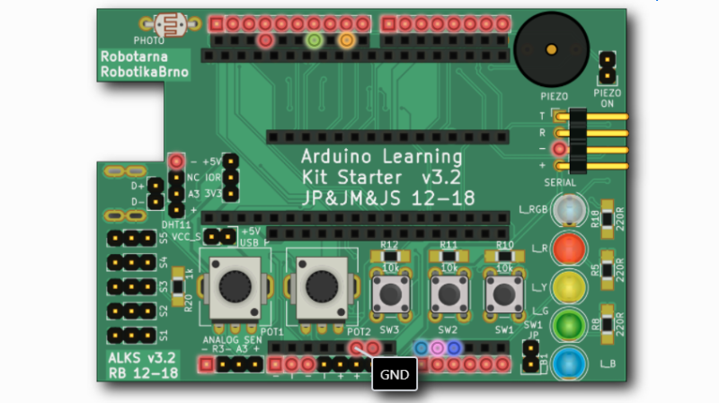
Nearly everyone likes nice pinout diagrams, but the more pins and functions are involved, the more cluttered and less useful the diagram becomes. To address this, [Jan Mrázek] created Pinion, a tool to help generate interactive diagrams from KiCad design files.
The result is an interactive diagram that can be viewed in any web browser. Hovering over a pin or pad highlights those signals with a callout for the name, and clicking makes it stay highlighted for easier reference. Further information can be as detailed or as brief as needed.
Interestingly, Pinion isn’t a web service that relies on any kind of backend. The diagrams are static HTML and JavaScript only, easily included in web pages or embedded in GitHub documentation.
If you think Pinion looks a bit familiar, you’re probably remembering that we covered [Jan]’s much earlier PcbDraw tool, which turned KiCad board files into SVG renderings but had no ability to add labels or interactivity. Pinion is an evolution of that earlier idea, and its diagrams are able to act as both documentation and interactive reference, with no reliance on any kind of external service.
Interested? Pinion has a full tutorial and demo and a growing library of parts, so check it out.


This is incredibly convenient and showcases how relevant FOSS is!
+1
looks like a lovely tool to have at hand, especially for creating documentation.
It is giants standing on the shoulders of other giants all the way down.
The author starts out with praising the style of a crappy *duino diagram. But the tool itself might be useful.
What kind of pinout diagram do you prefer? I’ve certainly seen much worse in many datasheets..
A simple table with pin number vs function is what I prefer. You don’t need a web browser and a free mouse hand to view them.
If you need a browser and a free hand to look at a pin diagram but are able to print and read a table, you’re got bigger problems.
Good luck identifying what pin numbers are where on an unlabeled PCB without a diagram. Pinout diagrams have been standard in everything from tutorials to datasheets for decades for a good reason.
Usually pin 1 is identified and it’s not so hard to follow pin 1 is next to pin 2. Try getting any useful info off the linked sample without clicking on something. Pinout diagrams show all the pin names at once.
Some manufacturers have decided to drop component designations (e.g. R6, C5, U9) as they are no longer practical for high density boards where your components are smaller than the labels. Fixing labels to make them readable is a lot of extra work. i.e. time & $$$. So good luck relying on PCB labels.
If you have the CAD files, then it is a matter of the highlighting the nets on the layout.
Last time I check, my PC motherboard documentation shows the PCB silk screen layer for the connector locations and you guess it tables for the pin outs.
A table works for simple boards or chips. However, in my opinion, it does not work well when you have a larger number of connectors per board. In that case a table or static drawing is rather confusing. Also, for many people having 1:1 visual aid helps a lot when they want to connect multiple wires – you don’t have to count the pins or tediously look for the connector J65 on your board. You just know where to look immediatelly.
This is why Pinion allows you to permanently highlight several pins. This is helpful when you connect, e.g., SPI wires. You highlight the required pins and then with both your hands free, you just give a quick look at the diagram and you connect the wires. Easy. No “free mouse hand” needed.
Or when you have a development board and you look where you could connect your peripherals, you can highlight the functional groups you are looking for. Then you can easily find where will your peripheral fit.
PS: I am the author of Pinion.
Just ignore them, Jan. For every clown who thinks their way is the best and only way, and that everyone needs to know about it, there’s a thousand others who can see how useful it could be but can’t be bothered to comment. Nice job, good work. :o)
Yes, what Byel said!
Generally the more impressive the project is, the more snark, vitriol and “I could’ve done that with a 555 timer” it gets in the comments.
I blame the soldering fumes. Messes up our brains and makes us cranky :)
Don’t know about you, but our FPGA vendor make available tables (excel spreadsheet) for their 1000+ pin outs. Pin out tables are used for engineering documents such as requirement specs.
May be fine for end customers, but no one in the engineering world would bother with your pretty pictures. If you can’t copy/paste the text labels e.g. from a pdf, you have to transcribe them and that’s a cause of errors.
Sounds like your use case might not be the same as what the program is intended for…
Why hate on a project just because it is of no use for YOU?
I can totally see me using it for my next projects and providing additional guidance for people who want to dive into them… Not everyone is designing 1000+ pin FPGA boards lol
This project is for board-level pinouts, not pinouts for chips. The needs are usually quite different.
Aren´t you aware that it is complementing a table or spreadsheet ?
It´s exactly the visual aid needed when one is prototyping anything with modular boards.
But I guess parsing netlists is what gets you off, and schematics are for dumbies.
Try this: convert your excel files into Morse code for a supreme entertainment.
Ah, pinouts that you can hear. How beautiful is that ?
Is this ismilar like the interactive HTML BoM?
https://openscopeproject.org/InteractiveHtmlBomDemo/
The use case a little bit different. Interactive HTML BOM targets at people who assemble the board. You have a list of components, you can group them by value or highlight them.
Pinion, on the other hand, targets at the users of the boards who need to find out what to connect where. Unlike Interactive HTML BOM, Pinion allows you to not highlight whole components, but also individual pins; also select what to highlight and add more or less verbose coments. It also allows you to put the elements into arbitrary groups and filter based on these group. And it also aspires to be more visually pleasing compared to Interactive HTML BOM.
This looks great, I love the functionality of the interactive HTML bom for assembly, and I think that this will be great for usage/debugging. Thanks for making this!
Pretty awesome, thank you much.
The concept looks similar to the asm() functionality in pcb-rnd
http://repo.hu/cgi-bin/pool.cgi?project=pcb-rnd&cmd=show&node=asm_tutorial