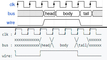
We all use text-based fields at one time or another, and being limited to ASCII only can end up being a limitation. That’s what led [Luke Wren] to create asciiwave, a fantastic tool that turns WaveDrom timing diagrams into ASCII art. Unlike images, ASCII timing diagrams are suitable for pasting into comment fields, change logs, or anywhere else that accepts text only. [Update: As the author kindly shared in the comments below, this tool’s original niche is pasting into HDL (e.g. Verilog) source code comments, where it has a special kind of usefulness.]
WaveDrom itself is a nifty JavaScript tool that we have covered before. It accepts timing diagrams expressed as JSON data, and renders nicely-readable digital timing diagrams as images directly inside one’s browser.
As cool and useful as that is, images can’t be pasted into text fields. That’s where asciiwave comes in. It reads the exact same format that WaveDrom uses, but generates an ASCII-art timing diagram instead. So if you’ve found WaveDrom useful, but wish you could generate ASCII versions, here’s your solution.


Ok, nice for sake of argument. But you loose small but important timing facts, like the wire only going high a few nanoseconds after the clock went high.
Yes, it’s meant for pasting into HDL source code comments. If you spend a lot of time staring at waveform debug windows (think GTKWave) then you will be used to seeing synchronous logic in this slightly stylised form, with no visible hold time.
If you increase hscale and shift the signal, you can add that delay in asciiwave. It’s not necessary for understanding a synchronous circuit though.
you lose your wallet when it falls out of your pocket, you loose a bolt with a wrench
great source for introducing errors due to pasting it into an environment that uses a proportional font.
or unintentional errors due to (automated) processing of the text later in another context or environment.
i don’t see any note that specifies only the use with a monospaced font.
i just tested the example. looks weird in MS Word with comic sans.
“looks weird in MS Word with comic sans”
Doesn’t everything?
It’s not a bug, it’s a feature.
Microŝoft is a clown.
Thank you for your insightful and enlightening reply. You have brought honor upon your house.
Are you refering to Slurm’s comment? The issues they point out are perfectly valid feedback. As much as I like the idea, using such ascii waveforms is indeed very risky and prone to errors. One should keep it in mind when using it.
WaveDrom is far from perfect but it’s an incredible leap forward…
https://wavedrom.com/
Combo : what if Wavedrom waves coud be imported and exported from Falstad’s CircuitJS ?
LinuxCNC generates documentation (From Asciidoc) in HTML, PDF and manpage (ie groff/troff) format.
Asciiwave is something that we have been looking at to help with some of the timing diagrams:
https://github.com/LinuxCNC/linuxcnc/pull/1314#issuecomment-1084339177
I’ve never got these non-basic ASCII characters to display correctly in a gitk window. It’s worrisome to submit a commit to the a repo containing characters that look like alien script. Any ideas?
Thanks for featuring this.
I wrote it specifically for pasting into HDL (e.g. Verilog) source code comments, right next to the logic. Maybe it has other uses too.
No love for SVG? It may not be directly human readable but it would result in a more accurate diagram that is in text without even relying on crazy unicode characters. Ideally, you would want to extract the data from an image rather than relying on user specifications.
yeah i’m pretty interested in descriptive languages like the one that wavedrom uses…and i find svg pretty useful even though it’s not that much fun to write directly. but the ascii output here is absolutely unusable. crazy unicode characters! some sort of bold?? and then even in the example at the head of this article, the timing information — the only useful thing there — is completely lost.
to me, it is the same problem as schematics and if i need to do it i will make my own ascii art by hand (or use a vector language like svg, for presentation). that way the important timing information is represented because i am deciding what needs to be represented! asciiwave obviously does a poor job of figuring out which information needs to be adequately represented and which can be lost in a blur / alignment infelicity.
tbh, i am not that crazy about overused timing diagrams. it’s worthwhile to show a single bit in detail, to elucidate all of the timing constraints (minimum and maximum rise/fall times, acceptable delays between clock transition and data transition, etc). but then to describe a serial protocol, you should just be telling me about bits using 0b0100 or 0x4 sort of notation. this in-between level of detail where it pretends to give me timing information for each bit in a whole packet, while actually not giving me enough information about even a single bit to provide useful information…it’s just not valuable.
but i am *really* dismayed that the fact that the transition on the data line happens immediately *after* the clock-rise is obscured in this example. it is an astonishing absence of basic minimal functionality for such a tool.
I find SVG OK to write directly. It’s probably a case of “if the only tool you have is a hammer” but I wrote an ESP32 web server (for central heating) that generates a graphical front end by pushing SVG out from C code.
This: https://github.com/andypugh/ESP-Heat/blob/master/Screenshot.png
Is 60 lines of C: https://github.com/andypugh/ESP-Heat/blob/master/Programming.ino
There are many other ways that it could have been done, but given that SVG allows entities to have hyperlinks it was the easiest way _within my skill set_ to create a display that could change element colours and numerical values at run time.
oh yeah i also have a program i use every day which outputs svg from C code. i meant writing it with nvi :) naked svg is tolerable and i’ve used it for a few projects but yeah usually it’s output from something else
This is a great idea for specialized situations where only text is allowed. I’ve been using ASCII art for decades. Yes, it’s ugly. But it’s a good (and maybe the only) way to display schematics and timing diagrams in a machine-independent format. Any computer (or even dumb terminal) that can display ASCII can display them. They can be printed on any printer, and sent in any plain-text format like basic email. They are still readable despite the endless babel of changing image formats. I can still view ASCII art that was produced 50 years ago on obsolete equipment.
As mentioned, you need to use a fixed-width font (Courler etc.). It’s best to stick to basic 7-bit ASCII, as unicode or extended PC graphic characters won’t display on many older or simpler systems.
Many editors are well suited to creating ASCII art. Basically, you just need one with an overstrike mode, and that has macros to allow you to quickly create repeating sequences.
Thanks thats realy nice!
This YouTube video produces nice looking timing diagrams in Excel – better than most of the others I’ve seen with Excel. I don’t see anything that can’t be done in LibreOffice Calc probably, certainly nothing LibreOffice Draw can’t handle easier:
* Digital Timing Diagram using Excel
https://www.youtube.com/watch?v=ouki3QGNQGE
https://www.youtube.com/watch?v=ouki3QGNQGE