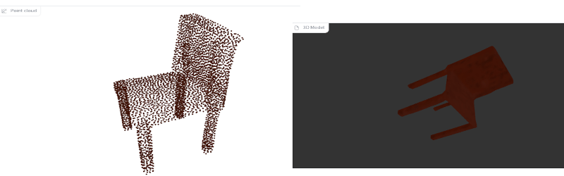
By now, you’ve surely seen the AI tools that can chat with you or draw pictures from prompts. OpenAI now has Point-E, which takes text or an image and produces a 3D model. You can find a few runnable demos online, but good luck having them not too busy to work.
We were not always impressed with the output. Asking for “3d printable starship Enterprise,” for example, produced a point cloud that looked like a pregnant Klingon battle cruiser. Like most of these tools, the trick is finding a good prompt. Simple things like “a chair” seemed to work somewhat better.
Is this going to put 3D designers out of business? We think it isn’t very likely, at least for engineering purposes. Unlike a visual image, most 3D models need to be exact and have interfaces to other things. Maybe one day, the AI can do like a Star Trek computer or replicator, just making what you want from a hazy description. But, for today, it might be more useful to train an AI to examine an existing design and help identify problem areas for printing or improve support structures and orientation. That seems more realistic.
On the other hand, we understand this is the early days for these tools. But at the current state, asking if this will replace humans is like wondering if parrots will replace radio disk jockeys. The writing and 3D modeling is, generally, not precise enough. If you wanted an artistic model or a piece of clip art, you might be able to get away with using a tool like this. Still, we are far from AI replacing a writer, a photographer, a graphic artist, or a 3D designer for most practical purposes.
Our opinion: computers work best when they boost human creativity, not replace it. Texturing, for example. Our own [Jenny List] has taken us through the search engine aspects of AI, too.


What a wonderful times we live in, computers can do such amazing things, yet the humans who program it fail at the most basic things, like designing a decent font.
For example: artificial intelligence or “AI” is spelled by upper case ‘a’ followed by upper case ‘i’. The name of the author of this article looks just like that but it is different. There is no way to see the difference between the I (upper case ‘i’) or l (lower case ‘L’). I wonder if I’m the only one experiencing this, I’m using firefox.
So therefore I assume the article is about Artificial Intelligence and not Al or vice versa. I guess I’l never really know (unless I copy an paste the entire article into a text editor and choose a different font). The sentence “Still, we are far from AI replacing a writer, a photographer, a graphic artist, or a 3D designer for most practical purposes” becomes very confusing. Either way, fascinating stuff.
You’re not the only one seeing that. It is just a bad choice of fonts. Fonts where the uppercase “eye” and lowercase “ell” are the same are not good in situations where it makes a difference like in passwords and URLs.
Never change hackaday comments, never change…
We are detailed people! Also, you are missing, a, comma.
Amazingly, everyone else managed to understand both the headline and the name of the author.
A lowercase L and capital I look similar in many if not most body text sans fonts fonts. As do a zero and O. Yet we’re not plagued by misunderstandings. If we were, we’d design them to look different in body text fonts. Yet we only need to make them different for coding fonts where context isn’t necessarily enough.
please don’t be mad, keep on reading, allow me to explain…
“Everyone else managed to understand…” why are you so sure, did you ask everyone?
Yet we’re no plagued by misunderstandings, how sure are you about that? This is exactly the exploit that bad people use to make an evil website look a legitimate one.
Yet we’re not plagued by misunderstandings. If we were, we’d design them to look different in body text fonts. Hmmm… “we”, who is “we”, like “we” as “we” walked on the moon, while in reality only 12 people did. There is no “we” unless when you a font designer yourself? The number of people involved in wisely choosing the font used in applications is surprisingly low. And the power users have over the look-and-feel of the devices they use is very limited and even if they do, the next update might undo it, who knows. Every two years my MS word looks different, my Windows desktop looks different, menu’s I like very much, settings I know to find, dissapears because some idiot thanks I like the new version better, but nobody asked me. Example, the windows tile-system and start menu. But that’s a different story, the bottom line is that I have absolutely no real influence about the look and feel of the software I use. Sorry… I got a bit carried away there.
“Yet we only need to make them different for coding fonts where context isn’t necessarily enough” Hmm… okay, you are certainly right in saying that text is highly redundant and that the reader is able to make out the essence of the written word. Yet… you failed to see the point I was trying to make, which amplifies that text is mostly read with the emotion and perception of the reader. This makes it very easy to misunderstand the emotion and perception of the writer. Sarcasm, doesn’t do well in comments. Jokes in many cases get lost completely in translation and the point I attempted to make but miserably failed at, was that I was trying to make a joke…
Please allow me to explain (which immediately shows that it was a bad joke).
Just replace Ai with AL (in the text below) and you’d still have a perfectly fine sentence but with a completely different meaning and context, a context that Al (the author of the article) might find to be funny too, I hope. After all, it were his own words.
“Still, we are far from AI replacing a writer, a photographer, a graphic artist, or a 3D designer for most practical purposes”
Best of wishes everyone and keep on smiling, if you care to l00k f0r lt there ls hum0r t00 be f0und ln everythlng.
I recently designed a sticker with the dutch equivalent of “Warning! people thought about this” including a warning sign. I was amazed how popular that sicker has become…
I think that you can easily translate it to English and be amazed again. At least I would buy few of them.
You’re absolutely right – sarcasm conveys very badly in written text! That’s something I mention when I teach writing for the web. We’ve developed hints like /s to mark it, but they’re not consistently used. Apologies for not reading your comment correctly – but evidence shows that tone is far harder to determine than misreading Is and Ls.
And you’re absolutely right that URL tricks with fonts are a nightmare – URLs are not body text, and really shouldn’t be set in body text fonts. That’s not a flaw of the fonts themselves, that’s a UX mistake in font choice. And yes, regular changes to software UX are often unnecessary and often frustrating.
411 h4ck4d4y 4271c135 5h0u1d 83 w21773n 11k3 7h47. 7h323 w0u1d 83 n0 p20813m5, 423n’7 7h3 p30p13 h323 h4ck325 4f732 411 ?
He asked me and I understood
you must be fun at parties
You’re first inclination was that this was The authors name and not artificial intelligence? After the very first sentence, context would have corrected you. I don’t see the issue.
ChatGPT can generate SVG and OpenSCAD files:
(I also tried with FreeCAD)
https://mastodon.social/@laen/109491324536792461
https://chat.openai.com/chat
Maybe this article was written by a bot.
Point-E, create the universe.
Sooooo cool! I asked it to generate a spinner. And so it did. I thought I will need to do a post-processing hull operation over a could of spheres, but it already does that. I have downloaded it as an .obj file, sliced it and 3D – printing it right now! Wooo-hoo! It looks precisely like a slice of tomato, and there is no hole for a bearing in the middle, but maybe we humans are just not smart enough to figure out how to use it! The next step will be to generate and 3D-print a robot who will figure out how to spin this spinner! In a meantime, I will put it on a wall at work and let people guess what it is. Thank you, AI engineers, for keeping us entertained!