The renaissance of Nixie tube popularity amid the nostalgia surrounding older tech has made them almost prohibitively expensive for individual projects. Seeing an opportunity to modernize the beloved devices, [Connor Nishijima] has unleashed this new, LED edge-lit display that he has dubbed Lixie.
We featured his prototype a few years ago. That design used dots to make up each character but this upgrade smooths that out with sleek lines and a look one would almost expect from a professional device — or at the very least something you’d see in a cyberpunk near-future. The color-changing Neopixel LEDs — moderated by a cleverly designed filter — allow for customization to your heart’s content, and the laser-cut acrylic panes allow for larger displays to be produced with relative ease.
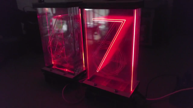
The image above (and the video below) show two revisions of the most recent Lixie prototypes. There is a huge improvement on the right, as the digits are now outlines instead of single strokes and engraved instead of cut completely through the acrylic. The difference if phenomenal, and in our opinion move the “back to the drawing board” effect to “ready for primetime”. [Connor] and his team are working on just that, with a Tindie preorder in place for the first production-ready digits to roll off their line.
Considering that Nixie Tubes were originally considered too expensive for mass-produced items like clocks, it’s ironic they’re seeing a revival in hobbyist projects for just that purpose. Lixie, then, may fit the purpose for those seeing a cheaper solution without sacrificing on the quality of the result. The design is fully open-source, so get to hacking!
For a suitably cyberpunk application of a Nixie tube, check out this motorcycle speedometer. Oh, and lest you think we’re duplicating ourselves, there was another edge-lit Nixie-alike project featured here just a few weeks ago. Seems good ideas come in waves.







Holy crap, that looks fantastic! Looks like I’m going to have to throw together a budget.
Sorry but I have to disagree. It looks like all these cheap edge-lit plastic-ey looking $10 lamps that scratch all too easily, but also with lots of light leakage, and quite a thickness of that acrylic. It reminds me of generic cheap chinese-made crap… I get a bad emotional response if anything :( I’d even take plain old 7 segments over that, look-wise. I guess I’m just not a fan.
Nixies on the other hand have that special glow, combined with a steampunk-esque, tube-ish retro look. Kind of like glowing tubes in the dark, decatrons, green/amber mono CRTs, filaments of incandescent bulbs at low power, etc. That somehow manages to get me to that happy place.
Well, I sit here fondling my IE original from 1958 (from the Univac II I worked on at Ontario Hydro in 1968-9) and there are no scratches on the plastic. Given the improvement in plastics since that era I am going to say that scratches are not likely given some reasonable care. We will be making some copies to help refinish the original console panel soon.
Lixie guy here! I wouldn’t use them for any rugged conditions, they’re more of a vanity display for a desk or office table – clocks, themostat displays, sales numbers, users online, that sort of deal. Under normal conditions, nothing ever has to touch the thing – but I’ve dropped one on hardwood without any noticeable damage. It’s the one in the blog image. ;)
I like how some of the digits have a depth as well. I am thinking that a half mirror at the front and a mirror at the back would make it look more awesome.
I especially like about this implementation is that when counting, the numbers gradually move from back to front and back again, so that there is no abrupt jump from 9 to 0. The order appears to be 1, 0, 2, 9, 3, 8, 4, 7, 5, 6, back-to-front. This shows a degree of attention to detail that I find impressive. (Nixie tubes had a different arrangement, which I believe was designed to minimize the occlusion of numerals by the ones in front of them, since those had opaque metal numerals.)
These displays also have what looks to me like the highest width-to-depth ratio I’ve seen yet, meaning off-angle viewing will be less affected. Very nice.
Lixie guy here! Thanks for the compliments! I did make sure 9-to-0 transitions weren’t noticeable, and the black light filter at the base allowed me to cram the digits VERY tightly to almost entirely remove leakage! This was a problem with the previous edge lit display they featured here:
http://hackaday.com/2016/12/22/light-pipes-and-leds-team-up-for-a-modern-take-on-the-nixie-tube/
I like his modular design, but it has one major flaw: There’s no spacing between anything and light spills all over. :( Lixie panes are 1mm apart depth-wise, and the bases are designed so that they cant be less than 4mm apart width-wise. I keep them near a window in the day and can still see them just fine – even with the transparency!
https://www.youtube.com/watch?v=qcI6rvEnabw
That is stunningly beautiful, and I don’t say that lightly.
I like seeing projects like this, because it shows that people don’t have to junk high-end antique test equipment just to get that Nixie tube look. Heck, this looks better than original Nixies anyway.
You can get old soviet neon dot matrix display modules pretty cheap on ebay. Something like $95 for a 20×16 of 5×7 characters.
16×10, my bad
I don’t know if I’ve seen these – can you send a link? :)
Have seen this in the 70’s. Had a surplus DVM from Cubic that used peanut incadences lights below to illuminate the edge. Oh it also used stepping relay’s in the analog to digital converter.
PS: Not sure could call this a nixie since its not a cold cathode display.
Neat, reminds me of this beauty http://hackaday.com/2016/04/24/plexitube-owl-clock-watches-you-sleep/
These are gorgeous, I will be ordering a few very soon.
anybody remember those etched glass hologram you could get at fairs and gift shops? now I want to see this done in solid glass.
where can i find the file with the new double line engraved numbers?
Sorry for the mix up, I’ve updated the repo with the new one:
https://github.com/connornishijima/Lixie-hardware/tree/master/LASER
Wow! Thanks for the shoutout, HaD! Here is a light show just for you:
https://www.youtube.com/watch?v=tFw8n33JcWg
Just to make sure everyone is on the same page, the Tindie page is a waiting list, not a preorder – no money needed just yet! Feel free to hop on the list to be notified on launch! :) The finished panes are coming in next week, and I’ll have them assembled and shipped to my fulfillment service by the end of January. At which time you’ll get an email at the Lixie launch to go grab some!
I had an idea, If you were to use these
https://www.adafruit.com/products/3341
You wouldn’t need to stagger the LED’s to make it all fit, and you could get rid of the side to side ‘dance’ you get right down at the bottom of the display.
But they are still kool as heck, so don’t think I’m complaining!
I had this idee for few years, never had time to realize it.
Maybe painting the left and right edges would be a good idea, to reduce light from a digit reaching the ones at the left and right.
This is a beautiful build but it has nothing at all to do with Nixies, which are multi-element cold cathode neon displays. Edge lit displays are not Nixies. Seven segment cold-cathode displays (which did exist) are not Nixies. Seven segment incandescent tube displays are Numatrons, not Nixies. Just because a display is of an old or classic style does not make it a Nixie.
Depends. Is Nixie JUST a technology, or an aesthetic? I’d say both with a leaning towards the later because that is what tells you it’s a Nixie in the absence of someone telling you the technology used.
I was going to respond with a made-up analogy of trying to pass off LED rope-lights as neon tubing, but I see that’s happened:
http://ledneonflex.com/
In 50 years time ‘nixie’ and ‘neon’ will be just an aesthetic, not a technology.
Neither. Nixie was a trademark of Burroughs for their numeric gas-discharge indicators, but I doubt they’ve maintained it. So whoever owns Burroughs’ former intellectual property probably won’t give you any flack, but a number of old guys here WILL. I had a “clock set” of gas-discharge stacked-figure tubes made by National; they couldn’t call them Nixies but they were drop-in replacements. Unfortunately National’s brand name for theirs was completely forgettable.
Also unfortunately, I haven’t been able to find a cool marketing name that was used for edge-lit displays like this, when they were introduced in 1953 by Nonlinear Systems on their first digital differential voltmeter. Yes, 1953, which comes to 64 years ago. IEE may have had a name for theirs, but I haven’t found that, General Radio called theirs a “Numerik” display, but that isn’t nearly as cool as “Nixie”, so nobody’s likely to pick up on that one. Speaking only of the name, that is.
Anyway, regarding the aesthetic, Nixies and edge lit displays were similar in that they had figures that had nice curved shapes to them (aside from those Russian atrocities that use an upside-down 5 for the 2), and that their figures were stacked one behind the other, giving them noticeable depth, particularly when viewing from an angle. But there is a considerable difference between their appearance. The edge-lit displays were very crisp and had the digits made from either a sequence of dots or mechanically etched curved lines, giving the numbers very clear definition, but internal reflections between the acrylic plates gave their numbers multiple ghosts. Nixies on the other hand didn’t have an ghosting, but since the light was emitted by ionized gas NEAR the shaped electrodes, they had a much softer glowing appearance.
My own opinion is that the differences are distinctive enough to warrant making a distinction in naming. There is some precedent for this – 7-segment displays were made using LED, vacuum-fluorescent, electroluminescent, gas-discharge, incandescent, and even mechanical technologies, but one would never call a 7-segment incandescent display an “Panaplex” display (Sperry’s trademark for their gas-discharge 7-segment). Not on Hackaday, and not if they knew what was good for them, anyway, so even though “Nixie” is a cool name – heck, especially because Nixie is a cool name, it should be reserved for devices that at least exhibit the full aesthetic.
New take on old tech, this is from a 1958 Univac II console. The Univac I used same devices. http://psgv.ca/Files/20170115_120315.jpg. These displays were made by Electro Instruments, San Diego.
403 forbidden. :(
Click a second time and it works, not sure why. Or use http://tinyurl.com/go9cq9n . The console looks like this: http://tinyurl.com/zw4e4fw
Add www. :)
Just click into the URL line and hit “Enter”, that worked for me.
HA! [Connor Nishijima] refers to Nixie tubes as “old news” on his hackaday.io page. Burroughs introduced Nixies in 1955, while Nonlinear Systems introduced THIS technology two years earlier http://www.hp9825.com/html/dvms.html.
Hahaha yeah, I knew the NLS displays were first – I just like to shit on Nixies a little bit because I’ve always been too poor to get the impressive ones! ;)
very cool! I made a horse-racing display for a museum using a similar technique, only we used addressable RGBW tape. I’ve used it for a few projects now, having a real white makes a huge difference.
I’m in consideration to do an RGBW version of the Lixie, how different is the code with a fourth byte? Is it FastLED compatible?
I wonder if you could do this with thin glass– like maybe microscope slides or something– and then just etch the figures into it..
I’m sure you could. I’ve been trying to think of thinner ways of doing this myself. There are hobby glass etching kits that include some sort of acid resist compount and some sort of fluorine-based etchant out there, or at least there were a few years ago. If not, there are still diamond grinding points for Dremel available. I wouldn’t want to do that by hand, but maybe a pantograph-like rig.
I would be very hesitant to do any business with the project’s creator, Connor. It is a matter of public record on Kickstarter that he fleeced backers of his Moodlight project. After refusing to communicate and drag things out for over a year, he finally admitted taking backer’s money and using to pay for car repairs and other living expenses, and then cancelled the project.