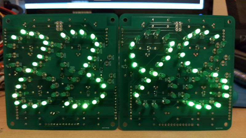
There have been many attempts at electronic numerical display technology over the decades since the first incandescent bulb or neon tube flickered into life at the command of a primordial computer, but the lowest common denominator has remained the humble seven segments. Here it might end, but for [Ken Yap] who has taken inspiration from a 1960s Sharp calculator to re-create a numerical display with only six segments.
This seemingly impossible feat is achieved by having six curved segments arranged as a figure-eight, which can render all the digits after a fashion, but which soon reveals why the extra segment made an appearance. The numbers that are made up of curves look good enough, but the straight lines in the 1, 4, and 7, are compromised by the diagonal, and the zero is curiously small at half the height. You can read the digits, but it takes getting used to.
What made sense to reduce the complexity of 1960s electronics is only a fascinating curiosity in 2020, but we maybe won’t see these displays appearing too often. You can take a look at it in the video below the break, and if you’re curious about the Sharp calculator which inspired it then you can take a look at its page in the Vintage Calculator Museum.


If you look at the article about the Sharp calculator, you will notice that its display is not 6 segments. It actually appears to be 9 distinct segments! There is a vertical full-height segment in the middle, that is used for the 1 and 4, and there appears to be a small dot to the right of the middle segment on the 4.
7 segments. The middle vertical one wasn’t two independent segments, and similarly, the little thing on the right of the 4 is part of the same segment that makes up the left side. So while some of the segments are split into two distinct parts, this still only requires decoding six segments, which was probably what they thought was enough savings to make it worthwhile.
I think the Sharp 6-segment display was meant not just to be a little cheaper, but also to be MORE legible than 7-segment displays. Keep in mind that in the early 1970s, 7-segment displays were brand new, and did not look like either handwritten or printed numerals. By putting curves on their segments, Sharp was trying to fix that. It’s hard to imagine now, but 7-segment displays were unnatural when they were introduced, but that’s only because most people alive today grew up with them being as common as well-formed numerals.
The video in this article does not appear to be the Sharp display, as it not only doesn’t include the vertical segment, but also places the digits too close together. I remember using one of those calculators, and it wasn’t NEARLY as annoying as the device shown in the video. Oh. I see, that was a hackaday.io project. Never mind.
The Sharp QT-8D used the Itron DG10B with 9 segments:
https://www.oldcalculatormuseum.com/sharpqt-8d.html
(the 1 and 7 share the same lower line and the right part of 4 is separate)
Here is the tube being driven directly, I think, as the 6 is different than on the Sharp:
http://2.bp.blogspot.com/-uak3OR-xNXs/UdA-s7KTTuI/AAAAAAAAAzg/-Ym04N–0U0/s717/DG10B+ALL.png
And some pictures of the unlit tube:
http://www.jogis-roehrenbude.de/Roehren-Geschichtliches/Nixie/DG10BIN.htm
The later Sharp EL-8 used a 8 segment variation of the Itron tube:
https://en.wikipedia.org/wiki/Sharp_EL-8
Interesting as an experiment, but as a result it is significantly less readable than that Sharp.
Rather than sticking with a smooth figure eight, I can’t help wonder if there’s an adjusted layout of those LEDs that produces a much easier, or even easily readable result.
It almost works but the 4 and 5 look like a “y” and “S” and the 0 comes off as a lower case “o”
Thanks! I was wondering what the “y” meant! And yes, I thought it was an “s” also!
Which lead me to think it was showing algebra.
Which reminds me of Einstein’s saying about simplifying, but not to the extent that the meaning is lost.
Especially since the 7-segment arrangement was invented in the early 20th century. And they did this nonsense to save ONE segment per digit.
As for the lower case o for 0, I remember reading somewhere that was actually by design-the early calculators with VFD tubes didn’t have leading 0 blanking and allegedly leading with oooo1234 was less distracting than 00001234 or something.
I rather like obscure segmentation on display, one of my favourate is the Soviet IN-23 format which is like a 14 segement display but is only 11 segement as it has solid outer bars. It achieves readability by curving all internal bars to the mid point. Looks really good if you draw out the numbers…
The curvy traces on the Sharp cxalcukator PCB go very well with the curvy segments!
http://www.vintagecalculators.com/assets/images/autogen/SharpQT8D_3.jpg
I was hoping the HAD comment system would do something smart and actually show the image, not just the link. I could go and edit the comment but…
Since ease of reading does not appear to be one of the design goals, why not get rid of 20 of the 24 LEDs per digit and just display BCD?
If your going for effect replace the LEDs with EL wire.
That’s interesting, reminds me of this 50+ year old clock on the main train station in Copenhagen
https://i.pinimg.com/736x/68/26/60/682660a7f27c66743e6ae94ae1f62580–train-stations-copenhagen.jpg
Looks like a giant Nixie clock, beautiful in person.
Yes! I remember that from seeing it in 1973. Numerals made from individual clear glass neon tubes.
You can do an entire microfont with a 5×5 array https://www.dafont.com/5×5-dots.font You can Charlieplex a 2 digit display of that font with 8 pins.
It would only work if you can read 5318008 on it. Or ( 378 x 10000 ) + 1637 = LEGIBLE .
Chris E submitted the following comment in response to one of mine, so I got notified, but it disappeared from the comments:
That’s interesting, reminds me of this 50+ year old clock on the main train station in Copenhagen
https://ci3.googleusercontent.com/proxy/vRkdlHYulSgc50aXJV5WDZy3mv2A6GS_DVpDJQWDomDhA_-C6XzLmPttiKsIxvfE7Ab8s1aKpEGde5qFMVMWDAP0miAwjodfy7ZhLk8cfObAK_j1Ave5rH5Z4oX6qXDKQa9oOdNv-9wEnfk56K2YoOkzHiS3=s0-d-e1-ft#https://i.pinimg.com/736x/68/26/60/682660a7f27c66743e6ae94ae1f62580–train-stations-copenhagen.jpg
And NOW it shows up.
You can do an entire microfont with a 3×3 array https://yofonts.com/ You can Charlieplex a 2 digit display of that font with 8 pins.
That’s silly. You can drive it as a 3×3 matrix with 6 pins