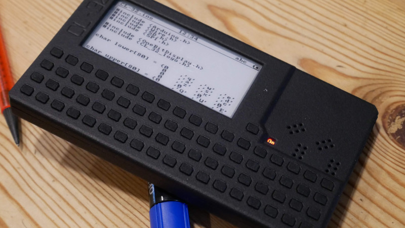
For almost as long as there have been microcomputers, there have been attempts with varying success to make tiny handheld microcomputers. Sometimes these have been very good, and other times they’ve missed the mark in some way. Latest to find its way to us is the CL-32 from [Moosepr], it’s a handheld computer with an ESP32 as brains, an electronic paper display, and a QWERTY keyboard in its smart printed case.
The hardware is relatively standard, save for the keyboard which is a dome-switch design in which the membrane carrying the domes is hand-made. We like this, and don’t think we’ve seen anyone else doing that. Expansion is taken care of by a novel socket arrangement in which boards nestle in a recess in the surface. Some experimentation was required as always to drive the display, but the result is a functional computer.
Sadly there’s little detail in terms of what the software will be, and no hardware files as yet. But what we can see is promising enough to make this one to watch, so we’ll look forward to what they come up with. If an ESP32 OS is a problem, there’s always badge.team, who have been continuously improving theirs since 2017.


There are no labels on the keys yet. The form factor reminds me of the Sharp calculators with a basic interpreter. (horrible language). The project has some pictures and info about the Sharp Memory LCD’s, but the pictures rare too low a resolution and out of focus to be of much use.
And technology wise it is still a struggle to get a display with decent refresh rate and contrast for a low price. ( < EUR10 would be fine I guess)
I do like the idea of battery life over color, but dislike the slow screen refresh. For contrast, it does not have to be better then “decent”. “More is better” of course, but as long as it’s decently readable, then further improvements would be marginal.
But still, the problem is that all costs add up, and if you add a bit of profit for the designer and retail, it quickly gets into the price range of a complete phone.
For the width… 18 buttons wide, that is a lot. I think I would prefer fewer buttons, but with more room around them.
I guess the C source code is just text display, no compiler on board. Does ESP32 do Micropython? I still have some fond memories of my old Psion organizers, but they did have a few disadvantages. Contrast of the display was horrible (limited by technology of that time) and software compatibility with Linux was bad. Also interfacing was annoying. I bought two different IrDa interfaces, but never got them to work.
I also disliked the sliding keyboard of the Psion. It made it awkward to hold the thing in your hand and type with two thumbs. For me, the super application of the Psion was it’s agenda. It had a whole week overview, and looked just like the paper agendas, with only showing times of entries that actually have been entered. All those phone applications I see you have to scroll though an endless list of empty space to even confirm there is an appointment somewhere. I never understood why people accept that.
My Psion had a battery life of 30+ usable hours with two Ni-Cd penlights (I often had some spares with me just in case) What sort of battery life can you expect from an ESP32 with display? A few hundred hours? I do have an E-reader and it has to be charged about every two months. It’s still a nuisance because it’s low-battery indicator does not work properly. As soon as it’s low battery indicator turns on, I have to click it away twice after each page turn attempt, and then click again to actually turn the page. That is 4 or 5 screen refreshes for each page turn on a low battery! If it gave me a reminder once, so I can read a few hours and then turn it on the charger for the next day that would be much better. Using the thing while a feeble USB connector is put in it is annoying.
And for form factor, I would prefer the clamshell design of the old organizers. Closing the thing protects the screen and I find that quite important for a device you haul around. It would also make it easier to incorporate a higher screen, and this also opens more options for a (semi) permanent menu (touch screen?)
Some of the old HP calculators had overlays to create application specific labels for the keys. That would be nice too, but it would need slightly higher keys. I can see variants of this working as a macro keyboard companion for my PC.
Not all of the IrDa dongles are supported on Linux now, eg check this: https://manpages.debian.org/testing/irda-utils/irattach.8.en.html
I think the Sharp “memory” LCDs are the best compromise – lower power than epaper when viewing changing content, and much higher speed. The trade-off is that the whites are somewhere around 30% reflectance.
And there ARE also very inexpensive monochrome “super-twist” LCDs out there. These have to be refreshed more often than the Sharp memory LCDs, so require a little more power, but most come with backlights so you can power the backlight when viewing in very low light.
Like smartphones!
Seriously, after all this years, we’ve found the best form factor to be a slab with a touchscreen. There’s a reason that phones with physical keyboards are extremely uncommon – they aren’t as good. That’s why everyone moved from blackberries to touchscreens. Sure, a proper mechanical keyboard is best, but on a small device, it’s far easier to type fast on a touchscreen than a tiny physical keyboard.
Obviously that comes at a massive cost, both of the screen and hardware to drive and power it, and of the smart software to make typing accurate on screen – so not knocking this project, and I for one like the unlabelled keys, very stylish though it’d take some practice and I’d like dots on the home row.
I wonder if the solution for these handhelds is a dual display – a tiny (so low power) but fast updating one for text entry, and a larger epaper for reading?
“Best” form factor depends on application. If you’ve ever tried to do computer-y stuff on a phone, typing out python on two inches of non tactile glass is pretty brutal. In ye Oelden days, I used to type Python on my Nokia n900 with a slide-out mechanical keyboard when I was on the subway and it was perfectly reasonable. But the slab is better for scrolling Twitter where you mostly just passively consume and scroll.
A big reason for the drive to touchscreen slabs is simply cost rather than utility. 100 little buttons is more expensive to handle and solder in place than one screen with a few extra pins to connect. If most people don’t need tactile typing, economy of scale massively favors the mechanically simpler design.
That said, I love the nostalgic retro “mobile cyberdeck” vibe. I don’t need it, but it would have been amazing to have a pocket computer like that in the early 90’s before more sophisticated hardware was available.
I think similar, it depends.. For typing, the Olivetti M10 was nice.
Reminds me of the Psion MX series of pocket computers/electric typewriters.
https://www.computinghistory.org.uk/det/535/Olivetti-M10/
https://en.m.wikipedia.org/wiki/Psion_Series_5
The big hole in the market as I see it is the smaller-than-19mm-spacing-but-can-still-touch-type-on size. This used to be available on some of the smaller Sony Vaios, and most of the netbooks were also in this category, but now it seems like everything is either mechanical switches in 19mm or 8mm spaced “thumbs only” Blackberry-like. There really should be an in-between size. I’m working on a smartphone-sized terminal now with 14mm spacing right now, because I just can’t buy such a thing. No, the folding keyboards for smartphones don’t count; they do weird key arrangements (I bought one, not realizing that the whole ‘z’ row was offset almost a full column, making it impossible to get used to.)
“Like smartphones!”
Oh please! 🙄
It got mainsream because of Handspring and Apple.
It’s certainly not “best form factor”, but most primitive.
It’s a pocket mirror, nothing special at all, as far as form factor goes.
It’s as much of a culture thing as eating with bare hands.
And I’m so glad that I had lived my early years without it. Such a gift!
Just because it has been widespread doesn’t mean anything.
Likewise, I’ve just read Kids in US can’t read analog clock anymore but that doesn’t mean that analog clock was poor whatsoever.
It rather shows how society has developed in reverse, just like with the smartphone.
The analog clock face had been in use for centuries no problem.
Seriously, the smartphone is no cure, but a symptome.
If you like it, fine. I don’t. I don’t like car comparions, either.
Or how venerable mainframes are being compared with C64s and smartphones over and over again. Sigh.
Or how large things measured in sizes of soccer fields. 😂
But that’s another story.
Software is everything. CPU is a don’t care. And form factor is a UX problem, tied into the software’s functionality.
For programming in BASIC, the ZX80, ZX81 and ZX Spectrum were really, really super. Anyone who denies it has never tried it.
But for touch typing, they were horrible! And the problem with them was: once you actually have a serious program that needs typing, e.g. a word processor or spreadsheet, you have to do it on that same keyboard. And then you’ll smash the computer out of frustration within seconds.
And history has shown that a good all-purpose touch-typing-capable keyboard is best. And now that BASIC is out, and languages like C and Python have so many keywords that no keyboard has enough keys for them, the mini keyboard or chicklet keyboard is dead. It just doesn’t seem to want to die. :)
You want a full-size keyboard with tactile keys with some amount of travel, everything else is not really useful for anything. Maybe the tactile keyboard of the blackberries were quite good. But really, they still needed quite some force. I can still type faster on my iPhone keyboard than a blackberry. I do wish it was tactile, I often do hit the wrong keys. A good keyboard for a mobile device would need very little force to press a key.
My fingers hurt by just looking at those keys :(
I had Nokia 6810 and it had a great keyboard. The screen was small, but it was enough that time.
Mostly the problem is that if you have a large screen, you have no space for the keys.
Another problem is that if you build a great device for traveller, hiker, office or laboratory work, the journalists start by telling that the device is too slow for gaming. And the resolution is too low for the last games.
I have seen many great products die, because ” they can not be used for gaming”.
It reminds me of the Microwriter AgendA (https://en.wikipedia.org/wiki/Microwriter#Microwriter_AgendA)
That was a great little machine. Very capable for the day.
Throwing a chording keyboard, exactly like how it was done for the AgendA, onto a revision of this design would be sweet!
Reminds me of the old TI-92, just updated with modern features.
What makes this device better than M5Stack Cardputer?
My initial question, exactly.
Too many keys. 18 columns? Really? Cut that down to 13 columns and the keys could be big enough to touch-type on. Sort of.
Looks like a “Hotblack Desiato” version of a Casio pocket computer.