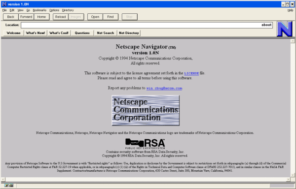
You’ve no doubt noticed by now that while some links are gold and/or bold, most links out there are blue, especially on web pages of yore. But why? the TL;DR answer is that the Mosaic browser, released in early 1993 used blue links, and since the browser was widely distributed, blue just became the norm. Okay, fine. But why did they choose blue? That’s a question that requires a deep dive into technology through the ages as the Web and personal computing developed in tandem.
It’s important to remember that the idea of hyperlinks predates the invention of color monitors, which thickens the plot a bit. But the pivotal point seems to be Windows 3.1, released April 6th, 1992, when hyperlink blue becomes a navigational and interactive color. A year later, the April 12, 1993 release notes for Mosaic include a bullet that becomes the point of origin for blue hyperlinks:
Changed default anchor representations: blue and single solid underline for unvisited, dark purple and single dashed underline for visited.Mosaic release notes
Around the same time, the Cello browser was developed at Cornell Law, which also used blue hyperlinks. So the blue hyperlink concept was arguably browser-agnostic even before Netscape Navigator and Internet Explorer came along.
The writer speculates that blue was chosen to stand out against black and white once color monitors took over, and that seems legit to us. Can you imagine blue hyperlinks on Hackaday, though? Ouch.
Speaking of important questions in computing history — who invented the mouse?


