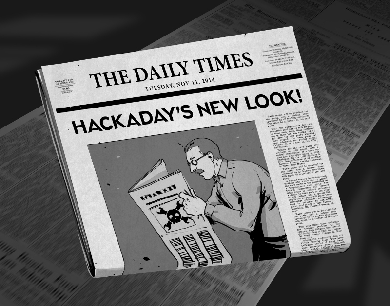
There comes a time when your movable type becomes so over-used that you no longer get a legible print off of the printing press. For months now we’ve been at work on a new site design that maintains the essence of Hackaday while ejecting the 10-year-old dregs of the site. With each small success we’ve actually ruined ourselves on viewing the old design. It is with great relief that we unveil a site design built specifically for Hackaday’s needs.
The most notable change is in the content of our landing page. For ten years, loading Hackaday.com resulted in the most recent blog posts. The blog concept is proven, but provides little opportunity to highlight quality original content and information about upcoming events. We have tried the use of “sticky” posts but honestly I find them somewhat annoying. The solution to this is not immediately apparent, but I feel we have found the most efficient solution to our complex set of needs..
We have a lot of community members who participate in Hackaday in numerous ways. Changes found in this design are driven by that fact. The landing page will, from this point forward, be a somewhat more persistent collection of notable content from the blog, our community site (hackaday.io), as well as news regarding live events, store features, contest highlights, and more. Those hard-core fans — a label I also assign to myself — will find the same reading experience as always on the new blog URL: hackaday.com/blog.
Aesthetically, we hope that all will agree the new design far supersedes the old. There was a lot to fix, and the work of the Hackaday crew who designed and implemented this new interface is truly amazing. I hope you will take the time to leave a positive comment about their work. As with any major transition, there will be some bumps in the road. Right now most of our sidebar widgets have not been migrated but that and any other problems will be fixed soon.
In this design we strived to highlight the title and image of each post to immediately convey the core concepts of the projects shown here. The author by-line and comment count remain core to the presentation of the articles, and our link style continues to be immediately apparent in the body of each article. I think we have far surpassed the readability of the comments section, in addition to the content itself. We knew we could rebuilt it… we have the technology… long live articles worth reading.
UPDATE: We are working very hard to fix all the parts that don’t look quite right. Thanks for your patience!
UPDATE 2: Infinite scrolling isn’t a feature, it’s a regression. On our test server all the blog listings were paginated just like always. When our host, WordPress VIP, pushed live the infinite scrolling manifested itself. We’ve filed a ticket with them and are hoping for a solution shortly.
UPDATE 3: Infinite scrolling has now been fixed and the blog layout now paginates. The mouse-over zoom effect has been removed. Slideshow speed has been adjusted and if you hover you mouse over a feature it will pause the scrolling.


Updating the site is nice but now it looks like all the other WordPress sites. What you need is to update the interface to a more modern style. Perhaps you could make all the posts into tiles and have them cover the screen. Add a ribbon across the bottom for all the tools and links.
Also loose the giant hackaday header. Incorporate a tiny logo in the top or nothing at all. People know where they go now a days. It just wastes space
I _demand_ page numbers in search results! Editable search field – good, I was waiting for it.
The button “Older posts” looks different in search results and when You click a tag name under the article.
A new design looks good after pressing ‘Ctrl -‘ [1-9] times
The buttons ‘Older/Newer comments’ looks like a joke. Page numbers are missing again… Please, bring a button ‘read all comments’.
Change the “/comment-page-4 ” to the number you need (as long as it exists of course).
Newest/Oldest Comments would also be elpful
sorry guys, its really terrible. incredibly hard to read because of ridiculous size and contrast. besides that: i do not get the layout of the site anymore AT ALL.
I agree. It was much easier to read and browse through the days hacks before this.
I also agree. I think they maybe change font after publish(?) or then it is just that my different computer. Anyway that contrast make this really hard to read.
Agree as well. Hurts my head to read it.
Looks nice but i will miss the green. Maybe greasemonkey can give me my green back. Anyone know a good tutorial for greasemonkey?
Horrible. How dare you. We fear change.
You should make a “light mode”. The crazy white-on-black contrast gives me a headache to read.
The “recent posts” on the right should be narrower, and the text on the homepage shouldn’t be constrained to the centre by the image on the left.
I’m a big fan of the old adage “if it ain’t broke don’t fix it!” To that extent, I am glad that you still have the /blog page. That shal be MY new landing page… but I do agree… good GRIEF them’s is some BIG letters!
My $.02. I am all for adding MORE content to this, one of my most beloved sites. Moving the old/main content to /blog is fine. I can see this as a good move. And I’m all for bringing back the ‘content’ of the handmade and weird subdomains.
As has already been stated by several people, the font sizes are very hard on the eyes.
Also, I, for one, very much liked the hackaday green. It has been a part of the site forever and has a certain feeling. It is also much easier on my eyes. If you insist on the new color scheme, could we at least have this as an option.
While I understand wanting to move forward and use new technologies, your core audience seems to reject many of these changes. I understand that not all change is bad, and I’m NOT afraid of it. However, on the other hand, if a change is not needed, why try to force one.
Now I want to expand on that. Again, new functionality of the main page, great, it doesn’t take away from the old content, and it has the potential to add great new thigns. Awesome!!!
But why was a font size/style/color change needed to bring new things in? As has been pointed out, that is just css. But it affects the ‘feel’ of the site. Which leads to two other points.
While you are free to change the core ‘feel’ of your site, you WILL alienate those who are drawn by that ‘feel’. Now if you are in search of a ‘different’ audience, so be it. But would it not make more sense to start with, or build something specific, for that different audience.
If you are not after a ‘different’ audience, then why change something central to the current one?
And if it wasn’t intended, why push it out in one big lump sump?
Just my thoughts, and meant to be constructive. I love this site and want to see it succeed. However, I feel this was poorly implimented or at least, too …gung-ho?
I cant stand this new layout. The new layout runs together. The old site had some small issues but at least it was easy to read. Pictures are cropped. WTF are you guys doing you just killed a great website. Removing from my favorites.
I’ve been enjoying the progression of this post. From “YOU ALL HATE NEW THINGS SO WE’RE NOT LISTENING TO YOU BECAUSE THIS IS BETTER” to “okay, yeah, that part is broken” and then “you’re right, that feature is awful”. Given that they’re now redoing the fonts I’m curious to see how much of the “new site” will actually last. Seems like more of a disaster than the last revamp.
My friend was looking over my shoulder and complained of seeing a strobe effect when I scrolled down the screen. I’d suggest that you change your colours around but then I wouldn’t have a way of stopping my friend reading over my shoulder.
Albeit the color and font requested improvements, please consider using media queries to create a tablet and mobile view of the site. And if you need frontend / CSS help, I’m sure a fiew of us (count me in) will be delighted to help.
I like that the new design has bigger fonts and is easyer to read, but i miss the Hackaday green.
Run your new design thru YSlow. Trim down the HTML, messy code looking like something out of HTML generator is so ’90s.
I DONT LIKE THE NEW LOOK ..
There used to be a link on the bottom of the page for older posts, now you have to click on view all blogs for that link to show up. It seems link a new revision to the site should make things easier, not make navigating your site harder. Also you should not call your articles blogs. Why not call them articles? It will decrease the douche factor 400%.
Why not just allow users to chose css layout like 4chan does. No more complaining if you can choose what you see… I guess it would mean even more work for you guys, but at least fans of green phosphorus font will be happy.
I have to say I’m not a fan of the extra-large, bold, all-caps headers. Yes, I know I’m on Hackaday, I don’t need 72-point Arial Bold taking up a third of my monitor to remind me. Not sure how I like the amber text either; it reminds me of Stanley Tools, Half-Life, or Newgrounds. The only other issue I noticed is on interview pages. At least on Chrome on OS X, the distinction between questions and answers isn’t immediately obvious now that the body test is semi-bold.
Other than that, changing the bookmark to hackaday.com/blog and a userstyle that changes the orange back to green basically puts the site back to “normal” now that the font sizes are sane again. It sounds like the loudest griping comes from people who are only here for the blog anyway.
i like having the search tool in the header, that’s better than burying it halfway down the right column.
Too much white, very harsh on the eyes and it doesn’t provide any separation.
This is one of the ugliest layoutsI have ever seen.
Seriously, I became a fan of this site the first time I stumbled upon it when I was around 8, about ten years ago. I read every single post ever made on this site. I hated the initial format change to that white disaster, but when Caleb dialed it back it was ok. If you leave the site like this I will no longer use it. You guys said you wouldn’t change when you were bought out, you said it wasn’t going to be all about the money. Now I go to hackaday.com and it just looks like you’re trying to sell me something. What happened, hackaday, where has your spirit gone? Did it leave with Caleb?
What trashy hipster approved this new layout?
Since my first comment was “moderated” out, I’ll say this: Looks good on my laptop, glad the carousel is gone. I come here for the info not the layout. Now get your underaged carcasses off my landscaping!
Guys, I’m a WordPress dev. Can I please help you make the site responsive? I think the design is great, but it really needs to work on mobile. Get in touch?
The text colour is just wrong wrong wrong!
Fix that and the pagination and it’ll be fine.
But how can you view older pages? I never read hack a day “everyday” but could go back when I wanted…
Sorry, don’t really like it either…I don’t get why websites just like to completely renovate when it’s fine as is, usually trying to be just like every other site. One thing I’d suggest, not just here but everywhere, is comments just stack up in straight line and no comments on comments…For large threads, it’s really annoying going back and finding what people posted in the middle of a 300+ comment thread.
i dont like this new hackaday..
Great! Just Another WordPress Site! I hope you didn’t remove the old one :P I feel let down by one of my favorite sites.
I miss the green, although I must admit that the new colors are easier to read. Embedded YouTube videos are still a problem on the default browser of my HTC One (M7). They either don’t show up at all, or they show up as one thin horizontal line that is almost impossible to ‘click’. I’ve had this issue on HaD for months now. Chrome on my device doesn’t suffer from the problem, though.
Please have the article text under or wrapping the primary image. There’s so much wasted space making it hard to read.
Also, for the life of me, I can’t seem to find a way to pull “older” article that’d fallen off the front page…
“older” articles are currently accessed by clicking the Blog link at the top then scrolling down and clicking “Older posts”, but you have to have javascript turned on for that to work.
I’m with another commentator, why call it a blog? They’re articles aren’t they?
The redesign reminds me of a friend who used some WYSIWYG software to design their website, it looked just right on their laptop but when it came to viewing it on a screen with a different resolution it was really broken.
You guys did check the layout on different resolutions/platforms/browsers and aspect ratio screens? Didn’t you?
Well apparently not given the outcry from so many people saying “IT’S TOO BIG!” We’re not all using 4k screens you know. I tried to look at the comments on this thread on my phone earlier and gave up scrolling down the first page of comments to get to the link to get to the next set of comments, the page was so tall the scrollbar was literally a few pixels high.
This site used to be the top viewed page on my phone, the content used to be laid out in such a way to make it easy to just ‘dip in’ when I had a few minutes spare to look at something new & cool and perhaps learn something new, not anymore, I removed HaD from the home screen of FF on my phone.
I know we all expect it whenever anyone makes any change to this site, but I’m really disappointed at all the yelling and complaining. Every single comment left regarding suggested changes/improvements, or even flat opinions about how people dislike the new look could have been left in a polite way, or even tactful, if not constructive.
My first impression is that it made my eyes burn. Admittedly I’m sick and on drugs, but I’m having difficulty reading it.
But you know what? I’m gonna give it a few days. I’m adaptable.
Also, I like the site content, and it’s free, so, I’m not going to complain.
it is bosser than it ever was.
it is awesomer than it could be.
Screw it, I’m making my own hackaday-like website.
I liked the old darker text at night. This white on black is burning holes in my eyes! And all the scrolling sucks giant elephant turds.
On my phone these comments are displayed with only 4-6 words/line. Is that a planned feature? Makes pages looong…
Yuck, please change it back
miss the old familiar green
Enough has been said about how people dislike the colors. I’m here to say they make the site unusable for me, had to go in and hand edit the style sheet just so I could get far enough to actually post this.
If your going to insist on colors that are known to cause issues with visually impaired individuals like myself you could at least give us the option to use a different pallet or an API we can just build our own UI on.
I love hack-a-day but if I have to rewrite the style sheet every time I visit, I’ll have to stop visiting. I’d hack hack-a-day to be more friendly, but have too many projects going already.
Not sure if you’re a programmer or not, but it would be super simple to write a chrome extension to handle this automatically. I also imagine that one already exists… Also, you could just look at the RSS feed…
Aside from the /fucking massive/ fonts used on the headings, I don’t mind the new layout
Once again, you’ve taken any indication of the next event in the Hackaday Prize off the main page. I’m not a marketing person, but come on, you’re giving away an incredible prize, created a lot of buzz, and when I go to the hackaday site… nothing.
Regardless of marketing, the Hackaday Prize is a BFD, please put up the panel showing the countdown again. Capitalize on this great opportunity to inspire new hackers and make the world a better place.
Also, why would you roll out such a huge change days before the big announcement? That’s a recipe for disaster, ask me how I know…
My eyes are bleeding from the strain…
I hate this new look. It hurts my eyes! Do you think all of your readers are blind?
Thanks for not killing/maiming your RSS feed in the process (annoying how many sites update and then flood the feed with repeated posts or miss some or…). My first reaction to the design isn’t pleasant, but we’ll see (I use the feed most of the time anyways).
Also, did you kill the forum in the process or am I just to stupid to find the link to it?
Comments look a bit strange on the ipad as well – 5 words per line
ok the layout is ok JUST OK! bt the site is very disconnect with the old site, the font colours and type should be the same not drasticaly different!!!
This is not a mere change of layout, it is a significant change in direction of the website. The focus is now shifted more on the community and the store, and the projects ‘”blog” posts are relegated in a subsection. But this is probably a matter of preference more than anything, and who knows, maybe people actually come to “hack-a-day” to buy T-shirts.
Now to the design part. The designers of this glorious website probably expect people to peruse it in full screen so that we may bask in its magnificence. Believe it or not I actually like to have several windows open and active at once, one of the many joys of a multitasking operating system. The post image is particularly ridiculous, it is even stretched to be even bigger than its original size. I can’t wait for the day your designers get their hands on a 4k monitor.
And then there is the whitespace, padding, and general waste of screen real estate. See : http://i.imgur.com/cvGwIkY.png. I omitted the scroll bar from the screenshot but you can check it for yourself on the right of this page. The blame should probably be shared equally with the designers of CSS, but come on, is it not possible to make things a little more compact ? I guess that the elephantine padding is there to make the endlessly nested rectangles less of an eyesore, but maybe that means this should be rethought too. Maybe indentation would suffice.
I dig the new look. It’s got a lot of bad design stuff, such as the interview Q/A styling, but I suspect a lot of that stuff will get shaken out in the next few days.
But that carousel at the top has got to go. The previous design put the daily content, the hacks, up front and center. Now it’s below the fold and redefined as “blog” content. Like most habitual visitors for the past decade, I come here because I want to see **a hack a day**, not your highlight reel or whatever commercial endeavor you want to draw my attention to.
But let’s get back to objectivity. Carousels are well-known in UX circles as a usability disaster. They get 1% click-through rate, and of that click-through rate 90% is on the first slide. Here’s a source for these numbers:
http://erikrunyon.com/2013/01/carousel-stats/
and
http://erikrunyon.com/2013/07/carousel-interaction-stats/
Be scientific and run your own numbers. I bet after a week you’ll be horrified at how little interaction that hideous little thing gets and you’ll be putting in a priority-1 ticket to have it removed.
I appreciate that you’re used to bellyaching from this curmudgeonly crowd whenever you change things up, but the decision to move the hack entries to /blog is more than just a choice of color scheme or font. And it is a very, very bad choice indeed. Your constant stream of daily content is your lifeblood! That’s whatever everyone is here for! Treat it as such and give it the biggest column on the front page, starting as high up on the page as you can get it.
I have been reading hackaday at night in a dark room, quite comfortably. This is bloody painful. I literally have painful tears in my eyes. This is so bad I cannot use this site any more. I will stop coming here a few times per day. I may check back every week or to just to see if this site is usable again, but it will drop completely off my radar in a couple of months. So long Hackaday, it was great to know you. Sorry to see you go before your time. Like the redneck famous last words: “Hey y’all! Look at this!”… Sad, really…
And layout? If I wanted to read a newspaper, I would buy a newspaper. I loved the classic iconic good old friendly Hackaday feel. If it ain’t broke, don’t fix it. And please don’t break it to make me cry.
Okay, just visited blog. Layouy not as horrible as this Home page. But color change still literally painful. Where is that trademark Hackaday green?
Everything is good and beautiful. But the images in your daily digest email didn’t load at all. Please check. Hackaday’s daily email is the best newspaper I read every morning.