It’s 2018, a full thirteen years since YouTube was founded. With an online sharing service up and running, and high-resolution cameras in just about every mobile phone, the production of video has been democratized. Sadly, for those citizens with eyes, the production of good video is not so widespread. What’s one thing you need for good video? Good lighting – and you can build it yourself.
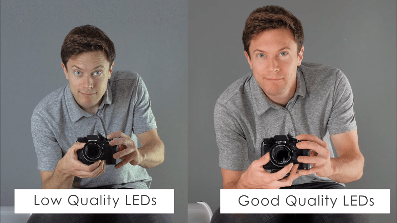
This build from [DIY Perks] relies upon readily available components and uses simple build techniques accessible to the average maker. Using cheap LED strips (albeit photography-grade ones), along with off-the-shelf plastics and dimmer modules, it’s possible to build a light that preserves colour integrity while being lightweight, compact, and easy to use. The final product is remarkably elegant – at a glance it could be a commercial product. Nifty tricks like daisy chaining the power supplies and combining different spectrum LEDs for better control add to the functionality.
Overall, it’s a build that does take some time, but it could easily be completed in a weekend and the results are top notch. It’s not the first lightbox build we’ve seen here, either. Video after the break.
[Thanks to Keith O for the tip!]


What “defines” photography grade LEDs exactly? There are a few differences in terms of refresh rates that you sometimes cannot specify and color temperature that you can generally specify but what else sets LEDs apart for photography use specifically?
I’d say it’s mostly their color rendering index and temperature.
Color rendering index, i.e. the similarity of their emission spectrum to sunlight.
It´s like Hi-Fi speaker cables: all about perception.
The photo with bad LED looks more natural than the magazine-photoshopped-look photo with “good LED”
Q: what makes a “good” article better than a “bad” article ? content quality ? instructional value ? or just a linked video ?
You must spend way too much time under poor-quality fluorescent lighting if you like that photo, because the “bad” photo has a severe greenish tinge to it. (Common problem for cheap low-CRI fluorescents and also common with cheap white LEDs that have excessive phosphor coating) Such tinges are so bad that even using a white balance reference can’t completely fix it.
Knowing how to adjust your white balance is at least as important as having consistent lighting. A simple 3 light setup using identical spectrum bulbs will go a long way for minimal investment.
It’s not a white balance issue, it’s a CRI issue.
And the solution is xenon strobes for still photography, hot incandescent lights for video. There’s no magic workaround to make LEDs anything but a distant inferior product.
Maybe 20 years ago or if you’re buying leds by the shipping container direct from China but a decent daylight led floodlight will be more than sufficient for most vloggers and maker videos. You can find led bulbs that have +90CRI in a minute or so of googling if something in the mid 80s just won’t do.
When most youtubers are still struggling with vertical video, tin can audio, not filming into the sun, and red blotchy faces I doubt introducing CRI is going to make a drastic impact.
Those two pictures in the lead look like the before and after in a weight loss advert.
I’m guessing you just don’t draw the punters if you have exactly the same scene?
should be called “dont use cool white LEDs”
Production quality does not correlate with video quality. Shoot your videos outside, only do hard science topics.
Well personally I find the image on the right more off putting because it’s got too much light and it’s reflecting off him.
The grey man on of the left isn’t correct but personally I find it less annoying.
Lighting, like architecture, or UI design. Its’ one of those things that a group of experten tell us it’s right or wrong and we are all suppose to go along with their opinion. Group think FTW.
I agree, though the lights themselves look good and they are better that the rig I did for my green screen (where you definitly do need lights and not shadows…). Though now he is has got me thinking about it I might do the same but with some rgb leds and a 8266 at the end so I can control the color via wifi.. That would be much more usefull..:-)
Why is everybody so sure that the left picture is the wrong one. Personally the right picture looks like he just came back from a sunny vacation, he’s way to red to look natural. The pale guy on the left looks much more real to me.
Now what’s real or not is not what counts, or is it? The one on the right simply looks more glamorous and because we are poisoned by glossy pictures in magazines and colorful TV commercials that we fail to see how real life looks like.
Real grass is rarely green, the color of the sea or a lake is rarely clear blue and the color of a car is not important but seldom without scratches. What I mean to say is… what effect do you want to achieve and adjust you lights accordingly OR do some post processing.
Regarding the build, it has some nice ideas, although I was a little bit confused by the hot-snot glue. Because every one who every used it knows that it easily loosens itself from smooth surfaces. But it could be useful if you are going for the maracas sound…
> What I mean to say is… what effect do you want to achieve and adjust you lights accordingly OR do some post processing.
That these lights are “better” is not purely subjective. They have a higher CRI, meaning their light emission is closer to that of sunlight. The goal is to have these lights render color as if it were natural sunlight.
Sunlight? At what latitude, date and time ?
Quote: Why is everybody so sure that the left picture is the wrong one.
I was going to say because of conditioning, but you nailed it in your second paragaph. Bravo.
Ranting about how magazines are poisoning peoples’ minds doesn’t change the fact that light quality can be objectively measured. The color being captured by a high CRI light is real, it exists in the subject, even if it isn’t visible under every light. If you don’t like the way your picture turns out you can always desaturate it in post, but if you don’t capture that information you can’t add it in later.
Well and what about YUJI LEDs? :P
BTW people complaining about the comparison photo, what monitor do you use? It’s also pretty important.
I have IPS display with 99% sRGB and calibrated with colorimetric sensor (IIC profile) and the photo on the left is totally greenish/blueish. Photo on the right looks pretty good for me.
exactly, here i have an old eizo flexscan l768, and the green tone is clearly seen
Nonsense, I’m looking at it on a monochrome VT100 terminal and both pics are clearly equally and completely green…!
I agree. I also have a calibrated IPS displays and the left image looks bad–greenish tinge and squashed color range. It’s unfortunate that he has a better expression and is larger in the right image (the “after” photo marketing enhancements) but it’s still clearly better color-wise. I also bet most people have their monitors set way too blue and too bright and may not see the differences as well.