Here’s a neat little trick: take the jaggies out of scaled fonts on the fly! This technique is for use on graphic displays where you might want to scale your fonts up. Normally you’d just write a 2×2 block of pixels for every area where there would have been one pixel and boom, larger font. Problem is, that also multiplies each empty area and you end up with jagged edges in the transitions that really catch your eye.
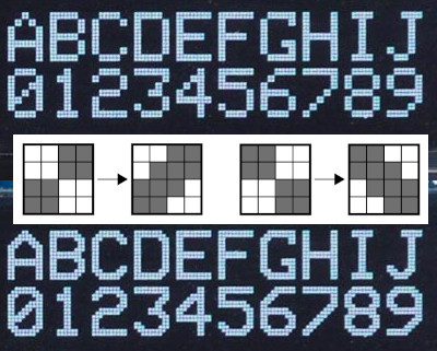 [David Johnson-Davies] entered big-brain mode and did something much cleverer than the obvious solution of using multiple font files. Turns out if you analyze the smoothing problem you’ll realize that it’s only the angled areas that are to blame, horizontal and vertical scaling are nice and smooth. [David’s] fix looks for checker patterns in what’s being drawn, adding a single pixel in the blank spots to smooth out the edge incredibly well!
The technique has been packaged up in a simple function that [David] wrote to play nicely in the Arduino ecosystem. However, the routine is straightforward and would be quick to implement no matter the language or controller. Keep this one in your back pocket!
Now if all you have on hand is an HD44780 character LCD, that one’s arguably even more fun to hack around on just because you’re so limited on going beyond the hard-coded font set. We’ve seen amazing things like using the custom character slots to play Tetris.


Neat. It could be improved by dealing with three-pixel stairstep configurations too though, to fix the glitches in the current implementation (see: the notches in the 3 and 4 at the bottom).
The glitch seems to be due to it not smoothing the pixels if it doesn’t have the checkerboard pattern.
The solution would be to ignore the empty squares and just smooth everything.
Ie, if we have two diagonally placed colored blocks, then smooth the neighboring blocks, regardless if they are colored or not. If those pixels are already part of a colored block, then one just adds black to black, so it won’t change.
That would work ok, but not without some drawbacks. Look what it would do to I and J for example. Inside corners would be smoothed on A, B, D, G, 4, 7, etc. which is probably worse than the couple of missing pixels in those few spots. I don’t think it would improve readability.
A simple solution is to have 2 different smoothing algorithms.
One that takes the non colored blocks into consideration, and one that doesn’t.
And then just specify what smoothing system to use for each character. That is only 1 bit of extra information.
Since to what I can see, every time we have the “flaw”, then we don’t seem to have any places where extra smoothing would be problematic. And when we have places where extra smoothing would be problematic, we seem to lack the artifacts. Though, I haven’t run a deep search on every character in the alphabet to see if this is the case, but for those edge cases, one can compromise for one or the other system.
The 4 character has both cases doesn’t it? But, maybe I misunderstand your categorization.
Not sure that would be a good idea as you would get weird rounding in places like the cross sections of “I” “J” and “H”, etc.
1 as well
That actually brings out a potential problem.
If using the smoothing “solution” I proposed, then it will smooth both sides of the the protrusion.
Making it into an arrow of sorts, nothing “wrong” with that, but a bit untraditional.
Also the top of the 1 could use an extra pixel.
This discussion hammers home that what we’ve got here is a 95% good solution with only two simple rules. It has a couple one-pixel flaws, while the original was pretty crappy looking.
https://i.imgur.com/uWAyHIW.jpg
I’m not authorised to view this picture…
Yeah, and even where there is the one-pixel flaw, it looks better than the original.
Neat, but I have to wonder if it’s just as codespace or time efficient to use the correct size font to begin with.
It has other applications though. I came across this problem before in computer mice. at a pixel level they move in a staircase pattern making x axis and y axis movements separately. the mlt04 in the microsoft wmo is the only optical sensor that draws a smooth diagonal line because it has a 1 pixel deadzone and caches the movements.
some artists still use ball mice to avoid this issue.
I would have thought that most serious 2D artists would use a tablet and stylus rather than a mouse or ball. Or have mice taken over from Wacoms?
Some people love mice and don’t get on with pens.
Even still, mice are generally much more precise, especially if your tablet is mapped to 2x 27” screens. Pen tablets tend to be faster and more expressive though.
If you don’t have space for the larger type character face table, use the general algorithm as described and hard-code the few fixups for 3,4 etc. for optimal solution
It all depends on the application, microcontroller and memory available. Most simple solution is to upscale, and the smoothing presented here can increase readability a little at the cost of having to post process the bitmap.
Another solution would be to use a font that scaled to the largest you want to use, then downscale it with bi-linear scaling with sharpening. Something like lanczos scaling (you could store it compressed, ie using run length encoding for example).
If memory is abundant you could store a font for every scale.
If cpu processing power is abundant one could use vector fonts that has been optimized for bitmap display. Throw in some rgb subpixel anti aliasing(when using a color display) and it looks as good as android/windows/mac typography.
I recall that Apple laser printers back in early nineties would do this kind of pixel smoothing on bitmaps and fonts before postscript came along. I suspect this style of pixel up-scaling is a solved problem.
PostScript was already in use well before the nineties; the original Apple LaserWriter was introduced in 1985 and came with PostScript built in.
Truly one of the best hacks I’ve seen in a while. Upscaling is normally very hard and rarely looks right, but this is very close to something an artist might draw by hand in high res.
Kind of reminds me of pixel art upscaling algorithms.
A neat trick perhaps 30 years ago, but not today. Examine early video games’ rasterization techniques and you will become familar with all manner of bitmap tricks.
Repeats are ok. If not, most everything was already invented in the 70s! :-)
What is better (and equally simple?) for this particular case?
I thought it as clever, and looks much better.
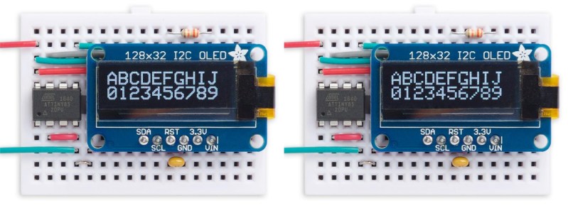
And here I thought this was going to be a how-to on how to use those little ubiquitous oled 128×32 and 128×64 displays. I see so many projects out there not using the 128×64 displays properly. Apparently the cheap Chinese manufacturer of these things was kind enough to make the 128×64 displays backwards compatible with the same code/output the 128×32 displays use, but if you dont properly specify the display size when configuring the library the display will make itself look “interlaced” it basically stretches the 128×32 display data into the 128×64 display space by inserting a black row between each active row. This makes your text look like garbage and ruins the geometry of any graphics.
A very similar technique was used in the SAA5050 Teletext chip for ‘character rounding’ the font used in the rendering of teletext pages on TV sets in the 80s – which was also used in the BBC Micro to provide the famous ‘MODE 7’. The SAA5050 was also optimised for interlaced output.
There was a demo back in ’93 or ’94 that used this method with a custom font, each pixel was 1 char wide and it smoothed with 1 whole character filled in the diagonal, one left one right. Very cool font. It was by a Brazilian group, some sub 2k Demo. If I could only find it again…
Was it SQUID1.COM ?
sqd1_src.zip 21K Squid1.Com ASM source.
1899-byte BBS Addy by cld & The Doctor. Includes: Char smoother Mini-player for AdLib, 8×16 charset
http://omolini.steptail.com/mirror/dcee/Files/Programm/Demos/index.html
mov bx,20h ;
mov al,0f9h ; XXXXXX
@@again: ; XX XX
mov dx,ax ; XX
xor dh,dl ; XXXXXX
mov dl,dh ; XX
and dl,0ah ; XX XX
shr dl,1 ; XXXXXX
and dl,dh ;
;
jz @@skip ; vira
cmp BYTE PTR [si+bx],010h ;
je @@skip ; /XXXXXX\
; XX/ \XX
mov dh,dl ; XX\
and dh,04h ; \XXXXXX\
and dl,01h ; \XX
cmp al,10h ; XX\ /XX
rcl dl,1 ; \XXXXXX/
or dl,dh ;
add [si+bx],dl ; Tricky code, eh? :-)
mov BYTE PTR [si+bx+1],1
This topic has been revisited many times by people doing BBC Micro emulations. (search for jsbeeb). The BBC computer used that same SAA5050 chip, and I think they came up with a similar algorithm. I think it’s a neat trick – especially for a project using a small FPGA with limited on chip memory for the display RAM and for the character generator. Why store big fonts and waste a K or two of ROM space when you can upscale in hardware and smooth out the jaggies?
It’s just occurred to me that if the point is to save ROM space, perhaps a well-designed compression scheme for the font could save even more, while allowing a higher resolution font. But that may be overthinking it.
I can cope with reading data out of a character gen rom and serialising it, but not sure if I am up to decompressing a font definition on the fly. This did make me think though.
I do have a Spartan-3 based text VGA display for a sequencer project (look Ma, no computers) In my text display, I only permit big fonts to align on even rows and columns. They are double the width and height of regular fonts so it all fits together. I use a two byte representation for each character – one byte for the code point, and one for the attribute byte which determines how the character is displayed – so four bits for the colour, one for reverse video, one for underscore, and one bit for ‘Big Font’ – which I am now going to change to do smoothing as above!
Ah, this all takes me back about forty years to designing so-called Converged text displays for those Its Better Manually people, trying to find a common symbol set and attribute definition for 5250, 3270, 6580, 5150 … it took weeks then to get a working prototype. With an FPGA I went from an idea to having multi-coloured, highlighted characters on the screen in an afternoon.
The approach works quite well with lower case characters too, see here:
https://forum.arduino.cc/t/oled-improving-doble-font-size/513410/5?u=bodmer
I know this is an old post, but there is a great potential to bring CJK and other languages to embedded devices with this method, by applying it to https://unifoundry.com/unifont/