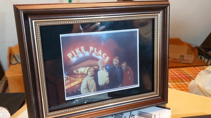
As a general rule, it’s not nice to prank your mother. Moms have a way of exacting subtle revenge, generally in the form of guilt. That’s not to say it might not be worth the effort, especially when the prank is actually wrapped in a nice gesture, like this ever-changing e-paper family photo frame.
The idea the [CNLohr] had was made possible by a new generation of multicolor e-paper displays by Waveshare. The display [Charles] chose was a generous 5.65″ unit with a total of seven colors. A little hacking revealed an eighth color was possible, adding a little more depth to the images. The pictures need a little pre-processing first, of course — dithering to accommodate the limited palette — but look surprisingly good on the display. They have a sort of stylized look, as if they were printed on a textured paper with muted inks.
The prank idea was simple — present [Mrs. Lohr] with a cherished family photo to display, only to find out that it had changed to another photo overnight. The gaslighting attempt required a bit more hacking, including some neat tricks to keep the power consumption very low. It was also a bit of a squeeze to get it into a frame that was slim enough not to arouse suspicion. The video below details some of the challenges involved in this build.
In the end, [Mom] wasn’t tricked, but she still seemed pleased with the final product. These displays seem like they could be a lot of fun — perhaps a version of the very-slow-motion player but for color movies would be doable.


With a full refresh of 15 seconds, I don’t think anyone has time or attention span for video. Cool nonetheless.
Was the insult really necessary to make your point?
How about just saying, “That’s the whole interesting thing about the ‘very slow motion’! Check out this link!”
https://hackaday.com/2020/08/23/e-paper-display-shows-movies-very-very-slowly/
2020 is bad enough already, lets try to be nice to each other. Remember bbp is probably just one of the 10,000…
https://xkcd.com/1053/
I appreciate the idea to be kind. Kindness is general would be really pleasant, no matter the times :)
Why did you take a simple (not even really insulting) comment (that wasn’t even directed at you) so personally??
I pranked my late stepfather by adding a one-second image of My Little Pony to his desktop slideshow. He didn’t notice for almost a month, but his reaction was well worth the effort. We got a call with him asking if I’d heard of a MLP virus. I trolled him a little, stringing him along, but we both got a really good laugh when I revealed the prank.
Amaizing use of color eink display. Good job!
I really like this. I hope someone does something with either an ESP8266 or an ESP32 because I think it would be great if these could pull pictures from a network photo share.
I would have, but I don’t control the network in my parent’s house, and didn’t want to run a server.
That’s understandable. I didn’t mean to imply that you should do it.
Unfortunately, I find myself at a stage in my life and career where I don’t have the time or expertise to tackle and ESP based implementation of this project. I’m hoping someone takes an network connected frame as an obvious next step because that display in a photo frame looks too good to not make something like that.
My wife would love it.
Waveshare sells an ESP32 with on-board eInk driver, you can connect straight to the display. I have a couple and they are actually really nice boards. My setup pushes images to it from a network share, but only because I wanted a bit more complexity in the script than I am capable of writing for the ESP.
It would be interesting to put the same picture every day, but changing something on each version. Like putting/removing hats, changing people, putting a car on the background, removing a car… So each day something small changed, but after a while the loop repeats and there’s a very large difference.
Sounds like a great idea!
I have an idea banging around the back of my head to build a larger version of this to keep our calendar on the wall – update the caeldnar- refresh, maybe have it showing a split frame with the week/month/day – refresh rate doesn’t matter, and power consumption would be low, it would refresh at least 1 x a day, and whenever our calendar updates
You may enjoy waveshare for this, too, then. They have a 12.48 inch display! Though not full color, it still looks quite impressive, having black and red!
They’re trialling the use of two of those large waveshare displays for real-time info on bus timetables here in Ireland. They’re really nice.
I like that idea, and 1 or 2 colour is probably enough for a really nice useable result so its easy to give it a go now..
That said I’m really hopeing some more sizes of this ‘full’ colour one come out.. So many uses of e-ink become elegant solutions that really make a project look right with the extra colour capacity. Higher refresh would be nice of course, but its really never been what a 0 energy cost for static display is about..
Isn’t that called a photo print?
No, but the point is, it looks a lot like one.
That was old timer humor. You young whippersnappers don’t get t.
No, it’s just not funny…
Why is no one telling us the 8th colour?
It’s sort of a lavender or lilac color. Light purple, nice looking really.
It’s the secret colour THEY don’t want us to know about!
I’d heard there was a secret chord
That David played and it pleased the Lord
But you don’t really care for music, do you?
Kind of like that.
Seems strange that it doesn’t look like a combination of the others. Must be some strange juju going on to even make that work. I’m wondering if there are really only two subtractive color layers – there is no blue or anything like cyan, and the green looks kind of muddy, like that’s what you would get if you mixed the purple with the yellow. Not sure where the red would come from, though. My guess would be that the two colors are yellow and purple, and that the real magic is in being able to mix them in different proportions. (Keep in mind that the original two-strip Kodachrome process did something similar.)
In that case, assigning arbitrary ranges of 0-2 to each primary:
yellow+purple=result
0 0 white
0 1 lavender
0 2 purple
1 0 ?
1 1 red
1 2 green
2 0 yellow
2 1 orange
2 2 brown
Note that with two trinary digits, we would have nine possible colors, whereas CNLohr only identified eight, so I could be way off. I tried mixing these colors myself in Gimp, and sort of almost made it work, but I couldn’t get the red and yellow to be as clean as they look in the video without losing the green.
having been successfully nerdsniped…
E ink’s web site says that this product is the “E ink Gallery Palette”, which is a specific version of the “E ink Gallery” with a simpler driver. E ink’s videos on their youtube channel state that the ordinary “E ink Gallery” line has a full set of CMYW beads inside, so I don’t think this “two pigment” model works.
I have no idea about the relative mobility of the different beads – certainly their Spectra line just has the colored beads move much more slowly than the black/white beads (see Applied Science’s video). But I’d guess it’s somehow like that.
Then I’ll concede. I hadn’t seen any of the specs. Like I said, I couldn’t make all of the colors like I thought I could. It just seemed even harder to get three different kinds of beads to behave well!
as always very nice work, cnlohr.
this really makes me want to play with such epd on my own.
There was a guy who slowly kept replacing family photos with photos of Steve Buscemi to play a trick on his mom, this guy should have done the same thing, start with a family photo with lots of people in it and every now and then replace one random head with a Buscemi for a day to see if anyone notices.
https://justsomething.co/guy-replaces-family-photos-steve-buscemi/
This epaper is cool but I agree with most comments that is slow. It also has a bad issue with temperature. Try it in a winter ambient, even inside when it might be under 15 degrees someday and the colors just appear completely washed out. Green is light green, black is not black, and so on. Made two pictures, one in normal ambient temperature on Germany in winter (15-18 Celsius) one after leaving it close to a warm surface for 15 minutes:
https://twitter.com/martinfasani/status/1361765591695163396 (Left the one cold)
Which leads us to ask,
1) Is this the temperature when writing the image, or viewing it?
2) How does it look when written at room temperature, then viewed at different temps?
1) This is only at the moment of writing the image. Write it in a low temperature: Color washed out. Warm temperature: Colors OK
2) Does not apply. Like I said this is only at the moment where is flashing and sticking the colors, once they are stick, they stay with the intensity.
It’s simple: Not designed to used at lower temperature. Should be always inside and if possible in a warm place. Otherwise still works but colors are not intense (And worse, black is like gray…)
Dear Dan Maloney,
I’m working on a project just like yours, but i want to use the arduino uno or micro. I have a separate SD card reader that uses SPI, just like my epaper display. I’m really wondering how you got it working with the small amount of ram that your micro controller has. Could you explain to me how you made it work? I would have to use two spi devices so i need to use 2 devices on 1 spi port, which is possible in theory (according to wikipedia and some forums).
This is Epic!
I am currently working on a photoframe / task list that I can update using an API.
I am using the Python libraries from Waveshare to save some work (and cover my lack of knowledge) and an rpi-zero.
I am wondering how you got the 8th color tho? If you could enlighten us it would be much appreciated!