
When can you be sure that you’re logging enough data? When you’re logging all of the data! Of course there are exceptions to the above tongue-in-cheek maxim, but it’s certainly a good start. Especially since data storage on, for instance, an SD card is so easy and cheap these days, there’s almost no reason to not record most every little bit of data that your project can produce. Even without an SD card, many microcontrollers have enough onboard flash, or heck even RAM, to handle whatever you throw at them. The trick, then, is to make sense out of that data, and for me at least, that often means drawing pretty pictures.
I was impressed this week by a simple but elegant stepper motor diagnosis tool hacked together by [Zapta]. Essentially, it’s a simple device: it’s a “Black Pill” dev board, two current sensors, an EEPROM for storing settings, and a touchscreen. Given that most of us with 3D printers rely on stepper motors to get the job done, it’s certainly interesting to do some diagnostics.
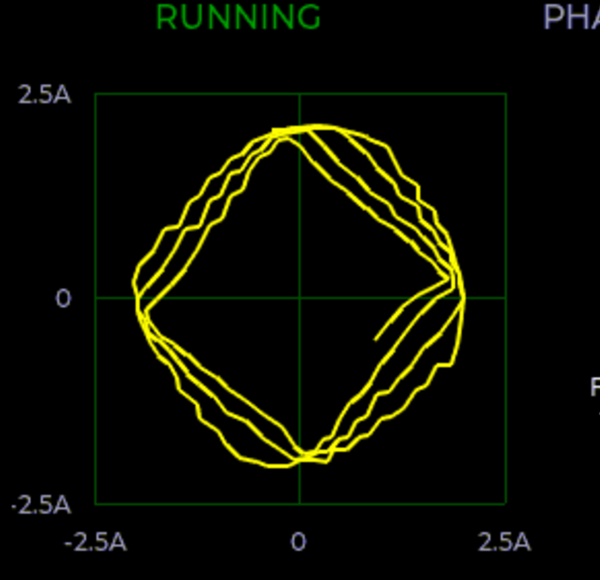 By logging voltage and current measurement on each phase of a stepper motor, you can learn a lot about what’s going on, at least if you can visualize all that data. And that’s where [Zapta]’s tool shines. It plots current vs motor speed to detect impedance problems. Tuning the current in the first place is a snap with Lissajous patterns, and it’ll track your extruder’s progress or look out for skipped steps for you across an entire print job. It does all this with many carefully targeted graphs.
I was talking to [Niklas Roy] about this, and he said “oh check out my hoverboard battery logger“. Here we go again! It sits inline with the battery and logs current and voltage, charging or discharging. Graphs let you visualize power usage over time, and a real-time-clock lets you sync it with video of using the hoverboard to help make even more sense of the data.
So what are you waiting for? Sensors are cheap, storage is cheap, and utilities to graph your data after the fact are plentiful. If you’re not logging all the relevant data, you’re missing out on some valuable insights. And if you are, we’d love to see your projects! (Hint, hint.)


This is an absolutely fascinating topic to me, I would like to know what everyone else likes to use for visualising data.
For example, I mostly use python+Qt or tkinter or matplotlib for displaying data / making quick dashboards
I use MS Office/excel. It can do a lot of things *without* coding. It can do X -Y, series or even log graphs; regression – useful for curve/linear fitting, shows you how well the data correlates.
The latter is what I use for piecewise linear interpolation for scaling/linearizing sensors for microcontroller. Combine that with an integer approximation of the floating point factors, you can get very decently small code without bringing in floating point bloats from libraries.
Very nice, I too use excel for much of my data processing needs, its honestly sufficient for most tasks and the only time it falls short is when the data is too vast large to handle, that is when I use pandas.
I’m assuming you’re talking about visualising the data after capturing it, and not visualising the data in mealtime (unless I’m unaware of some feature in excel haha)
I had written a small script in excel to steam data from serial port to spreadsheet. I haven’t gone that far but it is possible to have it refresh for every new blocks of data. Too lazy these days to do scipting. :(
Q: +1
I’ve not spent the time/effort to figure how to import live serial data into Excel to generate live graphs. However, I frequently graph logged data after the session.
> or matplotlib for displaying data / making quick dashboards
https://hackaday.com/2019/03/07/make-xkcd-style-plots-from-python/
\o/
Python/matplotlib for real-time. R for offline, but that’s just b/c I used it for a nearly 15 years for work, and am more comfortable massaging data in R than Python.
It’s rare enough that I just want to plot anything without first transforming it, even just running it through a simple moving average or something. And if you have the data in R already, doing serious analysis on it is easy. Quick search for outliers, fit a line/polynomial, whatevers.
It depends on the data, but I really like rrdtool for data collection and making graphs.
I like rrdtool but only for storing the data. A home-brew JavaScript lib makes the charts. The trick is choosing the parameters. I remember a Google Charts doc saying that ~80 points is good and I want hour, day, week and year charts, so I have:
    archives = [
      {xff:0.5, steps:1, rows:60} # last hour, every minute => 60 points
      {xff:0.5, steps:30, rows:48} # last day, every 30 minutes => 48 points
      {xff:0.5, steps:180, rows:56} # last week, every 3 hours => 56 points
      {xff:0.5, steps:10080, rows:52} # last year, every 7 days => 52 points
    ]
BTW, how do you markup pre-formatted blocks in comments?
“pre” tags. Normal old HTML.
If you do have something with limited space that you leave alone for periods of time, you might think of doing it like
HDD SMART data, logging mins, maxes, excursions outside parameters etc. Then read these off it regularly if you want a graph to spot trends.
Exponential time series is interesting way also. It logs N latest samples, then averages them together and logs N averages of that, averages those together and N such averages etc.
By repeating that at multiple levels one can see latest data at high resolution and long-term trends at smaller resolution.
From a schoolboy humor prospective, I’m not too sure the title applies in all cases :/
xD
We use Grafana, InfluxDB, and telegraf at work to monitor systems, so I installed them at home for keeping an eye on my server. They come with good enough out-of-the-box functionality. To me it’s not worth much effort to set up something different for something I don’t care too much about.
That said, I would never have thought of logging and plotting something like this. I’d normally reach for the scope leads, but in true Schroedinger/Murphy fashion, I’m rarely able to recreate the problem while simultaneously observing it. This is a very cool idea!
Ah yes, the heisenbug. https://en.wikipedia.org/wiki/Heisenbug