Winners Of Hackaday’s Data Loggin’ Contest: Bluetooth Gardening, Counting Cups, And Predicting Rainfall

The votes for Hackaday’s Data Loggin’ Contest have been received, saved to SD, pushed out to MQTT, and graphed. Now it’s time to announce the three projects that made the most sense out of life’s random data and earned themselves a $100 gift certificate for Tindie, the Internet’s foremost purveyor of fine hand-crafted artisanal electronics.

First up, and winner of the Data Wizard category, is this whole-garden soil moisture monitor by [Joseph Eoff]. You might not realize it from the picture at the top of the page, but lurking underneath the mulch of that lovely garden is more than 20 Bluetooth soil sensors arranged in a grid pattern. All of the data is sucked up by a series of solar powered ESP32 access points, and ultimately ends up on a Raspberry Pi by way of MQTT. Here, custom Python software generates a heatmap that indicates possible trouble spots in the garden. With its easy to understand visualization of what’s happening under the surface, this project perfectly captured the spirit of the category.

Next up is the Nespresso Shield from [Steadman]. This clever gadget literally listens for the telltale sounds of the eponymous coffee maker doing its business to not only estimate your daily consumption, but warn you when the machine is running low on water. The clever non-invasive method of pulling data from a household appliance made this a strong entry for the Creative Genius category.

Last but certainly not least is this comprehensive IoT weather station that uses machine learning to predict rainfall. With crops and livestock at risk from sudden intense storms, [kutluhan_aktar] envisions this device as an early warning for farmers. The documentation on this project, from setting up the GPRS-enabled ESP8266 weather station to creating the web interface and importing all the data into TensorFlow, is absolutely phenomenal. This project serves as a invaluable framework for similar DIY weather detection and prediction systems, which made it the perfect choice for our World Changer category.

There may have only been three winners this time around, but the legendary skill and creativity of the Hackaday community was on full display for this contest. A browse through the rest of the submissions is highly recommended, and we’re sure the creators would love to hear your feedback and suggestions in the comments.

Continue reading “Winners Of Hackaday’s Data Loggin’ Contest: Bluetooth Gardening, Counting Cups, And Predicting Rainfall”

If You Can Measure It, You Must Display It

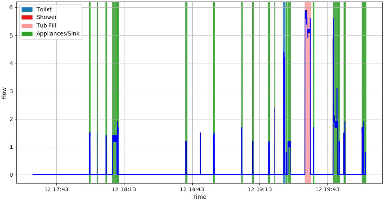
When can you be sure that you’re logging enough data? When you’re logging all of the data! Of course there are exceptions to the above tongue-in-cheek maxim, but it’s certainly a good start. Especially since data storage on, for instance, an SD card is so easy and cheap these days, there’s almost no reason to not record most every little bit of data that your project can produce. Even without an SD card, many microcontrollers have enough onboard flash, or heck even RAM, to handle whatever you throw at them. The trick, then, is to make sense out of that data, and for me at least, that often means drawing pretty pictures.

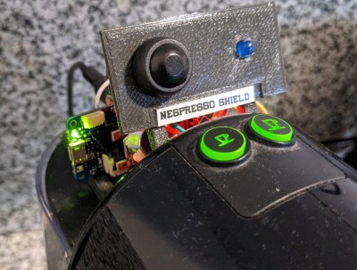
I was impressed this week by a simple but elegant stepper motor diagnosis tool hacked together by [Zapta]. Essentially, it’s a simple device: it’s a “Black Pill” dev board, two current sensors, an EEPROM for storing settings, and a touchscreen. Given that most of us with 3D printers rely on stepper motors to get the job done, it’s certainly interesting to do some diagnostics.

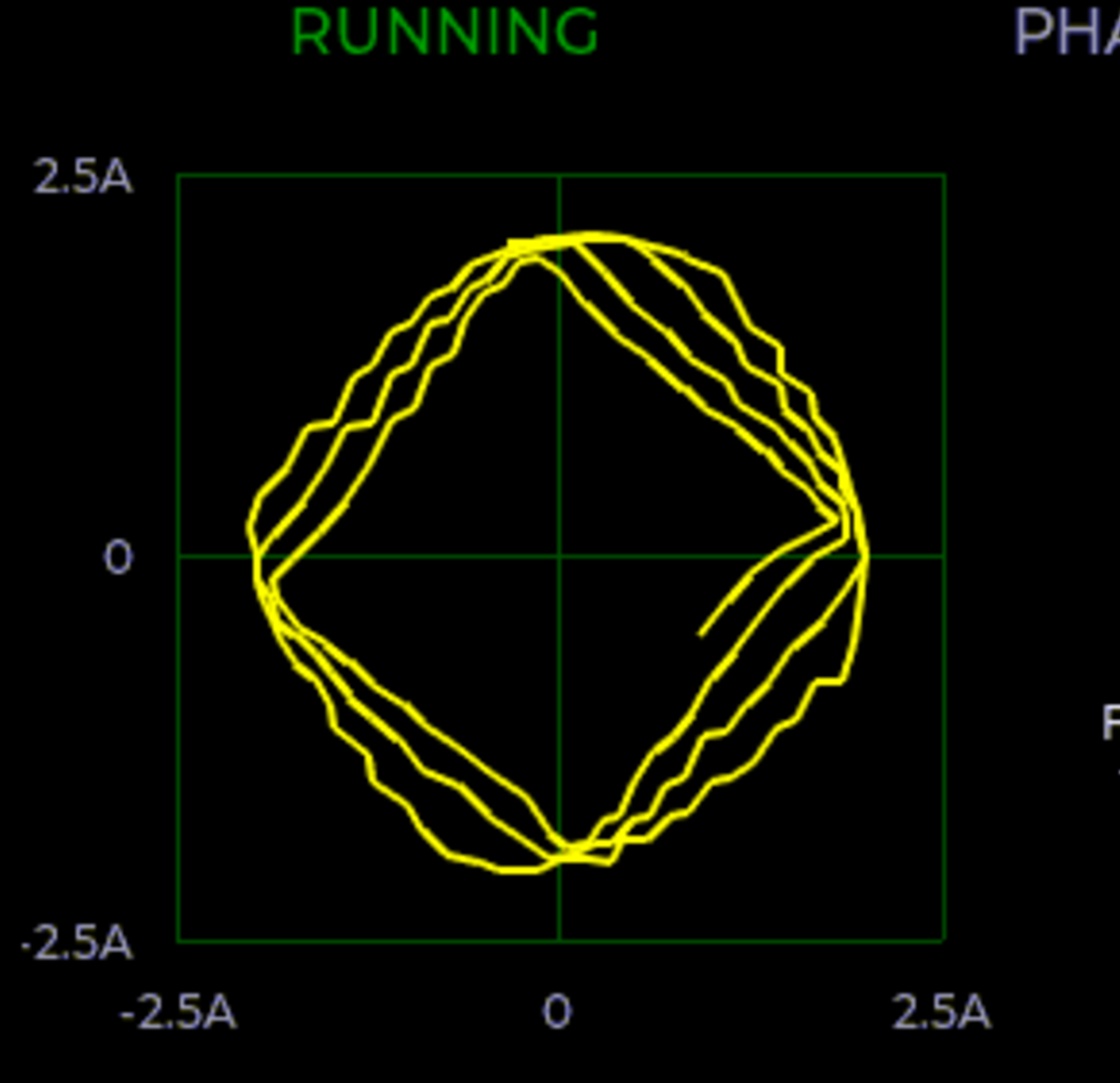
By logging voltage and current measurement on each phase of a stepper motor, you can learn a lot about what’s going on, at least if you can visualize all that data. And that’s where [Zapta]’s tool shines. It plots current vs motor speed to detect impedance problems. Tuning the current in the first place is a snap with Lissajous patterns, and it’ll track your extruder’s progress or look out for skipped steps for you across an entire print job. It does all this with many carefully targeted graphs.

I was talking to [Niklas Roy] about this, and he said “oh check out my hoverboard battery logger“. Here we go again! It sits inline with the battery and logs current and voltage, charging or discharging. Graphs let you visualize power usage over time, and a real-time-clock lets you sync it with video of using the hoverboard to help make even more sense of the data.

So what are you waiting for? Sensors are cheap, storage is cheap, and utilities to graph your data after the fact are plentiful. If you’re not logging all the relevant data, you’re missing out on some valuable insights. And if you are, we’d love to see your projects! (Hint, hint.)

Serial Studio: Easily Visualise And Log Serial Data

Outputting data from a microcontroller over a serial port is convenient and easy, but formatting, visualizing, and analyzing the data can be tedious and frustrating. [Alex Spataru] knows this all too well, having spent too many hours building and debugging custom dashboards. To save himself and others the same frustration in the future, he created Serial Studio, a tool for quickly building dashboards for serial data.

The only input required for Serial Studio to create a dashboard is a simple JSON structure specifying the data’s format, and how it should be grouped and displayed. Originally Serial Studio required all the JSON data to be sent over serial, which is fine for simple data but quickly becomes cumbersome for more complex applications. To solve this, [Alex] added a feature allowing the JSON document with the format information loaded from the computer, while only the data is sent over serial.

Serial Studio includes several visualization options, including raw line graphs, bar/level indicator, dial indicator, the artificial horizon for IMU data, or a map widget. It can also output the formatted data to a CSV file for further analysis in other software. A console window is also included for viewing raw data or debugging purposes. See the usage demo after the break.

We like Serial Studio’s ease of use and adaptability, and we’ll likely use it for our own projects in the future. It is compatible with Linux, Windows, and Mac thanks to the Qt framework, and the code is open-source and available on GitHub.

If you’ve ever watched one of the BPS.Space model rocket launch videos, you’ll know how critical data logging, visualization and analysis is for [Joe Barnard]’s work. Serial Studio is perfect for such applications, and [Alex] used it extensively for simulated satellite competitions at his university. Continue reading “Serial Studio: Easily Visualise And Log Serial Data”

Adding Space Music To The Astronomy Toolbox

Astronomy fans were recently treated to the Great Conjunction, where Jupiter and Saturn appear close together from the perspective of our planet Earth. Astronomy has given us this and many other magnificent sights, but we can get other senses involved. Science News tells of explorations into adapting our sense of hearing into tools of astronomical data analysis.

Data visualization has long been a part of astronomy, but they’re not restricted to charts and graphs that require a trained background to interpret. Every “image” generated using data from radio telescopes (like the recently-lost Arecibo facility) are a visualization of data from outside the visible spectrum. Visualizations also include crowd pleasing false-color images such as The Pillars of Creation published by NASA where interstellar emissions captured by science instruments are remapped to colors in the visible spectrum. The results are equal parts art and science, and can be appreciated from either perspective.

Data sonification is a whole other toolset with different strengths. Our visual system evolved ability to pick out edges and patterns in spatial plots, which we exploit for data visualization. In contrast our aural system evolved ability to process data in the frequency domain, and the challenge is to figure out how to use those abilities to gain scientifically relevant data insight. For now this field of work is more art than science, but it does open another venue for the visually impaired. Some of whom are already active contributors in astronomy and interested in applying their well-developed sense of hearing to their work.

Of course there’s no reason this has to be restricted to astronomy. A few months ago we covered a project for sonification of DNA data. It doesn’t take much to get started, as shown in this student sonification project. We certainly have no shortage of projects that make interesting sounds on this site, perhaps one of them will be the key.

Data Mining Home Water Usage; Your Water Meter Knows You A Bit Too Well

The average person has become depressingly comfortable with the surveillance dystopia we live in. For better or for worse, they’ve come to accept the fact that data about their lives is constantly being collected and analyzed. We’re at the point where a sizable chunk of people believe their smartphone is listening in on their personal conversations and tailoring advertisements to overheard keywords, yet it’s unlikely they’re troubled enough by the idea that they’d actually turn off the phone.

But even the most privacy-conscious among us probably wouldn’t consider our water usage to be any great secret. After all, what could anyone possibly learn from studying how much water you use? Well, as [Jason Bowling] has proven with his fascinating water-meter data research, it turns out you can learn a whole hell of a lot by watching water use patterns. By polling a whole-house water flow meter every second and running the resulting data through various machine learning algorithms, [Jason] found there is a lot of personal information hidden in this seemingly innocuous data stream.

The key is that every water-consuming device in your home has a discernible “fingerprint” that, with enough time, can be identified and tracked. Appliances that always use the same amount of water, like an ice maker or dishwasher, are obvious spikes among the noise. But [Jason] was able to pick up even more subtle differences, such as which individual toilet in the home had been flushed and when.

Further, if you watch the data long enough, you can even start to identify information about individuals within the home. Want to know how many kids are in the family? Monitoring for frequent baths that don’t fill the tub all the way would be a good start. Want to know how restful somebody’s sleep was? A count of how many times the toilet was flushed overnight could give you an idea.

In terms of the privacy implications of what [Jason] has discovered, we’re mildly horrified. Especially since we’ve already seen how utility meters can be sniffed with nothing more exotic than an RTL-SDR. But on the other hand, his write-up is a fantastic look at how you can put machine learning to work in even the most unlikely of applications. The information he’s collected on using Python to classify time series data and create visualizations will undoubtedly be of interest to anyone who’s got a big data problem they’re looking to solve.