Seven-segment displays are ubiquitous. From where I’m writing this, I can see several without even having to swivel my chair. We’re all familiar with their classic visage; slightly italicized numbers that are brought to life by LEDs. There are a boatload of variants available– you can get displays with a decimal point, ones with multiple numbers, and even versions in just about any color you desire, but at the core they’re all basically the same thing- an array of LEDs sitting behind a faceplate. Except for those ones that have some gears inside.
Wait, what?
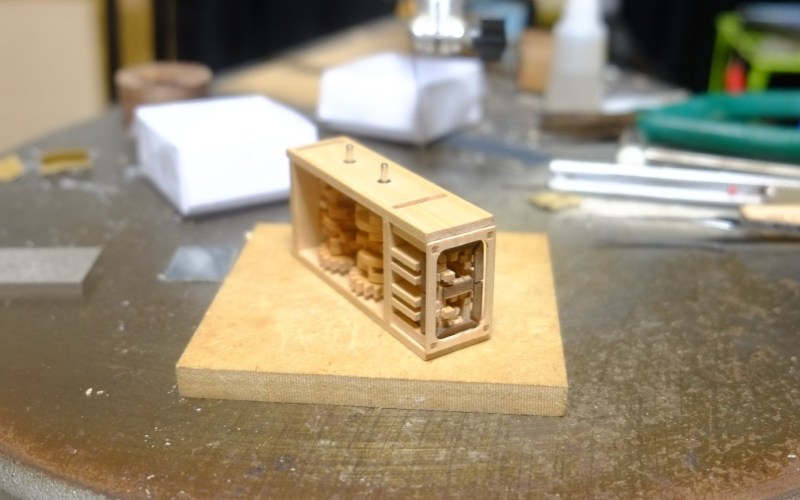
You read that right– a seven-segment display that contains gears, along with a handful of cams for good measure. Artist [Kango Suzuki] created this stunning all-mechanical seven-segment display that sequentially counts up from zero to nine when a thumbwheel is spun. All of the components are cut from wood and mesh together beautifully, complete with a satisfying click when the display rolls into a new digit, which you can hear in the video at the above link. You may recognize [Kango]’s style from this incredible mechanical clock he made a few years back. Unlike his earlier work, the seven-segment display is tiny, relatively speaking. Maybe we’ll see it integrated into a larger project some day, like a mechanical-digital clock.
We just love when somebody uses intricate mechanisms to artfully emulate some piece of existing tech. This isn’t even the first time we’ve seen a mechanical seven-segment display; [Peter Lehnér] built one back in 2019, and judging by [Kango]’s twitter feed, it appears to have inspired his design. There have even been a few other 3D printed ones over the years, but as far as we know this is the first wooden one– and, in true [Kango] fashion, its beautiful.
Thanks to [J. Peterson] for the tip!
7セグ作った
もっと色濃くすれば見やすくなるかな pic.twitter.com/nkTxPwiezf— K.$uzuki 𖠃 (@BellTreeNursing) October 21, 2021


nice!
Wow
Am I missing something? Where in the video does he actually show the seven segment display?
The first time I watched it the Twitter video came through very low-res. Try reloading and watching. The segments are the darker pieces of wood around the border of the end of the display starting half-way through the video.
This is awesome work!
I see it now, awesome!
Ahhhh, that’s a remarkable effect, but would definitely benefit from some paint!
That’s an amazing idea – basically grab the “philosophy” of a mechanically driven musical instrument (piano, organ, whatever) and “transpose” (pun intended) the logic to a display.
WELL DONE. I love it!
It took me most of the video segment to visualize the numbers forming, but then, WOW!
Hard to see. He should have painted it Red instead of a dark brown(?)
But once you manage to see the digits, simply amazing!
I kept looking at the middle “dots”. And I thought it was counting in Chinese. Then I realized the big segments around the edges!
Looks like most of the comments are about not being able to see the numbers. This is kind of a bad characteristic for a display device. Either the segments should be stained black, or a black mask could be made to hide the internal parts from the front. Yeah, I get it that the mechanism is the interesting part, but you can see that just fine from the sides.
Now this is elegant.
I speak Japanese by degree, I’d love to ask him a few questions about it, but I will never use twitter 😅
このからくりは唾らしいよ。自分で作りたいが、ファイルなんかないみたいだ。残念だ😔
アルミに作ろうと思ってたが。。。
Which leads me to wonder: does Twitter have message length limits that vary according to language? Seems like it takes twice as many letters to say anything in German, for example, and I’m not sure how they would measure languages like Chinese – would it be a count of how many fully-formed characters it is, or is it pictograms, or glyphs, or the length of the UTF-8 encoding?
Nothing can ever be simple.
Tom Scott made a video about just that topic, and expanded into a general point on information transmission rates in human languages.
https://www.youtube.com/watch?v=qOcxwRc2Epg