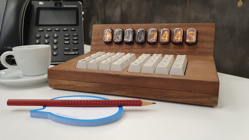
The Nixie tube is one of the most popular display technologies amongst the hacker and maker set. Glowing numerals can warm even the coldest heart, particularly when they’re energized with hundreds of volts. [ohad.harel] used these glorious displays to build the TORI Nixie Calculator, with beautiful results.
The build uses seven IN-12 Nixie tubes for numerals, along with an IN-15A which displays mathematical symbols like +, %, and M. It’s equipped with a 32-key keyboard using mechanical key switches. Everything is wrapped up in a beautiful walnut enclosure that fits the tubes and keyboard perfectly, giving the final build a nice mid-century aesthetic.
Impressively, it goes beyond the basic usual calculator functions, also handling conversions between metric and imperial units. It’s a nice feature that would make it a wonderful tool to have on one’s desk beyond the simple aesthetic charm of the Nixie tubes.
Nixie projects never seem to die. Their beauty and warmth captivates builders to this day. Indeed, we’ve even seen some makers go to the trouble of creating new tubes from scratch!


Beautiful it may be but once again I feel tricked into following a link to an advert. No schematics or other project files, just a link to a web site where you can buy one.
Agreed, if it isn’t documented how to build it yourself, at least say so in the article. Also, personally i feel that these commercial projects shouldn’t be on the hackaday.io projects website. But yes, beautifully build ;)
Should it not be a requirement for contest entry that the project be, you know, documented?
A single placeholder image on hackaday.io pointing to a commercial product should be immediately disqualified from even being mentioned on the blog, let alone be mentioned as a contest entry.
It’s a beautiful calculator that I’d like to use;I regularly scan for periods nixie calculators because I love them, and this is a nice one.
That said: how does this qualifiy for the sci-fi contest? It’s retro, not sci-fi; the build log basically just says “Here’s a thing I made!”; and by the description on the website he’s been working on this for two years, way outside the contest parameters…
Does filtering valid submissions happen later on the process?
Does anyone else think this would have looked at home on a desk in 2001 A Space Odyssey?
As with others, this entry does not comply to the rules of the contest on at least two fronts
1. All designs must reference some works of sci-fi.
2. At least two progress logs are required
This is a commercial product, not inspired by sci-fi, with the only project log being “project is done and ready”.
We had the opportunity to acquire three desktop calculators from the 1960s and 1970s when Raleigh Industries Ltd (Nottingham, England) were throwing them out in the 1980s. All of them used Nixie tubes – lots of them.
The newer ones were a Monroe 620:
https://www.oldcalculatormuseum.com/monroe620.html
It’s weird in lots of ways, like the way it had += and -= keys, but not just + or -. Like the way multiply was separated and had a separate key or the way the fixed point accuracy was determined by a dial, or the number of outsized keys.
We also had an Anita 1100, the first iteration of which was the world’s first digital desktop calculator, beating the Olivetti Programma 101, but perhaps a few months behind HP’s first desktop calculator. It looked pretty much like this:
https://collection.sciencemuseumgroup.org.uk/objects/co8410425/bell-punch-anita-electronic-calculator-calculator
Again, note the outsized keys, += and -=, but also x= and ÷=.
These calculator had to have a large footprint, because they needed multiple chips to support the functionality. For example, the Monroe calculators used separate CPU / ROM / RAM / Display driver chips and most of these were 40 pins, because of the need for the address and data bus in the design.
In the ANITA case, it was even worse, because it had no chips. Instead the entire calculator was implemented on something like 12 horizontally mounted discrete logic PCBs behind the display. A real feat of engineering for the time (the 1960s), but that accounts for its footprint and excessive weight!
“It’s weird in lots of ways, like the way it had += and -= keys, but not just + or -. Like the way multiply was separated and had a separate key or the way the fixed point accuracy was determined by a dial”
I think it’s an accounting calculator. I suspect that when you enter a number then press += (or -=), it immediately adds (or subtracts) the number to the running total and displays that total.
Fixed point and a selector for number of digits after the decimal point also suggests it’s an accounting calculator.
“Again, note the outsized keys, += and -=, but also x= and ÷=”
Makes me think the Anita might use “Reverse Polish Notation” – especially given the “Enter 1st Number” key.