When it comes to design decisions, we’re often advised to “think outside the box.” It’s generally good advice, if a bit abstract — it could really mean anything. But it appears that someone took it quite literally with this nifty little smart knob display and input device.
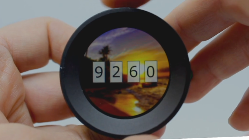
[Dimitar]’s inspiration for RoenDi — for “rotary encoder and display” — came from an unusual source: a car dashboard, and specifically, the multipurpose knobs that often crop up in a car’s climate control cluster. Designed for ease of use while driving while causing as little distraction as possible, such knobs often combine a rotary encoder with one or more indicators or buttons. RoenDi builds on that theme by putting a 1.7″ round LCD display in the middle of a ring attached to an Alps rotary encoder, allowing the knob to be customized for whatever you want it to represent. The backplane sports a powerful STM32 microcontroller with a lot of the GPIO pins broken out, so customization and interfacing are limited only by your imagination. The design is open source, so you can either build your own or support the project via Crowd Supply.
Unlike the haptic smart knob we’ve been seeing a bit about lately, which also features a round LCD at its center, RoenDi’s feedback is via the physical detents on the encoder. We think both devices are great, and they fill different niches in the novel input ecosystem.


Ah, guess we’re into a smartknobathon then, still can’t be any worse than enduring a PBS funding drive I guess.
Well, this knob doesn’t need a hollow shaft motor made of unobtainium.
True, but I hope they actually manage to find another motor for that one — the haptic stuff and the virtual detents are amazing.
There’s a hollow shaft gimbal motor in stock on Amazon. Is the hole too small? Motor too small/weak? Some other unacceptable parameters?
https://www.amazon.com/DAUERHAFT-Drones-Brushless-Materials-Gimbal/dp/B08S5XMK5J
It’s rather big for the application.
Interesting comment: “Designed for ease of use while driving while causing as little distraction as possible”… little as possible meaning you STILL have to take your eyes off the road to see what you’ve dialled up, or what the knob is currently doing… is it changing the cabin temperature, radio volume, fan speed, something else???
It is all about cost. Reduce the number of buttons/knobs to save on tooling and number of items on the BoM.
When there was one knob for one function, you knew where it was, and you could reach out, twist it, and not for a second take your eyes off the road. ‘Touch screen’ infotainment systems are just as bad.
Manufacturers have managed to slowly, subtly and surely reduce road safety to incorporate such ‘conveniences’ into a vehicle. The real motive is to reduce costs.
+1k. Exactly this. Cars are designed for ease of manufacture or cost savings. Never for service or support.
My citroen bx has a few low pressure hydraulic return hoses all returning to the oil vat, but for production, is was easier to gather a few on top of the frontal sub frame saving a couple of lines going to the vat directly. You cannot reach that extra junction as it sits in the least accessable spot, on top of the frame, guarded by the steering rod and rollbar. Of course this is the place a leak springs and you end up cursing for six hours to replace the damn ‘octopus’. Not helped at all by the fact that sand mixed with hydraulic oil makes a very slippery goo.
Of cousre i’ve moved the junction to a more service friendly spot after one try to put it in the “proper” place.
Fortunately my dash still uses the one knob, one function paradigm. Its an unconditional interface, opposed to the more and more conditional ones, taking up more and more attention from the driver in an ever increasing traffic.
Combined with ever shrinking window sizes it drastically lowers situational awareness.
No. Cars are not safer than before. They just shifted it from the driver to the hardware.
/rant
That’s a complete non-sense. When you turn a knob, you have to look at what you’re doing. Adjust the temperature ? Look at the screen in the middle of the dashboard to see what you’ve set (even if the knob “ticks” at regular interval). Seek the radio ? You’ll look at what station you’re now. Change for D to N or R ? You’ll just look at the screen with the rear view camera.
When you turn a knob, yes you’re using your hand and you have a tactile feedback, but the result requires you takes your eyes of the road to check the results.
Nope.
For example, when I adjust the temperature control for the heating and airconditioning in my car I don’t need to look to see where the knob is. It only rotates like 270 degrees. To one side is warm, to the other side is cold. I can reach over and turn it towards “cooler” without looking. It doesn’t matter what exact value I set it to – it isn’t even marked in degrees.
Turn it towards cooler then wait a while. If it doesn’t get cool enough, reach over and turn it towards cooler again. Repeat until comfortable.
Not all controls require that you know exactly where they are set.
Not really intuitive, you have to turn first to see what it changes, like setting insulin pump by trial and error.
Hi everyone
I am the one who made the encoder.
There are some interesting comments I want to address.
Yes, the encoder is inspired by work I did for the automotive industry, but the whole idea is to take it from that world and bring it to the world of makers and tinkerers. So you can use it for home automation, HiFi devices, HID devices or whatever you can come up with.
That being said, sometime there are other people in the car, that are not engaged with driving, that can benefit of such a knob. And also we are going towards a future, where the cars will be driving themselves. Passengers will have all the freedom to look at what ever is put in front of them.
The first time I look at Scott Bezek haptic smart knob my jaw dropped. It is awesome. If a lot of people get involved with such kind of projects the design will get even better and will not use such obscure parts.
Cheers and thank you for the interest in the work I do,
Dimitar
I certainly don’t intend to poo-poo your device. I truly think it is great. I also think that an automobile is not (yet) the right place for such a device.
In a decade (or longer) when self driving cars are actually capable of self driving, then “driver” distraction may not be such an issue. Currently all ‘self driving’ vehicles carry the caveat “the driver must remain in control of the vehicle at all times”… not really what I’d call self driving.
Driver distraction is the biggest contributor to car accidents, and with increasing traffic, and as macsimski notes, smaller windows (it follows that metal/plastic is cheaper than glass) manufacturers are only making it worse – not better. The reliance is fast becoming air bags and crumple zones. My vehicle has ‘collision avoidance’ and so far it has saved my bacon once, and false triggered about four times. God knows how the driver behind has avoided me when my car suddenly slams the brakes on for no apparent reason!
Yet another device that sounds like a marital aid… the word “end” in the title, “outside the box”… makes me think this is for a different subset of the market. :-p
This looks like a cool project. I fear they may regret the comparison to the apparently universally despised “automotive rotary encoder that you still have to look at”. (Yes, I can set the HVAC in my old Saturn without looking at the knob, because it has a pointer on the knob and I know where the settings are, and i can feel the levers move when I move between them.) For things that can afford to use your vision this seems like a really cool thing, and an actual round use of the round displays I see from time to time. Hopefully their Crowd Supply project doesn’t get hampered by their use of STM32 or they’ve already started testing alternatives.
(I totally agree with the home automation use case, it looks like a Nest thermostat that serves you instead of Google)
That’s an unusual connector for SWD, am I out of the loop and that’s replacing the .05″ 2×5 more widely? Or just a unique component choice? (Aka manufacturing/sourcing risk) It doesn’t look that much more low profile than the normal header.
As an automotive designer, this is EXACTLY what every manufacturer wants, I see everyone nagging about everything not having one purpose and one purpose only, while that’s kinda true, but the pros will actually out weight the cons;
Pros:
1-much sleeker design while adding a very important touch of timelessness to it.
2-with everything being controlled with one knob, you know where everything is, so less time to find the actual knob
3-lowers the costs of production which means companies now can reduce the price with their new cars
4-again lowers the costs of production by being able to be used in multiple different models, you just have to upload different UI and program it differently to match the other models functions
5-improves overall quality of the manufacturer line up (like the mercedes benz metallic air vents with LED lighting on them or the MBUX system hardware which is the same exact part on every single model they have or even the ECU which is the same in Rolls Royce phantom as it is on the base BMW 3 series or the MKV Toyota supra.)
Cons:
1-you just have to change the function by looking away from the road for a moment to see if you’re on the right page then look back at the road.
2-technophobes hate it.
3-probably not as straight forward for older people who can’t even use their mobile phone properly.
obviously the cons number 2 and 3 are not real cons, and about the number 1, it has been compensated for with safety features, like the LKA, BSM, FCW, AEB etc.
So this is an absolute win for everyone in terms of automotive industry. plus products like this which are plug and play helps smaller companies have a high quality part with where they don’t have to pay for the development.
I’m all for this product and I believe it’s actually amazing!
I was actually looking for something similar to this for home automation (a dimmer switch that can also control temperature and blinds). I will probably settle on this, it’s way cheaper and I would prefer the ESP32 as an MCU https://www.youtube.com/watch?v=xp52_vtqG3Y
Screens in cars are hopeless from a user interface point of view cos you have to focus on a screen and not the road…
Pet peeve – car radios. Two knobs == good, one touch screen == bad