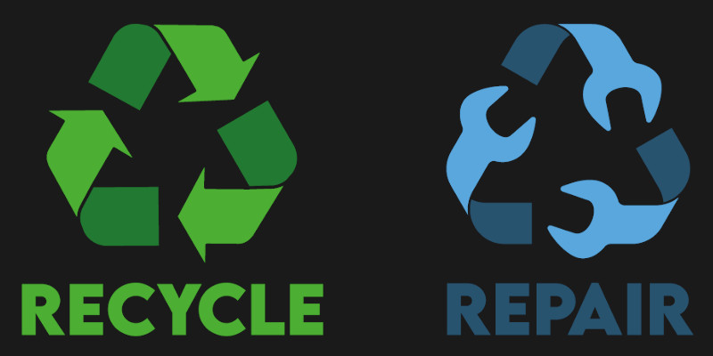
The only thing better than getting your hands on a repairable piece of hardware is actually finding the thing in the first place, which is why we love this “official” repair logo created by [Yves Parent]. Our predilection for crossed wrenches had (almost) nothing to do with it.

Designed to mimic the ubiquitous “Recycle” logo, [Yves] originally created the icon for Repair Café Roeselare — but realizing that it had wide practical applications, he got the OK to put it up on GitHub for others to use. Whether you’re a hobbyist creating your first PCB or a pro designing a commercial product for a particularly forward-thinking client, slapping this logo on signifies that your creation is destined for better things than the scrap heap.
[Yves] has helpfully provided the logo in both vector format (SVG) and PNG, the latter at several scales for your convenience. We’d love to see it offered in various production and CAD formats as well, so it can be dropped into as many projects as possible. So if you end up creating a DXF or STL version, be sure to submit a pull request.
While getting others onboard with this logo is just a ground roots effort currently, who knows what the future may bring? Today we take it for granted, but the official open source hardware “gear” logo has only been around for about a decade.


Love it! Thanks Yves!
Nice idea and cleverly executed, but IMHO visually too similar, which can be confusing when printed at small scale and/or bad/b&w colors.
Using a square shape instead of a triangle or putting wrench head on the triangle tips can make the logo more standing out.
Counter argument, to why keeping the triangle shape it’s important.
In terms of meaning it’s supposed to be similiar to recycling but not quite. Any other shape would need a lot more cognitive effort from the person seeing it. also I think wrenches only mean repairability in very specific contexts.
Agreed – the similarity is part of the point & the message.
The triangle is a bad idea. We already have millions thinking the plastic type symbol is the recycle symbol. Also we don’t need another logo to cramp up things.
The plastic type symbol is the recycle symbol. It shows that the plastic is recyclable, and its type.
And who is “we”? We don’t have to use it if we don’t want to.
I like this design.
You’ve fallen for the lie.
The triangle with number inside is the resin identification code and has nothing to do with recycling. It was intentionally designed to fool the ignorant into believing it does.
https://en.wikipedia.org/wiki/Resin_identification_code
Nothing?
The SPI stated that one purpose of the original SPI code was to “Provide a consistent national system to facilitate recycling of post-consumer plastics.”[2] The system has been adopted by a growing number of communities implementing recycling programs, as a tool to assist in sorting plastics. In order to deal with the concerns of recyclers across the U.S., the RIC system was designed to make it easier for workers in materials recovery and recycling facilities to sort and separate items according to their resin type.
True enough big oil, but Andrew’s “. It shows that the plastic is recyclable” is not correct since the symbol+number also appears on plastics that are currently not recyclable, to indicate those should not end in the recycle bin I assume.’
I’m only mentioning it since nitpicking seem to be the new trend on HaD :)
I like it but I would prefer a circular version of the logo. Just in a circular economy/repairability vein, something a bit different but not too different.
Can’t you put something in the middle to make the repair one stand out from the recycle out. On that doesn’t the recycle icon originally have an picture in the middle?
I don’t think it is in the spirit of the logo to put it on new devices unless you have built the device from old components.
If it becomes successful, I can see it being applied to tons of cheap Chinese crap that is not easily repairable.
But the probably could be descripted as being produced from old materials …
Why not? It should be used to advertise that a device is built with repairability in mind, in the same way the recycling logo shows the material isn’t meant to be thrown in regular trash.
So i’m not a designer by any means, but wouldn’t it make more sense for the head & profile to be in line with the next arrow? as it stands it looks like the wrenches are bent too far? yes a lot of wrenches have a slightly rotated head/profile, but in the context of “just like recycle symbol” this looks a bit odd?
I also wasn’t able to find any reference to this icon on the linked site, their facebook page or (for lack of a better term) any of their ‘member organization’ own pages? Getting the sense that the people who commissioned this didn’t want it?
Finally, im sorry, but i don’t really see the point? as a matter of fact what’s even the point of the recycle icon???? “dont throw this on the street but throw it in the trash”? ehh that’s like, common sense? im not gonna be looking for some icon to decide between the two? Likewise, “dont throw this away before trying to repair” seems pretty damn logical to me? do people need an icon to tell them to try repair something? or does it mean “this was repaired”? if so what exactly is the value of that information (when the owner of the device would know this) and does it really need an icon? If anything (if that second one is the goal) don’t you want some sort of tier-icons that could tell you something about the quality of the repair?
Sorry for being negative, didn’t intend to be, i just don’t really see the point & i get the feeling that the thing was made ‘public’ because ‘the customer’ felt the same way…?
Unfortunately, this isn’t all that logical for a lot of people. Obviously in a maker community like here on Hackaday this is common sense, but for most people, even recycling is hard. We’ve been taught ‘if it no longer works, throw it away and buy a new thing’ or even ‘there’s a new thing, throw your old thing away’
That was my incentive to start volunteering with a Repair Café. It’s not my customer, I’m just a volunteer who didn’t like their current logo. We’re just slow in updating all online media with the new design…
Unfortunately, it’s not so ‘common sense’ for a lot of people. They’ve been taught that ‘it’s cheaper to buy a new thing rather than repairing it’. That was my incentive to start volunteering with a Repair Café.
So they’re not my customer, I was just not fond of their current logo so I offered to make a new one. We do still need to update all the logos on the Facebook and other pages. But being a team of volunteers, in holiday season, that’ll take some time.
Love it.
I hope that if/when right to repair legislation happens for real, devices designed to be user serviceable feature this logo. And that the designer becomes a bazillionare.
I sure hope so! (:
I take it to mean “I accept and re-purpose broken stuff you don’t want to go to the landfill”
Online svg to dxf converter (https://cloudconvert.com/svg-to-dxf) did a decent looking job of converting the topmost symbol but didn’t honor the two rotate +/-120 directives the creator used for the ones on the lower left and right. Not posting a link because I lost interest at that point. Ymmv.
I added the DXF versions to the repository. I also noticed the issue with the online converter. Not sure why though, it’s the same curves rotated 120° L and R.
Although the README mentions that the logo is Open Source, I’ve requested that the license / usage be clarified. https://github.com/Solidifyconceptdevelopment/Repair-symbol/issues/1
Thanks for that! It’s what made me realize it probably had been posted on Hackaday.
:)
This is awesome ! I converted the logo in to a 3D model in FreeCAD FWIW !!
https://github.com/wyolum/Repair-symbol_3d/blob/main/repair_logo_3D/renders/repair_logo_3D_05.png