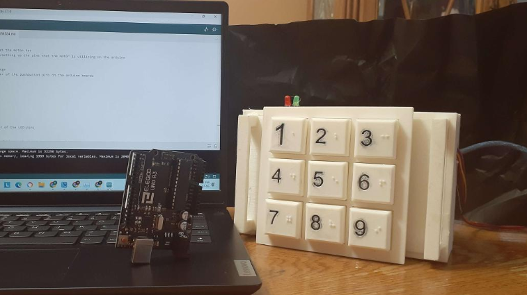
Numerical keypads are common entry devices for everything from home security systems to phones and more. Unfortunately, a great deal of them are difficult to use if you’re visually impaired. This high-contrast Braille keypad aims to solve those issues with simple design choices.
The keypad was developed as a school project by students [Nicholas Nguyen] and [Daniel Wang]. It uses a regular layout, with 1 at the top left and 9 at the bottom right. The keypad itself is 3D printed with large buttons for easier use. Each button has its numeral inlaid on the face which allows it to be easily filled in with paint for high-contrast readability.
The real neat feature, though, is that each individual button features its relevant number in Braille. The pips are directly 3D printed into the shape of each button. For those that familiar with the tactile writing system, this makes the keypad much easier to use. It obviates the need to guess at the keypad’s orientation, and we’re honestly surprised we don’t see this on more devices out in the wild.
We’ve featured a variety of neat Braille hacks over the years, including this neat tactile display.


Am I blind, or there is no “0” key?
Also there are high-contrast and Braille stickers for standard PC keyboards. In my school we used black on yellow, but personally I would prefer yellow on black…
There are 2 regular ways of orienting ten keys. This seems good for Roman numbering only, no zero. The standard ten key has one next to zero at the bottom the way numbers exist in the most basic math. Having one at the top is an anathema to number sequence. It was created by Bell Telephone to handicap fast number crunchers at their desks. TouchTone dialing was new and slow, nearly a half second to register.
One at the top or not next to zero along with 12 hour clocks belong in the dustbin. It burdens some learners and lowers test scores.
It would actually make more sense to design such numerical keypad around standard calculator arrangement, including additional keys…
I had a mechanical wristwatch for blind, where the watch cover and glass was on a hinge. You pushed the button to open it, and then gently located positions of watch hands with the finger – each hour was indicated with a dot (or 2 dots for 12) on watch face…
I don’t know if it’s still true, but cash registers used to have their keypad numbers laid out opposite from calculators (I’ve long since forgotten the rationale for that).
Now i get that the prices in the shops are made with braille cash register keyboards. They all end up like .99
The rationale was obvious – “It’s the way previous generations of machines did it.” :-)
It might be that decades earlier there was some mechanical reason it mattered.
Some time in the late 80s I went to a lecture about Bell Labs which was about
“I really hate that we have to do this, but we’ve got to figure out where to put the Q and the Z”,
because Touch-Tone pads were being used for entering alphabetical data, usually in the “push once for the first letter, twice for the second, 3x for the 3rd”, and you could either put the QZ on 0 (which had problems, because 0 was often special) or on the 7 and 9 (adding Z as the 4th letter on the 9 wasn’t bad; changing PRS to PQRS was guaranteed to break lots of stuff :-)
Clerk in my department in college had a Braille typewriter for making label tapes.
Braille uses six dots, the keyboard had six buttons for the three strongest fingers on each hand and a wide spacebar for your thumbs, so if you knew the letters typing was trivial.