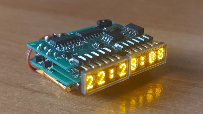
A common design language for watches has evolved ever since they first started popping up in the 1500s. Whether worn on the wrist or in a pocket, watches are relatively slim front to back, with the display mounted on the face. That’s understandable given the imperatives of human anatomy. Still, it’s not the only way to arrange things, as this very cool LED matrix watch with an edge-mounted display demonstrates.
True, the unique form factor of this watch wasn’t really the point of the whole project. Rather, [Vitali]’s design was driven by a couple of things. First off were the extremely cool Hewlett Packard HDSP-2000 displays, with four 5×5 5×7 LED matrices shining through the clear cover of a DIP-12 package. Also visible through the cover are the shift registers that drive the matrices, complete with gold bonding wires.
The main attraction for [Vitali], though, was the challenge of working within the limits of the ATtiny85 he chose to run the watch. The MCU’s limited IO made hardware multiplexing necessary, no mean feat given the limited resources and real estate available. He still managed to pack everything in, with the unique edge-mount display coming from the LEDs bridging the space between the two main PCBs. Everything fits into a nice wood veneer case, although we think it looks just fine without it. [Vitali] puts it through its paces in the short video below.
Hats off to [Vitali] for a great-looking project that pushed his limits. We just love these displays, too; of course, it’s not the first time we’ve seen them put to similar use.


Those sure look like 5×7 displays, not 5×5. So, 40% cooler.
Back when digital watches were cool (late 70s), a couple of friends had side-looking (red) LED watches. Even more expensive than the (still expensive) digital watches, they were standouts in design. Lots of pic exist: do an image search on “side-view led watch”
I thought they were very sensible, not having to flip your whole arm to read the time. The whole need-to-push-a-button-to-read-the-time thing was still lame though.
If not for the pushbutton the button cell would have to have been replaced a few times every day.
“side-view led watch”
…or “drivers watch”. Check out https://www.bulova.com/global/collection/computron/
Thanks!
This kind of design should be a sport watch! I used to jog and always thought that would be nice to lift and twist my arm less. Also buttons could be on top to just tap it for marking lap than catching whole watch to press upper right pushbutton.
My bad, fat-fingered it. Fixed it, thanks for the heads-up!
That’s legitimately cool. Love the way the displays are side-mounted via right angle headers. Honestly I do see the utility in a watch with that form factor too. I may be just a little too lazy and don’t want to go through the effort of twisting my wrist every time.
And nowdays you could have angled lcd for time and top for smart features.
Shut up and take my money!
Sorry – I dropped that comment hoping soon someone would take mine.
This is one of the most beautiful mini dot matrix LED displays I’ve seen! Amber is one of the most comfortable colors. Reminds me of my terminals.