

There’s an interesting cultural observation to be made as a writer based in Europe, that we like our sans-serif fonts, while our American friends seem to prefer a font with a serif. It’s something that was particularly noticeable in the days of print advertising, and it becomes very obvious when looking at government documents.
We’ve brought together two 1980s patents from the respective sources to illustrate this, the American RSA encryption patent, and the British drive circuitry patent for the Sinclair flat screen CRT. The American one uses Times New Roman, while the British one uses a sans-serif font which we’re guessing may be Arial. The odd thing is in both cases they exude formality and authority to their respective audiences, but Americans see the sans-serif font as less formal and Europeans see the serif version as old-fashioned. If you thought Brits and Americans were divided by a common language, evidently it runs much deeper than that.
But What Makes Text Easier To Read?

We’re told that the use of fonts such as Arial or Calibri goes a little deeper than culture or style, in that these sans-serif fonts have greater readability for users with impaired vision or other conditions that impede visual comprehension. If you were wondering where the hack was in this article it’s here, because many of us will have made device interfaces that could have been more legible.
So it’s worth asking the question: just what makes a font legible? Is there more to it than the presence or absence of a serif? In answering that question we’re indebted to the Braille Institute of America for their Atkinson Hyperlegible font, and to Mencap in the Uk for their FS Me accessible font. It becomes clear that these fonts work by subtle design features intended to clearly differentiate letters. For example the uppercase “I”, lowercase letter “l”, and numeral “1” can be almost indistinguishable in some fonts: “Il1”, as can the zero and uppercase “O”, the lowercase letters “g”, and “q”, and even the uppercase “B” and the numeral “8”. The design features to differentiate these letters for accessibility don’t dominate the text and make a font many readers would consider “weird”.
Bitmap Fonts For The Unexpected Win
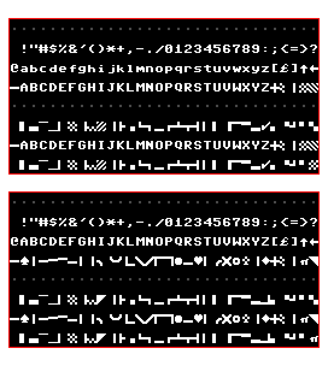
It’s all very well to look at scaleable fonts for high resolution work, but perhaps of more interest here are bitmap fonts. After all it’s these we’ll be sending to our little screens from our microcontrollers. It’s fair to say that attempts to produce smooth typefaces as bitmaps on machines such as the Amiga produced mixed results, but it’s interesting to look at the “classic” ROM bitmap fonts as found in microcomputers back in the day. After years of their just flowing past he eye it’s particularly so to examine them from an accessibility standpoint.
Machines such as the Sinclair Spectrum or Commodore 64 have evidently had some thought put into differentiating their characters. Their upper-case “Ii” has finials for example, and we’re likely to all be used to the zero with a line through it to differentiate it from the uppercase “O”. Perhaps of them all it’s the IBM PC’s code page 437 that does the job most elegantly, maybe we didn’t realise what we had back in the day.
So we understand that there are cultural preferences for particular design choices such as fonts, and for whatever reason these sometimes come ahead of technical considerations. But it’s been worth a quick look at accessible typography, and who knows, perhaps we can make our projects easier to use as a result. What fonts do you use when legibility matters?
Header: Linotype machines: AE Foster, Public domain.


SOME Americans prefer serifs. Just like some (for no sensible reason) prefer EMACS, or Miracle Whip, or the color red. We’re very good at finding ourselves to one side of a dividing line. Are you trying to start a fight? Because we’ll fight. I assume you have offended some Brits, as well.
Yup, not all Brits think serifs are old fashioned.
And she’s also offended all good graphic designers! There’s good reasons to use sans, or serif fonts, and a designer should know why and when. The tldr is legibility (sans wins) vs readability (serif wins).
Also there’s a lot of misinformation about legibility & dyslexia; this article would be a good primer on it: https://www.edutopia.org/article/do-dyslexia-fonts-actually-work
Legibility derives from the Latin verb ‘legere’ which can mean “to read” or “to pick out”.
So what exactly do you see as the distinction between legibility and readability? Are you talking about letters vs words or something else?
No serifs for me, big time NO on LCDs, don’t care as much on paper for some reason, but if you look at fonts on Chinese sourced devices with LCD displays, you will almost always see them. Perhaps they prefer the appearance of serif fonts because, no offense intended, their written language is nothing but “serifs”?
Yes, Chinese is entirely made out of 8 “serifs” or strokes. You can say their names as you write a character, like children in school. Asian art and architecture in general have that look.
Serifs serve two purposes: One is to help the eye read along lines of text by providing horizontal references at the top and bottom of vertical strokes in the letters. The second purpose was to extend the life of physical printing type which is typically made of a fairly soft material such as lead or rubber, such as used in offset printing presses. This would have applied to the typesetting for newspapers, books, and magazines. As the type rolls against the ink rollers and paper, the serifs would take the impact as the type meets those rollers and may wear away with use, but the basic letter will remain intact longer.
Another negative aspect of serif typefaces is that the busier a letter is, the effect of any smearing or smudging increases. People as old as I am that remember when we had Xerox copies of copies of copies, etc., and the small center of the letter ‘e’ would eventually become solid fill and the letters would get blurry over generations of copies. This effect was somewhat accelerated with serif fonts making all the text a bit busier.
In the digital realm, these effects are less of a factor than they were when typesetting was the primary method of reproduction. I believe the cultural aspect is more related to out-of-date style guides and and standards stemming from typesetting days, and less related to legibility.
Those “filled-e” characters usually originated from ink-soaked paper or cotton dust accumulating in the type slug on the typewriter that produced the original document. Of course, photocopies made it worse due to their high contrast.
Serifs predate the printing press by quite a few centuries – the Romans used them when carving text into stone, for example. That’s why it’s called Times New Roman.
Well stated. But Tines New Roman was originally cut by one of the companies who do that for the London Times at one point. It makes the pages easier to read.
So they say, but oh, wait a minute: That would mean that THE BRITISH thought that serif fonts were more readable. Which contradicts Jenny’s original position.
Readability might have been one of the criteria for picking that font, but a much bigger one would have been the cultural impact of using a (literally) classic font. Especially when there’s still eligible examples of Roman writing on walls and monuments around the UK.
The Times was/is a ‘traditional’ paper, so of course they went with a font with a traditional look.
Fonts need to be anti-aliased on digital displays, so the serifs either become smudged out and make the font look blurry, or they cause color artifacts when sub-pixel rendering is used. That’s why fonts like Calibri exist in the first place.
The problem is that most computer monitors are still 100 DPI or slightly less. Even the high resolution 2K and 4K monitors were just made physically bigger instead of making the pixels smaller. To render text at the level of a bad office printer, you need a resolution of 150 DPI or more. That’s why we still have to use hacks like ClearType to make text appear nicer, and why serifs don’t necessarily come across well.
The British patent is much more likely to be Helvetica. While the image quality isn’t the greatest, that looks like Helvetica’s fancy R instead of Arial’s straight-legged R.
(and while Arial existed in the 80s, it was first included with Windows in 1992.)
Having looked at it closely it seems to be Univers which can be distinguished by the upper and lower arms of the letter K emerging from a single point. In Helvetica the lower arm of K emerges from the lower arm a little way from the vertical stroke.
Arial was designed in 1982, so it’s from the right time period. But you’re you’re right – the R is the giveaway that it’s Helvetica.
It’s rarely possible to distinguish typefaces by looking at a single letter – particularly with sanserif designs. It happens that capital R is practically identical in Helvetica and Univers. You also need to look at lower case a and K (either cap or lc) and they are quite different (see my earlier post for the distinguishing features of k) with the bottom right of a having a clear hook in Helvetica which is absent in Univers..
I don’t know the answer but I wish I didn’t keep reading Artificial Intelligence Williams on HaD!
Or put more explicitly a font used in engineering writing needs to unambiguous, surely?
Oh, we got it.
I don’t know who’s to blame, though: the graphic design folks who did our CSS, or Al’s mom for picking that name.
But yeah. At least the “1” in this font has the little hook thing. Otherwise it would be IlI instead of I1l.
Lucky HaD usually uses imperial units of volume instead of litres/liters 🤭
I’ve heard some people claim that serif fonts are easier to read on paper, while san serif is easier to read on a screen. I’m not certain this is true, but it does look like serifs are harder to render at low resolution.
This was true when screens were low res – and will still be true for many of the things we hack together with cheap yellow displays and the like.
But modern “retina” screens make this a non-issue.
Having dated someone who studied typography and graphic design I learned more than is reasonable about the subject – and yes, it’s generally held to be the case by the professionals that serif is easier to read than sans, maybe because the letters flow a little.
How much of that is actual science I don’t know – there’s a lot of rules and guidelines in typography and graphic design / design in general that we all “know” are more or less true but probably impossible to actually prove with science.
For serif/sans I imagine there’s a cultural aspect too – if we were brought up reading serif we may find it easier to read / more familiar.
IMHO, serifs make letters look busier, but that’s over-generalization. There are certain cases ( like the mentioned lower case l vs upper case I vs US number 1) where I’d prefer to have serifs clearly marking one so that it can be visibly different from the other.
O vs 0 is a never-ending conundrum, so unlikely it could be decidedly resolved, and since both are a circle good luck with serifs. IBM’s crossed zero resembles danish/norwegian “œu” (Ø), so it simply thickens the confusion.
I had long suspected that some fonts were types that outlived their original media/purpose, which, I am quite sure, had its reasons to choose those type over potential others. I also suspect that just like the US Fahrenheit instead of Celsius, it may be unexplained/pointless stubbornness.
A good font design for body text (as opposed to headers) always makes 0 narrower than O. And an alternative to putting a slash through a 0 is to put a dot in the middle – IBM used to do that.
I can’t recall a font that does not put the serif at the top of 1 even when the serif at the bottom is omitted. And fonts usually make digits monospaced.
Some fonts also make lower case letters like bdlk, etc., slightly shorter or taller than upper-case characters – Lucida Sans, for example. At small point sizes it’s hard to distinguish, but it’s easy at 12 point or up to distinguish an upper-case I from a lower-case L when one is followed the other. Or the serif might be present at the top but not the bottom of the lower-case L.
A contentious person could say that the barb at the top of the numeral 1 is NOT a serif. I know that Germans put that on it when they hand write numerals. Which is also why they have to put a cross across the 7. I think this was their way of distinguishing the numeral 1 from the capital letter I or the lower-case letter l.
I spent 3 months in Berlin when I was in school, and in my experience they hand-wrote 1 almost like a upper-case italic A without the cross-bar – the “hook”, in your parlance, was the same height as the body. I never picked that up, but to this day I still put the cross-bar on 7.
Only when I got into medicine and had to copy out lab values etc on carbon copy forms did I realize how ambiguous 1, 7, 2 zero etc can be. For when it’s really important I put the crossbar on the 7 and a on a one, a serif on the bottom and the hangy-bar thingee on top.
When in France the one looks so much like a 7 (or an A without a crossbar) I wonder how people get along there. But not good to cast stones ya know?
The issue as pointed out that all these are apparent when using larger fonts (12 points), which is probably plenty for the simple average Sam’s needs (scifi, some simple textbooks, etc).
For the rest, as in “dense printing US A4 page” I found I need sans size 10 and two columns, ie, roughly font size of the cheap paperbook. That’s when things start going unusual. I have a lot of technical documentation at my work (that I have to write and maintain) that need to be in printable format, obviously, back to square one, A4 two-columns sans font 10 points, because there are gazillion screenshots that need proper explanations, commands/code and all. Screenshots, too, have to be printable and recognizable, so that kind of puts limits on how large the font can be without splashing onto second page.
Something not mentioned here, but I always see it in books (admittedly, mostly American) on typography, is a difference between readability and legibility.
Legibility is the ease of distinguishing letters from one another, such as the uppercase “I”, lowercase letter “l”, and numeral “1” or O vs 0 as mentioned here with the accessible fonts. Very important when you’re trying to read an unfamiliar word, or quickly parse a meaning of a word without context, like FIRE EXIT or STOP.
Readability, then, is the ease of reading a lengthy block of text, noting that beyond a certain level of literacy (i.e., no longer a child sounding out words from individual letters) we rarely look very closely at the individual letters in a word but more often recognize the overall shape of a word while skimming over it. Traditionally (again, coming from an American background) serifs are thought to improve readability by visually flowing everything along the line of text, although they be more of an obstacle than a help when appearing on a limited-resolution screen as we often see them now, or in the past on poorly-reproduced printing. I don’t know if the American vs. European division is based on different interpretations on how serifs affect readability, or if it’s purely a cultural aesthetic preference thing – it could be interesting to find out!
The two often go together, but not always – a big bold font, especially sans-serif, may be very instantly legible as a button label or a sign or a title/heading, but would be tiresome to read continuously, making it not very readable.
OR WHEN SOMEONE REPLIES TO A FORUM POST IN ALL CAPS WITH NO PUNCTUATION AND ITS PRETTY EASY TO READ ANY GIVEN LETTER BUT THE ACTUAL COMMENT MAY BE A CHORE TO DIGEST HOWEVER THESE TYPES OF ALL CAPS POSTS SEEM TO RARELY ADD ANYTHING OF VALUE TO THE CONVERSATION SO ITS OFTEN BEST JUST TO SKIP OVER THEM ENTIRELY
i think you’re unfairly maligning people who post via telegraph
…or Teletype…
THE QUICK BROWN FOX JUMPS OVER THE LAZY DOG 1234567890
RYRYRYRYRYRYRYRYRYRYRY
If you can easily read that, you will do well with ancient Greek inscriptions.
yeah a lot of the comments here are pretty good but youhit the part that i really care about — I vs 1 vs l. When i’m hand-writing, i put serifs on my uppercase i. And, related, i put the tail on my lowercase t to distinguish it from +. Otherwise, i don’t really care for serifs anywhere. Just a few cases where they’re functional.
Since I first learned the “European version” of 1 and 7 I’ve been 117 percent on board, sadly the font here lacks the crossbar on 7. In my day we used “l” lowercase L for “1” but it had a serif and we wore an onion on our belt because that was the style at the time.
You should probably work on improving your handwriting if you are having a hard time with t vs +.
Writing t with a tail is perfectly sensible, but wouldn’t be necessary if the line segment below the cross was longer than that above. Centering the + with respect to the top and bottom would also reduce the risk of confusion.
“For example the uppercase “I”, lowercase letter “l”, and numeral “1” can be almost indistinguishable in some fonts” You probably mean, like the one used on the Hackaday website.
This: AI Williams – AL or A.I.? Just kidding, we all know. No, just kidding, nobody knows:)
LOL +1
This has long been an annoyance. I wonder if HaD can be persuaded to switch to a better font?
Yeah, right after they enable deeper nested comments, and fix the “email me new comments” button which has been broken (in Firefox at least?) since about 2023. Others will also say they need an edit button… but if we had more nested features we could just post edits in new comments as necessary. Oh and the weird comments that show up as a “reply” even if we tried to post them at the end.
All that said, I really really appreciate the wisdom of the greybeards on here, and if Hackaday made any big chance that drove such people away, it would become a much poorer site to read.
I would be willing to leave it to personal preference, except for the overwhelming majority of fields in Web forms that use a sans-serif font. For those of us with names that include an i followed by one or more l’s and another i — it is often difficult to distinguish whether we are misspelling our own names in a sans-serif font.
I love the computer generated passwords with 1lI’s or oO0’s in them that you can not tell what they are. Many times I’ve had to cut and paste them into libreWriter to figure out what it was… Same with Captcha’s. What a waste of time.
In a past life I was responsible for giving new users their initial password, which was random(ish)ly generated.
Ended up with a script that told them “Your password is ‘0oOB8Il1’, which is the number zero, the letter little-oh, the letter big-Oh, the letter big-Bee, the number eight, the letter little-ell, the letter big-Eye, the number one.”
I can’t say as it entirely eliminated confusion, but certainly eased matters, and made folks laugh. Had a lot of positive user feedback, always rare and always nice.
I imagine quite a bit of it has to do with our differing business and economic cultures as well. Until the 80ish fonts were expensive and some companies would have people come in to make them a font instead of paying to license one. Governments would go with what they had instead of using up budgets on something silly, unless using up the budget was the point at which point a company would be contracted to license their machines and the donts therein. (IBM especially).
This is true of the US I know. ..I imagine those conditions varied greatly internationally and with the variation of the sources of technology and how local printing press interests intersected those choices.
Its only in recent decades that our choices for decorative purposes and convenience have been enabled by technology (and probably people ignoring the ‘rules’ en masse) where we’ve been able to so casually choose fonts according to our whim and preference.
I did a gig recently to update some PCs to new hardware that can run Windows (N+1). The client wanted a printed label with the pseudorandomly-assigned Windows machine name affixed to the monitor. Problem was, the name was displayed on-screen in a typeface whose glyphs are ambiguous. To disambiguate them, we’d copy-and-paste the text into a Notepad instance, where the serif typeface gave enough hints to distinguish an l from an I from a 1, for example. (B/6/8/9 can also be problematic.) I switched my label printer to the serif font to reduce the likelihood of users having the same problem in future, and I’ve kept my labeler set that way ever since.
Sans serif may be easier on the eye and a quicker read in a book, where your brain reads entire words or even sentences, not individual letters. But for random text in which it’s necessary to discern each letter without ambiguity, I’ll take advantage of the extra hints that serifs provide.
I have noticed along time ago, that British magazines like PC Magazine is easier to read that US magazine.
If you are easily offended, please just skip to the next comment.
1) It is my considered opinion that most fonts which are chosen (as opposed to those that are used because they are the default) are chosen not for their legibility or readability but for their style.
When I read the NY Times or the Atlantic, in print or on their web site, the presence of the serifs gives me a feeling of confidence that I don’t get when I visit CNN, or even the BBC.
This feeling of confidence may not be present in younger generations, who may have grown up placing their trust in sources with more modern fonts, but if I want to be taken seriously, I will choose a font with serifs.
2) My main issue with Hackaday is the use of all capitals in their headlines. More than once I have thought that an article about F.P.G.A.’s was about something that could be called FP-gas. I brought this to their attention, but they very politely said they were not considering a change.
3) I went to the Braille Institute’s web page to check on the Atkinson Hyperlegible font, and no matter how I ran my fingers over the screen, I was unable to distinguish the letters.
When I opened my eyes, I found the Atkinson very legible, perhaps even hyper-ly so, but it reminds me of learning to print in first grade. I don’t think I would be taken seriously if I used it.
If I had a web page, however, I would want a little button in the upper right hand corner (right where “Log Off” is supposed to reside on EVERY web page) that would allow the viewer to switch the font to Atkinson.
(Don’t criticize the Braille Institute: they are quite touchy.)
I would like to respectfully disagree with your assertion that style is the primary factor, BUT I CAN’T. I looked at the Atkinson font, and my first impression wast that it looked elementary. The opposite of stylish. So good job of proving your point.
Thanks for pointing it out – i love the Atkinson Hyperlegible font! I want to use it for everything. But i remember the nightmare it was last time i installed the chrome plugin to override the default font on every website, and i will not be doing that again. Defaults forever. Sigh.
How wonderful that you can crowbar your political opinions into a completely unrelated article.
(Restated.)
Tines New Roman was originally cut by one of the companies who do that for the London Times at one point. It makes the pages easier to read. In fact I believe it was originally the Monotype company who did so. Eventually it became part of the catalog of fonts for the Mergenthaler Linotype company. Oh and thank you for selecting them for the lead photo. I am amazed and delighted. I know the machine reasonably well.
Here is my default toolbox:
Code: Go Mono (Nerd Edition) or Hack (which is an improved version of DejaVu Mono)
Technical text: DejaVu Sans or Inter (the Helvetica-Univers-Arial for the 3rd millennium)
Small displays: LektonCode, Agave, ProggySquare, Crystal
Prose: Merryweather
Typewriter: Courier Prime
And a lot more of it fits the purpose better.
haha code should be a scaled up 8×16 bitmapped font ripped from a 1990s VGA BIOS and rendered in xterm at 80×25 :)
LoL. But ultimately no.
I have had enough retro for a lifetime every time I had to use a virgin Putty because that was the only way into a machine.
I think it’s 8 wide and 12 tall. 8×12, usable area 7×11.
And yes, the font choice of Hackaday falls into the clue-less category. Why doesn’t the team take a hint?
Shoutout to Artificial Intelligence Williams! You rock!
I learned to read at home from the fairy-tales my father read to me. These were books intended for adults to read aloud to children, and set in serif type faces. When I got to school we were given reading-books set in Helvetica. I thought that the pubishers had decided we were all too stupid and ignorant to read text with serifs, and felt patronised. I have disliked Helvetica ever since. (No, I didn’t know the name of the font when I was five, but I recognised it later.)
There might be a couple other influences. The Early colonies and then USA were around 30% German. Their descendants are still the largest ethnic group in the US. Many people learned to read and write from family Bibles, which were always printed in a nearly Gothic Germanic font.
Then there is Microsoft. MS stuck with that truly awful system font forever. It is just plain wrong for a low resolution display technology. So generations of users and programmers apparently came to expect a font with serif-like attributes.
Apple MacOS WYSIWYG + LaserWriter changed expectations and appreciations. I think printing the MS system font on paper looked pretty bad but don’t remember the last time I saw it. Adobe Postscript prompted deep analysis of fonts and graphics.
IIRC Scott Kim got the first graduate degree in computer typography under Donald Knuth at Stanford. Someone should ask him about this.
There was a moment in the late 1990s when a lot of real publishers produced a ton of books that looked like garbage. I think they believed that desktop publishing was “as good as” whatever they were doing before…and it wasn’t (yet). And all of those books look like awful in hindsight. I’m not sure if i’m historically accurate but i blame it on that apple laserwriter revolution. People got so excited about how much better it was that they didn’t notice it was still not good enough for serious work.
It was very good if done well. Don Lancaster was an early advocate and switched all his books to print-on-demand as the commercially printed inventory ran out. I think it was all done from his home in Thatcher, AZ. He also did all his graphics by writing the postscript. He did a lot in AppleWriter because you can embed code in it – like Postscript.
+1 for mentioning the Guru.
I was having trouble with reading comprehension and retention, i.e. reading a page three times and still not remembering it. In high school and college it was annoying, as a 40-year-old who writes for a living it can mean lost hours of productivity, especially now that I likely need reading glasses.
I did some digging and found Lexend Font for dyslexia. Its helped reduce the “stress” of reading quite a bit. Sometimes I’ll have to change the background color I’m working with as well. White text on black or dark shades of blue or gray seem to help too.
Struggled with terminal and powershell bit map fonts until I found out you could install new ones. Really like Nerd Font (IBM 3270).
Our eyes are relatively imperfect optical systems, and much of the discussion here relates to personal preferences. A long long time ago I worked on testing optical imaging systems and learned just enough about concepts like Modulation Transfer Functions to be dangerous (this defines how things get blurry in any optical system, which includes the Mark One eyeball). One thing I learned from experience that reading black type on a white background, the words and letters are much clearer (to me) than white type on a dark background. I do a lot of powerpoint presentations, charts, graphs, etc., and when I much use white type on dark background, I usually make the font bold or use a larger font size to make it more easily readable. When I pick up a magazine that has sections with white on black text in the same size font as the rest of the issue, I often find it nearly unreadable, as the black tends to optically wash over the lettering.
Has HAD covered the Linotype machine, its history, and its inner workings? That’s the crazy machine used for the cover image on this article. That mechanical monsterpiece is worthy of it’s own in-depth article…
Update: Yes it has!
So you came back to post that, but didn’t paste a link? Rude.
For other people reading this thread, one example is https://hackaday.com/2018/10/13/save-a-linotype-machine-for-future-generations/
But of course I have no idea which article the “Chr El’ was thinking of.
Just using the English alphabet — upper case and lower case — and wanting to be able to clearly distinguish each character by itself (Tiny5 does not do that), the minimum width is 5 pixels (H, M and N need that). So, 6 pixels needed with spacing for the width.
For the height 6 or 7 pixels. But too little and the g and 9 might not be distinguishable by themselves. So, 7 pixels and a blank line makes 8.
Thinking 6 x 8 at a minimum. I’m sure some engineer predating my horizon by a few decades will have come up with that around the turn of the last century, predating any 80’s tech by a long long long time.
https://simplifier.neocities.org/4×4 a little more than half that size, it is
The best font in the whole wide world is the one you prefer at the moment. I wish I had more control.
Thanks for the post Jenny! Font readability is a topic I wish was more talked about. I am dyslexic, and some fonts drive me absolutely nuts (particularly all caps). I have used all manner of readable fonts including the rather interesting Open Dyslexic. But I have found my preference to be monospace “programmer fonts”. Jetbrains Mono has been my choice of font for years, and I generally force websites and Linux apps to use a consistent font as much as I can. And yes, I read e-books and Hackaday in monospace.
I thought we abandoned serif fonts because they simply didn’t work on EGA/VGA CRT displays.