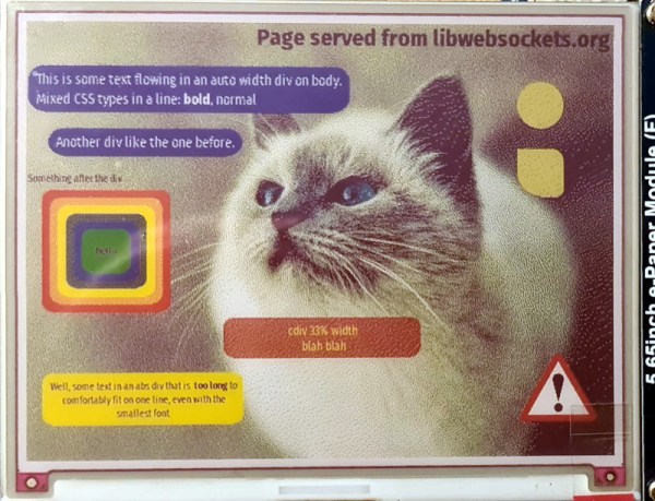
As the available computing power from affordable microcontrollers continues to increase, there is an inevitable blurring of the line between them and the lower tier of application processors capable of running Linux-based operating systems. For the most part a microcontroller busies itself with behind-the-scenes tasks, but as so many projects here have demonstrated, they can be pretty capable when it comes to user-facing applications too. Now [Andy Green] has extended the possibilities with affordable silicon, by producing a proof-of-concept HTML + CSS renderer over h2 on ESP32 for libwebsockets. Surf the web on a microcontroller without settling for a text-only experience? Why not!
He freely admits that this is far from being a complete HTML rendering engine, in that while it parses and renders HTML and CSS with JPEG and PNG image support, it does so only with a subset of HTML and is not tolerant of any malformations. There is also no JS support, which is hardly surprising given the available resources.
Even with those limitations it remains an impressive piece of work, which we hope will one day be able to make some effort at displaying Hackaday on ESP32 devices such as the badge.team European conference badges. Definitely a project to watch!


