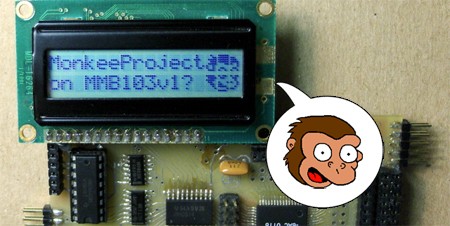
[Dean Hall] doesn’t seem to know his Simpsons characters very well, but that didn’t stop him from coming up with this method for displaying a bitmap on an LCD character display with a Hitachi HD44780 chip.
[Hall] used an LCD with two 16 character rows and 8×5 pixels in each character. He displayed the image over 2×3 characters, which gave him 17×18 pixels (including the spaces between the characters) to work with. The first step after acquiring an image is to rasterize the image by hand onto graph paper. This won’t be scanned, it’s just a diagram to determine which pixels to light up.
Once the 6 characters were determined, [Hall] used this handy web-based tool to convert his graphed diagram to bitmap data. The data is loaded onto the microcontroller and the image shows up on the LCD. This is a pretty straightforward project, just be sure you properly identify your monkeys.
[via YourITronics]


good use of existing technology being used for its predetermined use.
I don’t quite agree with rasterizing to paper — personally, I’m much better off with zooming in MS Paint, using the pencil and showing a grid if necessary..
Would be awesome if you could do it w/ lcd smartie. I have an lcd set up to my computer at work so I can display song info w/o having my monitor on. I also have a remote control for winamp too so I can pause my music when the boss walks by.
What exactly would be so hard about writing some conversion software here and forgoing the manual plotting and web based upload?
I’m confused as to why it’s such a dirty hack. Would perhaps be more enlightened if the site hadn’t crashed and left me in the dark about the write-up.
@3: With so few pixels, hand-rasterized art is likely to look better than something that’s been computer-resized. At very least it’s going to have to be hand-edited to look clear.
@thegimpster: I’ve done it in LCDSmartie before, this was several years ago but I’m sure they still have the feature… Didn’t look as nice as his, but see mine that I did in LCDSmartie: http://zenith.notepadhax.com/uploader/uploads/pbj.jpg
I’m thinking that monkey might actually be Gunther, from Futurama, I havent googled it to be sure. Being a Groening thing too the artwork is very similar, but he appears to be missing his hat…
Ummm nice project, but to state the blindingly obvious – the gaps between the characters ruin the effect quite a bit I think.
Only problem is, those chips can only hold 8 custom chars, so you wont be able to have completely custom picture on alphabetic lcd