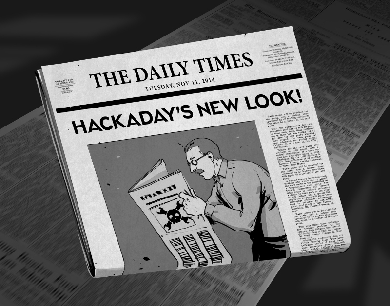
There comes a time when your movable type becomes so over-used that you no longer get a legible print off of the printing press. For months now we’ve been at work on a new site design that maintains the essence of Hackaday while ejecting the 10-year-old dregs of the site. With each small success we’ve actually ruined ourselves on viewing the old design. It is with great relief that we unveil a site design built specifically for Hackaday’s needs.
The most notable change is in the content of our landing page. For ten years, loading Hackaday.com resulted in the most recent blog posts. The blog concept is proven, but provides little opportunity to highlight quality original content and information about upcoming events. We have tried the use of “sticky” posts but honestly I find them somewhat annoying. The solution to this is not immediately apparent, but I feel we have found the most efficient solution to our complex set of needs..
We have a lot of community members who participate in Hackaday in numerous ways. Changes found in this design are driven by that fact. The landing page will, from this point forward, be a somewhat more persistent collection of notable content from the blog, our community site (hackaday.io), as well as news regarding live events, store features, contest highlights, and more. Those hard-core fans — a label I also assign to myself — will find the same reading experience as always on the new blog URL: hackaday.com/blog.
Aesthetically, we hope that all will agree the new design far supersedes the old. There was a lot to fix, and the work of the Hackaday crew who designed and implemented this new interface is truly amazing. I hope you will take the time to leave a positive comment about their work. As with any major transition, there will be some bumps in the road. Right now most of our sidebar widgets have not been migrated but that and any other problems will be fixed soon.
In this design we strived to highlight the title and image of each post to immediately convey the core concepts of the projects shown here. The author by-line and comment count remain core to the presentation of the articles, and our link style continues to be immediately apparent in the body of each article. I think we have far surpassed the readability of the comments section, in addition to the content itself. We knew we could rebuilt it… we have the technology… long live articles worth reading.
UPDATE: We are working very hard to fix all the parts that don’t look quite right. Thanks for your patience!
UPDATE 2: Infinite scrolling isn’t a feature, it’s a regression. On our test server all the blog listings were paginated just like always. When our host, WordPress VIP, pushed live the infinite scrolling manifested itself. We’ve filed a ticket with them and are hoping for a solution shortly.
UPDATE 3: Infinite scrolling has now been fixed and the blog layout now paginates. The mouse-over zoom effect has been removed. Slideshow speed has been adjusted and if you hover you mouse over a feature it will pause the scrolling.


I guess I’m in the minority, but I like the new layout.
That being said, there are a few things that I would change if it were up to me to do so:
1: reduce the font size a bit on the front page
2: use proper capitalization rather than writing in all caps
3: slow down the autoscroll and reduce the amount of text to a simple sentence each
4: center the text, everything looks lopsided on my screen (1680×1050)
5: give us an edit button
Thanks for all you folks do, and keep up the good work.
We fiixed the scroll speed once but it regressed during another fix. We will correct it again soon.
HaD it’s a site I browse and recommend everyday,smaller font and pictures means I am able to get much more information at a glance in less time and choose the article I want to read using only the up-down cursor keys, maybe the “traditional” green and black color scheme was easier on the eyes.
I will have to get used to typing the blog address, and configuring it to open automatically where necessary.
Other than that, the “older Posts” button should open another page, not just add some in the same page. And it doesn´t even put the focus in the starting place of the new group .of posts.
On the plus side… I’ve not seen this many comments about one HAD page.. since… well… probably the last style change. Oh… and I quite like the VT220 phosphor colour, but it should have a slightly stronger nicotine tint for full 1980s authenticity… BTW the VT220 had four edit buttons
Yes, too large, I had to knock my zoom down to 75% to keep from overloading my brain, with large fonts and over sized images.
All this hate and no one’s mentioned Arduino!
Change happens. Roll with it.
I feel like what I imagine an autistic child experiences when being volunteered for an ice-bucket challenge without consent.
Best comment so far, even if i disagree.
Honestly i like the new look. Everyone hated the change from Hotmail to Outlook at first (me included) but it grows on you. Im sure this will aswell
Oh no… Please pick a different metaphore. LoL
Okay, the last month, projects posted on hackaday was more and more uninteresting….now they change their design to a more mainstream thing….whats next ? more ads ?
sorry, but it looks like the sellout has begun…
April 1st happen already, this has to be a bad joke ?
I actually like the new design. Keep up the good work!
My only complaint, and it is a small one (as I figure I’ll get used to the new layout) is that I can’t find the “older posts” button or link on the 1st page.
You now have to go to http://hackaday.com/blog/ and click the “Older posts” at the bottom of the page, which will load up more posts into the same page, then scroll down and click the “Older posts” to get further back posts,
It’s a stupid and slow method of accessing the vast archive of years of posts, especially as you can’t jump to a specific page and your browser will slowly use up more RAM whilst it incorporates more and more text & images into the page, so probably not very friendly to the relatively small amount of RAM on tablet-like devices.
If you’re using NoScript then that “Older posts” link won’t appear, you have to allow hackaday.com and wp.com, a change I don’t like as I try to minimise the amount of javascript running because I often have multiple tabs open on multiple sites.
We’re working on fixing this. Our tested behavior was paginated exactly as before. When our host, WordPress VIP, pushed it live this manifested. We’ve submitted ticketa with them and expect a fix.
I hate change, ask again in a week.
Glad to see the report flag removed. That’s what moderators are for.
I still don’t see the much needed ‘edit’ button.
Oh, and where did the link to the forums run off to?
I’m not unpleased by the new theme, ok, big fonts, but that’s not that bad… but c’mon, hackaday green was like a brand, like a slogan, like… hackaday. Get back the green!
The text needs to be green. Otherwise I will start to hear voices in my head again.
I don’t like change :(
Do whatever the %*$& you want. I’m here for the info, not the fashion show.
It’s like haircuts. There should be no apparent change if done right. Instead of…OMG!
If something needs changed you don’t need to do a “makeover”.
I use Classic Shell on W-7 and “best performance” mode so all the shadows, imitation glare, and animations are gone.
I can’t believe all the names for the AADADHD inducing crap at the top. Sci-Fri on NPR went to the stuff and the same articles are visible stationary below. So it only aids AAADADHD, the first A is for acquired.
No animation.
A couple of minor css corrections and I think you have nailed it…
font-color: #0C0
background-color: #ffffff
.. oh…. and an Edit botton for the comments.
I think that lumping all negative feedback about a change into “You hate it because it’s new” is just as indefensible of behavior as people who do just hate it because it’s new. It’s a cop out that can justify literally any change (or to complain about any change).
I mean, if HackADay turned into Yvette’s Bridal Formal, and there was an outpouring of “this is awful!” you could say “Yep, every time we make a change there’s an uproar of people complaining about it because they don’t like change.” This would be false, people hate it because it’s terrible, but you can still falsely excuse it away.
Yes, some people literally hate it just because it’s new. The old design was familiar, even if it sucked (and even if it sucked in the opinions of people who are complaining), it’s the devil you know. It’s a group worth catering to in the sense of, don’t make big changes too often. For example, if the design changed every week, even if it was better, people would eventually say “enough already, I’m tired of re-familiarizing myself with the site.” One overhaul after years is not going to upset many people on the grounds of “change itself is bad.” Some grouches will complain now but love it later. This group exists, but it’s fairly small, and I think it’s disingenuous and lazy to frame the majority of the criticism in this light (especially because it requires zero defense to explain it all away that way). It comes off as excuse making.
Next is the old guard who are worth listening to up to a point. You have a selection bias from your past readership because it’s people who already liked what HackADay was. Even the ugliest site in the world would have its few fans, and they would complain loudly if the thing they liked became something else (beyond it just being unfamiliar). But, all the people who hated what HackADay used to be… aren’t here commenting praise with the changes because they’re not part of the community. All the people who from today forward would stay because they like the new design, but would not stay with the old design… aren’t yet commenting praise. And probably won’t because they won’t have the old one to compare to. At some point, there’s going to be a loss of people who liked the old design no matter what, and gains of new people who would not otherwise be here. Hopefully the new design makes the tradeoff better. This is also small though, a few percent either way.
Next is the large group actually worth listening to. People to whom a change once every few years isn’t a big deal, and people who would not be passionate about the old design even if it sucked. The open minded majority.
Of this group, people that are happy probably don’t care enough to comment, because they’re happy, so it’s hard gauging their numbers. The people that are unhappy are probably commenting, or at least reading to see if someone mentioned the things they didn’t like about the change. So, their numbers are hard to gauge too. If they see all criticism getting stubbornly piled into “you just don’t like change”, they won’t invest in trying to make things better.
…
I’m sure a lot of readers are questioning the motives of the changes, especially with the change of ownership last year. Were these changes something that was called for by the community because it makes a better website, or is it something that hopes to make more money for investors/owners?
In particular is a big fear about this being a precursor to dumbing down the content so it’s digestible by a larger and more profitable audience. In television everyone knows this as “Channel Drift” ( http://en.wikipedia.org/wiki/Channel_drift ) SciFi channel became SYFY because they wanted to add programming about magic, supernatural, and paranormal stuff. The Learning Channel became just letters “TLC” which is an abbreviation for nothing. MTV became reality TV unrelated to music. We saw it on our favorite websites like Make and Instructables after they got bought. Gee, the numbers of crafty-moms outweigh makers, let’s add categories for easy and vapid cooking and crafty stuff that drown the good content but keep numbers up. The local science center has started spending their exhibit budget on play parks rather than science exhibits, because gee, kids like amusement parks more than science, keeps the numbers high.
There’s no question that HackADay serves a niche. There’s no question that it’s more profitable to expand to a larger readership and pay lip service to the niche. When a site is corporate owned, that’s pretty much the end of the discussion. Serve niche… low profit. Serve lower common denominator… higher profit. Niche things start and flourish for being original, but can’t grow forever because they’re niche. They stay niche while the owners are passionate about the niche, then bloat and float away and new communities form to fill the hole.
Were HackADay readers calling for HackADay to turn into another Instructables, Make, etc with projects? Were readers saying “Gee, there just aren’t any websites out there for me to document my projects and tell people how to make things. Please create this!” Or did they just want a website that curates their niche content and delivers a few hacks a day?
The space contest was awesome. It’s a huge carrot to dangle to try to attract readers to use the projects subsite. It seems to be kinda failing. People used it to give it a try, or because they had to, but when given the choice other sites do it better.
Were HackADay readers wanting Hackerspace listings here? Or did everyone who cared know that it only (poorly and incompletely) duplicates the list maintained on hackerspaces.org?
Were HackADay readers wanting the flying article carousel at the top of the website like we have now? Was that something missing? Is it a better way to digest the content? Or is just a flashy fad that hopes to attract different people? (Hint: It’s not just an issue of getting the flip speed right, don’t dumb it down to that).
And so on. The new owners are clearly trying to grow the community, and doing some fairly good things with that ambition, but to the community that exists now, that may simply never satisfy. There’s a pleasant, simple, unique scope to HackADay that makes it what it is. It’s starting to swell in directions that may be unfavorable.
Myself, I like to wait a couple weeks before forming any solid opinions. This keeps me honest and makes sure I’m not just complaining because it’s unfamiliar. In the end though, I might not provide further feedback. I may just say “This isn’t for me anymore” and quietly disappear.
Hear Hear, listen to this man, for he speaks the truth.
This should be stickied somewhere.
Thank you for your reasoned, articulate discription of the problem.
This was very helpful. I think now, I get it.
Hackaday, I’m not your peeps. I like high-tech and low-tech projects that I can mostly understand. I look at the emails because there’s always a chance that someone is doing something that I might want to incorporate into one of my projects.
However, I’m a jack-of-all-trades kind of guy: I can play Hendrix with the guitar behind my head, but can’t read music, or play even half-assed jazz; I can write a passable program in VBA, but anything harder than VBA, which includes most things that would appeal to this community, is over my head; I like chemistry, but am a pretty poor chemist.
I think ultimately, those running this site need to decide if they want to alienate dabblers and dilettantes like me, or embrace them. I can’t say if one or the other option is wrong. I’m not sure if there is a “wrong” here. I will say that sites that embrace people like me probably have a lot more money at their disposal. It’s sort of like the discussion regarding Radio Shack. Should it become more like Best Buy, or like Mouser? Or, given the depth of their financial sea, can they really do either?
This is the “real” breakdown of the situation, it’s sad but true.
I think that it is kinda bad, but I will use it before I say that it is for sure. :-)
Um, I think it looks better. I like that it’s dark grey rather than none-more-black black, which always comes off like a hard rock band motif. I know everyone feels that all caps only means shouting, but it’s actually a style choice. To say that it only signifies shouting, is like saying e.e. cummings only whispered. I’m not advocating wholesale reading of the Cambridge Ladies here, I’m just saying that we don’t have to be quite so black and white about things.
Help! I think Hackaday was hacked. The layout looks like it was done with a hacksaw.
did something change?
Nope – not a fan. Looks like it will go from hack-a-day to “hack every couple months when I remember to check the page” for me.
Ugh. Is not there any way to return to the old design?
Hackaday in 2005: http://web.archive.org/web/20051013071841/http://www.hackaday.com/
The linked version has an article about HaD becoming an independent site… Is that a coincidence or a clever nod to the new owners on your part? :-P
I like the UX design pattern stuff. Nicely done.
I think it looks great, and this is honestly the first time in about five years of daily visits to Hackaday that I visited the store. I don’t even remember when you opened a store because the link to it was so nondescript.
I think it’ll really help the “business” side of Hackaday. I’m all for that!
As a caveat, though, if tech-related aggregation of original content stops being the predominant feature of this site, I will abandon it in a heartbeat.
As a HaD reader since the very first post, I won’t loose my time on criticism, I’ll simply use this time upgrading my bookmarks to the /blog version. The upper case change and the coloured images (without tape!) one were harder back then… On the orange instead of green, I think I may accept it eventually (I used and liked both phosphors). But what the fuck is the “read more” link? I stopped visiting makezine’s blog for that! And what about adafruit’s? Two clicks to read an article? They must be kidding, I want to read and scroll, no more! I hoped this was the last authentic old-school site, but…
Okay, on a “modern” LCD screen 1900xwhatever, it’s effingannoying to read, even moreso than on a 1024×768 CRT. I didn’t think it was possible to have TOO MUCH CONTRAST til’ now.
Please, revert. And ditch the carousel thingy too.
The new layout is not bad. Do miss the green, and I’d prefer it if the background was even darker.
The biggest thing for me is the size of everything. It’s all massive. I’m having to do a lot of scrolling to read stuff, I only get a couple of comments on the page and I’m using 1920×1080. Articles are the same. Font size really needs to be dropped. Abusing the CSS via Firefox debug tools and knocking it down to 95% seemed like a fairly decent size.
The margin space on the left and right could do with being smaller as well, mostly to reduce text wrapping and scrolling. You’re losing a good 30% of real estate to nothing. Centralised content is fine, but there’s a very fine line that’s easy to step over with left and right margins that just makes things bad.
Aside from the sheer size of everything, it’s not actually that bad at all.
You guys just need to back off, I mean, they just went from green screens to the amber… LOL
Technology moves on… maybe they got a discount for getting the huge fonts.. ; )
As for the new style, Meh. I rather enjoyed the old, now you’re just like the rest. I see the only thing you’ve
lost is your individuality. I’ll try it out on a few other devices and give feedback ifn you want.
wrl
To quote the Doctor: “I see you have redecorated – I don’t like it”. First reaction is the fonts are too big and the whole thing looks like it was designed by Fisher-Price.
I’ve no problems with the new layout, just please please PLEASE never disable pagination like those morons at the make blog did. I just about shat a brick when I saw the “more posts” button, but after I scrolled down I saw the “page/2” part of the URL and figured changing that would get me in the archives. Please for those of us who like to browse old articles leave that in place – it’s beyond painful having to go through an “endless scroll” website past a few days.
Edit: so I’m stupid. Turns out you can do that in the make blog too. Phew!
Eh.. no like… the font, it’s weight and size… all teriible. Hard on the eyes.
Well it’s certainly a BOLD look, haha. Maybe a bit over the top in places, but I mostly approve.
Limiting myself to usability issues rather than aesthetic preferences:
1) I don’t like breaking up comments into several pages. Seems like needlessly breaking up content, and certainly adding needless clicks. If I’m interested in the latest comments, there is no way to go directly to last page. Instead I have to scroll down to “newer comments”, click, wait for next page; repeat for each page. The site doesn’t even show how many pages there are, if it did, I could at least alter the page # in the address bar. If I’m awaiting a reply from someone on a comment I left, I can’t just Ctrl-F my name on a single page anymore either.
2) On first load, there was a long delay. Enough that Chrome timed out and asked if I wanted to kill the non-responsive page. Only happened once, can’t make it happen again, and not sure if it’s actually a site issue. Mentioning it just in case, as I seem to recall there was a bug causing a similar issue after the last major redesign.
I’m done. I’ll check back in a week for the old layout.
The old layout gives the feeling of home-made and is relevant to the hackaday crowd. The new layout spells profit margins. Sorry to see you guys go.
Ok just a follow on comment – please retain the paginated structure of the old site – as far as I can tell, I can only see the last half dozen posts. Not good – I am afraid that the site has fallen into the trap of being over-designed and under-engineered.
I for one really like the new layout.
It looks a lot more crisp and professional, and also you can never go wrong with white on black.
Make the background pink with grey text and put everything in size 12 comic sans for all I care. I come here for the content and if the layout helps to improve the site to make sure it continues to grow so that we get more good content and stuff like the hackaday prize I’m all for it!
P. S. Did there always used to be a box grouping all of the comments?
Yep
Hackaday, are you serious? Your theme before was BEAUTIFUL.
This is UGLY, HUGE, BLARING, and HURTS MY EYES. Seriously, I have eye strain.
Please change it back, please.
I use a 1600×1200 21″ display in portrait mode. I think the side scrolling is a huge improvement in ergonomics. It makes reading articles much more interactive. I get to move my mouse from the side bar to the bottom bar for each line I read.
Did you hire the Windows 8 team for this?
Headings are too big and SHOUTING…
And imagex too big.
The one on this pist is taller than my tablet screen.
I have to xcroll down to see the whole image.
Totally out of proportion.
As you can see from my mistyping im on the tablet soft keyboard at the moment.
Seriously cant your style sheet scale for different screen resolutions?
Probably already mentioned but the site gets cut off when you go under 860px(ish) wide. I have multiple windows open at a time and this is a frustration. The old site was more responsive in this respect.
I’ll give it an honest shot. Good to know there is an option to get fairly close to the previous HAD. Mobile viewing isn’t horrible, but instead of making a full mobile browser experience, just address a font size change. I also think the background and text need tweaking. It is causing eye strain quicker.
I like some parts of the new layout. The font is nice, I like the slide show but it needs to pause on each slide longer. What I loved about the old layout was how it looked the same on my phone and desktop while being readable on both. The one thing that always bugged me was how tiny the older posts link was at the bottom of the page.
Is there anyway to get the best of both worlds here? Bring back blog posts on homepage, keep slideshow with a few tweaks, keep the new fonts, and a few of that others have pointed out.
I just want to go to hackaday.com and see a hack a day so to speak. Call me crazy.
Keep trying though, I like change as long as it’s improvement
Hack a day – first a thank you for a great site. On the new layout – my 2 cents:
Banner – its too big
Fonts – too big
Format – viewing in iPad mini – columns are too narrow – too much scrolling, scrolling scrolling..
The old format – the green screen – was just right – somehow it had the efficiency and legibility of a VDU. Understand the requirement to move platforms – a beta trial might have been the way to go – but if it ain’t broke..
Only a few tweaks on the size it’ll be good to go
Oh and ditch the carousel – why is it needed at all?
Your eyes can detect more levels of green than any other colour, it’s one of the reasons why exit signs are green, and if I remember reading rightly, green is the last colour your eyes can distinguish when they’ve been damaged by a toxic chemical…
I do miss the green on black, can’t recall any other website having the same colour scheme. Plus it’s nice on the eyes in the dark.
I DON’T KNOW WHAT WE’RE YELLING ABOUT…
LOUD NOISES…