Anyone who’s into retro aviation gear falls in love with those mysterious displays, dials, keypads, banks of knife switches. There’s a lot of sexy in those devices, built with high standards in a time when a lot of it was assembled by hand.
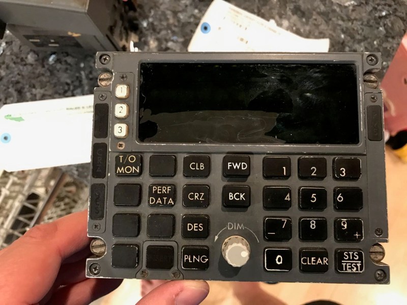
 [Jeremy Gilbert] bought a 747-200’s Control Display Unit (CDU)– the interface with the late ’70s in-flight computer–and is bringing it back to life in a Hackaday.io project. His goal is to get it to light up and operate just as if it were installed in a 747.
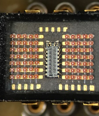
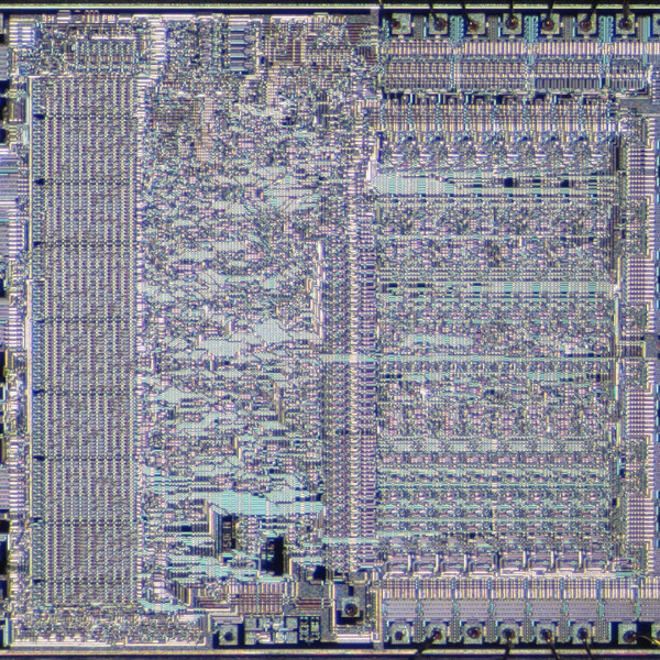
Of particular interest is the display, which turned out to consist of a series of 5×7 matrices (seen on the right) controlled by chips no one uses any more. However, [Jeremy] found a blog post where someone had hacked out Arduino code for a cousin of the chip, saving him a lot of time. However, he’s got a lot more sleuthing yet to do.
If you’re into retro displays, we’ve mentioned a number of good ones, including the legendary Apollo DSKY and an awesome retrocomputer.


I love that the LEDs in that display module are all slightly misaligned. It shows that a person probably assembled it by hand,
I wish car dash boards looked like cockpit controls, I love that ultra utilitarian look t’you get with industrial and military equipment.
Kind of want to try rigging up something like this as part of a car dashboard; Maybe use an old radar display screen for backup sensors or something.
Want to have also the “missile locked” warning from a fighter jet when the car is under enemy radar. :-) Although going faster would be the wrong reaction in this case.
Strange how the numbers on the buttons seem to be completely misaligned.
I don’t think they’re misaligned, they’ve just shifted them all towards the center of the keypad. Since they’ve used the outsides of the 7 and 9 for – and +, it’s possible the other keys had alternate purposes in other versions of the keypad.
They’re not; they’re just clustered towards the center. I bet there’s a decent ergonomic study behind that.
They all seem to purposefully justified towards the center, I’m thinking that there is probably a version of the unit that has alternate functions on the number keys (just like the plus & minus on 7 & ) and they are just leaving space for the addition of them.
They’re not, or at least I don’t think they’re misaligned. They all seem to purposefully justified towards the center. I bet there’s a decent ergonomic study behind that, and since they’ve used the outsides of the 7 and 9 for – and +, it’s possible the other keys had alternate purposes in other versions of the keypad. I’m thinking that there is probably a version of the unit that has alternate functions on the number keys (just like the plus & minus on 7 & ) and they are just leaving space for the addition of them.
Steve the Summary Bot
I dunno, if you look at the 4 and the 6, they are much closer to the edges than the characters above and below them… The 6 and the 3 also appear to be just slightly higher than their respective rows…
Every button is a unique “pattern”. The button numbers may be like an analogue dial face.
It takes less brain power/time to read those patterns than it does to read a number.
It’s why some of us still prefer analogue gauges.
faster to identify and simpler for the brain.
Just a dinosaurs 2 cents worth of thought.
And a bit of a flashback to some late 1960’s IQ tests.
Oh and they’re also easier to differentiate under lower lighting conditions or a dimly lighted flight deck.
That’s done on purpose. On a darkened flightdeck you wouldn’t see the buttons themselves, only the illuminated numbers. By offsetting them towardst the center of the keypad they are visually separated from the other buttons, providing easier identification. A lot of though gets put into IO design in aircraft (and yet often found in hindsight to be not nearly enough). A “misalignment” like that is 99,9% likely to be a deliberate design choice.
Wow, great work and thorough documentation!
I actually scored what I believe to be a CDU trainer for a 737 a number of years ago. The keypad and CRT look just like they do on the real thing, but inside is a little 286 or 386 computer running a small program off a ROM that’s waiting for serial commands from some other host. It’s a nice piece of hardware, but obviously not airworthy; it’s got an IEC on the back and rubber feet. I suspect it was part of a training system.
fail.io is so useless, cant even access whole gallery at once, all it gives you is a line of 7 thumbnails … perfect for a phone I guess
Does anyone know what the abbreviations on the buttons actually refer to?
My guess to some of them:
CLB climb
CRZ cruise
DES descent
PLNG performance landing
T/O MON take off monitor
PERF DATA performance data