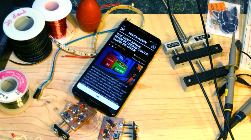
Most of use read and comment on Hackaday from the desktop, while we let our mind work through the perplexing compiler errors, wait for that 3D print to finish, or lay out the next PCB. But more and more people discovering Hackaday for the first time are arriving here on mobile devices, and now they’ll be greeted with a better reading experience — we’ve updated our look for smaller screens.
Yes, it may be a surprise but there are still people who don’t know about Hackaday. But between featuring your amazing hacks, and publishing the incredible original content tirelessly written by our amazing writers and editors, we’re seeing more new readers than ever. Our mission is to bring hardware hacking and the free and open sharing of information and ideas to people everywhere. So we made a responsive design that fits on the tall and narrow shards of glass attached to everyone’s hand.
There’s a generation of mobile-first hackers that we know has been headed our way — just a few years ago I lamented the change this poses to full-sized keyboards. But we think everyone should be interested in the kind of delightful self-learning that happens all the time around here and we’re happy to improve the mobile experience for that reason. Now we look great on a cellphone screen, and continue to look great on your battlestation where you have one-tab-always-open with Hackaday while laying out that circuit board, or debugging those timing issues on a sweet embedded project.


While I’m a fan of the attempt to support mobile better, can it be altered to allow zooming in and out in mobile mode, please? The locked zoom is pretty awful.
in fennec browser you can select “request desktop site” to get back the old layout.
I’m not getting a desktop version served, even though I request it. This works on most other sites and seems site specific.
Maybe just a way to tap on images to view embiggened and make those zoomable? Looks great otherwise yes!
Yeah, good point. We’ll look into this. Thanks!
Update: pinch zoom is now live.
any way to enable tap and scroll to zoom? I use it almost exclusively so can zoom one fingered. but am one person. mentioning incase others do to.
Seconded. If nothing else, this breaks the expectation set by every other site in the world. I use my phone one handed. There’s are at least two of us.
I like it! My eyes thank you.
Being able to zoom in and out is the right way to go on a small touch screen.
This was an incredible surprise! I read Hackaday through Inoreader RSS app on iPhone 8 but often find myself browsing through more pages after the article. I had to zoom and scroll with every link that I clicked but, this is what I needed! Thank you!
Firefox has this ability in its options regardless of the website design.
Ah, finally! Thanks very much, really appreciate it.
I read hackaday on my small screens when I step *away* from my desktop, to wait for the kettle to boil etc. or when relaxing.
Plus if I read hackaday on my desktop, it’s unlikely that any work would get done…
Good job but how many access via RSS or apps like Tapatalk?
Thank you.
The new setup is awesome, really good job and thanks for enabling the pinch zoom.
Agreed, this is lovely. Nice work team!
Finally! This has been issue I’ve learned to live with since I got my S60 phone. So much nicer to read now.
mobile version looks great, nice work hackaday web team.
Wonderful!
Thank you! I almost lost my sight while reading Hackaday articles on the phone :)
Excellent! Finally, I can spend even more of my time reading Hackaday!
If I may request one more tweak: it would be perfect if making my browser fill half of a 1920×1080 monitor (i.e. 960 px wide) didn’t make a horizontal scroll bar.
We only asked for an edit button on our comments, but thanks, any improvement is welcome :)
Came here to say this.
Edit button on ones own comments please.
The more peopple that say it, the more likely it is to happen. :)
Thank you, in advance because I have such faith.
What is this “Edit Button” you speak of? It smacks of sorcery and witchcraft to me. Are you never satisfied? The HAD team have worked hard to bring these pages in to the late 20th Century with an (almost) working mobile version, and you want all this and an “Edit Button” too. Have you no shame?
Yay! I’ve long lamented the mobile-unfriendliness of HaD. When viewing articles on my phone, I’d often just bookmark articles to read later. Which, of course, I’d never go back and do.
Wouldn’t pocket do the same?
What, allow you to save articles to read later and then never do? Yes, in my experience it offers exactly that
Maybe you can make option to expand all comments with click on some button “see all comments” under the article, while keep “if you miss it” section with advertisements just under that button. Therefore, you dont need to scroll trough all comments (especially if there is lot of them) if you are not interested reading them to reach some more interesting articles, and ads themselves are more reachable to people. And yeah, that is going to be visible on some statistic graphs over there, while keeping people stay longer on your site.
Finally!!! I mentioned this a few years ago, glad you joined the Anno Domini era…
Wow I must be the only person on earth that does not like this new layout. I guess I’m going to have to use the “request desktop site” feature on firefox like I already do to view facebook
Totally agree, new huge font is dreadful. Much too big on a large screen. It is impossible to read an article in comfort. We really need an option to set the font size.
Yes. And the article title are too big also. Please reduce the headlines font size and allow the complete title to fit in the reserved space for It instead of truncating It because of it’s large size.
Yes please! Or the ability to zoom out. The new website looks great but it has jarringly larger text than any other website I frequent on my mobile device. I’ve been really enjoying the larger write ups but it’s painful to read them now with the excessive scrolling required by the massive font.
I agree about the font. Compared to the desktop version, which works great on my phone, the lines are half as long and there is a ton of space between the lines.
And it
gets old
quickly having
to read
a new
line every
Couple words.
Desktop version has far better information density and allows for a better overview.
A lot of sites that offer “mobile versions” I find getting the desktop site is the best way forward.
Because the people writing them decide what features they want to remove, or info not worthy of being displayed.
So you ended up loading the desktop to make it work properly.
Less cringe worthy than many apps which are simple front end wrappers for pulling all the same data in over webpages anyway. But allowing devs to harvest more data from the phone.
Agree! Now I need to hold my phone at least 2 feet away to not be overwhelmed by the extremely large font. It’s initially shocking when switching from any other website.
Nah…
I’m with you… I’ve been using hackaday.com/blog since that switch for a reason. Now that’s ruined too.
Such is life I suppose.
Nice to have this option when I want to read the comments, but I primarily read the site postings via an RSS reader on my mobile devices. I find it handy to have all the various sites I read consolidated in one place, and where I can easily see if there’s a new post.
Your website sucks on all devices.
When we finally had high resolution monitors, I was convinced that the time of white, green or amber letters on black background was gone for good.
But there are still some unteachable nutters, that seem to think that this is nevertheless a good idea, against all ergonomic findings of the last 100 years.
If there wasn’t some interesting content here and there, I’d never visit hackaday.com. It hurts my eyes.
And I’d never even think about putting one of my projects on hackaday.io. This is the most confusing thing that I’ve ever seen. I’d rather dump everything file on a ftp server.
I like it,. Fonts a bit big for my device but I like it, however I always have my phone set to desktop for other sites so will continue to view HAD this way. can’t please everyone :)
Looking good on nexus6p, this is a welcome change. The font balance between headers/body is now much more sensible too (used to be: header so huge it does bot fit on screen, text so tiny that you must zoom to read and eyes hurt anyway).
Extra thanks for enabling zoom.
(extra rant) Why oh why mobile sites love disabling zoom so much. You have a tiny screen? You can’t really make out any details in this tiny picture? Well f*** you, we also disabled zooming in, muahahahahahahaha! — or what were they thinking?
Finally! Welcome to the present! WooT
Love the mobile layout, THANKS a bunch!
Great, I read hackaday almost exclusively on mobile as I’m waiting for lectures or such. But the text feels a bit large at my note4. Perhaps it could automatically adapt for screen size, or zooming outcould be enabled.
Coudn’t it be printed onto some form of dead tree and delivered to my door?
Send us the IP of your printer and we’ll set up a cron job ;-)
Awesome, thanks!
Take your pick my printer has multiple IPs;
2606:4700::6812:724f
2606:4700::6812:714f
104.18.113.79
104.18.114.79
Damnit. Called Mike’s bluff.
OTOH, you’ve now put your printer IPs up on the Internet. Interesting experiment? Or madness?
I tend to use the WordPress Android app to read HaD on my phone. That’s another option for those who still don’t like the layout.
Now do the opposite for HaD.io bcz the mobile-preferenced(?) layout makes containing information to a single browser screen like a high speed chase on an IMAX
Since we’re on the subject of fixes, can you do something about the search?
When I enter a search term that’s somewhat broad, I get a list of blog items displayed on the page, and then my only option is to hit the ‘Next’ button, and that’s it. No seeing how many results, no pagination to use to jump to if I know it was an older post, sorting methods, etc. At the very least it would be nice to see JUST titles with links to the blogs, and not the entire posts just barfed out one after another, so I can narrow down what I’m looking for easily.
https://duckduckgo.com/?q=site%3Ahackaday.com+whatever
Our search is a WordPress thing, and it’s not always the most intuitive. It goes in reverse chronological order, and seems to favor matches in the title over matches in the article body.
Searching by author seems a lost cause…
You can adjust how search works on WP by hooking into the search filters. The defaults work well in 90%+ of sites, but I wouldn’t expect them to be good for HAD.
Why is not m.hackaday.com for mobile platform and http://www.hackaday.com for desktop users
not all readers like this mobile spageti site version
or add to url?layout=desktop and I will bootkmark this site with forced desktop version
many readers using wide LCD monitors and this responsible version s?x….
Because it’s 2019 and we don’t do separate crippled mobile versions of websites anymore. Not since IE9.
really??? it would be freaking awesome if i could select which version of had i got to view. it really annoys me when i view had on my phone and i have it set to “request desktop version” then when i refresh the page it reverts back to the god damn mobile version. i have to disable “request desktop version” and then re-enable it so i can get back to reading in comfort without my eyes hurting from such large font. my phones screen is 5.5in so the letters in the titles is 1/4in tall i can literally read the titles from 20 feet away. so what will happen when you have a word in the title that is more that 14 letters long……. it wont fit. also when you use a lot of big words we end up with one word per line.
long time reader but not for much longer
I mostly welcome the fact that the text is no longer hard against the left edge of the display. I have yet to find a screen protector for the stupid curved screen on my new phone that does not obscure the edges.
Hackaday was my test site to see if the edge was legible. Now I don’t need to search anymore!
PS: text could be smaller.
Great update! May I suggest putting the new comment field at the top of the comments?
New update is great! Much more sensible margins on mobile. But when scrolling through the comments, it seemed very easy to accidentally hit the reply button. But other than that, everything looks great!
Yes! at last! just set the size on slides title to something like .featured-slides-title -> font-size: 3.2vh; because it is cutted sometimes.
I was reading on desktop mode because I did not like how the mobile version look like an then got to this post… change it back to mobile and it looks great.
Yess thank you. I’ve been using my own janky userstyle for mobile for a while, now I can ditch it
Still not liking this new mobile version. For some reason HAD forgets I have my phone set to “request desktop site” but when I open firefox it loads the mobile version then I have to disable “request desktop site” and then go back to menu and re-enable “request desktop site” every time I try to view the HAD site. At least facebook loads the correct layout how is facebook’s site more intelligent than hackaday’s I was a daily reader of HAD but since this mobile version has been forsed down our throats I only come here once or twice a week.