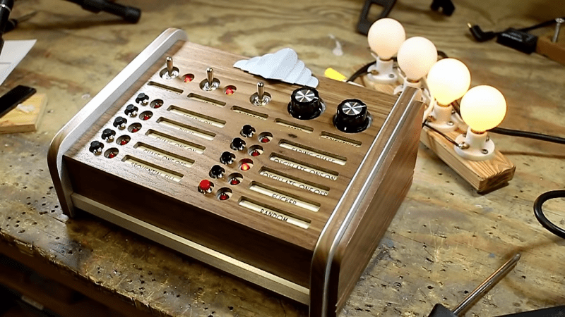
Bakelite, hammertone gray finish, big chunky toggle switches, jeweled pilot lights – these are a few of [Wesley Treat]’s favorite retro electronics things. And he’ll get no argument from us, as old gear is one of our many weak spots. So when he was tasked by a friend to come up with some chaser lights for an Art Deco-themed bar, [Wesley] jumped at the chance to go overboard with this retro-style control panel.
Granted, the video below pays short shrift to the electronics side of this build in favor of concentrating on the woodworking and metalworking aspects of making the control panel. We’re OK with that, too, as we picked up a ton of design tips along the way. The control panel is all custom, with a chassis bent from sheet aluminum. The sides of the console are laminated walnut and brushed aluminum, which looks very chic. We really like the recessed labels for the switches and indicators on the front panel, although we’d have preferred them to be backlighted. And that bent aluminum badge really lends a Chrysler Building flair that ties the whole project together.
All in all, a really nice job, and another in a long string of retro cool projects from [Wesley]. We recently featured his cloning of vintage knobs for an old Philo tube tester, and we’ll be looking for more great projects from him in the future.
Thanks to [anacierdem] for the tip.


Wow! I’ve never even considered that a human could make something like this, by hand, in the 21st century! The attention to detail here is amazing. It’s given me some ideas. Well done!
This is an utterly gorgeous and very clever build, but I have a lot of questions about the final product’s durability in use. There is a lot of double-stick tape and uncoated paper labeling in use and those age away pretty quickly. I was going to whine about the lights not being “really” jeweled, but then I checked out what a real faceted jewel indicator lamp goes for on Ebay these days – I may have to start sifting through my parts bin for gold!
Wow, that’s beautiful. Looks like something you’d be fiddling around with in Bioshock.
In my humble oppinion I think It doesn’t look Art Deco. I think the design lacks verticality and some of the characteristic decorative patterns of Art Deco. But that doesn’t mean I don’t like It. It looks retro, It looks cool, but I don’t think It looks Art Deco.
Amazing build but I must agree with Thinkerer about the excessive use of double sided tape, painters tape, and paper! Such a wonderful build but it won’t stay that way for very long. These will all be gooey and sliding off leaving sticky trails in a month from now.
Fantastic !!!
Looks like 1974. Retro but not art deco.
Totally agree
lovely works, i prefer art nouveau where the aesthetics of the curved lines of the decorations is magnificent.
Thank you for sharing this post
take a tour here http://www.facebook.com/style.art.deco for more inspiration