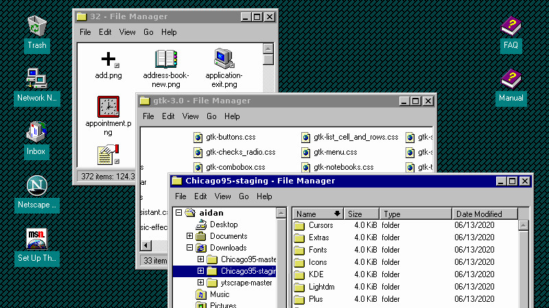
Sometimes we cover works of extreme technological merit here at Hackaday, other times we cover interesting projects that while they might not lie at the bleeding edge are interesting enough that they deserve a wider audience. Sometimes though, we bring you something in this field simply because it amuses us and we think it will you too. Such is the case with [Bryan Lunduke]’s look at making a Linux desktop look like Windows 95. And lest you think that it might be yet another skin to make Windows users transition to Linux a bit easier, the aim and result is to make it look exactly like Microsoft’s mid-90s desktop.
Underneath it all is the relatively familiar xUbuntu distribution, with a deliciously troll-worthy project called Chicago95 atop it. This takes some existing Windows 95 theme and icon projects, and adds GTK themes, an MS-DOS shell theme, the ability to install those cheesy ’90s Plus! themes, and a Microsoft Office 95 theme for LibreOffice. It really does deliver an experience very close to the Redmond original.
So, what’s the point here in 2022? In the first instance it’s an excellent opportunity to troll open-source enthusiast friends with a crusty laptop seemingly running ’95 and showing YouTube videos on Netscape Navigator 3. But beyond the jokes there is a serious use for it. There may be many criticisms that can be leveled at Windows 95, but it’s safe to say that its GUI was a significant success whose echoes can be found in many desktops here in 2022. There are a huge number of people in the world who are completely at home in a Windows 95 environment who might struggle with a Linux desktop, and this gives them a way to be immediately productive. Would you give your grandmother a Linux box with this desktop?


Ain’t this Windows10 constantly updating rubbish :D
To get the real WinDOS feeling do everything as root!
https://www.reddit.com/r/linux/comments/hywuq/sudo_comic/
The other way round (Win to Lin).. https://m.youtube.com/watch?v=GVO8RU9h88k
At the time it didn’t even seem crazy.
Some of us did think it crazy. I switched from Windows 3.11 to NT 3.5.
But, even by WinXP, MS office still needed admin rights to run spell check.
Fortunately, by them I had switched to Linux with a minimal service Win2k happily running in a 256M vm.
This…. Unfortunate that as a consumer and not enterprise I can’t purchase LTSC without all the update and less tracking garbage… LTSC is… refreshing.
Linux Mint Cinnamon is excellent and the UI acts like Windows.
Linux Mint Cinnamon has been my daily driver on home & work PC’s for maybe a decade now, I’ve even put it on relatives’ machines to save them the expense of upgrading and it’s been painless.
Seems more stable than modern Windows and driver support for most stuff “just works” especially on older machines / peripherals.
same, mint cinnamon has been my daily for about 10 years now too. at home and work, it feels very mature
Win95 kind of looked like Breadbox Ensemble, too.. :)
http://toastytech.com/guis/bbe.html
But which came first?
ISTR that Win95 was officially released late 1995, but was realistically available in early 1996.
The copyright date (1994) seems to indicate that Breadbox was first by about a year and a half, but it might have been modelled on the appearance of an earlier Win95 beta release, so who really knows?
I always thought that the Explorer shell interface was a huge success. It wasn’t perfect but it was foundational for most modern desktops. A large part of it’s success was that the appearance itself indicated functionality (e.g. window resizer).
There is a lot that today’s programmers could learn from studying the Windows Explorer GUI design.
Back in the 90s, as a kid, when Win95 was brand new, I liked the Program Manager more, though.
Because, Windows 3.1x had a friendly face and bright colors.
Win95, by contrast, which my father used on his mighty 386, seemed so serious/corporate-like to me. Like a dude with a suit and a necktie. I felt so little when using his PC thus.
Not sure exactly why. Must be because of that 3D/concrete look and the gray color.
OS/2 Warp 4 felt similar, I mean.
Well, maybe a little less so. The funny sound effects made Warp look less menacing.
Anyway, these are just my two cents. They are not important, but since “I was there” I felt mentioning that at the time, not all of us were amazed by or fans of that “legendary” Win95 shell or the task bar.
Some of us rather used the Worplace Shell, for example.
http://toastytech.com/guis/wps.html
https://www.oocities.org/wilmarcdw/
That being said, the GUI of Win Me/2000 looked quite nice to me right from the start. The sand-colored task bar, for example, has a nice warm feel.
“I was there” too but ventured off the beaten path lots more. Had UNIX on 386 with X11, Ventura Publishing, Gem, etc. Windows 3.x was clunky and DOS under it was painful after using a real multi-tasking OS(UNIX). But the WorkplaceShell was amazing at customizing to your needs. Found HP NewWave to fix the horrible Windows 3.x GUI at a time everyone had their own ‘better’ Windows desktop(Compaq had a rolladex, or was that Dell). Microsoft hired away most of the HP NewWave team and put them on the Chicago project once it was obvious Windows NT 3.1 was going to flop.
http://toastytech.com/guis/nw.html
HP NewWave, like WorkplaceShell had the concept of folder and application templates where you’d drag-n-drop a template item to your folder/work area and it was automatically a copy of the template. Like taking a piece of paper and placing it into a real project folder. Matched real life operations for document handling and retrieval.
Better yet, you could create a folder with many documents and document types in it and make that a template and place it in the template folder on the desktop. Got another chemistry lab project BAM drag off a Chem-Lab template and rename the folder to the lab number. Now you already have a notes text file, a Word,WordPerfect,StarOffice word processing document and a spreadsheet document. Both HP NewWave and OS/2 WorkplaceShell had this feature but OS/2 multi-threaded(multi-tasked) well so it was a very smooth UI experience.
Windows 95 was the beginning of the end of Desktop UI innovations on Windows. To maintain control over what applications users see when they purchase a Windows computer they removed the ability of any vendor selling a Windows based computer from customizing the default screen. Users could change the default Windows 95 desktop after first boot but there were very few who bucked Microsoft’s control. Star Dock was one and they came from an OS/2 perspective and did a decent job. But under the hood, Windows 95 was still DOS and still a REALLY bad multi tasking OS.
I stuck with OS/2 til about 1999 and then went back to my UNIX days but using Linux as the daily driver. Professionally working on HPUX and Solaris systems so even though I did lots of that development on OS/2 via emx and XFree86OS2, Linux on multiCPU hardware like BP6 was a screamer. To this day, desktop UI innovation thrives on Linux but boy would I love to see the CORBA/SOM based WPS once again but on Linux.
I love it! I think I may try to install this. Not because I care about Window 95, but because I really like the beveled edges and the “3D” look. With modern “Flat” interfaces you can’t always tell what is (or isn’t) a button, what’s clickable, or where the edges are for dragging.
> With modern “Flat” interfaces you can’t always tell what is (or isn’t) a button, …
add to that modern websites with scrolling pages of nothing (information wise) and I wonder how and why all that got worse. :-/
https://www.windows93.net/ I thought this was a brilliant bit of fun and perfectly encapsulates that era :)
Now old man rant on interfaces.
OMFG it is like html tables never happened. Nope, lets bloat the hell outta the page with a java butt plug that completely covers the page with a drop menu with all options at the top and empty space for the rest and make it open for no reason other than the lighting changed in the room and make sure there is no side space so you can click out of it or minimize it lol so you have to choose something from the menu now and leave the very content you came to read or buy. And the hidey scroll bar that I am supposed to “know” is there when I move the mouse to the right side of the page? No, just put things in their boxes. Kinda like having all that blank space in the top and making the search a magnifying glass you have to click to expand a search box where you can type. Just put the f-ing search box up there it is not ugly I promise haha. I have many gripes with the mobile merge new skool web design. It seems so self important to deliver garbage content like Cardi-B’s dead hamsters keto diet. I feel like we lost something along the way but I think every generation feels that way. I can always hope that Apple releases it as “new” with appropriate slick hype and have the masses embrace and forget it happened 30 years ago already. For a final “seriously, f you” I point to Chrome’s whole Print cosmos that gets worse and worse. Now it is “Share” and holy carp I canNOT understand the Pages selection where they dumped the page range input box. Nope ya gotta drop box, wait for it to put up input box then type while staring at the vast 70% of unused whitespace all over that area. I mean why? Did people try to email their dad from the page range input box? Are these the same people that gave us oral ingestion warnings on Prep H haha? Okay old man rant done. Gonna finish shaking me fist at a cloud and adjusting my onion lol. Memories…
Flat interfaces suck: https://www.theregister.com/2017/09/05/flat_uis_designs_are_22_per_cent_slower_official/
I fear it may be deliberate, to force you to spend 22% more time looking at ads :-(
I’ve started having trouble intuitively knowing which window is in the foreground on my work machine. When I have 4 windows up and will sometimes be staring at one for 3min between interacting, I’ll start typing into excel just to realize that CAD was in the foreground. Or worse, my notes app was in the foreground and I just typed “=abs(” somewhere arbitrary.
Not an issue on my home machine, but Windows’ current UI, while slick-looking, isn’t always the easiest to work with.
I had the same problem and you can actually enable good old title bar colour changing with focus, you have to edit the registry
A quick search for “windows 10 change inactive title bar colour” gets you on track.
I know even worse stories! I have to use Windows at work :-(. More often than not, an input field in an unfocused window will have a blinking cursor, making you believe it’s got focus.
And then there’s a business virus scanner manager program that prompts for a password and while loading will randomly give the focus to any other open window, so you click inside the password field, start typing and your password will appear in a window behind! It could be a chat program and hitting enter could make everybody on the network see the master password!
That said, I also kinda wish the Program Manager of Windows 3.1x which I grew up on would become a window manager for Linux.
The same site has an article about a theme from the same person that did this Windows 95 one, but this time it looks like the 90s Mac OS desktops. https://lunduke.substack.com/p/make-linux-look-like-macos-9
I was never a Mac person, but I did like the style of their desktop even if I rarely got to use it.
Windows 95 was better than Windows 10 in the fact that it didn’t have disappearing and very
narrow scrollbars. Who came up with that idiotic idea, we will never know.
The guy who sells mouse wheels.
“now they have to buy my wheels, mhuahuahuahauahah”
Windows is in hock with “big mouse wheel”, WAKE UP SHEEPLE!
All I want for Christmas is the guy who thought it was a good idea that the Start menu come up, display items then continue loading other stuff, which isn’t in the start menu’s folder only to display it making all the first set of menu items shift just as you are clicking the spot the one you wanted was a moment before.
I want him, some rope, a shovel, a bag of quick lime and lots of privacy.
“lots of privacy”
a public spectacle would help to discourage similar designs.
Agreed. Make it a pay-per-view event and get rich. :D
I think he went onto design current webpages, the ones that don’t load linearly, so if you click something before the page is fully loaded, you go to the wrong page, and have to start again.
About once in every 10 links I click in any browser, the screen shifts a split second before I hit the mouse button. Doesn’t matter when I click or how long I wait, even if I know it’s gonna shift.
and the pages where it loads the ad in a narrow strip across the top and they time it perfectly so when you head to the login button the resize the ad so you’re clicking the ad instead of the login button.
Abusing your customers with UI changes is so much a Microsoft thing it just has to be the same guy.
He’s the guy who decided to make flip phones beep every 10 seconds when the battery is getting low
Well many O365 pages do this very same thing, so I don’t think he left MS…
I have a feeling he also supplied a patch to Firefox that makes it not switch its address bar (which is configured to be _separate_ to the search bar) from search context mode to URI mode and so when I enter an address like https://hackaday.com it thinks I’m doing a Google search for the keyword “https://” (and yes, it ignores the rest of the UI).
Seems to be a race condition / CPU performance thing… my little Atom-based netbook does it a lot, but even my Ryzen 7 desktop does it to me at least once a day.
He’s in hiding with the guys from team Clippy
That is hilarious, I’m not a Windows user, given the processing power of today’s machines. It reminds me of when Windows 95 was being developed(Chicago) and Microsoft tried to multi-thread the Explorer so it ran as smoothly as the IBM OS/2 WPS. There was maybe one beta release with this multi-threaded Explorer and it was unusably slow. The next beta Explorer had maybe 2 threads and most all of the other OS tools and utilities were similarly single threaded. Sounds like Windows is still a piece of shit OS coming up on 30 years since Chicago became Windows 95.
I miss DESQView. Was amazing before all the gui.
If you can find a bag of quicklime, please message me. I’ve been trying to get some for six months!
Well you don’t need such a permanent scroll bar on a touch interface….
But I totally agree with you. ^^this is just a reason I came up with (surely not the only one).
Disagree there, sometimes you need a space on the screen where you can stick your finger that _doesn’t_ activate some page widget.
A good example is this page:
https://www.abc.net.au/news/2021-03-02/charting-australias-covid-vaccine-rollout/13197518
If I scroll down to the map on that page, on my tablet, I’m “trapped” in the map, swiping the finger up or down just pans the map and I can’t “escape” it to see the rest of the page. I have to hit reload and move it while it loads to get around it.
A scroll-bar enforced by the web browser would be brilliant.
This: browsers handing over _all_ scroll/zoom control to some widget without reserving any way to zoom or scroll the page. Bah.
I honestly haven’t used a scroll bar in decades, because mousewheels and touchpad scrolling exist.
Except for when they don’t work. e.g. Steam, then one has to drag the bar around. I end up using a function of the mouse software (middle-click, move up and down, variable speed).
Proper scrollbars are also feedback (output) not just control (input) zones. They show where you are, how big is the current view is compared to the total, and creative ones even show extra hints like where other results of a search are. All those apply to desktop or phone displays, irrespective of how the user commands the computer (contact screen, mouse wheel, etc).
But modern UI/UX experts have shown over and over that they do not care about users’ comfort, efficiency, etc; or do not know why things were done one way instead of another.
Absolutely right!
Sometimes it does not work and then you think there are no more options on that window. And there are.
that irks me too!
ive been customizing repairing rebuilding and programming computers almost all my life but at a new job had to ask my boss how to scroll down on a webpage in windows 10…
my excuse was that i removed all the scroll-wheels off of all my mice before even plugging them in (at home and prev. job(s))
and to think i was the only one who could tell a ram-stick failure without diagnosis-software or a screwdriver… never got an appology from her. dont want an expierenced technician’s diagnosis? dont hire one.
“Would you give your grandmother a Linux box with this desktop?” — Well, no. I’d run away like a bat out of hell, if either of my grandmas suddenly showed any interest in computers or me, considering that they’ve both been dead and buried for decades now.
Is this a new thing? I remember various options for a Linux desktop, I assume KDE, that included a Windows 95 theme.
But Idon’t pay attention to these things.
I do think Windows 98 had a better interface than Windows 95 but I’d gladly take 95’s interface over any of the more recent Windows versions!
I agree. I even used redmond theme on my Slackware 11 with KDE. It had nice contrast and edges were of good size.
Does anyone remember FVWM95? :-)
I guess that’s what I remember.
I may have tried it briefly, but since I’d never used Windows at that point, no need to get the feel.
FVWM95 was my first thought when I opened this article.
It was ok.
Something with an actual tool to edit the entries in the “start menu” would be a lot better. At least in the distros I have every tried any of the FVWMs (95 included) there were so many different config files that interacted to generate the menus, and they so rarely matched the locations that were documented online. It made FVWM not worth it.
Why????
Why not????
Because Bill obeyed a tall and bald kid.
I was just about ready to install this. But, then I noticed the browser. Running a modern looking Firefox or Chrome would kind of kill the effect. But the browser they customized was Pale Moon. I’m not a fan of DRM but I’m not ready to give up most mainstream content just to avoid it.
Remember the time when companies didn’t try to limit how you can watch the content you paid for? The last time I bought or rented DRMed content was about 20 years ago.
Windows 95 wasted countless hours of life for millions of people, why worship destruction and pain? Maybe these folks should try getting a modem to work right on windows 95, this is like paying homage to the grim reaper.
For the proper experience surely they should try getting a modem NOT to work right and be a constant PITFA.
Still using “classic start menu” with windows 10 and living in the past with a GUi I recognize and have 20yr+ experience of using without having dickheads force changes on me that I didn’t ask for.
Changes which these days mean noise, unwanted spam in the form of “news”, adverts for stuff I’m not interested in, etc whilst hiding my program I want to run.
When the start menu is almost become it’s own OS its’ time to roll back the clock.
Excellent. I like the retro trolling 😆
Is Jenny’s 1995th article on HaD.com. Metahack?
My Windows XP themed linux: https://www.reddit.com/r/desktops/comments/rzu6a0/q4os_gemini_427_wxp_theme/
For non-sentimental (well… also sentimental) reasons, I would love a true WFW 3.11 look and feel for my linux. Due to an old back injury causing nerve damage, my fingers do not always do what my brain tells them to do. I often have trouble when I click on a menu, and accidentally move the cursor off of that menu – the “open” menu automatically moves to follow the cursor. This causes me to have to go back to the position of the menu that I want, and often have to re-open that menu – occasionally I end up repeating this several times.
I really miss the menu system in Win 3, where the open menu stays open until you click off the menu, even if you move the cursor to another menu location. Does anyone know of any window manager which can do this?
I did try running Progman under wine, but it keeps the “modern” moving menu game. :-(
My memory of eagerly switching from Windows 3.1 to Windows95 was the shock at how sluggish everything was comparatively, the start of the whirly wait-cursor, the endless restarting and to be informed it was all my fault! II needed more RAM, more disk, faster processor etc… Wikipedia informs me that installed size of Windows3.1 was between 10-15 Mb. In the incremental move from 16 bit to 64 bit I became ever more frustrated at this endless reloading and whirly wait cursor and trying to time mouse click a minute ahead to get it to perform something. Each new Windows OS seemed to be getting slower, not faster and with more and more confusing features and this endless whirly wait cursor which appeared and disappeared without any seeming reason. And we seemed to always need more memory and more disk space, yet when I look back at Windows 3.1, I don’t really see anything was missing. ( arguably this was a cooperative multitasking OS where you had to yield focus, rather than a preeemptive one, but having used FreeRTOS [preemptive], I don’t see that the switch in Windows95 should cause a slowdown) Nowadays when I need to use Windows , usually to help a user, it is amazing how slow and frustrating and just downright ugly their operating system is compared to Windows 3.1 which I remember as being quite responsive on my old 386.
Thank goodness for Linux!
But anyway it is good to now you have the freedom to get the look and feel you want in Linux without to much hassle.
I’m more interested in GUIs resembling older releases of MacOS–Snow Leopard, Tiger, or even OS 7 – 9.
So probably it is a sleeper OS comparable to Win95, supporting GBs of RAM, multiple cores of CPUs, GPU drivers, WiFi, Bt, and more :O
Omygosh, when I dumped Windows I did NOT want to replace it with a nearly identical OS! I hated Windows and did not want my new OS to look or behave anything like the OS I was ridding myself of. I guess there’s a place for these one-size-fits-all “Windowsy” interfaces, but for cry’n out loud, some of us despise that “look and feel” of Windows. Familiarity doesn’t have to mean having a “look-alike, act-alike” interface. Point-and-click is one thing. A Windows duplicate is a whole ‘nother thing! No thank you, not for this boy.