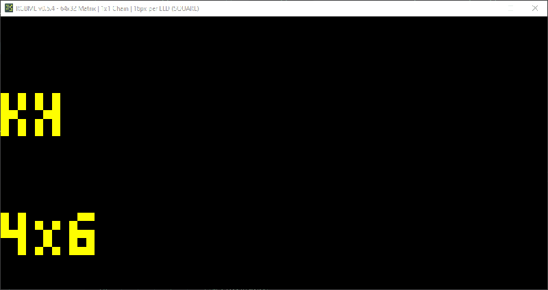
Baseball is in full swing again, and having recently accepted a position with Major League Baseball, [Ty Porter] is warming up with a big contribution to the MLB LED Scoreboard project — modifying 20-some old fonts to support baseball’s ‘ꓘ’ character that indicates a special strikeout with a called third strike (meaning the batter didn’t take a swing).
The problem is that Major League Baseball-the-entity recently deprecated the original data source for the scoreboard project. This called for a huge refactor of the codebase, including previously-patched fonts which were now showing either the font’s default no-character character, or nothing at all.
Fortunately, BDF font files are fairly human-readable and make reference to bitmap, which is an actual bitmap in hex. [Ty] settled on Unicode A4D8 (ꓘ), a character from the Tibeto-Burman language Lisu that certainly looks good enough to this baseball fan. Then it became a matter of mirroring the bitmap for ‘K’. [Ty] tried a few things like reversing the nibbles and looking up each one in a table, but that also mirrors the padding, which is bad news.
Then he tried not reversing the nibbles and just looked them up in a table, but this approach dropped and added bits unintentionally. Finally, he tried reversing the order, looking up the reversed nibble, and shifting each byte until there was no padding. This worked for most of the 20 fonts [Ty] patched. The others fell in line with some manual work.
Not much of a baseball fan? You’re almost guaranteed to like this one, especially if you hate mayo.


Baseball? I know base band and harmonics…
But …
https://xkcd.com/2606/
… don’t we need all of those too?
Nice short and sweet story.
A little trick I use for variable width bitmap fonts is logical OR all rows together into a single byte, then check if the rightmost bit is a 0 (padding), and right shift it. By keeping count of the shifts, you get the width of the character. You could also check for left padding as well this way, doing all rows in a single check.
I never got to the next step of kerning, which is when a character tucks under the previous like a couple of forward slashes.
Nice to see some Baseball here!
When the national league implemented the designated hitter rule that was the last straw for me. Haven’t watched a game this season.